Brancaster Chronicle No. 13: Fred Pollock Paintings

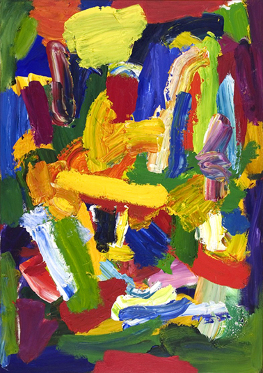
Highland Dancer, 2005-2010, 127x101cm, acrylic on canvas. [No.3]
19th July 2014, Bermondsey, London.
Those present: John Bunker, Anthony Smart, Anne Smart, Emyr Williams, Robin Greenwood, Sarah Greenwood, Alexandra Harley, Patrick Jones, Mark Skilton, Hilde Skilton, John Pollard, Noela James, Dan Coombs, Nick Moore.
Anne Smart: These are Fred Pollock’s paintings. He is unfortunately unable to be here today.
Robin Greenwood: But we are going to talk about them with his permission…
Mark Skilton: I remember last year when Fred was here I was very impressed by him, as well as his paintings, in that just his presence and obvious experience and the honesty with which he talked about his work – I sort of miss that.
Hilde Skilton: Yes, we asked him a lot of questions.
Mark Skilton: We did.
Patrick Jones: I think that not having seen them for a while the thing that strikes me most is the tonality of them, that the flat dark greens and you know the darker and lighter colours, and I remember them as being flatter. In time, since last year, when we looked at them, the surface does not bother me any more, whereas it did with the over painting, and now I am seeing the depth in the painting… Are these new paintings?
Robin Greenwood: 2010, I think. No.3 is 2010. The big one [Painter’s Song] is 1993.
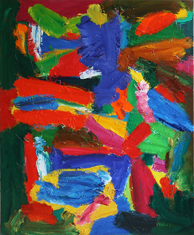
Painter’s Song, 1993, 214x150cm, acrylic on canvas
Patrick Jones: What ‘s striking me about Fred’s painting is the amount of dark and light in the pictures as well as the strength of the colour, and something I did not notice last year so much. I will attempt this, it may not work, but in terms of what we have been talking about, a lot of discussion has been about how the art work touches the ‘external reality’, which is either the floor or the wall it is related to. We talked about it in John Bunker’s work and about it in Robin’s sculpture, how it touched the floor. But with Fred’s work I have no problem in entering the world that Fred wants me to look at, it is so intense and involving that I can step straight into Fred’s paintings, emotionally… and in fact if anything it’s so declarative. Fred is a quiet man, they don’t shout, but the pictures absorb you somehow, in a really, really good way, and it is not easy to do that with all of that bright colour. But as I said last time, he is a class act. A very, very high quality artist.
Dan Coombs: Does anyone know how long the paintings take to make?
Emyr Williams: 5 years?
Robin Greenwood: Some of them are made over a very long period. He has a lot of paintings on the go at once. He very often pulls out an old painting and carries on with it.
Patrick Jones: Which is usually the kiss of death – it’s amazing that he can keep them so fresh, with the overworking.
Emyr Williams: It is probably worth talking about the big one [Painter’s Song] in comparison to the later ones, because the big one, lots of pieces of the colour have colour within colour to animate them. You are aware of the ‘brushiness’ of dragging greens and yellows in orange, or whites in red, whereas it seems there is a little less of that going on in the smaller ones, its more about the density of a single colour.
Sarah Greenwood: Yes, that is quite a big painting and they are small areas, aren’t they, they are not huge areas of colour, so it’s adding greater variety to the colour and to the whole surface because it is a much bigger painting.
Emyr Williams: It could be, but also a little less hit and miss. What happens when you put the brush stroke on, there is a lot more up for grabs when you do that ‘mix’, very seductive to have that to happen.
Patrick Jones: Yes there is a technical difference in that some of this [Painter’s Song] is done with a palette knife and mixed colour, whereas these tend to be flatter and brushed; so the big painting has got proper, thick wodges of paint, manipulated with a knife, which allows the white to drag through, and in No.3 the areas are quite clearly brushed and flatter.
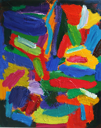
Untitled, 2005-2010, 127x101cm, acrylic on canvas. [No.2]
Anne Smart: Are we thinking that [as we look], or does that occur to us after we have worked it out? Because I think these [Nos. 1, 2, and 3] are less flat, because I find – after a long period of time – that these smaller ones are initially flat but now are more spatial – because I understand more about the colour. The colours are much more controlled by Fred in that one [Painter’s Song]. I admire that – not a lot of people can do that – but I am going to say that I find the others much more successful. They build up into something which is much more controlled, which in itself cancels out that control and then becomes looser; whether that makes sense? And because, a lot of what I like is that some of the colour, say, this orange on this green, they are like ‘zum, zum’, and then it looks flat! It gives you that fabulous feeling that is really exciting, a movement between myself and the painting. Whereas this [Painter’s Song], I am tired of this. I want to get something that will turn me on because of its colour and shape, but which initially is quite low key. I think this [No.3] has a more vibrant quality. There are these emeralds, viridians and sap greens, they build together and this whole section here is huge, really big, and it does not have to have this much control. I just believe that ‘control’ in its proper application becomes, if you know what you are doing, fresh and loose. Control does not mean you will be weighted down by something, to me these sing with looseness but I know they are made and built – and that is special.
Alexandra Harley: They are considered…
Anne Smart: You get passages where there has obviously been an alteration and so, OK, we have worked out there has been a 5 year gap. I don’t care, I want to see it now, I like it now, and that’s what Fred says this painting is about. This piece here and whatever is happening, that retains that quality of the yellow, with that bit of green coming in, compared to that sort of indiscriminate green [Painter’s Song] – which I know people get off on, I also have got off on that for a long time – but now this [in Nos. 1, 2, and 3] is more pertinent. More real, more abstract.
Noela James: In this painting you can sort of go into it more – these areas, that area above the yellow, that is a virtuosity which is quite appealing and very exciting. That is more layered and you can see the bright colours marked and you can travel into it.
Patrick Jones: I was looking at it closely [No.3] and it has been repainted. The orange at the top where he has got the little hook on the end. It looks like it is orange over green but in fact the greens come back over the top – he has probably made a more conscious building effort than you were describing it.
Anne Smart: And things like this stop you from looking at the painting as though it is a series of marks and a series of events, you look at that and you cannot stop yourself from looking at the rest of the painting. You might just think, ‘Oh, I’ll have a look anywhere else’ and so constantly you are moving around the painting, for a reason, to get to know what Fred is trying to tell you.
Patrick Jones: Having said that, I do find those two yellows, the big lemon yellow one and the yellow that shoots up [in No.3], that is a little bit flat in terms of the rest of picture, and they jump out. The fact that it holds together still is amazing. Do you see the two elements I am talking about?
Anne Smart: I do, but I don’t agree…..
Hilde Skilton: But has it got a lot to do with that blue as well?
Anne Smart: Well, it has to do with all of it.
Hilde Skilton: Yeah, yeah, sure.
Anne Smart: I think the ambition of that painting is not to be able to talk about it like that. That is what drives me to be so positive about this painting.
Hilde Skilton: Well, No.1 for me is the one I like particularly, although I like them all. It is because he plays so well with that sensation of space, and yet always bringing it back to the surface. And I think Fred is very successful with his tonal range. And, absolutely Anne, I am looking at No.3, and I say look at what the blue is doing there as well. But because what is happening as I read a volume in No.3 – and a volume, and another volume – and then eventually the whole thing becomes one volume.
Untitled, 2005-2011, 127x101cm, acrylic on canvas. [No.1]
Dan Coombs: When you say one volume, what do you mean by that? Do you mean the whole space? Do you mean it all comes together?
Hilde Skilton: Yes, Yes.
Dan Coombs: Yes.
Hilde Skilton: And not necessarily just as in concave or convex, but certainly coming together, yes.
Dan Coombs: I am quite interested in the issue of drawing, and what it applies to, because in a sense you could say that this man doesn’t draw at all but he goes straight in with the brush and there is a whole idea of the edge of the shape determining itself. He does not draw he just goes straight in.
Patrick Jones: Well Alan Gouk on abstractcritical referred to the fact that those big clumps of variegated paint that he uses, the edge of the form is the drawing- am I right? I do not want to paraphrase.
John Bunker: Yes, I think that was what he said and that did intrigue me. So when the edge of one colour hits another, or one lies on the top of the other and gives you a distinct edge, there is a really interesting build-up of shapes. So now that it is pointed out, I am starting to see a very architectural quality to the way they are put together. But it is not dominant, though; and it is not holding anything down.
Sarah Greenwood: Is that because the architecture is ‘how it is’. The painting is working, therefore it seems to be that you are feeling the structure of it.
John Bunker: Yeah… and I keep coming back to the movement; they just feel as though they are just arriving when you look at them…
Dan Coombs: That’s good. I mean that’s a good thing.
John Bunker: Yes. That is what I get from these.
Dan Coombs: So you mean they have not stopped moving?
John Bunker: They are still coming into being what they are in front of you, while you are looking. That sensation of dialogue is what gets me with these paintings.
Alexandra Harley: They are jostling for position- each section is jostling to get in.
John Bunker: Yes. I think that gets something internal somehow, physically and that is very powerful.
Emyr Williams: When you set up those darks and lights in a painting, and you set a tonal quality, the risk is that the colour will become an element that just floats within a tonal space and that is constantly the thing this is fighting against. And Anne clarified it; these ones try to specifically deal with space through colour, and if the tone dominates you will lose that, and it becomes floaty space where colour can become interchangeable. To succeed it has got to do it through its colour relationships. It’s got to ‘beat’ the tone, so to speak.
Patrick Jones: Fred seems to think and paint at the same time – so the structure shows.
Anne Smart: But don’t you think that shows.
Patrick Jones: Yes… Well I paint and then I sit down and I go back. Working on the floor, I would have a long period of reflection after a period of physical activity. Fred thinks and constructs all at the same time.
Anne Smart: An excellent point.
Patrick Jones: It is lovely to see that.
Anthony Smart: How do you know that?
Anne Smart: Because it shows in the painting.
Patrick Jones: You can sort of feel it… just to do something to see what would happen, if I put yellow here what would happen to the rest of it?
Emyr Williams: He was standing up. He had to have a time of reflection because the paint was runny.
Patrick Jones: I can see that these are paintings that are made by the physical act of painting – which seems a strange thing to say.
Noela James: There is an immediacy. In the film we have seen of Fred it shows him just squeezing paint and licking it off on to his brush and just putting it straight on.
Hilde Skilton: Emyr, why do you feel that the tonal thing is not a colour thing? If you have got light and dark you have still got colour.
Emyr Williams: I didn’t say it wasn’t a colour thing. I said that the risk, when you control a painting through its tonal relationship, is that the space that you will make won’t be as exciting as if you are creating that through colour relationships. If you are using dark and light within one colour you are going to get a recessive space happening almost naturally. So if you have a tonal relationship, say, between dark brown through to a golden brown and through to a yellow that’s going to create a recessive space, come what may, whether you like it or not. You are going to end up with a box-like space, a Renaissance space if you will, where things feel as if they are floating within that space. Whereas if you are doing it through colour, it will break down that box like space and take you into a space that you couldn’t choreograph or foresee. I think with tonal painting you pretty much always end up at the same point – either a good version of it or a poor one.
Hilde Skilton: Do you mean by tonal it has got to have gradations?
Patrick Jones: Its structure through light and dark, as opposed to hue.
Emyr Williams: Yes.
Hilde Skilton: But Fred has both. He has the light and the dark but the light and the dark are colour. Is that what you are saying ?
Emyr Williams: I am saying that the risk when you construct something tonally is that it won’t be as advanced spatially as when you are doing it through hue and changes of colour.
Hilde Skilton: Well that one’s [No.1] got quite light and dark green areas and yet it still works spatially…
Emyr Williams: Exactly, so that is where he has done well.
Patrick Jones: It is to Fred’s credit that those dark green elements on the left don’t read as black, because they are so dark and yet they do still read as green (partly because they have got red next to them). The top half of No.2 – all of this dark area up here and the dark round there – does not just fall back, it sort of holds the picture somehow. I am very impressed.
Alexandra Harley: He does frame them in a way which seems to be quite a convention when he does that. There are areas which hold it together and then you have got these other elements within that. Can somebody explain that to me… as a painter? The centre section of these is always exactly as John said, it’s as if they have ‘just arrived’, but I feel that in a lot of Fred’s paintings they are framed by what often feels at first glance to be a sort of darker surround, almost like the background…
Hilde Skilton: Well, he talked about that last year. He talked about sometimes having so much going on that he wants to sort of – if I am correct in saying this – “hold it”…
Alexandra Harley: …so that it is contained?
Robin Greenwood: I think he used the term ‘to clamp it down’.
Anne Smart: I don’t think it’s a theory of his but you can see how this green comes over here but you don’t ever feel that it disappears, and it goes into the red, and it is fluid in the sense that it makes you think how he got that to happen. You can feel that thinking process and you know there is a reason.
Alexandra Harley: Yes… and I love the way it moves from that edge, very subtly and very slight changes.
Anne Smart: And you can get it in both ways – you have this weaving this way and that way and then up and down, it’s always there. The same with these blues here, that is going into the canvas as a very significant part of the painting, but it also makes you think where else there are similar sorts of colours which come in, so it is taking you and holding, there, but it is also interacting right across. So I feel the movement across is very strong.
Patrick Jones: When Fred uses white in this painting here [No.3], mixed with other colours, there and there, it changes those areas and takes them away from the flat areas – it has got great dramatic effect. Because I keep trying to pick a hole in Fred’s pictures, and say to myself, ‘which bits look a bit fiddly’ or whatever, but they don’t have that quality, they have a broad constructional feel.
Anne Smart: I don’t know what Fred would say but I don’t think that you can pick out a little piece and say if you change that to, say, yellow that would make it work better.
Hilde Skilton: He is specific with his colour choices, and also you might feel that is all blue, blue, blue, but they are all different and all the yellows, and, OK, occasionally you do have a similar blue, but more often than not, he will tune that colour. Tony said that [last time]…
Alexandra Harley: The other thing that I really like is the history behind the painting, where you can see the surface, the texture that becomes apparent in the surface from what has gone on before, so the dribbles, the changes, all of these things, I just think that they enhance that.
Emyr Williams: I don’t agree with that. I don’t think it makes it more interesting. I think that if you hit it right first time, I think he would be happy. I don’t think he courts that…
Alexandra Harley: Well, I don’t say he courts it.
Robin Greenwood: It is sort of impossible to hit that first time, anyway….
Emyr Williams: One in a hundred?
Anne Smart: I also think that it is part of the thinking. We are party to the thinking. We are not party to its history, but to Fred’s thinking. He has thought ‘I don’t want that, I am going to do this’, he has not scraped it off, he has just been able to paint on top of another colour and change it.
Emyr Williams: I don’t think it’s like that. That’s taking it to an external, theoretical point of view. I don’t think that matters whether you can see those pentimenti or not, you could deny those as well. If you wanted to you could really work hard at getting rid of them completely. I just don’t think he is hung up about it, that’s all.
Patrick Jones: There was a red and green painting hanging here last time we looked at Fred’s work which was much more cleanly painted with no over painting, and personally when I first looked at them the surface was a complete turn off with all that bumpiness underneath because it seemed to me to deny the colour. But having got used to them and also seeing the risks he is taking in the paintings, I find them very impressive.
John Pollard: I wonder if he ever rejects a painting because of this coming through, because it could potentially be intrusive. To me they look like paintings by someone who is in quite a hurry and is kind of working and reworking and thinking obviously in between. That is why you do have a lot of this , because he can’t be arsed to scrape it off, or whatever. He is so much into the process of what he is going to do next. One thing I wonder is how much of the past remains on the top of some of these, whether some of this has been around for a while.
Sarah Greenwood: Not very long, because what’s underneath does not actually correspond with what’s on top, does it? There are great swathes of texture going across the red into the blue and then across the pink and green and the actual thrust of the colour on the top is the opposite direction.
John Bunker: And that is the interesting take, that over a 5 year period that a painting takes to make, there must be, I would have thought, a history of adding and subtracting, a lot of adding , leaving and working over that period of time. So it’s kind of striking that something that seems immediate actually has a huge amount of time locked into it. I think that is really interesting, quite powerful, a presence. I think it really adds to the painting.
Hilde Skilton: Somebody asked him last year whether he would consider re-doing it without all of the bumps – he said ‘no!’ – because this is Fred, he just works into something until is sits right and feels right.
John Bunker: It was interesting what Alex said about that old thing about edges – is it ‘breathing’ in the middle, and do I go clamping it in, holding it in? When does that kind of thing work and when it does not work? And with Fred, usually it just does. But there seems to be no issue, to the degree that you see in a lot of other painting. That’s the first thing that strikes me, because I have spent a lot of time looking at this painting [Painter’s Song] and it relates to what Anne said, because I was bowled over by this when I walked in for the first time yesterday. I thought , wow, that’s a hell of a painting! But what Anne has said this afternoon, I must admit, after spending a bit of time looking at the painting last night, which we did in relation to the sculpture, and then seeing the other 3 paintings here now, that is changing for me also. Being hit by a kind of a virtuoso sort of language in a way, and then working through that, and having to come out to something else that is actually a lot more dense, kind of slightly more difficult. I am having to spend a bit more time with the paintings. This painting [No.3] has a green corner there, a green in that corner. In these ones the corners tend to even out; but having said that, you then have got colours moving in from the sides, breaking the sides up, and I was also thinking there was a sense of more of a cradling quality to these [Nos.1, 2 and 3], with horizontals. OK, you have some strong verticals but maybe only one or two, and in this painting [Painter’s Song] you have got a lot of verticals breaking it up – that was my feeling about it.
Patrick Jones: The big painting [Painter’s Song] is a bit of a masterpiece, I have to say.
Noela James: It is a very exciting painting – it is a different feel from these, almost playful – someone having a lot of fun moving the paint around.
Anne Smart: Going back to John’s work and about the space. What I am clear about in Fred’s paintings is whatever is happening and however it works, colour is the space, and it’s fantastic, yes. But if it’s a collage, it has to be about collage, and a painting has to be about painting. So if I took the thoughts I had about John’s pieces of rope, and how they made a fabulous space – not a real space, but it is coming off the surface – and if I look at this piece of turquoise paint on that orange, the space there is bigger than the space of the real piece of rope. I am not saying how, and I do not know why, but it is very, very fascinating – say this yellow on this red is as spatial as the glove on your collage. Some of these pieces of paint, I can’t call ‘shapes’ because they are so spatial, yet you can’t put your finger on how they are so spatial. But that’s good. I am not implying that you should only paint , but it’s having to think about what these spaces can do.
John Bunker: This kind of painting , I do get a lot of ‘food’ if you know what I mean.
Anne Smart: Yes, but I think we all do in terms of what space is, and what colour is.
Patrick Jones: I think it is difficult for beginners to do what Fred is doing, so I think as a caution to me in the idea that anyone can just pick up a brush and attack a painting and come up with something like that, you can’t really. He knows how to do things. That magenta in this one, which is quite a thin sliver, that ought to dissociate from these other marks , but it doesn’t, its perfect and not just because of its colour. And there are lots of other small incidents which I find amazing, the way they lock into the picture; they don’t just float off like little bits.
John Pollard: Can I say that there is something about the skill, the doing and the judgment, and I wonder whether he is as good a judge as is his skill base. In other words, he knows it when he has done it and he probably knows it when he has not done it; and maybe, because we see the history of the painting, a lot of the time it is not working but he is able to see it when it does. There is an awful lot of dynamic work going on throughout the painting, but the history will not tell you much about the finish. But there is something about his judgment, as in all really good painters – he knows what looks good when he has done it.
Alexandra Harley: Which means that he has not pre planned it. It means that he has not just sort of settled on ‘I know what I am going to do, I’ll paint it and then I’ll just stop.’
John Pollard: Yeah, who knows ? He is not here, so it is a bit difficult, but I imagine that he thinks, ‘OK I’ll try this’, and he does a lot of trying this and trying that…
Alexandra Harley: But I think that’s brilliant, because it means that he is always pushing the boat out. Somebody said earlier on about how he thinks ‘I’ll give that a try, I’ll have a go, I’ll see what happens’. He is really all of the time just pushing and pushing those boundaries all of the time.
Robin Greenwood: And how they are built is really important. I am not contradicting Anne when I say there is so much more in them than being about colour and space; it’s so much to do with how they are built – with one thing from another, that is different from another. They do not seem to me to be exercises about placing colour into space, at all, they seem to be about building a whole big thing. You can see all of these reds, and they are all in different places, and they are all different reds. But even the same red in different places in the painting is in different spaces. Which is clever.
Alexandra Harley: Yes. Which is what Anne was saying about the way that the greens move across the painting.
Robin Greenwood: The variety in the painting – fantastic.
Alexandra Harley: Yes. Huge.
Robin Greenwood: No repetition.
Alexandra Harley: Anywhere.
Patrick Jones: It is a very sculptural way to paint. Emyr and I will both show paintings where we have got completely different concerns. Because I recognise the quality in Fred, but I am not going to try to do that sort of painting. I am not sure I could even if I wanted to. I am clearly trying to address different issues, and the spatial quality of them is not the only way to go. So I would probably disagree a bit with Robin about that, because I believe that you can construct paintings in another way.
Robin Greenwood: I am not saying there is only one way to construct it. I’m saying that the way they are constructed is really important to these paintings.
Patrick Jones: And these volumetric forms, they feel as if there are loads of reds tumbling out of the picture. That volumetric form that is a choice of Fred’s, to have that, whereas you could do a painting with a different, more optical space, where there was not such a solidity in the elements.
Robin Greenwood: That’s a weird one, isn’t it? Are the elements solid? Not really.
Patrick Jones: Well, to me they feel like they are loads of reds which are falling out of the picture…
Alexandra Harley: John said earlier on that they have only ‘just arrived’. So that’s a contradiction.
Hilde Skilton: What do you mean by solid, Robin, because Fred used that term last time?
Robin Greenwood: Yes, but he was talking about making the whole thing solid. I think Patrick is talking about the individual elements feeling solid.
Patrick Jones: Yes, I am.
Robin Greenwood: And I think I agree with Fred. This painting has a whole solidity to it, but I don’t feel that these are ‘things’ within it. I think they start to build into bigger things…
Nick Moore: I think the solidity has something to do with the fact that in most of the painting there is another colour – it’s not just similar colour – whereas in this piece here, well, I know there are some little bits of orange coming out, but that appears more solid than the ones which have more colour in them.
Dan Coombs: Looking at these two paintings together, I don’t know if I am right or not, but it looks like he is following the same compositional logic, so he has got this here and here. I was wondering whether he had a basic sort of schema?
Robin Greenwood: I think he has had at times but, no, not really in these.
Dan Coombs: They look like he is following the same composition, in a way.
John Bunker: When I talked about the ‘cradling’ thing, and this orange and blue thing here… well, there is this certain cradling thing. Sometimes I get this feeling that everything is allowed to stack slightly, and they do. Sometimes there is a slightly darker quality near the lower edges of the canvas, sometimes, but then that gets broken up by this.
Patrick Jones: Is there a focal point? There is not really. I don’t see one area of paint that I go straight to.
Noela James: There are lots of elements in that one [No.1] I find difficult . I feel unsettled. It’s a very difficult shape, but this area here is very beautifully done, it has a translucence and movement, but there are just some of the elements there that I find quite difficult.
Robin Greenwood: That is an unusual adjective to use about Fred, translucent.
Noela James: It’s that bit there [in No.1], compared to these elements, which are very dense.
Robin Greenwood: This is all unusual for Fred. Its mixed on the canvas.
Patrick Jones: I also find that painting [No.1] rather crowded and confused.
Noela James: I feel it to be in a state of flux and wonder that it is not as resolved as these two, to my eyes.
Hilde Skilton: Yes, now that you have mentioned that right hand side, maybe it’s just a different aspect of Fred you are always reading his paintings for the ‘whole thing’, but look how the left hand side has a different character to the right hand side. But it doesn’t feel disjointed. It just adds more.
Noela James: Well, the sides are fine form, it is more the middle bit, that Royal Blue coming down with drips on the yellow and the drips on the pink.
Anne Smart: Shall we finish there? I think we have said some good things.

On reflection – and I do like reflection – I think the argument put forward that the smaller, newer paintings by Fred are better than ‘Painter’s Song’ does not stand up. It seemed like a good idea at the time, and something new and different is always good to see, but not necessarily better than what we are more familiar with. In this case, ‘Painter’s Song’ is, as Patrick suggests, a ‘masterpiece’; or if not, as near as we can get, at the moment and in present circumstances. My guess is that it will remain as a high-point in Fred’s oeuvre. The other three paintings are much more limited in ambition. More whole, more spatial? I don’t think so. I don’t think the newer works have anything to compare to the coherent and complex and clinically crystalline tumbling space(s) of ‘Painter’s Song’, which continues to defy all one’s expectations, or fall prey to a limiting format, even as it seems to flirt with it.
More free? In Nos. 1 and 2 especially, the ‘stacking’ suspected by John B. is undoubtedly there, and a limitation on how the space is used. So too, the’ locking down’ or framing mechanisms.
Emyr’s points about tonal painting and the reversion to a ‘Renaissance box’ are really interesting and challenging. But Painter’s Song is no box. Nor, for the record, is much from the history of figurative painting (even in the Renaissance) that I admire. As for the argument about the paintings seeming to be ‘just arrived’; well, all good art has something of that ‘liveness’.
In the end, I continue to be something of a sceptic over the achievements of abstract painting that sets total store on colour and only colour, with or without a good tonal range.
More broadly, disturbingly and argumentatively, I remain sceptical of the idea that abstract art can and must live only ‘in the moment’, without continuity of principle or content, from one viewing to the next.
Well, I suppose, ‘vive la difference’!
LikeLike
Robin, you are in a better position to judge Fred’s oeuvre being a lot more familiar with it. I remember he was in a show at the Whitechapel ( 4 Scottish painters? ) in the late eighties/ early nineties? His work has been about deepening his own mine since then it seems, finding those rich seams. A comparison with Hodgkin would be really interesting to see as a brushy tonality which is subject driven would be brought out into the open and exposed in its limitations. Fred’s work is a lot more visually demanding and achieving. Yet vested interests would probably disagree. Why do we have such a trepidation to purer forms of art? Is it down to ego? I do not know , but it was ever thus…
The large work was the standout work as you say. I wonder if the use of white which is quite declarative throughout the painting helps give it a charge that the others don’t quite have by comparison, also sets up a dramatic tonal jolt. My point about box space was a general one and was related to tone as used more systematically. I have explored it a little myself in recent years and have mixed feelings about using it. It really gives a kick to things, but to rely on it as a space maker just feels like cheating in some way. I am not referring to Fred’s work here. The best painting goes beyond any of these kind of general points as you rightly point out.
Your last paragraph is a moot point which is more theoretical. Surely great art continues to reinvent itself according to the moment it is seen in and as such would also be in the moment. I find Giotto hugely relevant as well as Morris Louis for that matter. You’d probably disagree about the latter but would maybe accept my point. As to any labels , modernist etc . I am not at all sure those kind of labels either hold weight or are helpful any more. I also wonder if they ever were. As Larry Poons once said the question about art is how much art is in it.
LikeLike
Re; the moot point – I do agree, even about Louis. All real art is experienced ‘now’, regardless of when it was made; but I’m arguing for art that can sustain an ongoing series of ‘nows’ that add up to something bigger, rather than diminishing with each viewing. Too much to ask of abstract art?
LikeLike
I’m sure abstract art can’t just “live in the moment” but needs a cohesive list of aims and acheivements. Despite each individual’s skills and interests, we need a clear agenda, which is why I call myself a modernist, in order to perpetuate the tradition to which I feel I belong.
LikeLike
Well, best of luck with formulating an agenda for everyone, Patrick, but be prepared to get shot down immediately.
No, what i meant was working from the opposite position of wanting individual abstract artworks that stood the test of time and added to their meaning from repeated viewings, rather than fading away as soon as a new variation comes along. It is out of such singular artworks, rather than theory, that any continuity might arise. Anyway, we have to leave that to history, don’t we?
LikeLike
I’m commenting because Robin Greenwood asked for comments in a recent tweet. I’m not really comfortable saying anything about Fred Pollock’s work or the discussion at Brancaster Chronicles. I live in New York, had never even heard of Fred Pollock until I stumbled on abstract critical last summer—but maybe it’s worth mentioning that it’s been really great to discover Pollock’s work (at least to the extent it can be discovered/experienced online) and the work and writing/thinking of everybody associated with abstract critical and now Brancaster Chronicles.
Maybe I shouldn’t mention that I’m a FAAARTer.
Here in New York “Cubism: The Leonard A. Lauder Collection” just opened at the Met. There’s an essay on Leger by Dorothy Kosinski in the catalogue. This paragraph at the end of her essay had me thinking about Pollock’s work. (I don’t need to mention that Picasso, along with Braque, invented FAAARTing.)
“Picasso, for one, set Leger apart, claiming a special status for “the Three Musketeers of Cubism”—himself, Braque, and Leger. “Leger puts down his colors in the required amounts and they all have the same degree of radiation. . . . You can stand in front of one of his paintings for an hour and nothing happens beyond the shock you register during the first two minutes.” With these dismissive or ambiguous comments, Picasso nonetheless expressed an appreciation akin to Kahnweiler’s admiration of the strident energy in Leger’s work; he acknowledged, too, Leger’s success in achieving his goal of “maximum effect.” Yet the pictorial freshness of “Houses under the Trees” and “The Village” was soon tempered by the violent caesura of World War I, a traumatic reeducation, which Leger experienced firsthand and which would prompt a radical reevaluation of his artistic purpose and expression of the modern experience.”
LikeLike
Please dont leave it to history as then you are in the hands of the Tate curators.Better RED than Dead!.Oh Dear that sounded like Peter Stott
LikeLike
Welcome Jock to the new Brancaster site.Nice to hear those names mentioned in this context.Robin,I have more holes in my poncho than Clint Eastwood so a few more wont hurt.You sculptors have your agendas[spaciality]etc which are particular to your craft.We painters have no such commonality.The problem with that is generality ,like good colour,is subjective.Lacking understanding of concepts such as Modernism and Greenbergian,Painting is left with nothing but material itself.Drag it ,pour it ,it makes no difference.As Poons famously said to me in his studio “We are not Painting Nuns are we?”I will continue with my agenda through my Abstract Art Course,where we discussed Samuel Becketts appreciation of Bram Van der Velde and spent his later years “”dreaming and farting”
LikeLike
Thanks for the welcome, Patrick. I like the names in your comment too. Maybe I see a bit of Clint Eastwood’s poncho in your paintings. Maybe it’s just Mexican sunshine. (I’ve only “seen” your paintings at abstract critical and in Jon Yau’s Hyperallergic review.) Maybe I see Canadian sunshine in Fred Pollock’s paintings. Maybe this kind of talk sounds whimsical/silly/annoying to an abstract artist. To a Figurative-Artist-Against-Abstract-Art-er it’s disturbing to hear that painting is nothing but the material itself. To what extent is this an abstract artist’s thing? To what extent is it an English thing? I think it’s fascinating that you brought Bram van Velde into the discussion. He was a kind of French (certainly unEnglish) painter, kind of insistently NOT interested in painting though he painted and painted really terrific paintings. I don’t need to tell you there’s an immaterial dimension to painting: we alI fart AND dream. What I’m really trying to say is I’m having a lot of fun reading and re-reading the Brancaster Chronicles about Fred Pollock.
LikeLike
Good discussion about some very good painting. I think I would agree that ‘Painter’s Song’ is the best of the four paintings although ‘Highland Dancer’ came very close at times during the day, partly because it does nearly as much as Painter’s Song with a lot less (in terms of variety). No mean achievement but I don’t think I would get the rewards, over time, that I would get living with ‘Painter’s Song’.
Having said this I think Anne’s explanation of her preferences did make me think a lot about a type of colour/shape formation and what this does to and with space. Fred’s more solid colours create a jostling and a very clear bold spatiality when they work, while the broken colours perhaps don’t so much (they do other stuff, perhaps more energetic/dynamic). I’m not sure though that the denser colour is more interesting, or better, or more advanced, than the broken/dragged colour. I would always come back to judging the individual work and a liking for variety (and lack of repetition) would mean you can perhaps get the best of both worlds in one painting. And ‘Painter’s Song’ does have elements of both solid and broken colour and all sorts of spatiality.
I liked Emyr’s comment on the limitations of a “brushy tonality” which is “subject driven” and feel that this is still abstraction’s power; the focus on the work itself, less diversions, limitations (ok, perhaps more angst: that is what affirming your freedom does for you).
The Bancaster’s remind me of the gap between the creating process and the completed object. The talks can be crudely divided up between talking about process (how something is made), and the judgement on the finished work (the what, why, how ‘it’ is working and not working). The two, whilst connected, intimately connected for the artist, are also distinct: sometimes we get too caught up in what the process is behind the work we are looking at. I think the meaning and value we give to the process can detrimentally affect our judgement of the finished work.
LikeLike