Brancaster Chronicle No. 15: Emyr Williams Paintings
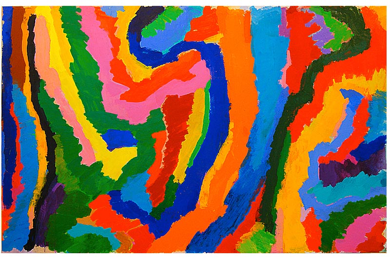
Credu, 2014, acrylic on canvas, 271cm x 171cm. [No.1]
20th July 2014, Bermondsey, London.
Those present: John Bunker, Anthony Smart, Anne Smart, Emyr Williams, Robin Greenwood, Sarah Greenwood, Alexandra Harley, Patrick Jones, Sam Cornish, Mark Skilton, Hilde Skilton, Nick Moore, John Pollard.
[Ed’s note: this is a much fuller version of the transcript than originally published.]
Emyr Williams: All the works are from this spring onwards and they’re bigger…
Mark Skilton: Did you do them serially or together?
Emyr Williams: That’s an interesting question – these ones (1, 2, 3 and 7) were started before the others, but I didn’t finish one before starting another. I came back to them, so chronologically I would go with a start point. I came back to them even after I’d done stuff to those others.
Patrick Jones: Are they painted flat on the floor?
Emyr Williams: A bit of both actually. The main painting was done on the floor, but I found with a number of them, the earlier ones a lot of reworking was done when they were up, which obviously means that it was heavier paint and I’d put it back down if I wanted something thinner, so I’d try and work between, I guess.
John Bunker: Did the thinner paint on the floor when it was on the wall suggest where thicker paint would go, suggesting a structure?
Emyr Williams: No, in an ideal world you’d like it not to run, so you can control it whether it was up or down, it was more to do with the practicalities of putting the paint on, but then sometimes you’d want to glaze it or put a thin layer on and of course I had to do that on the floor. Sometimes it was more impastoed, it didn’t sort of matter. I didn’t have a one size fits all. I didn’t mind if it was up or down, but it had to be down to go thin.
Patrick Jones: And were they stretched at the midpoint in the painting process – were they stretched physically onto a stretcher?
Emyr Williams: Right at the end, when it was done.
Patrick Jones: So, you haven’t painted on them on the stretcher?
Emyr Williams: No.
Nick Moore: Thinking about the theme of edges, I’m interested in that your painting goes around the edge and a lot of people don’t do that, they stop at the edge and I wondered was that just because they were stretched later on?
Emyr Williams: I suppose also I’ve not put a frame on it – it’s just in the raw state. I like to think I am careful with the edge, that’s just how they are at the moment.
Nick Moore: So they might be covered up with a frame?
Emyr Williams: If I think it was okay I’d leave it – I don’t have a rule.
Mark Skilton: One thing I am seeing, and not being a painter I might be missing something, but in all of them, you seem to be making a deliberate decision about maintaining a purity of colour and there is very little overlapping; and in places there are other colours blocked off. What was the thinking about that why some of the colours are isolated?
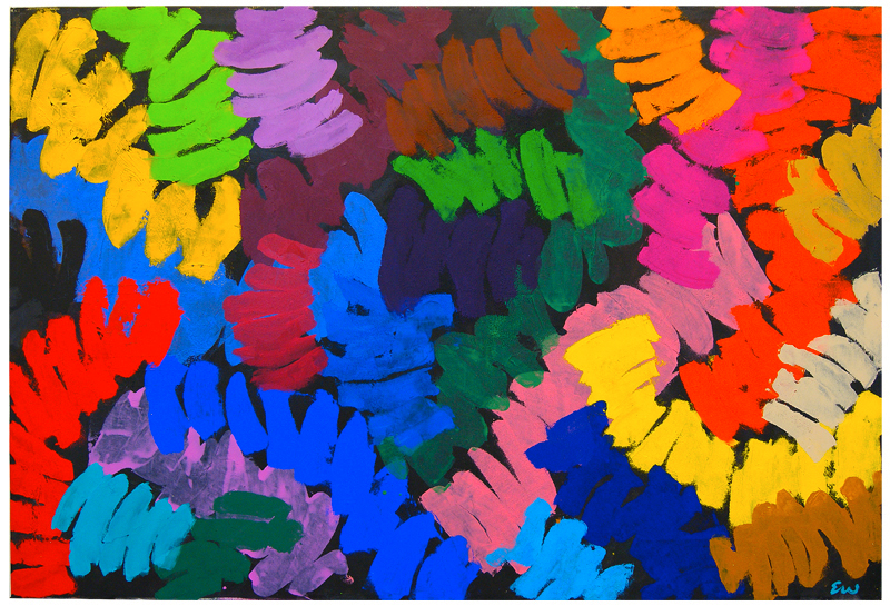
Anne Smart: Are you thinking about this one? – number 3 – let’s concentrate on this one.
Ebb and Flow, 2014, acrylic on canvas, 198cm x 170cm. [No.3]
Mark Skilton: Why doesn’t that red cross over onto that blue? What’s important about keeping that colour in control all the way through? but not just in control but keeping it pure all the way through, and there’s no contamination by neighbouring colours?
Emyr Williams: Well that’s something I suppose I am starting to bear down on more – sometimes I’ll leave it and other times I won’t. It’s just how I want to paint, it’s what I want to do with the colour.
John Bunker: I think that’s really interesting as that is what draws me in to the paintings – are these definitive moments, these focused moments when one colour does go into the another, or go over one, and at other periods we do have this sense of them being laid on a surface with a gap between them we can see; and I think that’s interesting to draw that out more. I’ve just seen very thick deep paintings with a dark backgrounds and I think it’s very interesting to see a painting that does show the canvas through it. I’m really intrigued by that. Is that for you important? You just said you were focusing on that.
Emyr Williams: I overwork a lot. I tend to paint the painting a lot of times and when I’m repainting I have certain choices, where I can either take it back to white; or what I also sometimes do is, I’ll put a passage of colour on and I’ll think how would that look if it had another colour coming through it? So sometimes I’ll deliberately leave it a white or sometimes I’ll put (points to painting) a soft lilac or pink a cream, a green… underneath another colour and then paint back on top of that. So when I’m reworking and then deciding how to rework, I’ll put an element in then I may want to change that element.
Alexandra Harley: But that passage of colour, isn’t just pure. It may be a pure colour all the way through but the juxtaposition of the other colours around it are changing that colour immensely.
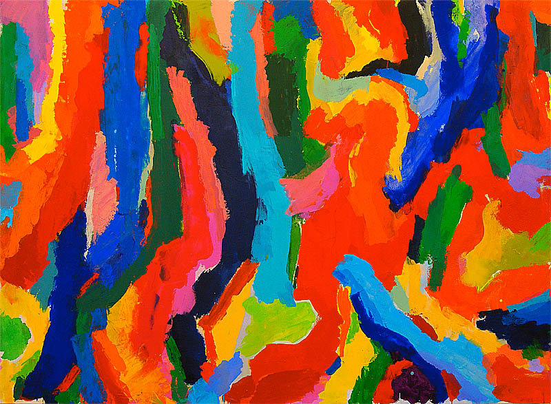
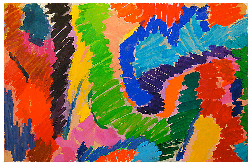
After Before, 2014, acrylic on canvas, 267cm x 171cm. [No.2]
Emyr Williams: I’m pleased you said that because I’m just starting to tune into that. That red for example in this one (number 3) can move through and function in different ways.
Alexandra Harley: That was exactly what I wanted to pick up on – what I had seen.
Mark Skilton: If we look at this one (number 2) you’ve got more instances where colour tends to bleed into each other, like these reds, orange, yellows – that tends to form a unit in itself, which seems to be then separate from the blue, I suppose separated tonally more than anything else and yet at the same time the strength of the colour is still apparent. In fact I find the colour much stronger in this, the differences in the colours and that turquoise in the middle, it isolates itself not spatially but just through the power of its colour. I think there’s a lot of evidence in that where things have been painted over each other or into each other, the differences in the colour still vibrate out, whereas on this one (number 3) the separation between the colours tends to pin it down a bit – sort of pins it back to the canvas.
Robin Greenwood: You think it’s the white coming through? There’s hardly any white in number 2.
Mark Skilton: I think it is the white coming through, but if there was another colour underneath it or a sense of background in this one (number 3) I think you would still have the same kind of feeling. I guess there’s just a depth in number 2 which the others don’t quite have.
Robin Greenwood: And there’s, a modulation in the colour, almost a modeling in the colour. That’s completely absent from number 3.
Anne Smart: I don’t think so.
Robin Greenwood: You don’t?
Anne Smart: I think that this (3) is much stronger because of the edges and I think the control of this one is much more difficult to get straightaway, but when you get it the whole vibrancy of this painting is much stronger. What you (Emyr) say, ‘I tend to overwork’, I think this is more worked than that if you look at it in that sort of a way. I think the light coming through from these colours stops you looking at the colour as red or green and makes you feel colour as a whole thing, and I love that sort of joyousness, and whilst I understand that one (2) I think that’s more heavy duty and more difficult to get and just a little bit more old somehow… I don’t know what Patrick thinks because you know more about colour than I do.
Patrick Jones: I just think number 3 is one of my favorites of the work here, the one Mark started to talk about because of its loose-limbed approach and the drawing doesn’t seem to pin the picture down too much. The whole image floats a bit and all the gaps are really important and it’s lively and sort of upbeat. That’s not an easy thing to achieve in a painting and you’ve done it really, really well. It’s one of my favorites and the other is number 7, which is quite a different painting because of the black in it. These two are my favorites.
Sam Cornish: The most obvious difference between the ones you said you started first and then returned to compared to the ones which were the interruptions, is the way the paint is applied in the first group (7, 1, 2 and 3) follows the flow of the shape whereas in 4, 5 and 6 it’s a sort of scribbled line which… I don’t know quite what it does to me, it feels very disruptive of the total image, whereas the way the paint follows the shape knits it together much more convincingly. It’s almost, maybe, the thing when I first saw them, it’s almost a statement as in 4, 5 and 6 ‘I just want the colour as colour’, to do what it does and not to have the added support of the handling.
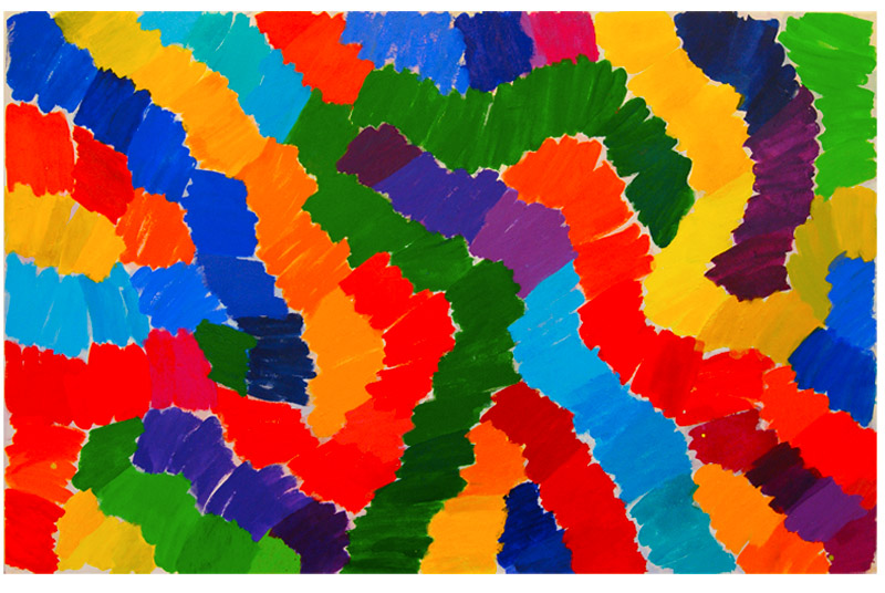
Colour Ways, 2014, acrylic on canvas, 265cm x 169cm. [No.6]
Anne Smart: I think it would be interesting to go and look at those two because of the relation between them and say a bit about the difference that you are talking about. We are looking at this one with the white behind (6) and it’s painted in a similar way to number 5 and yet they are vying with each other and doing different things. I know they are going to be about colour but If I try to forget that what comes out really strongly is how they make me feel and I’m minded to think of a painting that relates to both of them, Monet’s 1860 “Women in the Garden” and what that does for me and what I have always felt strongly about is the light; and both these paintings articulate what light does. So in this one I’m up a tree sort of looking down and in this one I’m on the floor and looking at the canopy and I feel a strong presence of that light and what that sensation can give you spatially.
Alexandra Harley: When I first saw these I could see overall what was going on and then I was looking at a couple of them and I couldn’t quite work out what was going on with the light. It felt as though you had modulated much more than you saw at first glance. I couldn’t see how things were changing and there’s a lot more texture on these than first meets the eye – more light coming through. From a distance you just see that as a passage of green, but the way that green is articulated all the way through there – passages of quite stippled texture, brushwork, something different that opens up. The way that the light physically hits the canvas. You’ve worked with that incredibly well. Because that first glance it says one thing and a second reading says ‘Oh my goodness what’s that?’
Anne Smart: I can’t make a call on which is more successful.
Sam Cornish: The way the snakes of colour are broken in these to smaller units, in some places they remain as snakes and in others the colours form shapes made up of more than one colour, like a chess board in places, and I find that a bit disconcerting. One area is like molecules in a pattern, buzzing, and in other areas it’s much more like a line moving in a serpentine way across the canvas.
Emyr Williams: About the differences in them. It was a gradual thing – where I wanted to take the colour from A to B – and just move it around rather than just do a brushstroke and I found myself just following a path of where I wanted to take it in a drawing, linear way, in the earlier ones; whereas in the later ones I sort of instinctively wondered about them doing it going another way really – I mean it wasn’t as clumsily obvious as that, it just sort of gradually seemed to build up the same thing but going in another direction, and that intrigued me.
Robin Greenwood: Where does that one fit in? (4)
Stop the Traffic, 2014, acrylic on canvas, 246cm x 170cm. [No.4]
Emyr Williams: That was a goofy one really. It just sort of parachuted in.
Robin Greenwood: There’s something incredibly goofy – there’s something that grabs you about that – It seems to be more in the room, ‘in my face’, than these which drop back… perhaps what Anne said about the light coming through in the others. These seem to open backwards and this one seems to be very ‘in my face’.
Sam Cornish: It’s also the first signature seen in the Brancaster Chronicles. It’s my favorite here. This one has the more consistent sense of handling and sense of how the different bits go together in that this basic unit, they all overlap and hit each other in different points. It tilts in different directions yet they are all fairly similar in feel or in how they are. In 5 and 6 there is a dislocation in the basic units.
Anne Smart: Would you say it’s just the black Hilde?
Hilde Skilton: No, it’s not the black. I just think the colours are just spot on in this one – they are far more specific. Although the marks look the same in the way they go through – Look at how that green feels different. This one for me is one that just goes ‘Wow, boom, look at me’.
Robin Greenwood: The elements in the painting are demanding so much more than one stripe next to another. I feel I’ve seen that sort of thing before – you know, beautifully coloured stripes, but here I’ve never seen anything quite like this before – I’m not sure I like it, but bloody hell it’s…
Hilde Skilton: Emyr, were you very conscious of very deliberate placing, because your colours are the same but your marks are not just like squiggles, they are really, really placed? For me, the black is working very well.
Sarah Greenwood: In 6, the white gaps tie it across the surface, which holds the whole thing together, rather than the shapes; whereas in this there’s an interplay with the black, and this black, which is becoming like the other marks.
Nick Moore: It’s more integrated. For me, the black is what makes this strong. What happens with black is the colours zing out more. Also the mark making is much stronger and more confident. That’s why it’s so great. It is really whacky and just hits you.
Robin Greenwood: It’s also slightly baffling to me – the mark-making. I can’t quite work out how the bloody hell he did it.
Emyr Williams: I could tell you but I’d have to kill you. [laughter]
Hilde Skilton: That black that you’ve painted on the left side here, one touch of solid blue – you know it’s crucial in bringing all the black up.
Patrick Jones: In number 4 right in the centre at the top where the Indian red and the brown is, that area to me could have been the black ground and then the whole picture wouldn’t have seemed like it was filled in and that’s my problem with these 3 paintings in the way they relate to Frank Stella, in that you are presenting us with stuff to look at and it’s up to us to decide whether we like it or not. Whereas those that Mark started talking about seem to me to be a different world, really.
Nick Moore: These seem not like Stella, but more like Karel Appel who used blocks of colour and black and colours ‘in your face’.
Patrick Jones: I think the suggestion of depth is very limited.
Robin Greenwood: Depth yeah, but not space. Between the marks is very spatial. The whole painting is in the room, in your space, in your face. Between that and that is a huge space.
Sarah Greenwood: In spite of that yellow going across there; and that blue, which you don’t see straight away, seems further forward.
Hilde Skilton: Your colours are much more specific here, and I’m really feeling that in this one; and what I want to ask you is: did you have a perception of how they would behave on the black?
Emyr Williams: No, it was a painting that wasn’t going anywhere and I just covered it with black. When I did that I decided to kick up some of the areas with a very heavy texture and I skidded some of the other areas so it was flat, because I had half an eye of how I wanted to put colour on top of different surfaces, because I do that a lot, how one colour would change depending on the quality of the surface it was sitting on, and that sort of forced my hand in how I would put the colour on, in a way, because with the heavier textured areas, you simply had to put it on in a heavier, harder, more aggressive way, just to get it coat the surface.
Alexandra Harley: Yeah, but you didn’t put it on in blocks. You kept that space and you’ve allowed the black to come through, with that you’ve created more of a dialogue across a wider area with different colours.
Emyr Williams: Yes, the first colours that went down were glazes, and then bit more impastoed at other times and some thinner ones at the end.
John Bunker: What I like about it is there’s a huge amount of variation in the application in the painted surface so you’ve got very strong where it seems to lay on top and you’ve got this green even though its opaque only just arriving – a nice combination of both texture and colour working together.
Anthony Smart: Do you also think the shaping of how these things are being delivered has an equal role to play. This green here. These are all of a family and those are very different to those but they’re all alive interacting – constantly expanding. There’s something in the drawing distribution which expands the painting. But there’s something in the way things kiss on to each other. What I like in this is the sheer audacity in taking on such a bloody big surface and nowhere does he actually fall down. It’s completely sorted
Patrick Jones: It’s a very accomplished painting.
Anthony Smart: And you lot you know are going colour, shape, you know, you’re coming on heavy.
Anne Smart: Why does it work so well?
Anthony Smart: I think because he’s carried it off – the thing has a confidence. It ‘thrusts’, as Robin says. It comes right in at you. It’s so confident and cocksure of itself and doesn’t seem to be going to fall down.
John Bunker: There is a huge amount of subtlety.
Anthony Smart: But never is it fussy. Never is he caught dwelling on…
Sam Cornish: The tone is quite strange – it might be the way colour sticks to black – the yellow and green in the top left and the yellow, and orange – it seems the right hand side and the top left hand side are much brighter and all the shapes in the middle are much darker and I find this a slightly jarring contrast whereas in the earlier ones the tones seem more evenly distributed.
John Bunker: A general consistency can be bland.
Sam Cornish: It feels like this bit – the right hand column and top left hand corner are fighting for my attention. The middle, which is the whole of the painting, loses me a bit. Does that make sense, because you are much better at talking about other people’s paintings than I am?
Emyr Williams: I suppose they are just different noises.
Robin Greenwood: That’s a good word, noises.
Hilde Skilton: What I’m seeing now in number 4 – take this blue sweep – those are all the same blues, right, just the one sweep, but because of the way those marks are made it’s sort of still going backwards and forwards, moving in and out, whereas in that one you’ve tried to make it go in and out by having a sort of a greeny-yellow and an orangey yellow. I think that’s what you were trying to do there. Were you were modeling there?
Emyr Williams: With all of them I don’t quite know what’s going on, you know – I am doing them, then you notice things and you go with that for a while, then you go with that for a while.
Anne Smart: I think that this one (4) there’s a consistent attitude, so you’ve decided to keep up the momentum by doing it in the same way, and its more obvious there, but I think that this one also does that because of the shape whilst they are also marks but there’s continuity, rounded shape, and you forget that then and it makes you focus on all the things it has; the colour, the surface, and the texture, and the movement, but that is like a repeated shape, but you forget that, and it makes you concentrate on the colour and its relationship to other things.
Emyr Williams: That was a more crash, bang, wallop sort of painting.
Nick Moore: That’s exactly what I was about to ask you – Did it come about very fast? It’s not laboured. It’s almost like you’ve thought: ‘fuck it, I’m just going to have some fun with this ‘cos I’ve blacked it out and there it is’. It’s like you’ve let go, and then ‘bang’, this amazing creature appears.
Sarah Greenwood: But it doesn’t ‘just happen’…
Emyr Williams: No, it took quite a while. Technically you have to wait for the paint to dry before painting over it. So it was done in a lot of sessions. But this one (6) was overpainted a lot – 8 or 9 times completely from start – each time I’d paint it out and each time I’d leave a ghost.
John Bunker: That’s what I meant right at the beginning, I think, about those lines of suggestion.
Emyr Williams: So this was a brown, this was a purple – that was a mustard, a green I think. It changed a lot.
Patrick Jones: Would you go over the whole painting between each application?
Emyr Williams: I’d put the colour in first, paint the painting, look at it for a while. If there were some things I’d like I’d leave those little patches and then paint over it again but at times it would be a whole heave-ho and the whole thing went and I’d start again.
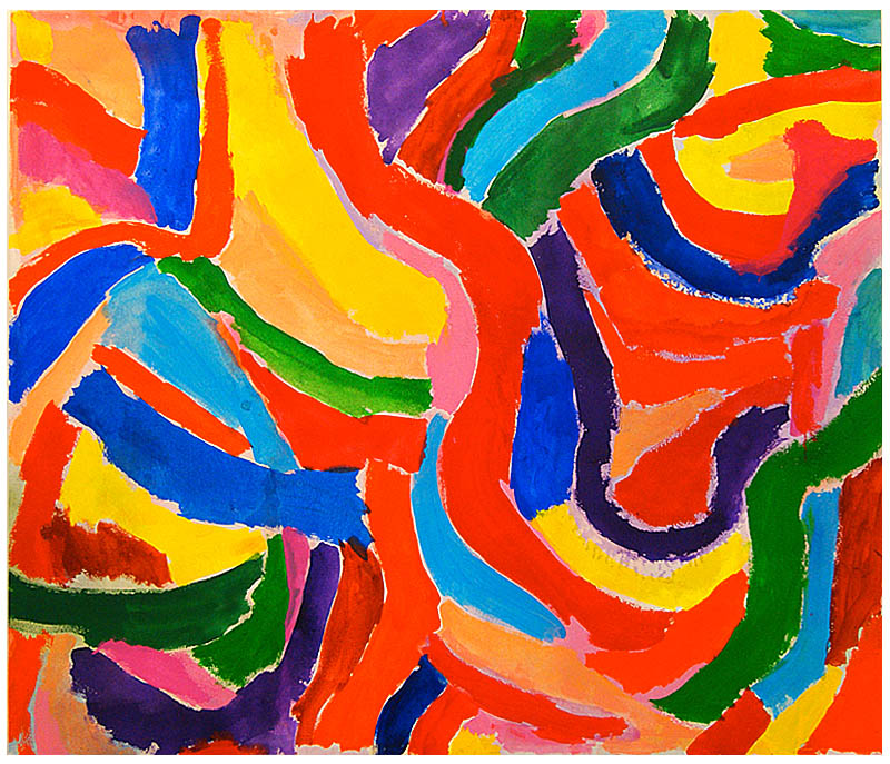
Patrick Jones: Can I just ask you about the long lines in number 5? ‘Cos these lines which are obviously not sort of part of the pattern of others, they form some other function.
Emyr Williams: I had a lot more of them.
Robin Greenwood: Last year you had a few in your paintings.
Emyr Williams: Yeah, I was sweating out the last lot, I think. If you did a stop frame animation of 100 paintings they’d be quite logically one after the other. In all of them I’ve enjoyed using the brush – that was incredibly important to me – to be able to want to use the brush and not to be scared of the consequences of that.
Alexandra Harley: Can I just ask you a question about the brush? Are you using the same brush every time. What you’ve set up are some wonderful rhythms – in number 6… I was just intrigued…
Emyr Williams: I have a whole range of brushes – some are very hard Italian housepainter brushes and Chinese watercolour brushes of different sizes. If it’s a very thin soft thing I’ll go for that softer brush, if I want a heavy kick-up-the-arse mark, I’ll use the house painters brush. I just move around the brushes, dependent on what I want to do with them. The thing that intrigued me about the way of working in this painting is, you’d have that doing that, then I noticed, you have these different greens, olive greens. I was intrigued that they would be these snaky pathways but then you could jump across them and go in other ways and find other colour sequences. I enjoyed tuning the colour accordingly to that.
Alexandra Harley: I hear that but I am talking about the physical size of the marks themselves. I think that adding to that matters.
Emyr Williams: That’s interesting. It has been very liberating to work on this size of painting. I enjoyed going to the studio to work on bigger paintings and one of the things I was concerned about was I should be able to execute a large painting without having to making a gigantic mark which I felt was a theatrical way to paint. I admire some of the great 19th Century art and it’s often painted with a tiny brush and the whole thing was breathtaking. It should be more intimate. There’s an intimacy to using the brush which I’ve enjoyed as well and there’s something very immediate and satisfying about liquid paint and moving it. I’ve spent a good few years looking at area and shape and edge and it just wasn’t enough.
Tip Top, 2014, acrylic on canvas, 266cm x 171cm. [No.5]
Patrick Jones: When we looked at Fred’s painting I got a very strong emotional response to his work, the way he’s jamming colour together and pushing them in to the space we were so fond of discussing, gives them an emotional quality. Do you feel there are any pictures that you have that connection to, or do you feel more (and this relates to me to what Stella is doing) that you’re actually displaying stuff for us to enjoy? And I’m not worried about the Stella part more the emotional part. In this (4) this red is quite thinly painted. If that had been Fred he’d have just whacked that on very opaquely and it would have caused all these elements to tumble, because they would have been in space, but because you’ve flattened the whole surface, which is a skillful thing to do – it stops that so it’s a completely different feeling.
Emyr Williams: Well, painting is very sensuous – paint and colour. I have a strong emotional feeling about colour and painting. My concerns are always how delicate you can be or how heavy you can be and just the full range of surface and colour you can operate with, so it has very strong personal emotional content to me; but I’m not trying to illustrate that. I’m trying to be completely dispassionate about it. Who knows where colour comes from? I want to see that particular pink on that particular black and so on, but I couldn’t tell you why.
Patrick Jones: But in terms of the paintings you are exhibiting here – you know, 7 really big paintings, do you feel there are some paintings that you hit something in them emotionally, I’m thinking about the ones that Mark started talking about and the big one next to it – the language of the big one which Mark liked has more chance of getting to what colour painting can bring than that one which is to me, more like Frank Stella with a ‘display’ quality. I don’t know how to say it…
Robin Greenwood: And what about this one? Number 4.
Patrick Jones: Yeah, I mean I think it’s a terrific painting. Emyr is a very, very clever painter but I’m slightly confused about which direction he’s moving in ‘cos I think the paintings offer a completely different experience.
Robin Greenwood: The breadth, the ground that Emyr has covered with these 7 paintings is huge, I think. There are 7 ‘painters’ in the room.
Anthony Smart: Is that a bad thing? Is that a cause of concern?
Robin Greenwood: Not for me, no.
Anthony Smart: Exactly and what is this emotional thing?
Patrick Jones: I think it’s inevitable, you know, they are colour paintings, and if you look at Hofmann’s work, or if you look at Pollock’s work, you know the relationship with the colour and tone are there for a purpose – to give you an ‘oomph’, which I don’t wish to go into ‘cos it’s too…
Anthony Smart: I thought that’s one of the things art did, you know, make the hairs on the back of your neck stand up, get you excited, or be very emotional. I don’t understand – that’s the third time you’ve wanted to make a separation with emotion – what’s all that about?
Sam Cornish: It sounds to me that Patrick is avoiding a value judgment that he wants to make, which is like an on-off switch. You are saying that some of them (4, 6) are skillful and impressive paintings but others (1, 2, 3) are going beyond being skillful, and they do something else.
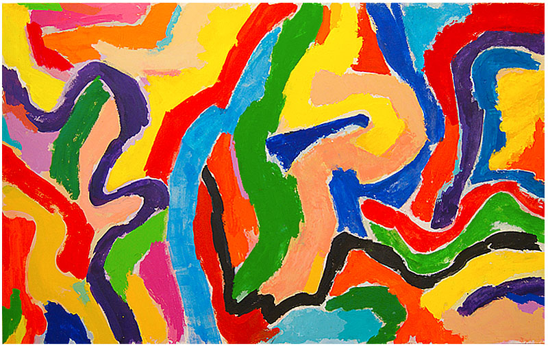
Elysium, 2014, acrylic on canvas, 270cm x 170cm. [No.7]
Patrick Jones: Take number 7. To me that’s a masterful painting. It could have been painted by Matisse. It’s got a terrific array of colours, the way that black line whizzes through it. You know, there’s not many people I know in the world who could paint a picture like that. The others I believe I have seen something like before, but I’ve not seen that before, particularly in the top areas, the much softer colours, the yellows, creams, pinks and greens. I’m only shooting in the dark really. How do you feel about that painting – number 7?
Emyr Williams: I like it…
Patrick Jones: Do you feel differently about it than any of the others?
Emyr Williams: Possibly. I think I get more value for the pinks and the yellows, the lighter colours. I found that using the lighter colour (I noticed I stopped using them a bit) opened out space more, just as I felt it not in as literal a space. It could breathe more using the lighter colour throughout.
Patrick Jones: My eye can take in all that whole area and go through there into that corner without it being one of those zigzag shapes – I can accept that as a space. I think that’s a breakthrough, actually, that you have those larger areas that can act as a space. My two favorites are 3 and 7 – they are loose-limbed. I think this is cracking painting.
Emyr Williams: It was very frustrating to make because of how many times I moved things around. Again, it was repainted many times. I try to find a way of painting that allows me to tune the colour and gives me room to do that.
Anne Smart: Well, in giving yourself room you have created a much stronger sense of movement across the surface. The painting feels as though it could go on and on. The rhythm of the line and the blocks is never ending, whereas in number 6 it stays within itself.
Sam Cornish: I think I’m sort of in agreement with Patrick – these paintings (4, 5 and 6) feel kind of subjectless – like an exercise in colour and they don’t come together to give me anything more than that.
Alexandra Harley: I think that’s harsh.
Mark Skilton: Isn’t that the point – if you listen to the way Emyr is describing the paintings – they’re painted and painted out and painted and painted out and what he’s ended up with is something that looks absolutely immediate, without the kind of labouring and depth that we saw in Fred’s work. Here it is, straightaway.
John Bunker: I’d like to get at what the subject is though.
Patrick Jones: It could be because he had to struggle with the picture that he trapped some emotion, some feeling in there.
Sam Cornish: I disagree with your reasoning but I agree with your outcome.
John Bunker: Robin was saying about knowing a language in which he had seen something like that before and then again in which he hadn’t seen before. And I’m intrigued that this painting is just giving you an historical something to sit on, saying this is what I know. Does that ring true, so the subject sits in the historical knowledge?
Sam Cornish: I don’t think historical knowledge, perhaps visual.
Anne Smart: I would say something to Sam. You hear painters talking about how they are looking for something that was done as a sort of one hit wonder. If we could go back to the American Abstract Expressionists… I think it’s easy to misinterpret that as literally happening in terms of the time it takes to make that doesn’t equate to what it looks like. In what you describe in these as a sort of colour experiment, it might be a quite new way of trying to discover how else you could make something that looks immediate, but isn’t painted in one go; and often for me things that have been laboured over ( maybe I know that by default) can become the most immediate things. So I think there is little correlation between how these look as though they’ve been painted very quickly but actually maybe they haven’t.
Alexandra Harley: There is a sense of 6 and 5 being more immediate because the blocks of colour are more consistent and when you get back to number 7 – which I happen to love by the way, I’m quite happy with that, you see a lot more of the underworking, you see a lot more of the history behind the construction of the painting.
Emyr Williams: These ones are trying to get at the diagonal. I felt that the early ones were still stuck in a vertical-horizontal weighting. I was trying to feel the diagonal – I mean, it’s not something you can just go and do. You’re always fighting against yourself, and diagonals are awkward things to deal with.
Alexandra Harley: Getting back to what I was trying to say about the blocks of colour being a similar size… This one (7) allows you to be much smaller – there’s a lot more difference in the way that that has been built.
John Bunker: I would say that that is what I am getting out of these paintings – again it’s a different kind of complexity and it’s a different colour combination. It feels somehow – coming back to Patrick’s comment… I do think there is some kind of resonance, but I do get drawn into sections of the painting. And I see these amazing combinations in small areas and I lose that slightly when I move away, but not much though, and then I see drawing it in together – I think they’re stunning. I think this particular painting is stunning and I think in a way it’s a credit to you that you can traverse a large area of ways of working, and I think that’s why it’s such an interesting, slightly confusing environment.
Patrick Jones: I think to get up at five in the morning you know to make ten or more huge paintings… I mean, he could have made one small 6 inch one, but he didn’t, so obviously he’s trying to get somewhere with it. I think what Mark said – I’d like Mark to look at number 2 again. There’s something I’m drawn to even though I don’t think it’s a successful painting. I still like the jamming of the colours together.
Mark Skilton: I agree there’s a relationship. There is a sensitivity between the colours (here) and the brashness in these other ones that we’ve been looking at. It’s still there even though the colours aren’t particularly isolated or particularly worked on individually even though they sort of bleed into each other. There’s something about the relationship between the different colours that makes them vibrate in an unconventional way, I think. I was beginning to think this was a conventional way of painting, but I don’t think it is, because I think the colours are very different, but I don’t know why.
Patrick Jones: Even down to the green circle in it – that’s the only painting with a circle in it. This is much closer to where I’m working from and having lots of difficulty in how the colours are leaping about. I think it’s a very problematic painting, but I think it’s a very exciting one.
Robin Greenwood: Yeah, I agree with that. I think it’s a very exciting painting, much more unconventional than number 3. I think that’s taking you backwards and forwards, in and out articulating much more than this (2).
Anne Smart: That’s good – paint does many things. Sensual means many things. You don’t have to paint a big nipple in pink to make a sensual painting. You can use pink flat, you can make sensuality and physicality without the conventional colours you would think would do that.
John Pollard: I think the right hand side of that is amazing. Right on from the turquoise vertical. What’s going on there? Part of it looks conventional, but it’s not, and where the colours and shapes are sitting is not straightforward, but neither is it unsettling. The ‘coming down’ bits I’m not sure of.
Anne Smart: It’s very complex.
Robin Greenwood: (pointing to right side) This stuff is terrific.
Hilde Skilton: But also the contrast with the left hand side – you call it hanging down I just think the movement is different. Those are working into the painting diagonally and then that side is more vertical, so it’s just giving you a different spatial thing happening.
Robin Greenwood: The space in that bit and up through there reminds me a bit of the really jarring space in number 4. The sheer depth of the thing. Things pulling way out and going back in.
John Pollard: Going back to emotional… Will you get a bang emotionally? Will you get it straight away? I tend not to but looking at number 4 and trying to work out why it works and questioning whether it really does work and deciding that it does and not being able to pin it down. The emotion I get is a bit of awe, and that for me is a powerful emotion.
Robin Greenwood: So the work has to have an emotional involvement…
John Pollard: It’s a difficult one, because something appeals because you are going to look at it a bit longer, so something obviously grabs you early on. I think the emotion comes with almost the questioning for me, and obviously it’s different for everybody, but the questioning and trying to doubt, trying to find fault with it and not really being able to…
Patrick Jones: Which is what an abstract picture does that no other picture can do. It demands so much of the observer than any other sort of picture.
Robin Greenwood: No!
John Pollard: A complex painting would. I‘m not sure whether all abstracts would.
Emyr Williams: I’ve been looking at mostly figurative art for the last couple of years.
Robin Greenwood: What are you going to do next Emyr?

When I saw these paintings, briefly the day before the critique, I was immediately struck by ‘Stop the Traffic’ (no.4) . It has a very powerful confident presence, with an unusual texture, which I do feel is intensified by having a black background. I remember I was a little unsettled by some of the paintings that had the light canvas or white ground flashing in between the coloured areas (which was a distraction and something not so visible on screen ) but when I viewed them from a distance the effect was far more coherent. Great paintings with a lot of visual sound !
LikeLike
Great to see Emyrs paintings again.To me the discussion swung between the value of exhibiting beautifull colour like Stella in the protractor series and Fred Pollocks jam them together approach.The second involves overlapping and spatial accidents ,which Fred relishes,yet Stella avoids on purpose with the pin stripe..Emyr showed us an array of work which both Mark Skilton and I seemed to agree about,jamming them together,causing relationships, is better,if more risky.Thats my memory of the occasion ,yet Stella is not mentioned in this edited version.This seemed to me to exhibit the difference between a more cerebral approach and a lived emotional intensity.
LikeLike
Have never seen any of Emyr’s work “live”—maybe it’s crazy for me to comment—maybe I am crazy. . .
It’s been lots of fun to “discover” Emyr’s work though—and Fred Pollack’s, and Alan Gouk’s—even part-time painter Robin Greenwood’s—and the work of many others who don’t show in NYC—through Abstract Critical/the internet. I’ve been tied to the NY Studio School forever. The school has important ties to Hans Hofmann: many of the first Studio School teachers were students of his, etc. But the Studio School’s relationship with Hofmann is “complicated.” New York’s is too. There seems to be a much more open embrace of Hofmann in England, part of England anyway—though I remember Andrew Forge was NOT wild about Hofmann’s work. This “open embrace” is exciting for me. I “like”/”love” Hofmann’s color. It’s color that can stand on its own two feet. It’s bold. It’s brash. It’s not quiet, tasteful, “comfy” the way Tuttle’s color is—the way Marden’s is. That said, I find my interest in Alan Gouk’s paintings growing because Alan seems in some nontrivial sense “unable” to make a Hofmann, “unable”—again in some nontrivial sense—to make a vertical painting. There are “limitations” to Alan’s work that, it seems to me, are deeply enriching. Emyr seems to be able to do anything. Of course, Emyr’s young and “foolish.” Should he smarten up and be more “serious”? (Short answer (MY short answer): no!) Interesting that Patrick says Stella was part of the original (pre-editing) Brancaster discussion. Stella’s an old guy who’s kind of made a career out of being able to do anything. Stella’s work is just about without interest for me today though. The Brancaster Chronicles are very interesting to me though. Garth Evans has been running Brancaster Chronicle-like crits at the Studio School for years. They’re terrific (in my opinion): I’ve learned a lot from them; other students have. It’s interesting to me that Bruce Gagnier, who also teaches at the Studio School and has participated in many of the BC-like crits—Bruce hates the crits. Maybe the crits can be a kind of trap—but maybe—if you’re careful not to get “trapped”—you can learn a lot from them. . .
LikeLike
Thanks Jock – its been very enjoyable to read your comments on both sites (“young” – I’ll definitely take that!). My website has only the tips of ice-bergs posted which can look disparate spread out (especially over many years) so to speak, but underneath they all eventually join up, my best analogy for my own work . I rework a lot, a few times redoing the same area but trying to get it to be fresher, other times completely changing things. I like trying to keep things fresh without relying on outmoded stain techniques which are “faux fresh” and acrylic can look really stodgy and heavy handed at times – overly plastic so to speak and it’s a never-ending battle to control it. Anyway. if you add up all the painting stages of all my work and put a stop frame animation to it , include all the lower parts of the icebergs and then run the tape, it would be pretty smooth in transition I think. I don’t look at Stella’s work ever really or Hofmann for that matter – Morris Louis was my hero when I was a student and that hasn’t changed too much. His work led me to Matisse. I love the way Matisse redoes things from scratch – repeating the same painting often to “get it right”, tweaks here and there or tuning the colour – this has always spoken to me, plus he and Louis worked like stink to make things look easy – I love that and the way that their work has such a wonderful luminosity, not a fan of the veils though. The Unfurleds are great but it’s the late Stripes for me . I draw a lot by the way – figuratively quite often too, but never ever ‘abstract’ from things. Its always about colour for me and the way the surface can reveal the colour is important to me. I clearly need to work more on these things which is what I will do next.… best to you over there across the pond.
LikeLike
Thank you, Emyr, for your note/reply—and especially for opening your work/yourself up to the Brancaster Chronicle “process.”
A few quick notes: I’m not surprised to hear you’ve never paid much attention to Stella. I didn’t really see Stella in your work. I see a kind of disconnect in Stella’s work though—a disconnect between the work and any kind of “serious” content—that I kind of “blame” on a kind of zest/intelligence/ambition. It’s this zest/intelligence/ambition (though even Stella’s z/i/a is different from yours) that I see in the “disparate” “tips of icebergs” of your work that I have been able to look at on my computer. I miss a more “settled” sense of content.
You say, “It’s all about color for me.” Another guy who says that is Stanley Whitney. Maybe you know his work. He’s pretty “big” in New York. I think he shows in Europe. I think Stanley’s a terrific painter—and I don’t think his color is unrelated to yours. Maybe Stanley’s 65. I don’t know him, but I think he spent many years banging away alone in his studio—then, sometime in the ‘90s maybe, he went to Egypt and had a kind of revelation about “structuring” his paintings: everything fell into place. I’m fantasizing now about an iceberg plowing into the Pyramids. I don’t know what Stanley thinks of Morris Louis—(I think Louis is terrific—and I do see a real connection between his work and yours)—but I think Stanley spent a long time struggling to get past a lot of post-Louis/”color-field”/outmoded stain technique work—and I think he succeeded.
I did see some nice (maybe too “nice”—but very fresh/luminous) charcoal drawings at your website or somewhere on the internet—“copies” of Titian paintings, as I remember. I think there was a time when “everybody” connected de Kooning to Tintoretto: draw a Tintoretto—all the while forgetting about the figures, the architecture, all the recognizable/nameable things in the Tintoretto—and you’ll end up with a de Kooning, “they” used to say—(and I think “they” weren’t so dumb).
You “never ever “abstract” from things.” Deborah Rosenthal is sympathetic to this anti-reductive sense of abstraction: http://deborahrosenthalstudio.com/dmr_nc_feb92.html.
I’m throwing out a lot of names. Maybe it’s helpful. Maybe it’s more “helpful” not to be helpful—to be “irritating” or something like that. Maybe it’s good that I’m “across the pond”—that essentially I don’t know what I’m talking about. The Brancaster Chronicle “process” is tricky. I think it’s “working” (I think I’m getting so much out of it) because it’s NOT a bunch of people agreeing with each other, congratulating each other—all speaking the same “language”. But I do wish you the best, and look forward to your next appearance here. . .
LikeLike
Alan Gouk has a show on at the moment (until 6th Dec.) in Hampstead (here’s the link: http://www.hampstead-school-of-art.org/autumn-event/events/alan-gouk-new-small-paintings.html ). The show comprises some very large works on paper, in gouache and acrylic. In his own catalogue intro he writes:
‘…a pure gouache technique means that the painting really needs to be executed in one continuous session without revisions. I have found this to be a very exciting challenge…
‘I no longer even stop to think what I am doing, but work rapidly from impulse to impulse. I respond to sensations which the first moves arouse…
‘…the range and variety of these new works would indicate… that there are no formulae, no pre-conceptions, and no burden of heavy intent limiting the libidinous flow of feeling, the “perturbation of spirit” which free improvisation arouses.
‘As to the content of these new works, I must leave that open to the imaginative responses of sensitive viewers, but not just any response will do. There is, or there should be, a fitting degree of objectivity…’
Emyr has described the Gouk’s on Twitter as ‘gutsy’. They are; as well as confident, massively competent, and very difficult – I don’t think that’s too subjective! Three days after seeing them, and I’m still wondering. And these words from Gouk throw up so much stuff into the air; maybe I’m waiting for that to settle before I know what I think. Gouk’s words are always worth considering, and his work is always worth a long look.
We all, don’t we, as abstract artists, work from impulse to impulse? We all hope to leave at the studio door our own pre-conceptions and formulae, don’t we?
Or do we? Should we? Is this a modern(ist) conceit? Why do I feel something is missing in Alan’s method? Don’t we, as artists, have to address the content? Can we really ‘leave that open to the imaginative responses of sensitive viewers’?
And are things really so different for abstract artists anyway? I just cannot imagine any of the artists who I admire from the past acting fundamentally differently. Even that most intellectually rigorous of painters, Poussin, I feel must over and again have followed his impulses and acted spontaneously. Art just doesn’t work without that, does it? The omission of such an element is one reason why conceptual art and academic art are both sunk in dullness.
But is that the whole thing? Gouk goes further here than most of us – than me or Emyr or anyone in Brancaster, perhaps – in completing a whole work in a single, spontaneous sitting, without standing back to reflect or editorialise or self-critique. I gathered from this Chronicle that Emyr may possibly paint out and repaint a whole work in one go; perhaps, but it will have been previously ‘rehearsed’, so to speak, perhaps a few times. Is this formulaic? Are these paintings by Emyr more formulaic than the Gouks? What about the ‘striped’ paintings – is that a formula, more so than the ‘freer’ works? Is ‘Ebb and Flow’ more of a pre-configured painting than ‘After Before?
The problems of ‘configuration’ are something that preoccupy me a lot. To cut a long argument short, I think you can have a ‘spontaneous’ configuration, i.e., one that is discovered ‘in the moment’; but I’m yet to be convinced by the idea that such a result can come from acting purely and simply from a singular session of spontaneous impulses. At least, I rather think that the ‘content’ of works so produced, which is to my mind dependent upon configuration far more than ‘handling’ (and it is ‘handling’ which abounds in the Gouks) will tend in fact towards formulaic configurations, rather than lead into new, non-formulaic territory.
To finish (and I apologise for all the questions!), I’ll say that at the moment the Gouks seem to me to fall back in content to something quite familiar, albeit that they are driven by such extraordinary vigour that they throw out a really exciting degree of energy and new detail. I like this detail, and I miss it in Emyr’s work, but it seems incidental to the whole. (Compare to the detail in Anne Smart’s work, which, more or less, IS the whole)
Emyr’s paintings were, in their variety and confident invention, really exciting on the day, but I can’t really say that any significant content has remained with me. Maybe that’s not the point… maybe the ‘content’ was the excitement on the day. But how I mistrust that ‘libidinous flow of feeling’, even as I seek it out.
LikeLike
Questions are good.
I’m very interested in this relationship between process (making) and finished object (judgment) and how judgment comes in to the process . The Brancaster conversations rightly, in my opinion, focus on the object, the judgment of how is it working, not working. This of course then affects the process when we get back to creating the work.
Judgment is always continuous, in some way, throughout the process, subject to the individual and will come in various degrees of reflection – time looking, thinking, questioning and back to the doing. Judgment is perhaps happening throughout the physical making but in either a very focussed way (e.g. on a narrow part of the work), or perhaps non-consciously (although that’s problematic).
During the process we are probably talking about different degrees of reflection taking place, which in turn will be related to the way we actually put the material down. More rapid working with more physicality will get you something different from a slower, more controlled (and more reflective thoughtful) process.
But what’s better? How much does it matter? If you tend to like variety and complex forms I’m not sure how much it matters whether the paint is put down in a very controlled, slow, reflective, way or a more gestural, manic method, with less (but not no) judgment. It’s the form, at the final judgement, that matters. It may be that the best of painting needs both gesture and abandonment, delicacy and control. It will definitely need a good, ambitious eye to decide that something’s finished (and good!) which is what ultimately lets so many good painters down (and is why we need good curators).
I don’t think there is a proper answer which will tell us how the process should be, only some guidelines, which in turn may be there to be broken. It’s got to work visually and I’m only bothered as a practising artist, how it happens. As a viewer I know it just has to work.
I’m sure Gouk does reflect within the one “spontaneous sitting”, just not so much as he would over a period of sessions. The rehearsal is a bit like training, but to stretch a sporting analogy, the difference is that the training is always a possible actual match (if the painting works and comes together), although for some artists ‘rehearsal’ is perhaps the right word.
I think that a “spontaneous configuration” can “come from acting purely and simply from a singular session of spontaneous impulses” but maybe it will take many ‘misses’ to get that ‘hit’ and because of the short period of working it is going to be difficult to get the complexity that seems to be needed to get past the “formulaic configuration” and make something special.
Mistrusting that “libidinous flow of feeling” is part of the questioning and doubt that gets us further; without doubt I think we’re in trouble. Although I think we shouldn’t mistrust it too much!
LikeLike
John, I used to talk to Sidney Geist, a sculptor, about not thinking while working. Sidney would tell me, you can’t stop thinking: you can stop judging though.
LikeLike
I agree with John Pollard: questions are good. I tried to answer Robin’s one by one. It was fun, but I kept coming up with more questions—and I lost that “libidinous flow of feeling.”
Let me just get tangled up in a couple of paragraphs close to the end of Robin’s comment now. I like the word “configuration”. It has the word “figure” inside it! I’m not certain about the distinction Robin makes between configuration and handling in Gouk’s work, but I think I like it (very much). I see rough “handling” of lots of paint in Leon Kossoff’s work. (Maybe it’s comparable to Gouk’s “handling”.) Maybe Kossoff’s configurations/figures are “formulaic” at least in part because of that kind of “handling”—and maybe that limits Kossoff’s exploration of content. (Maybe all figures are “formulaic” in important senses though. Does that mean they can’t be “new”?) But then I think of Bruce Gagnier’s work. Over the past 25 years he’s moved from very “rough” “handling” of clay toward “smoothness” (clearer configurations?). You MIGHT say his configurations/figures have grown less formulaic/more “new”, but maybe it’s that his engagement with the formulae associated with the figure has deepened. Maybe his exploration of content has deepened too.
Robin talks about the content in the Gouks: it falls back into something quite “familiar.” I like Robin’s use of the word “familiar”. I obviously don’t really know whether or not it’s “accurate” for the Gouks, but it’s something useful to think about in the context of any painting or sculpture. Still, I have questions about it. What’s the content of a Hofmann painting—one made after he’d stopped teaching, say? What if we say the content’s old age? Does the Hofmann painting suddenly become “familiar”/boring in content? Or is it just whatever we might say about old age that’s “familiar”/boring/tiresome—not the painting itself? But what’s better/more useful: to say that the content of a Hofmann is old age, (or that a Matisse is about joy (“and all that crap”))—or to say that the content’s familiar or not familiar? Just what’s going on when you ask that question?
Robin brings up detail and wholes. What he says seems very sharp, very important—and just beyond my grasp. I almost want to fuss with the words—but I bet readers just need to see the work he’s talking about: then everything will become clear. I’m happily taking the words into my studio though. . .
LikeLike
I have probably been a bit lax in my uses of the terms ‘content’ and ‘configuration’ here, so (thanks to Jock) I need to sharpen them up a bit. In my definitions, they do overlap, but configuration I think of as the overall physical architecture or structure (‘composition’ being too two-dimensional a term even for good painting, never mind sculpture); and content is, less narrowly, the sum total of everything that the work ‘does’ or ‘says’, plastically, spatially, physically and visually. In abstract art (if not in figurative art too), the content denotes what you get out of the whole thing, what you might see and feel at the time, and/or take away from the experience; what it ‘means’, if you like. This is necessarily vague, because real content in visual art is not easily verbalised or written about. This is why we stumble about in Brancaster, trying to get at the thing. But it’s also why Brancaster is really important in it’s constant return to the work itself.
To my mind, content is very different from ‘subject matter’, which is where a figurative artist might start out. Abstract art, of the kind that we are discussing here (i.e. stuff that is not put through a process of being ‘abstracted’ from source material) does not have or need a subject matter. Your inference, Jock, of ‘old age’ being the content of late Hofmann, is well wide of the mark. There is nothing in the Hofmanns to suggest such a content; it’s a cultural, contextual and subjective imposition on the work. I think you may be attempting to impose a subject matter on Hofmann; but he doesn’t have one (in the later works) and doesn’t need one.
OK, so when I talk about a ‘formulaic configuration’, I’m talking about simplistic formalisms or formats or things that have become clichés of abstract art – stripes, dots, rectangular arrangements, etc. So I’m suggesting here that despite Gouk’s amazing handling of the paint, which I admit prevents the work from falling too easily into such trappings, the spatial architectures of the work are not that new or special.
To return to Emyr (with apologies for going off-piste, but also for so many inverted commas); the one painting of the seven that I don’t think we spoke about at all, ‘Credu’ (No.1), is the one I would most want to look at again now, because it looks now to have the most inventive configuration. Dangerous to say so from reproduction, but those purple patches either side seem to be moving and bullying the rest of the stuff around in some quite eccentric fashion, and the whole surface appears to have ‘deep form’. I’ll have to think of a definition for that now.
LikeLike
Thanks for the definitions, Robin. Very helpful, much appreciated. I like your definitions. I especially like the overlap between configuration and content that you point to. As you say, real content is not easily verbalized or written about. I guess today I see content, in part, as a test: if there’s real—plastically real AND philosophically/poetically/spiritually meaningful/real—content in a work of art, then it’s a real work of art.
And, as you say, content can easily get mixed up with subject matter. You talk about figurative art “starting with” subject matter. I think that’s been true for lots of figurative art. But I think at least for, say, the last 50 years all artists (figurative and abstract) have been suspicious of subject matter. It hasn’t been a given. It’s been something some artists have discovered for themselves, but it hasn’t been “necessary” the way I might suggest content is. I see artists being legitimately casual/careless about subject matter. I also see them being casual/careless about content though: that’s where I see a problem. (This is territory where insisting on a distinction between abstract and figurative art can get you in trouble: it’s too easy to understand abstract art simply as art that doesn’t have subject matter—too easy to forget abstract art must have content.)
When Hofmann stood in front of a canvas, he knew what he was doing: he didn’t have to think about it: When he was done, his work was full of content. Exactly what that content was/is is, of course, hard to talk about—but it’s there. You say I’m wide of the mark to suggest old age is the content of some Hofmann paintings. OK. Can you accept Life as the content? I bet you’re not happy with that either. In a way I’m with you: I’m not really happy talking about a Hofmann that way.
But in a way I’m not with you. You say I’m making a cultural, contextual, subjective imposition on his work. I don’t really know much about contextualizing, but what little I know has to do with thinking about paintings in political or economic “contexts”—contexts where much of what I think interests both you and me about art is dismissed: contexts where art is considered nothing more than a status symbol for elites, for example. Saying a Hofmann is about Life is maybe a bit dopey, but denying that a Hofmann is about Life—about the “context” we all live in—is just Fancy Talk.
I don’t think it’s been possible for artists since Hofmann really to have his kind of confidence. We all think too much. We all have too much to think about. Am I wasting my time (and now yours) by thinking about the Brancaster Chronicles? Maybe—but, as you say, Brancaster is really important because even though you stumble around, you’re trying “to get at the thing”, trying to get at content: it’s in the work or it’s not. The work, the work. Emyr’s is marvelous. Truly marvelous—but here’s something you might not want to think about: is there not a torso (mostly rib cage) (bounded by what seem to be dark green lines) striding from left to right in “Credu” (No. 1)? I know, I know: please don’t shoot me. I will shut up.
LikeLike
I had also ‘seen’ what Jock Ireland refers to as a torso in ‘Credu’ but I’m wondering whether this is possibly a perception created by the compression of what is after all a large painting to a an image viewed on a computer screen. Torso or not it is for me a key feature in the work in that it forms an almost discrete feature. I see something similar to the left side of ‘Elysium’ in the area bounded by the purple? line or band and it has (at least for me) a very strong echo of Matisse.
LikeLike
There is some very good stuff here.After a year continuously reworking paintings ,partly due to limited time constraints after the birth of my daughter,I came to the same conclusion as Alan .Just do it all fresh every day,without critical reworking,and let the unconscious flow of feeling be everything . Part of the problem of course is that we are far too self conscious in the studio,partly from having such a rich and exciting heritage.This heritage ,for me ,is more exciting from Cezanne,thro Cubism onward ,until Pollock/Louis,then it starts to lose its momentum.Stellas career almost shows this .literally show by show .I was blown away by the colour and scale of the Protractor series at the Hayward,but nonplussed by the erratic stainless steel sculptures,shown at MOMA Oxford a couple of years later.Now Ive lost interest completely but am buoyed up by shows from Larry Poons and John Walker ,both veteran Painters of note,who seem to have found themselves in old age.England is continuously gripped by the complete irrelevance of Tracey Emin and Grayson Perry,which is an extension of its conservative bias against Abstraction.Its hard to ignore politics and finance because big money makes reputations to shore up its investments .There will be a Jeff Koons Museum shortly because the collectors need it .They didnt buy with their hearts but with their advisers.So this extreme self consciousness of History and the present makes Art for me harder to make than ever before.Robin Greenwoods involvement in English Abstract Art ,even tho we vary on individuals ,is exemplary and thro Poussin Gallery ,Abstract Critical ,now Ab Crit and the Brancaster Chronicle,at last , there is a Forum.Listening to other artist and critics talk about my efforts during my Brancaster is both humbling and extremely encouraging .
LikeLike
Just caught up with the expanded transcript and was interested to read that the paintings were stretched only when they were completed and that painted edges wrapped around the stretcher remain visible. My choice for my own paintings is to have bare (or at least irrelevant) edges that have nothing other than incidental links (smudges,drips and so on) to the front-on surface. I suspect that this is because in an unframed work I like to imagine the painted surface as an illusion that exists/hovers in space free of the visual connection that painted edges make with the wall or whatever is supporting the painting.. .
LikeLike