Brancaster Chronicle No. 21: John Pollard Paintings

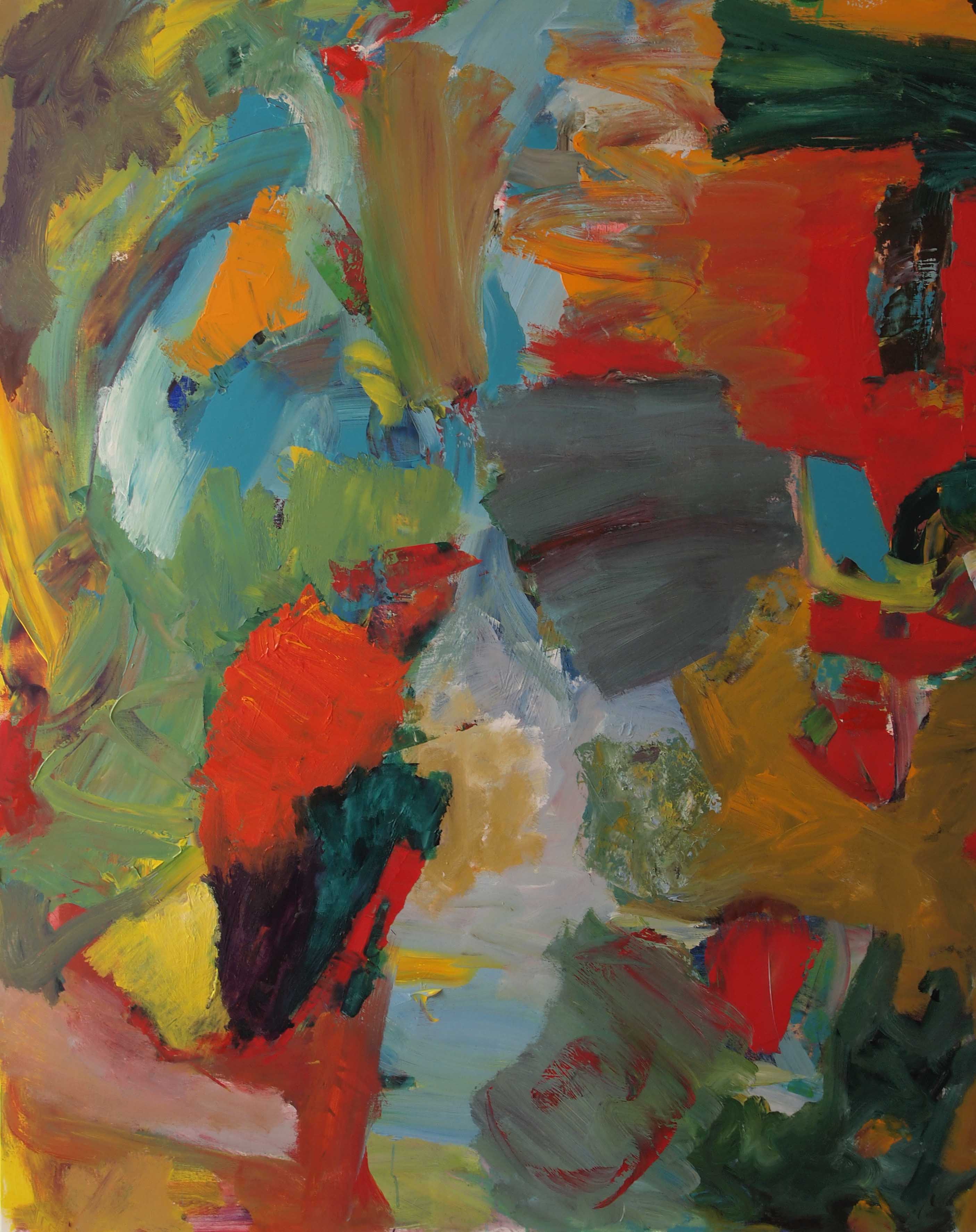
[No.3] Wolfson, 2015, 76x100cm, acrylic on canvas.
18th July 2015, at Anne Smart’s studio near King’s Lynn.
Those present: John Pollard, Anthony Smart, Anne Smart, Robin Greenwood, Sarah Greenwood, John Bunker, Alexandra Harley, Patrick Jones, Helga Joergens-Lendrum, David Lendrum, Mark Skilton, Hilde Skilton, Noela James.
Anne Smart: Hello everybody. Welcome again, it’s the third year. And what I’d really like to say first is ‘welcome’ to John, who has been magnificent in his constant contributions to how the Brancasters are going and what Brancaster is, and we’re really pleased to see you here and excited about what you’re going to say.
John Pollard: It’s a pleasure, thanks for inviting me. I think I just really want to say that all seven paintings have all been painted in the last two months. The first one was the smaller one [No. 3], I don’t know whether that is significant in any way. In terms of aims I don’t really have too many specific or narrow aims. I suppose if I had to say something it would be around trying to achieve complexity with diversity; both of those things are quite important to me. So over to you, look forward to hearing what people say.
Patrick Jones: Can I just ask if the work you’re showing here, that you’ve done over the last two months, is consistent with work you’ve done previously, or is it a new departure?
John Pollard: Not a new departure, probably. The kind of way I work is fairly broad, trying to be complex and diverse, with variety, but I don’t have a considered game plan. I think it would be difficult to place certain work in a time line over the last year, but before that, yes, you can see a change.
Mark Skilton: When you say your aim is to have complexity with diversity, in a sense that is fairly easy to do, in a random kind of organisation you’ll get lots of complexity and diversity…
John Pollard: Yes…
Mark Skilton: There has to be some kind of limitation that you have in mind when you do that.
John Pollard: Yes, well it’s got to work, it’s got to work as a whole, it’s got to work as a structure, work in all ways I guess.
Mark Skilton: But do you have anything specific in mind for all of the paintings, or do you let the painting inform you as you go along?
John Pollard: Absolutely, yes. I have very little preconceived ideas before I start painting, even down to a palette. I’ll grab some paint and start. I think it’s kind of an open, dynamic process, I don’t really know where it’s going to go.
Mark Skilton: Right, so you initially start by just getting a lot of paint on the surface?
John Pollard: Yeah, or it might occasionally be a different way of starting which might influence specifically what happens in the end, but I think sometimes it doesn’t.
Hilde Skilton: John, what about influences from other artists, do you take that as a springboard…?
John Pollard: Yes, absolutely, I think so. The influences are not particularly conscious influences, certainly not when I start. Like any of us, things start to look like some things, and there’s an element of how much you resist that, or go with it, explore that, so again I’m kind of open with that. I’m much more interested really in an individual painting, whether it works. I think that is something that is really quite important, so yes, I’m aware of those issues, but I’m not over-concerned, or worried about whether they…
Hilde Skilton: So these are your ‘expressions’?
John Pollard: Yes, I think so.
Hilde Skilton: Good.
Anne Smart: Mark and Hilde, and Tony and I, were looking around last night in the quiet, just contemplating them, and I think the complexity is magnified a bit because of the volume that are in this space, we’re sort of slightly overwhelmed by it, by the complexity here, which is… a bit of a problem, in some respects. So, I would propose, if everybody thinks so, we just look at one painting, and all talk about one painting initially. So, has anybody got any sense of which one we might want to look at first and talk about it in terms of what you are saying, about how you’re thinking?
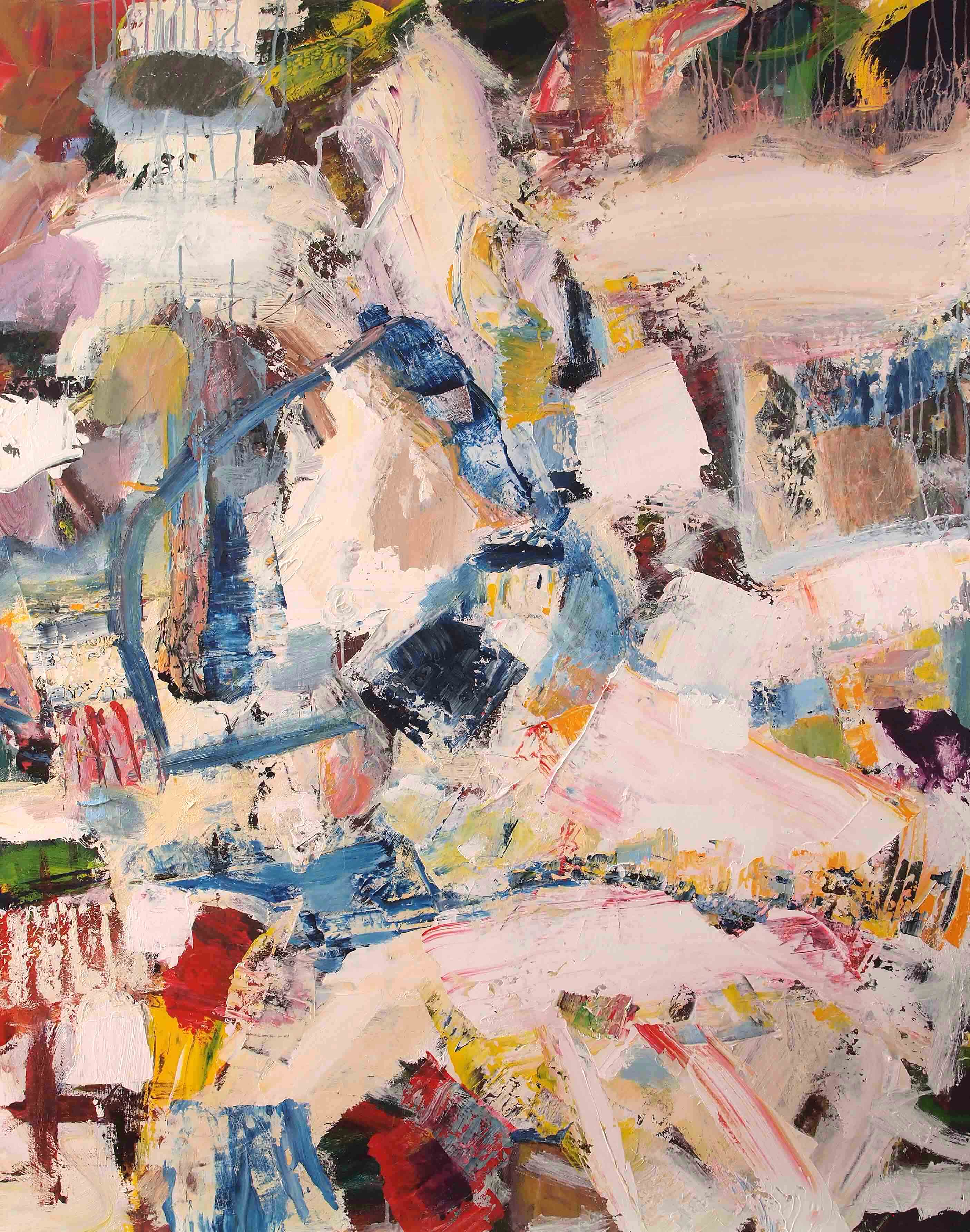
Noela James: I was thinking I find No. 3 quite interesting because you say you started off with that one, because it is really complex, because there’s a lot happening.
Anne Smart: Hilde likes this one, I like this one…
Noela James: What I like about this one are the lovely passages, like this yellow square and the pink which offset some of the complexity and so you can see as you work your way in and through it, rather compellingly. I think that the quiet areas seem to balance out the rather volcanic activity.
Anne Smart: Can you just point out what you feel to be the quiet areas?
Noela James: I think this yellow [left hand edge] and this pink [top middle right], these areas here [yellow, pinks, beige, top right] just seem to hold this kind of ferment of movement and colour and I like the way these sort of lines lead you in [bottom left corner] and round. I find that kind of satisfying…
John Bunker: I’m intrigued by these lines, as you call them. They seem to be moving through the paint and it is naturally guiding the eye in to distinct areas of the painting, and also creating a different kind of space in the painting. I find this area leading in to here [bottom middle right black lines] particularly interesting and also the way this black line here [top edge round pink oval] is isolating that pink and pulling you down into a different kind of passage of paint there. I don’t know if anyone else wants to think a bit about the drawing that’s going on in the painting?
Alexandra Harley: I think there’s a wonderful distinction between the two types of forms that are being created. There’s the open forms that you get with these drawn passages (bottom middle black lines] and then you get these more dense forms of the larger blocks of colour and I like the contrast between those two very much. It does exactly what you said, doesn’t it? It leads you through. It creates a complexity within these open drawn areas [bottom middle black lines] that goes into those very strong solid areas and dense areas that are behind, but even they have a translucency, don’t they? You’ve got areas like this [dark red in top right corner], where you’ve got that rippling across it here [moving in to the centre], I love that. I think it’s a different way of describing different forms, there’s some great things going on, aren’t there? Look at that big V [‘v’ shaped blue/green centre right], I didn’t see that initially but it becomes a very coherent passage through, within, the whole piece, and it sets up several other things that are going on around it doesn’t it?
Noela James: Yes, there are definite directions, and directional forces within the painting, which take you around…
Alexandra Harley: But you don’t see that straight away do you?
Noela James: No, the more you look at it the more images and passages are revealed. It works very well. You could look at it, live with it, for a long time and keep seeing different things in different areas within the work.
Helga Joergens-Lendrum: You were talking about the V shape [blue/green top right quarter], that’s very interesting because I didn’t see it at first. Now I’m aware of it, and I see various other V shapes; the little red ones, the yellow ones, on the top leftish areas and that leads to a rhythm which is going through the picture and makes it exciting, makes it vibrate, and go forwards and backwards, and inspires the eye to travel around it, and explore the picture even further. It’s really nice.
Noela James: Were you aware of that John? The Vs, the rhythm, was that just subconscious?
John Pollard: Well, not really no, I’ve only just seen the blue V [laughter]. There’s something about taking risks and I like the idea of things that in a sense might jar, but work, that’s something I like. I think that some of the top right, the pink, and the rather nastily painted crude yellow patch, felt a risky thing in a sense, to put in, but I think works and I like that.
Noela James: I think they are essential to that because they hold everything else in, I think they’re quite important, to me, they feel important.
Patrick Jones: When John [Bunker] started to talk about lines in paintings, I didn’t really see any lines, what I saw are these sort of gouges, like that one [green middle right]. You know, it seems to me that element, which is very much in that one by the door, No. 7, it’s the gouging which seems to be done through the paint which I find exciting, in terms of organisation. I do find the paintings, to be honest, very complex, a bit too much all at once, and really I’m looking for organisation in the structures within it, and to that extent I’m enjoying No. 1 very much because the areas are larger and flatter. But I was interested – can you tell us a bit about the gouging that goes on with the knives?
[No. 1] Only for a Second, 2015, 150x120cm, acrylic on canvas.
John Pollard: Well, I use knives and brushes, and there might be occasional battles between knives and brushes and what wins might influence how it’s going to be overall, but I’m kind of mixing paint quickly, generally on the canvas, and so I think some of the depth will be through the broken paint and patches, which will come with a palette knife, but also when a brush is loaded with various colours. Occasionally I’m not sure about them; the dragged line here in No. 3 [green, right of centre line], that really annoyed me for quite a while. I’m not sure whether it still annoys me, but yes, that is just one of the techniques I use quite a bit.
[No. 7] Print Upon Your Stars, 2015, 150x120cm acrylic on canvas.
Patrick Jones: So, in No. 7, these areas where you’ve got this sort of thing happening [points to top right), could be a…
John Pollard: I was very conscious when I did that [Patrick points across to left blue oval shape], oh that’s brushed, that first bit probably scraped through, probably with the end of a knife…
Patrick Jones: There’s no figuration implied by that? You know, a tree branch with a something down there and a something down there, that’s making a coherent form within the picture? It’s individual separate elements, to an extent, am I right? Because I’m just wondering if there’s any sort of hidden images in the painting?
John Pollard: No, I resist that as much as I can.
Alexandra Harley: I think I’m going to disagree with you Patrick, because I really think that [No.7] is coherent, and I do think that I love that complexity, that exuberance that it’s got, and I’m not taking anything away from No. 1, for example, which you said you preferred; but ‘this’ is just astonishing in the way that it gets right across the canvas, right through the palette, the way that it’s been constructed, quite literally in many ways, gouged through and built on, I think that’s…
David Lendrum: I think it’s a very complex sort of space in this picture…
Alexandra Harley: Yes.
David Lendrum: …because you’ve got the slightly linear elements in terms of the brush marks and it’s like looking through a kind of lighter and darker sort of space behind, quite a lot of overlapping going on. So yes, it’s very complex, the space. Also, this one shows a lot of textural differences which adds to the richness of the surface.
Alexandra Harley: But these forms have been created in different ways [pointing to semi circle line in middle left and blue circle top left], you’ve got those dense areas that have been put together and then you’ve got these open forms that have – framed is not the word I want to use – but they sort of frame another area, or they delineate an aspect which…
Anne Smart: If we pick up on a word that John [Bunker] used about line in No. 3 and then we look at No. 7, I think that has something to do with complexity and diversity in that respect, and to me No. 3, the line is all sorts of things, so if you think of the word ‘line’ and you think of the way we describe abstract stuff, most people will automatically go to this [points to No. 3 black lines in bottom centre right] line here. But line can be other things that are more built in, so you know that is, in a way, what John is saying he wants, which is variety and diversity because just the thought of line is enough to produce that sort of diversity.
Alexandra Harley: But I thought John Bunker was saying more about drawn line in that particular area.
Anne Smart: Yes, true.

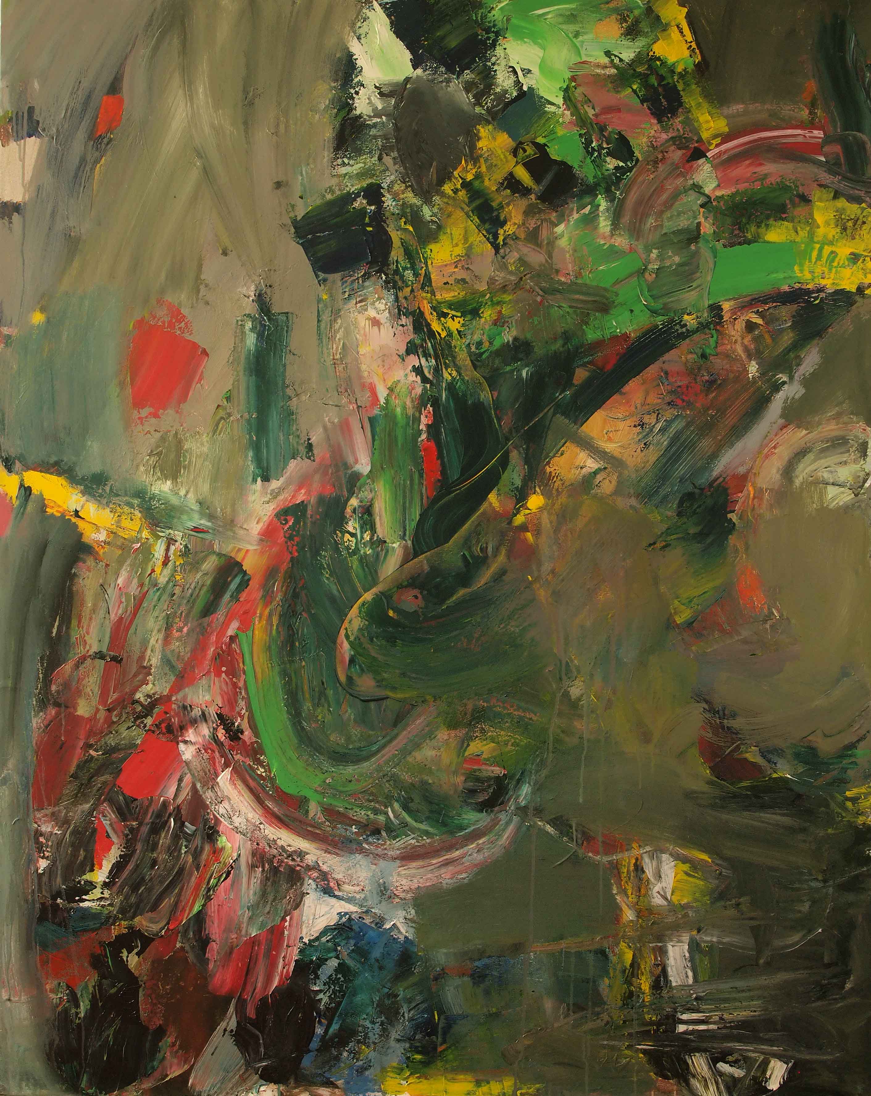
[No. 4] The Light Brigade, 2015, 120x150cm, acrylic on canvas
John Bunker: I guess I’m interested in the way that John has found a way of breaking up… I think that in this painting, No. 4, I’m seeing something consistent with a sort of language of painting that I’m quite used to, I think.
Anne Smart: Yes.
John Bunker: And in No. 3 I’m seeing someone who has decided to try and kind of break that up somehow, or open that language up more, and I think by gouging through, as Patrick said, or by using lines in a more drawn sense, to break open those denser forms you’re creating quite an interesting space, I feel, and something quite dynamic and exciting, I think.
Anne Smart: And it shows in No. 7…
John Bunker: Yeah.
Anne Smart: …particularly with these lines, which initially could be seen to be on the surface, so you could sort of imagine that was painted and then that action was done on top of it, but in fact does it make that space more interesting [pointing at ‘drawn’ lines centre and left above centre],so that one, No. 3, has more control in it, because this, No. 7, initially to me, feels as though that’s on top; although…
Mark Skilton: Yes, I think that the marks in No. 7 are the thing that organise the whole painting. I don’t think the colour does it, but whereas in No. 3 I think the colour and the marks work together to create a much more organised and effective space.
Anthony Smart: The problem for me with this painting (No. 7), and it has been a problem since last night, is that the drawing that is on it is, in itself, varied and yet not seemingly linked to any structure, so you get a sort of hit and miss, and that may very well be, at this stage in the development of the painter, that could be just fine…
Robin Greenwood: Do you think that is true of the whole thing?
Anthony Smart: No, because I think that, in the lower part of the painting the lines seem to be part of the content so you get a line containing something but then when the marks pass, pass through there [points towards area by centre left semi circle], this thing is suddenly sitting six inches on top, so then I think, is that also not sitting six inches on top [points towards left part of semi circle that is blue] and then I’m in trouble, because I’ve got too much, too many conditions coming with the lines, and not yet built. Somebody said that almost at the start and I was thinking that, somebody took the wind out of my sails, at that point, but I’m still sitting here with this problem.
Robin Greenwood: Are you saying that this line here (points to centre left pink/blue semi circle line] denies the space of the stuff behind it?
Anthony Smart: It creates a different kind of space.
Robin Greenwood: But that could deny it, though that could be…
Anthony Smart: It could be a contradiction. The thing is this talk of complexity disturbs me right from the start because unless the complexity has some purpose, then it’s just complicated, and we haven’t really achieved complexity and…
John Bunker: This area for me (right side blue circle area] is a stunning piece of painting, I think this area here is a stunning piece of painting (bottom central area). This tiny piece here is a stunning piece of painting (left side middle edge orange], but it makes me realise how the painting has shifted and starts to become more inconsistent. The depth, the power of the colour here [right side blue circle area], for me saves the painting and the same down here, it saves, it makes me want to look at the painting. What can you say? It’s as simple as that for me, whereas these areas don’t feel so resolved or…
Robin Greenwood: Up the top?
John Bunker: See, this is nearly there for me [blue circle area top left]…
Alexandra Harley: Do you see aspects of what you’ve just seen down there in No. 4 that translates better?
John Bunker: I almost feel it’s gone too far [No. 7] the other way in this section of the painting [No. 7 middle area]. Like everything that’s happening in No. 3, where there seems to be an interesting balancing act between what I almost perceive as two distinct languages in a way of painting. Down here [No. 7], it just feels full of potential and suddenly it goes into areas that are more, like John you said you were irritated by this [points to No. 3 green line gouge right of centre]…
John Pollard: For a while yeah.
John Bunker: I see a lot of that in the top half of that painting [No. 7] and I don’t know what to do with it, but that’s just…
Noela James: It feels like this painting [No. 7] has been attacked, rather than resolved in a way for me, and it feels like you could probably carry on with it. I think I want some of the areas to sort of come together or be reinforced there, your eye doesn’t really land on anything.
Sarah Greenwood: Because there’s making shapes at the bottom and there’s all these big shapes here and then there’s not really any shapes anywhere else, apart from delineated by the lines, you almost feel as though you want something like that [middle bottom shape] to start building again out…
Anthony Smart: This is the height of simplicity [semi circle line in No. 7], whereas all of that is the height of richness [points to right below centre sections] but all more embedded, but if you were to cut the painting off, which I know we don’t do that these days, somewhere there [just above centre] and get rid of that [points to semi circle], you have got just the most amazing thing left, because the linear element is related somehow; that’s the one that throws me off [semi circle] all the time.
Robin Greenwood: I first thought when I saw the paintings that there were probably more than one painting in each of the canvases, that was my first reaction.
Anthony Smart: I mean all last night I just thought when they first came in ‘that’ [pointing to No. 3] and ‘that’ [pointing to No. 7], brilliant, fantastic yeah, and then we’ve sort of gone on from there. I was persuaded to look at that [No. 6].
Robin Greenwood: Let’s just stick with this for a minute.
Helga Joergens-Lendrum: I want to say something…
Anne Smart: Before Helga says that, that is an interesting thing, whether these lines, which I saw as top lines are pulling two things together, so if ‘that’ is a painting and ‘that’ is a painting somehow this activity that comes with such dynamism on the top [blue line top left going down through the semi-circle] is actually being used to pull it together.
Robin Greenwood: Do you think that’s too gestural?
Anne Smart: I think it is very gestural. I mean gesture obviously is part of some sort of painting but is it part of here, or is it used indiscriminately?
Helga Joergens-Lendrum: I think that what I see here, first impression (No. 7), is of great dynamism. I like that there seems like explosions going on, there’s so much movement in it. I think that I really like the gestures and the liveliness and I think maybe if I thought about a problem I think, as everybody else was saying, there seems to be two pictures in it. There seems to be first, to start with the colour and you make gestures, lines and shapes and colour, brushstrokes. Then you abandon colour and use various shades of grey and pink, greyish pink, greyish blue, whitish blue, and I find that if you had done the gestures with colour it would have been a bit more consistent. You may have found that it becomes too loud, so I understand that maybe you wanted to calm it down by using greyish tones. But I think if you maybe clarify certain areas, maybe this area here, the colours are too similar [darker pink area top right), because you have here a line in one colour and then in blue and then a clear green there next to it and each brush mark has its distinct colour and then you find here these brush marks are still there but the colours are the same and they are for me a little bit too similar. So I thought maybe you can give a little bit more unity back to the picture by maybe even going over with colours and just distinguishing these individual lines and varying them a little bit, just to link again to the clear colours that you have applied in an earlier stage of the picture. I think that’s the problem; the grey over-painting is too similar and too grey.
Robin Greenwood: Do you not think that there is plenty of real content happening in this thing underneath these gestures? I find that this drawing over the top might be an attempt to make it into a whole painting of some perhaps slightly known description, rather than to get into what this means [inside semi circle], this real, actual related content, whereas you put a line over the top, its unrelated to me. This all sits in across in the real surface of the painting, spatially and then these things [lines] are something else.
Helga Joergens-Lendrum: Yes, you’ve changed the language.
Robin Greenwood: Well, I don’t know whether it’s a language or not. It seems unnecessary, and losing faith in what you’ve done that is much more interesting.
Noela James: This passage is really interesting. This dark red…
Robin Greenwood: Absolutely…
Noela James: …coming through [points to above semi circle]. If you look at it for a while…
Robin Greenwood: Look at that [points to top left under blue circle]. I even like this bit of drawing [top left pink ‘u’ shape] here…
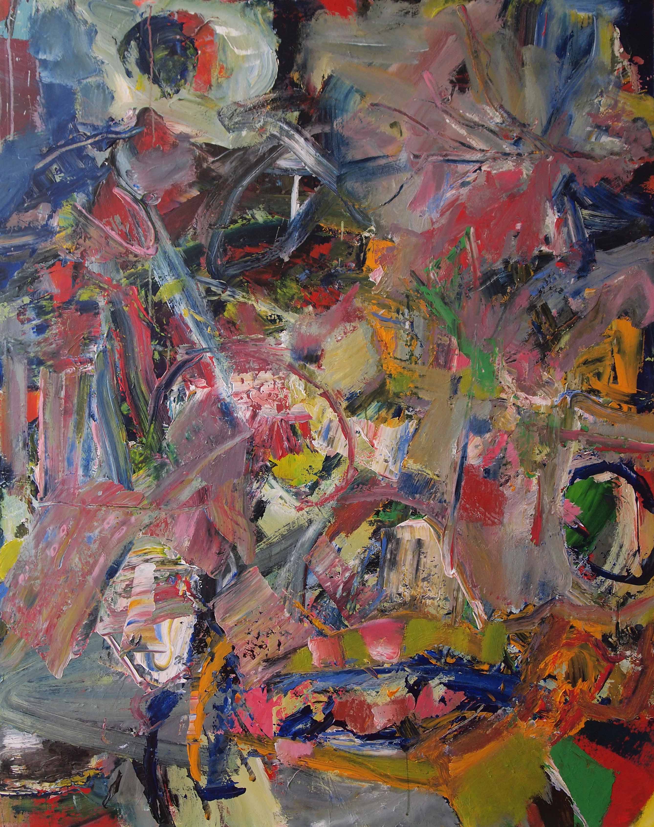
[No. 2] If Only for a Time, 2015, 150x120cm, acrylic on canvas.
Anne Smart: In lieu of saying that, No. 2 for me feels a bit more like this without the top on, what do we think about that? I know it’s a bit more vague, these grey and green areas…
Robin Greenwood: I don’t agree with that…
Anne Smart: This feels a bit more built…
David Lendrum: I agree with you about that. To me, in terms of the composition and scale of the brush stroke and language, this [No. 2] works as a whole, and I like the differences in scale of area as well. You’ve got these sort of nice large grey bits there and here, it’s like a chasm or a gully. There’s a lot of differences in scale of mark and texture and this has a sort of movement from the top and coming from the side, this immediately gives it a sense of wholeness. Also, when you look in here there’s sort of space in there which is really interesting [points to centre of painting] then comes up there, a sense of it all being done in one go… well, not one go, it has a sense of real unity…
Robin Greenwood: Do you think that’s the most whole of all the pieces?
David Lendrum: I think it is to me, yes, because I like the scale of some of the gestures as well.
Robin Greenwood: I was going to say it has the biggest gestures, goes through the whole of the canvas.
David Lendrum: Then you get the textural marks coming through from underneath, no fiddly lines being imposed on top, so it all seems to work in a very powerful way.
Anne Smart: So there’s a lot of talk lately about whole painting, working as a whole, so do you think, Patrick, if you do something else, supposing we took off some of the lines over here [points to No. 7] which we see initially as the top gesture, would the painting be more whole? And if we put on some sort of gestural line here [points to No. 2] would this be less whole?
Robin Greenwood: How would we know?
Anne Smart: I know but it’s an interesting thing as a painter…
Hilde Skilton: I think it’s a feeling.
Anne Smart: How do you make that choice? If John sets out, looking for variety, is that variety to add another dimension, or can you get all your variety in something simpler? Is ‘less is more’ in complexity, or is complexity lots of….[shrugs shoulders]?
Patrick Jones: Can I just answer the first part of what Anne was saying was really to do with the size, the physical dimensions of the paintings, whether you are creating a whole. All the pictures here are the same size and the same proportions, very similar in size or proportions. So, for John, the problem in a way is to deal with that amount of paint on that surface and do something… and I agree with John Bunker that some areas of richness of colour are absolutely staggeringly beautiful, but in terms of organising the whole picture, then its slightly more problematic. I did like the idea that this [points at No. 2] could almost be a great big grey slab of all sorts of stuff stuck together with a few much more exciting developments, because that will take care of the whole picture.
Robin Greenwood: I agree that this is possibly the most whole painting [No. 2]. It’s just that it has a wholeness that is very familiar, I find. I sort of know quite a lot about that kind of painting, I feel I’ve seen it before. It’s achieved something that was done twenty years ago in abstract painting, maybe.
Patrick Jones: Well, de Kooning…
Robin Greenwood: Not that that matters.
Patrick Jones: Can we look at No. 4 because in No. 4 John is using much smaller areas, and when you’re talking about much smaller paintings coming out of bigger paintings, there’s loads of little paintings in here, but to me there isn’t a big painting. It sounds like we’re being heavy on you, but I’m really enjoying what you’re doing…
John Pollard: I always think there’s little paintings in every painting, in fact even in some of the best paintings, if you cut out a bit, probably an even better painting, and I think that’s a whole interesting thing because we are just looking at the object: why can’t we do that, if what we’re producing is really good? And yet it’s been criticised – that it’s just photography – I can’t remember which one of the abstract expressionists criticised cropping as photography. But I would kind of agree with that. I understand what people are saying because you could look at a bit and say, ok, so what is so good about this cropped bit within this painting and then, how could that influence you?
[No. 5] Jive, 2015, 150x120cm, acrylic on canvas.
I think these two paintings [Nos. 4 and 5], kind of similar, the most recent, are probably trying to do another thing, and that was probably colour, because I haven’t historically tended to do big contrasting colours, which are quite popular within this group of painters. I do tend to do more muted palettes, generally, although recently I’ve brightened up, but in terms of using lots of different colours rather than reds, oranges and pinks, that’s kind of new: these two were kind of experiments, just playing around with colour, and I think probably what, after a pause, I will try to look at, is a kind of synthesis, about what works and how I want to go forwards. I don’t mind the drawing marks in some ways, I think that if they work they work, it’s when lines stick out and perhaps aren’t achieving in the overall structure… maybe that does stick out and dominate too much [semi-circle in No. 7].
Mark Skilton: The thing with complexity I think, is that the achievement is finding a method of organisation that makes it clear, without actually losing the complexity, that somehow through the continuous working you don’t simplify it, but you organise. You can’t impose an organisation on it you have to sort of draw it out of the work but once you achieve it then you get clarity.
John Pollard: That’s what I try and do. When I say diversity and complexity it’s a given that it has to work together. I kind of like the idea of putting some kind of order and structure into chaos, hence the variety…
Mark Skilton: It can’t be imposed…
John Pollard: No, I don’t…
Hilde Skilton: I think that in No. 2 you’ve imposed it, because of the grey just blocking out, you’ve tried to simplify it, whereas in No. 3 it’s all there, it just simply gels, it works. It comes up together, there’s complexity, there’s change, there’s everything happening and somehow it just sort of gels. I don’t want to be analytical at this point, that’s just how I feel about that one.
Patrick Jones: I don’t think it’s a coincidence it’s half the size of the other pictures, so in terms of what John is trying to do he doesn’t have to deal with a whole surface of a ‘six by seven’. I think what Robin said about whether wholeness is an important thing to get in a painting, it seems to me it’s absolutely primary. I can’t think of anything else a painter would be trying to do.
Robin Greenwood: So long as you don’t think you know what it is.
Patrick Jones: No, no.
Noela James: If a painting does have lots of little paintings in it I don’t think it’s a bad thing. If you’re living with a painting like No. 4 it’s quite okay to look at one part of it and then another. I don’t think that necessarily matters, there’s so many interesting areas in that one; it’s quite ‘patchworky’ as a whole, but I could quite happily, every day, look at a different part of it. I don’t think it has to always be a complete whole, to be successful.
Hilde Skilton: Yes… it does
Noela James: Does it? That’s still successful [No. 4].
Anthony Smart: I think what we are doing here is sort of, slightly pussy footing around, when the big thing is to get the thing to work…
Noela James: The whole thing to work?
Anthony Smart: …because, when stuff comes together, you get more than the sum of its contents, whereas when you just have this complexity idea you just have the sum of the contents. They don’t know about each other so you find yourself looking hither and thither across the canvas and getting excited, but at ‘that’ (hand at waist level) level. But if you can harness all the cylinders to fire at the same time you suddenly get a big hum that is – should be – out of this world.
Noela James: So do you think No. 4 has got too many elements to be a whole? Are there too many small elements that don’t make up a whole?
Anthony Smart: Too many small elements to make up a whole?
Noela James: The reds and the pinks sort of bring it together, it hangs better because of the colour.
David Lendrum: To me this one has a slightly different visual language in that its mainly planer, it does feel it is solid masses, there aren’t so many lines drawn over, through it, so the space is much flatter space compared to that one [No. 3].
Noela James: Yes, it’s very different from No. 3, which does seem to have all the elements.
David Lendrum: This [No. 4] has planes butting up to one another which is another way of painting, a slightly different language that is used in some of the other ones.
Helga Joergens-Lendrum: To me this is a whole [No. 4] because you create shapes which are similar, very roughly similar to rectangles or squares, and also consistent in the direction, either slightly diagonal or vertical, then you have balanced it with the more horizontal diagonal that is at the bottom. There is a rhythm going through and this rhythm holds the whole picture together. Also, I find you have many smaller shapes and larger shapes, almost corner shapes, we have larger shapes here [top left corner] then responded or reflected by this area here [centre], then moves on to this area here [bottom right], these shapes here [top left] receive an answer [bottom right] and that is holding the picture together. Also, these smaller shapes [top centre and right], then echoed in this area here [below centre and leftish] and that again to me hold the picture together. So, for me, this painting has a wholeness and it has movement. It has a complexity in smaller and larger marks, and the consistency of the colour palette goes right through, and the colours are reflected which appear in the top left, appear in the bottom left, or bottom right, or find an answer in the top right. That to me holds the whole picture together.
Noela James: I think I agree with that.
Anthony Smart: But, you could say that is wholeness by design.
Noela James: Is that wrong?
Anthony Smart: Yes, it’s very much a problem. I saw a show of John’s earlier on in the year. The first thing I saw was that he brought a dynamic, an energy, like a new enthusiasm, a kind of bravery to painting. I thought that the stuff I saw earlier on in the year was timid by comparison to this. Those two paintings [Nos. 4 and 5] seem to me that he knows too much, he knows what he’s doing, he’s doing it to fit, to order. Now he has every right to do that but, I’m not having a go at that, but I’m wanting to draw attention back to the battle that is going on, the battle that is going on in the other paintings, where these wonderful creations, this inventiveness is taking place, But, how you get that to work together might have to sit on him for quite a while. If I was going to stick my oar in I would leave these kind of things alone [Nos. 4 and 5] because, I agree with you its ordered, but I think it’s a lower order.
Helga Joergens-Lendrum: Because it’s something known? The other ones are going in to a new realm which has not been explored.
Anthony Smart: Yes. I think the progress in these paintings is quite mind boggling, I wish you’d seen these others. You know we can say that bits sticking out and that’s, but generally I’m with them. But it’s these [Nos. 3 and 7] I’m with, not those [Nos. 4 and 5].
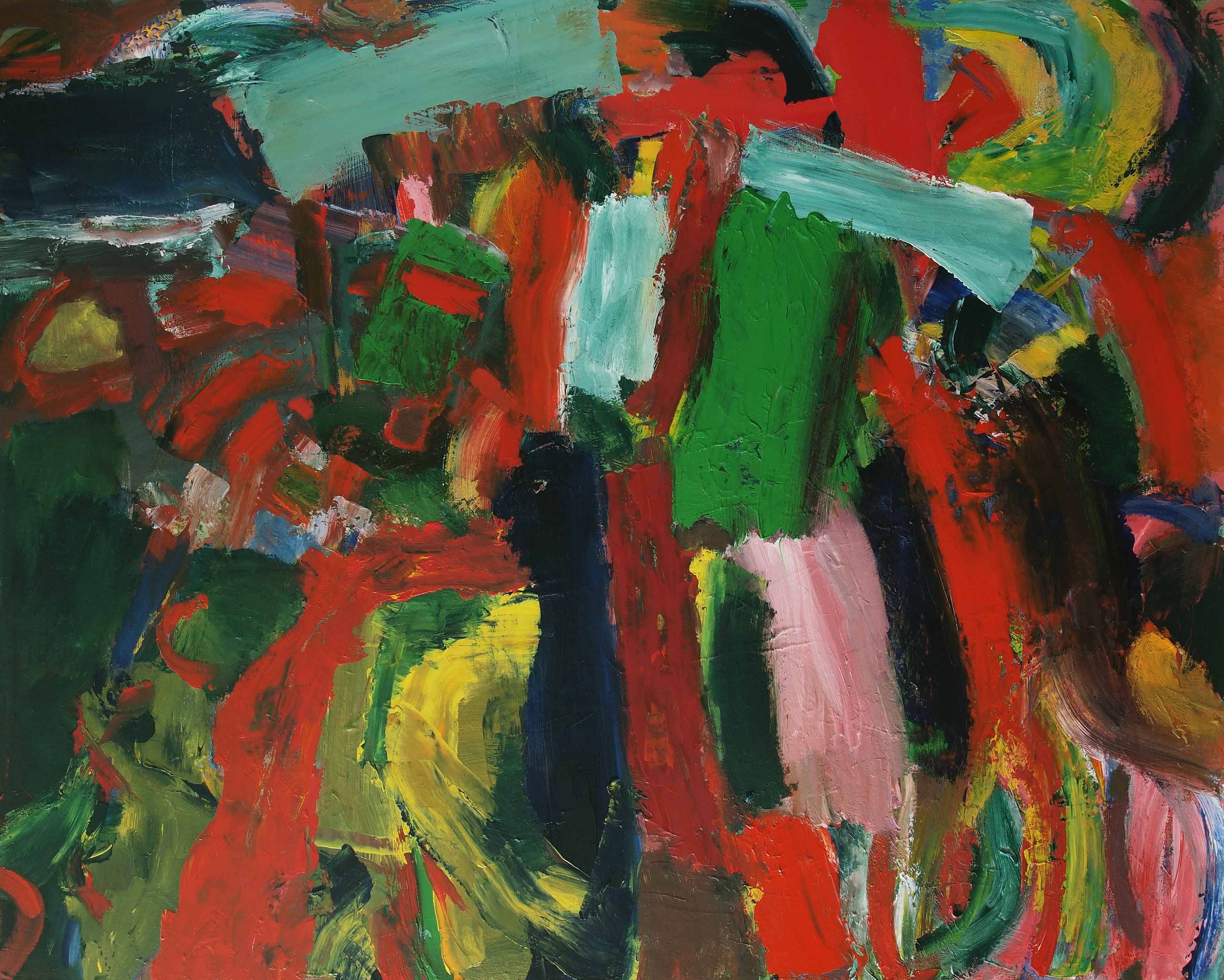
[No. 6] untitled, 2015, 150x120cm acrylic on canvas.
Anne Smart: Can we have a look at No. 6? I’m quite interested in this. If I was going to put these two together [Nos. 6 and 7], in terms of dynamism, I find No. 6 a little bit more coherent. For me that line [No. 6 large blue ‘C’ shape left of centre] is quite successful because it combines with the blue, that perhaps feel as they are behind it so, in a way, although it’s quite obvious, it does link the bottom and the top of the painting together and what I like about this painting is that, it would be really interesting to see that painting on its own because this one [No. 7] overshadows it by its constant moving. If we saw that one in isolation I think it would actually be more dynamic that it appears.
Anthony Smart: I agree.
Anne Smart: And it’s easy to say, making a painting in one go, or going with the flow, but it also might only be a short period of time, but there’s a timing in this one [No. 6] that I really feel is considered, but that one [No. 7] feels a bit rushed to me. This one, we’ve seen dribbles before, lots of times obviously, but I like the way these dribbles combine with the blue and there’s the brown on top, this sort of seems to flow through [top left] so you can go on a little travel, but it’s built. It feels loose but it also feels as though it’s, he’s, in control. That’s very difficult to achieve and he might not know it’s happening, those sorts of line [top left] and then this painted red [left edge below centre] and this white on top of the brown [bottom left]. Your getting an unusual way of building ,while this [No. 7] is always on the move, sense of swirly explosion. This one [No. 6] for me, more than that [No. 7], appears to be literally.
Patrick Jones: Do you think that’s related to the fact that is basically a white painting with colour added, rather than a full colour painting?
Anthony Smart: Anne has sort of said what I was going to say but the only thing I would add is that the darker, which are predominantly in the blue – you said they were built – yes they are. To add to what you have just said, they achieve compression within them of a built line so they have real structures [blue diagonal ‘line’ ending in centre] but they are taking the place of these things [lines on No. 7] which are brush marks. The only brush mark on the canvas that actually registers is that one [blue ‘C’ shape]. When you saw it on your tweet site that’s what you saw, and you thought, what’s that? That’s a bit challenging, what’s going on….
Sarah Greenwood: You’ve got that same thing with that blue arc across it…
Anthony Smart: Sorry?
Sarah Greenwood: The blue curve coming across the bottom, it’s actually a similar blue line, but it’s in the painting.
Anthony Smart: Magnetically the blues have gathered themselves together into narrower bands which are not paint lines.
Sarah Greenwood: So you can have a blue on the top or a blue behind which is revealed, because you have different ways of using the line across the whole painting.
Anthony Smart: Yes.
Sarah Greenwood: So there’s a very pale blue line on the right hand side, there’s almost a red line [bottom right] which is two bits of red on the white, and is another line, but it is built in a very different way from that one [blue ‘C’ shape].
Anthony Smart: But they’re not lines.
Anne Smart: It is a line in a sense.
Anthony Smart: It’s a narrower mark, made of many bits.
Sarah Greenwood: Made in a different way.
Anthony Smart: It slows the process down. This thing [No. 7] goes 300 miles per hour, whizzing about, and maybe there’s something to be had out of that, who am I to say? But it’s how it strikes you on the day and I’d go for those concentration of marks [No. 6] that make something slightly linear, but they feel as though they’re being attracted, they’re more dimensional, that’s the thing, they have a real range of pace.
Anne Smart: But don’t you think that is variety? Taking something and using that thing to make your variety, instead of just scatter-gunning lots of things on and thinking that that is what variety is.
Anthony Smart: Yes, but also if you have groups of marks that are attracted to one another into passages which are moving about the canvas you create space, that’s a space creating activity, and he’s filled those empty spaces with this blander, but equally dynamic, so the painting is sort of breathing. It sort of pulses as you go from concentrating on the blander paler areas and then concentrating on the denser ways across it, even to the point where there’s a kind of, almost an image, which is, I think there’s something really good about this. I had to be dragged kicking and screaming to look at it. I didn’t like it at first John, it was that bit [blue ‘C’] that put me off. Now, this is the one for me in the whole show, and I’ve never seen that.
Noela James: This one feels like, when you’re saying about that one there [No. 4] this one [No. 6] seems to have different paintings in it but it’s not so designed, like No. 4. Is that what you…
Anthony Smart: I’m saying, actually, this is the nearest he’s got to a whole painting.
Noela James: …so it doesn’t have that designed element?
Anthony Smart: It’s by invention, the invention is not localised, its broad scale right across the whole canvas, I think.
Hilde Skilton: The white is used to just calm things, its somehow sort of integrated better. If I were to challenge John I would say, do you have to bring it into a whole with using the white like that? It has very much…
Helga Joergens-Lendrum: Do you mean it erases what is underneath?
Hilde Skilton: No, because he’s painting a lot on top as well. This dark area, this lovely band down here.
John Pollard: I think the danger is that I wanted to paint a lighter painting and I was going to use a lot of white, I didn’t know quite how it was going to be, I did slab it on. The danger is you can hold and unify a painting, quite easily, if you dominate with a colour or maybe a dominant contrast of two colours and that was the concern.
Anthony Smart: Well you can’t, that’s a misnomer. You can’t unify anything by, you might as well say to Tony Caro, painting something red unified it.
John Pollard: What I mean by unify is that it doesn’t work, I’m using unify in a negative way…
Anthony Smart: I’ve just gone to great lengths…
John Pollard: I haven’t finished, Tony. That was my worry when I was painting it. I’m okay with it and it’s partly because I think the white slabs are doing something interesting, they’re doing something in different ways, and they’re not all the same at all.
Anthony Smart: Quite.
John Pollard: So, for me that’s okay, that it’s got lots of white on it, but you can try and do a painting that holds together, or you think holds together, that might be successful by using a lot of white because it, kind of holds it together…
Anthony Smart: No it doesn’t…
John Pollard: in a way that isn’t challenging…
Anthony Smart: That’s the bit I’m disagreeing with. I don’t think you can bring something in that is as important as that notion and expect it to do a serious job.
Hilde Skilton: But it’s done a serious job here.
Anthony Smart: That’s because he has got variety, the very thing he says he wants, bingo it’s there in front of you.
Sarah Greenwood: It’s where you put it, it’s where the white is, it’s doing a job.
Anthony Smart: The thing that is holding my attention with this painting is that I have not seen this way of the thing coming together and I want to hold on to that because for me that’s big, that’s worth it, that’s good. Looking at good bits is only ever going to get us to good bits. You’ve got a whole attack there.
Sarah Greenwood: If you cut that up into smaller bits you would lose what’s going on overall.
Hilde Skilton: Yes, the whole feeling.
Anthony Smart: It defies being broken down into bits.
Sarah Greenwood: Although there’s some really nice bits.
Noela James: You could still cut this one up into bits.
Sarah Greenwood: You could but you would lose what it’s doing now.
Hilde Skilton: But Noela, this one you don’t have to, that is what is successful about it.
David Lendrum: I think what’s also interesting about this painting, I like the lightness of it for a start, sort of optimistic, plus there’s the warm and cool element in the colour so the white is a fairly neutral cool, but you’ve got the warm yellows against the cooler blues and you’ve got different reds. You’ve got a cooler red in the crimsons and a slightly warmer one in the vermillion, so this is working for me very well tonally. You’ve got the contrast of light and dark, you’ve also got the contrast of warm and cool that gives it a unity for me.
Noela James: I think that the texture that comes through, the pink through the blue and all the different colours coming through the other colours, makes it very interesting and complex.
Anthony Smart: There’s another interesting thing about this painting and that’s what is going on at the top. I think if you’d taken that activity unifiedly to the top, if that wasn’t there (top right darker areas], it would be in danger, so well done to you for putting that in, or leaving it in, because it determines the scale of the painting.
Patrick Jones: Not only that but it changes the surface, you’ve got all the drips and thin paint…
Anthony Smart: But it stops it looking like a cropped painting.
Patrick Jones: That’s much more interesting to look at than these white slabs, which I feel, from a distance, your eye just can’t help fall on those sort of rhythmically, boring, but this area [top right darker] is much more, all this running painting [top left] is integrated much better I think. Well, I think it’s the way to go.
Hilde Skilton: The whole thing is better as an integrated…
Anthony Smart: I missed what Patrick said, his last sentence.
Patrick Jones: I think its variety in here, of the thin paint over the thick paint [top right darker area], seems to be the way to go. I’m trying to give John a clue as to how he might look at his paintings in the future, because otherwise with the size of the canvas and the weight of the paint, if it all gets to a uniformity, and it’s very hard to get all this to function, partly because of the skin its building up, which is so inert, if you’re not careful, particularly in acrylic. When we look at Anne’s painting we will see a big difference in the richness of the surface. If that makes sense.
Anthony Smart: I’m not getting this slabby bland, I’m not getting that.
Patrick Jones: Well, what Sarah said about that, it’s a movement isn’t it as much as it’s a mark, and it is terrific and there are terrific areas in the picture and when I was looking at this [all left hand side edge] you know some tremendous stuff going on, but again I can’t get the whole picture in the relation to what might be the empty areas against fuller areas, or passages, for your eye to go through.
Robin Greenwood: So you don’t think it’s a whole painting?
Patrick Jones: I don’t think any of them are whole paintings in a funny sort of way, and I’m not being horrible to John. I think they’re very ambitious paintings and I’d really like his ambition to have more chance to be seen. And if you think of Hofmann for instance, there’s much more stained canvas against thick paint, and I think there’s a problem with a canvas, which I am personally experiencing the same thing, a canvas of those sort of dimensions, five feet by seven, or whatever it is, four by five, with an already primed surface with acrylic paint going on top of it. It’s death, because it’s just going to end up like a leatherette settee which we’ve already discussed last time. The surface quality, you know it’s very hard to get differentiation. If it makes any sense? Because of…
Robin Greenwood: No [laughs].
Patrick Jones: Tough.
Hilde Skilton: I like the surface quality.
Robin Greenwood: I think it’s neither here or there.
Hilde Skilton: I mean I know your surface quality is different, fine. But I think John, especially in No. 6, the surface quality is very successful.
David Lendrum: I think what’s quite important is what I call in the slabs or swathes of colour, there’s a change of depth or perspective from here to there [bottom central white slab and surrounding area]. Anything that comes forward to you doesn’t seem near or far, there will always be a change in a block, those subtleties he’s got in the white areas, I think those really add an awful lot to the painting. I agree with Patrick that where that’s been left without any change from the back of the forms to the front of the forms [white square shape to left of blue ‘C’ shape] there would be other colours slightly reflecting on to them. There is an element of illusion in actually everything, also the way what you’re doing here [semi circle in No. 7] is for me your trying to integrate this sort of line and shape into the painting by changing the tone from dark through to light, from one colour to another. If that was all the same red [semi-circle line] it would just sit right on the canvas, but the fact that you put that blue that blends, links it to the background, that actually does integrate a linear element into the rest of the painting. And here [No. 6] I like the way you’re making that slightly different change where it comes around [left side No. 6]. This whole thing about trying to create a bit of illusion and depth in the painting one should try and be consistent, with all the elements you use, so that the forms and brushstrokes receding or coming forward, that’s changing from there to here, then it’s all sort of consistent.
Anne Smart: I think John we’ve had a massive amount of content in this conversation, lots of good things to focus on.
Sarah Greenwood: Can I just ask Patrick and David, you’re talking about acrylic paint. Because you have to keep building on it you end up with this weird surface, but if it was oil paint you could work it in a very different way?
Patrick Jones: Yes, it’s wet longer and you can scrape it off and rework it. The only thing I would say is that I don’t want John to think I’m just giving him a load of stick for no reason, I think they’re very ambitious paintings. I think there’s areas of them which are terrific, work really well, and I’d just love you to see your way clear to upping the game. I don’t know if there is any other way to say it.
Anne Smart: We’re going to call it a day.
John Pollard: Thank you for all your contributions.

Congratulations to John on his first Brancaster. The conversation about wholeness intrigues me a little. I would be interested to hear some people’s thoughts on the matter, and if at all possible, what they might take wholeness to mean. I enjoyed what Anthony Smart said about harnessing all cylinders to fire at the same time. I also like the idea that we should be able to keep coming back to a painting and finding something new each time we look at it. I’m sure that is still compatible with Smart’s expressive description.
There seemed to be some sort of consensus that no.2 was the most “whole”. Yet in some ways it was probably the least “complex”. I think the wholeness/complexity issue was the underlying theme of the discussion. When I scrolled through all the images, no.2 was perhaps the one I was most drawn to initially, but now I think it has been replaced by no.3 and no.7. This reaction seems pretty similar to a few participants as well. Is the feeling of “wholeness” we get from no.2 really just some sort of sense of comfort or familiarity that we get from something that has maybe a little less information and is a little easier to digest? I would say that no.3 is the more challenging, has the more information and is the less familiar. But not whole? If it is the better painting, but less whole, is wholeness actually the primary aim? I don’t know, I’d just be interested to see what people think.
LikeLiked by 1 person
I think no.3 has complexity as well as wholeness. Maybe ‘wholeness’ has to do with composition as well as integration and coherent handling of paint. Not sure if wholeness has to feel comfortable or familiar as such, I feel it has more to do with a sense of balance.
LikeLiked by 1 person
Good point Noela. I definitely wouldn’t equate wholeness with familiarity either. If anything we’re probably more familiar with fragmentation. I think it must have something to do with everything working together (a very easy thing to say), and a kind of interconnectedness. If that’s so then it is a terrific thing to aim for. But can we not make the case that an Yves Klein monochrome has a wholeness, albeit of a not very demanding nature?
I think that no.3 may well be whole, and that would make it a greater achievement than say no.2, because no.3 has more to have to manage and relate.
LikeLiked by 1 person
I like Mark Skilton’s comment about ‘organising’ complexity rather than ‘simplifying’ it to create wholeness, and Tony Smart’s sense that ‘complexity’ shouldn’t end up just being ‘complicated’ . There’s a lot to strive for, yes, and something very simple could still resonate wholeness I suppose.
LikeLiked by 1 person
Thanks Harry and Noela for your comments; there’s much to benefit from this kind of conversation. I think I agree with much of what you have said Harry which relates to the difficulty of a ‘style’ of painting, which I describe as “complexity with diversity/variety”. I chose these terms as I was trying to clarify just what I was trying to aim at with my work and also seeing it as a way of describing my pathway or trajectory. It also makes sense looking back and seeing what I valued most in abstraction, what that was, and how it fits into the abstract art narrative, including a possible future.
Something seems to have happened to mainstream abstraction just as it was developing a complexity (and yes, diversity) in the middle/late 50’s. The recent Diebenkorn show illustrated this when he diverted from what was developing into a complex, content, rich style (see Berkeley #57), to a flatter, and much less visually interesting, figuration. De Kooning may be a better example, as in the same year as Diebenkorn’s Berkeley painting he painted Gotham News (a coincidence?). He then simplified these ‘abstract urban landscapes’ and lost the complex, diverse, content that he was developing. There must be other examples as well.
Anyhow, while this is history, complex, diverse abstraction has a future to be explored – there’s mileage here and maybe even an interesting uniqueness to be achieved. However, very unfashionable.
I do think you can use the term ‘wholeness’ as one that does not mean a work is very good. A blank painting might have a sense of wholeness but be vacant of content and meaning. No. 2 might be the most whole but not so interesting and yes Harry, be more familiar and comfortable to look at, although no. 3, the best painting I still think, is whole but has much more diverse content and a lot more to engage with (so agree with you again on that point).
‘Composition’ is an interesting term that seems to be left out of Brancaster conversations (a dirty word?) and I think I would certainly leave open a place for it.
Noela, you said that “something very simple could still resonate wholeness I suppose.” For me, there is something about both how much ‘content’ a viewer has to engage with, and how challenging for the painter a ‘style’ of painting is, which helps to give a painting its value. See a gymnastics analogy – a perfect forward roll might be perfect but its form and content isn’t as interesting as a triple somersault executed perfectly (and won’t score you as many points). You can stretch the sporting analogy to how you judge the value of a poor triple somersault versus a perfect forward roll if you like (Emyr Williams comment would be good here).
Too many people get exciting about a very simple work; it may hang together, be a whole, be pleasant, or give you a big colourful hit, but is that all we want? This might be fine if I’m decorating my living room, but I don’t look at my living room walls in the same way, or for as long, as I look at a painting.
Back to the conversation, I don’t think Tony should be too worried about the term complexity, or indeed diversity/variety, as of course it doesn’t guarantee a good painting. What actually works in this way remains open.
I should also add that I am very hesitant to be too prescriptive as abstraction is absolutely about freedom and possibility.
LikeLiked by 1 person
Composition has an element of design in it so maybe that’s why it has a ‘dirty word’ status.
LikeLike
“Composition” probably has some formalist connotations, something you might want to steer clear of at a forum so particularly concerned with evaluating the visual/aesthetic properties of a work. “Composition” sort of makes me think of drawing as well, and the paint acting as a filler-in (that design element Noela mentioned). I know it doesn’t have to refer to this, it’s just an association that comes up for me. I’m not fussed though. We could do a lot worse than to talk about composition.
Looking at John’s paintings, the word “composition” doesn’t spring to mind (and I mean that in a good way, I assure you!). Generally, I tend to think about the composition when there is a lot less going on in a painting, and you can see where the artist has come in and tried to impose a kind of order on the work, putting in obvious directional lines or blocking out big chunks of information to make it “read better”, or make it act in a way that we misguidedly think is expected of it. Organisation as an afterthought rather than as an integral and continuous part of the thinking/doing process. Diebenkorn seems to me a very “compositional painter”. I’d like to make the point too that I’m not just advocating turbulence and gesture as the only way to make inventive content driven abstract art.
LikeLike
I think these are helpful descriptions Harry. One thing on design; I wanted to respond: how would we know that a painting has been designed? A painting can ‘look’ designed in a negative way but that doesn’t mean it was. Perhaps we also value a painting that was designed but doesn’t look it. I sometimes worry about veering off towards judging the ‘value’ of a painting by the process, how it was made, and I think the worth of Brancaster is sticking with how something looks, hence valuing the object, which I realise is part of a very traditional critique, but I come back again to the reminder that this is ‘visual’ art.
LikeLike
I agree, but I might just seek to clarify a few things. I’m not a fan of process driven work either and I think it is a cop out to discuss how you got there rather than what you’ve got. However, when I said that organisation shouldn’t be an afterthought but indeed part of the thinking/doing process, I think I said so in the belief that either approach will find a way of manifesting itself in the visual properties of the work, and therefore could be something that is worth talking about, even thrashing out, so that the artist and also other artists may start to better understand what they’re doing, what they’re not doing well, what they may be doing right, or where they hold back and don’t go far enough, all for the purpose of development and progress. I’m trying to describe the decisions we make when we work, and we could give any number of names to it… composition, organisation, clarification… but not one single word alone can do justice to the amount of thought and as Robin said, attention to detail, that goes into putting together a complex work of art.
Now if for instance someone does a painting and all they want you to know is that they painted it blindfolded, possibly to make some ironic point about no-one knowing what a good work of art is anyway, then obviously I will have already lost interest. But I would also reckon on my being able to tell that said work was painted by someone who had absolutely no idea what they were doing, based solely upon looking at the work’s visual failings, without the artist’s background briefing.
Now, somewhat conversely, if I came across a painting that simply left me awestruck, or at the least very impressed, I think I would be interested to listen to its’ maker discuss how s/he might have arrived at that point. Not necessarily what brand of paint they used, how oily their medium is, how long between coats yadiyadiyada, but how they might have thought their way through the picture. Because as a painter hoping to develop, it would be of great benefit to hear a thorough and detailed description of the thinking process behind a great work. What parts of the painting have they tried to hinge a lot on, what elements (present or not) did they try to avoid, what cliches they overcame and eradicated, why cool colour here, why warm there? Questions that we must all ask ourselves while working, and ones that relate directly to the visual content we see, because these thoughts often materialise into decisions that are evident in the work itself. Maybe process as thinking is more about the Why? than the How?
As to whether a work can be designed and yet not appear so and vice versa, and all the while be visually appealing or not… hmm… maybe there is an issue with the word “design” and what we mean by it. I seem to recall some discussion on the old abstract critical site about Van der Wuyden and that his paintings were very well planned out (designed even?), and yet are undoubtedly visual marvels. Perhaps it’s that attention to detail again, and the execution, which I’m sure must have accommodated a decent amount of room for discovery.
LikeLiked by 1 person
I think you make a very valid point about the ‘thinking process’ being the key to fully discussing the value of a painting, rather than the physical process.
LikeLiked by 1 person
Yes John I worry sometimes about judging the process rather than the outcome. I think if something works coherently it shouldn’t matter which route has been used. Composition, possibly design in disguise, could be quite a subconscious process, a feeling that a mark or dab of paint needs to be in one place rather than another. And is that therefore a very valid way of working?
LikeLike
Brancaster might not be about judging processes, but as well as trying to see carefully what is in front of us, it can also be about identifying issues that can be discussed as common concerns. One of these topics might be the idea (currently being discussed on a number of fronts in the big wide world, not just in art) that local rules create global structures, and that complex yet coherent results can arise from an attention to detail. Anne Smart’s paintings are instructive on this point.
LikeLike
I would also add that keeping a view on what are good, ambitious and meaningful global structures/results is important and will be part of identifying, creating, and judging details. I guess detail and the whole are in a dynamic relationship.
LikeLike
The overpainting bothers me, especially when its acrylics, which is little more than opaque over opaque. Guess there’s too much Delacrois in me. A painting should be nothing more than what is needed to paint the composition. Effects and such should be precisely painted.
LikeLike
Wondering if this might be quite a narrow view of what a painting should be and how it should be produced. Surely the thrill of allowing oneself to use a variety of media in various ways is at the heart of being a painter? I really like Delacroix too, but would not expect all painters to use his technique. A painting needs to work, whatever materials and methods are used, this sounds obvious I know, but I feel it’s more helpful not to have too many restricting rules and not to judge work from too narrow a perspective. Mind you, maybe we are all guilty of that sometimes!
LikeLiked by 1 person