Brancaster Chronicle No. 32: John Bunker Collages

King Lud, 2016, 46X52cm, mixed media shaped collage.
23rd April 2016, London.
Those present: Anne Smart, Anthony Smart, John Pollard, Nick Moore, Hilde Skilton, Mark Skilton, Robin Greenwood, Sarah Greenwood, Charley Greenwood, John Bunker, Emyr Williams, Noela James, Mark James.
https://vimeo.com/164010428http://

Catapult, 2016, 60X74cm, mixed media collage.
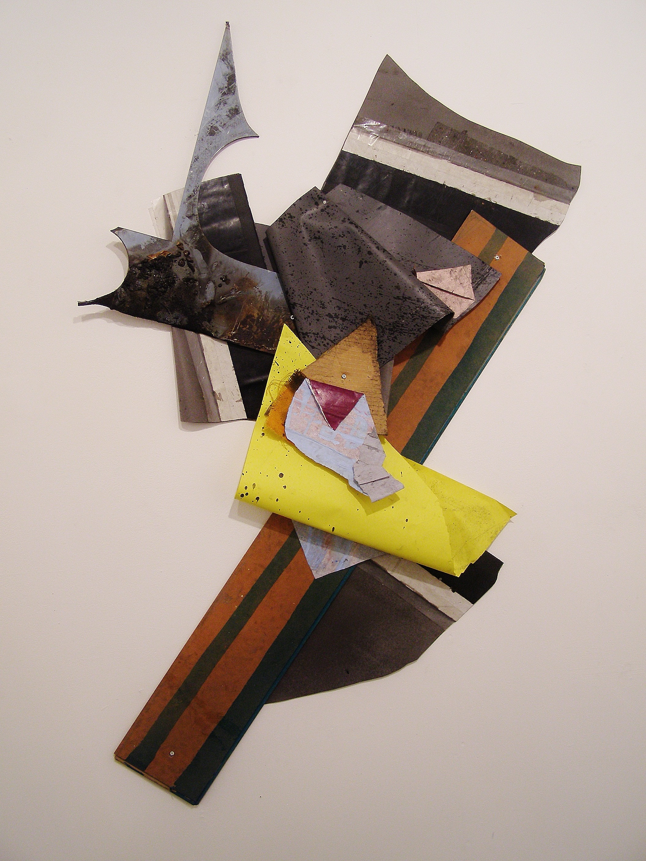
Rumble Strip, 2016. 210cmX160cm. Mixed media shaped collage.
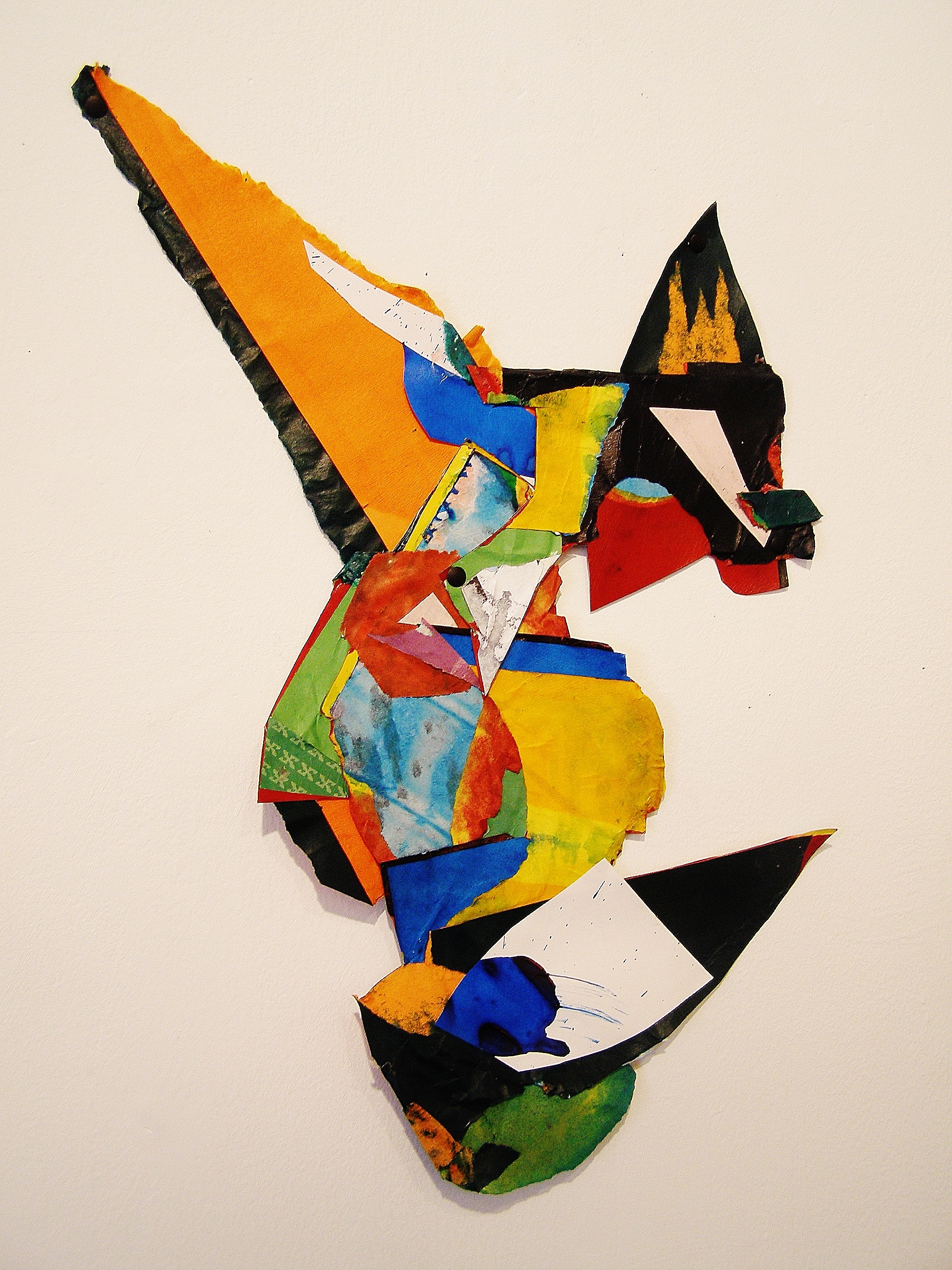
Shibboleth, 2016, 56X44cm, mixed media shaped collage.

Tribe. 2016. 66cmX59cm. Mixed media shaped collage.
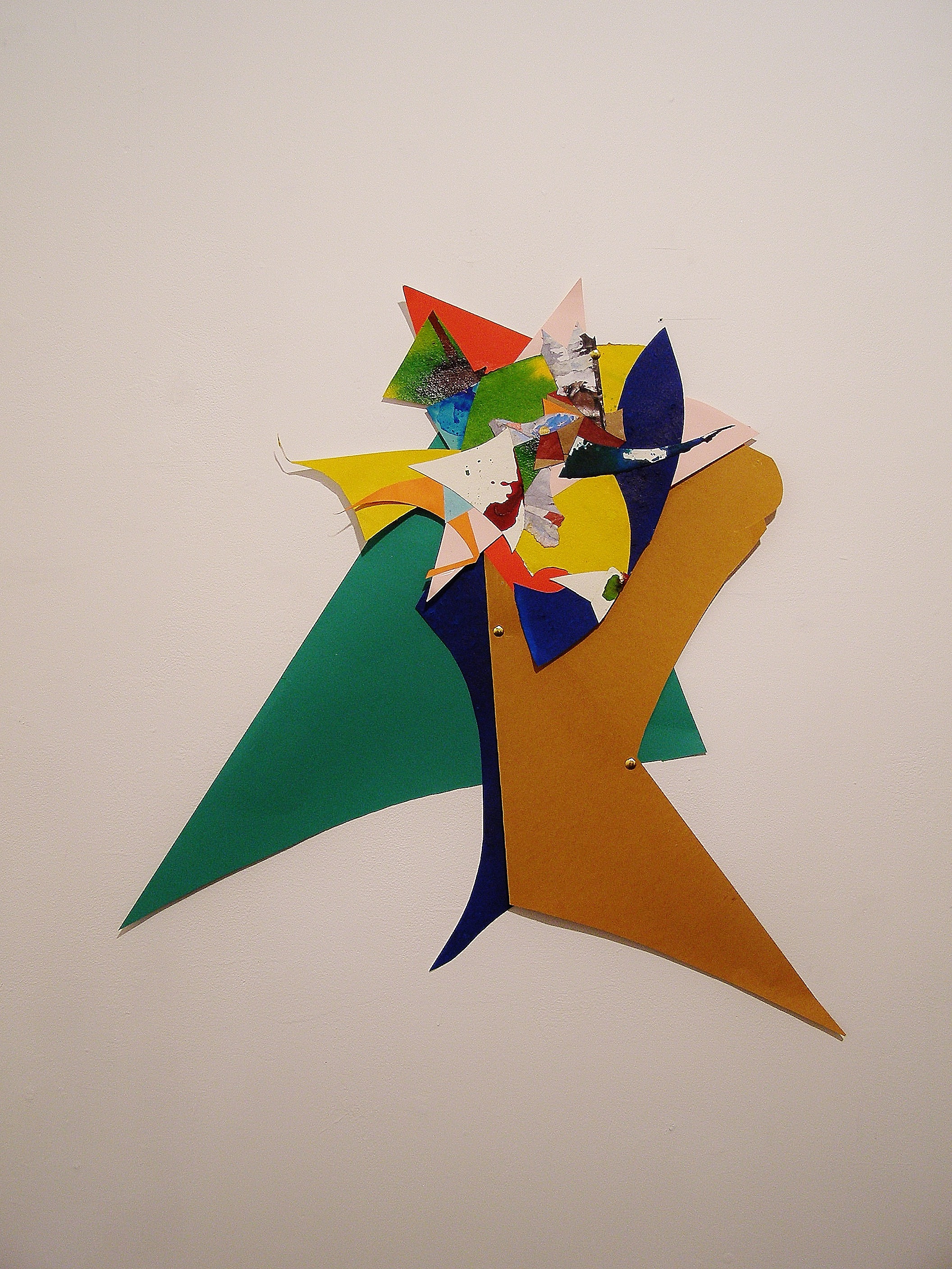
Turncoat, 2016, 78X71cm, mixed media shaped collage.

Whippersnapper, 2016. 30.5cmX38cm. Mixed media collage.

Really good.
LikeLiked by 1 person
“Really good” from me too….both the work and the discussions.
While it may sound obvious to the initiated it is maybe not so obvious how much can be gained from just “dipping” in to any film or transcript from the Brancaster Chronicles.In these discussions about Abstract art NOW, sometimes conclusions are made, but they may change and are reviewed and revisited as we compare the inventions and discoveries all the time..So I just wanted to say that all responses are welcome even if you just “dip in” to what we are up to.
LikeLike
Yes, “dipping” is a good idea. It’s much easier with the recent chronicles: the presentation has improved so much: the films, the sound, etc. It’s also fun to go back and read/watch all the chronicles associated with individual artists—fun/exciting to see the real “progress.” Really an amazing site!
And one day maybe these crazy people will realize that there’s no such thing as Abstract Art—or that all art’s Abstract Art—or something like that. . .
LikeLike
Just to say that not only has the work come up another notch, but so has the level of the discussion, with greater clarity of language provoked by the work itself. What is so striking about Shibboleth is that seen from the oblique angle of some shots it retains its three dimensional integrity, whilst remaining pictorial. And the transparency of the washed colour in some segments gives a added lift. In this one the colour is working plastically at last. You may not like this, but it is as if a cubist still life of the 1940s by Hans Hofmann has been projected into relief.
As to the big one, it clearly works extraversively. It projects into the space of the room, and it’s profiles carve the space of the wall beyond the confines of its overall shape. Congratulations. A big step forward, so long as the projection does not become too literal, as in Stella, for instance.
LikeLiked by 1 person
What I meant to say was that Shibboleth retains the illusion of a coherent three dimensionality even from an oblique angle, whilst remaining in shallow relief. I agree with Hilde about its quality. Between it and the big one is the way to go.
LikeLike
Agreed, really good – work and talk.
In “Shibboleth”, I was on the day hampered from seeing all of its qualities by an unfortunate accidental figurative image I kept seeing in it (I won’t say what and spoil it for others); but having got over that, I now think that the content seems to extend out more to the whole of the shapes – that bit of red on the end of the black point, the black line up the side of the orange, etc. – compared to others, say “Turncoat” especially, where the larger outside shapes are simple flat cut-outs offsetting the more complex parts; and there is anyway less “inside” activity and “outside” shape, with the activity spanning edge-to-edge, as it were, so it seems like the whole thing is more integrated. An interesting development, and seems like a strong move. Less convinced by the argument for “Rumble Strip” because I think the literalness of the spacing off the wall, and the folding of the material, and the found outline, are more to do with materiality than (pictorial) spatiality.
LikeLike
What a great discussion and I am sorry to have missed the real thing. Seeing these for the first time on film but knowing some of Johns previous work, I was struck by the very 3D imagery; the shaped work, in some instances looked as though it was hanging rather than on the wall. I have quite a strong sense of an asymmetrical symmetry, many of the pieces revolve around a central axis which then defines and integrates the negative space. I also have a sense that this ‘symmetry’ alludes to the creation of edges, obvious in the rectangular format but peeking in to the shaped configurations. ‘Rumble strip’ ‘tribe’ and ‘Shibboleth’ all have defining additional lines that reinforce this. Very briefly I remembered Dubuffet outlining his sculptures but John’s are far more considered and carefully defined.
Hilde said that the shaped works bring in the space. I think without the hard edge frame of the board this is freeing up the elements to reach out. I think there is room to explore this further as, in ‘Turncoat’ for example, their reach is just ‘so far’ before you are lured back into the centre using the outer extremities as limiters, which pulls the eye, back in towards all the excitement in the top centre. Sometimes this is induced by the cut form indicating a visual halt like the blue form of ‘Catapult’ or in the top left of ‘Rumble Strip’
I also like the complexity that these pieces take in their stride, they feel in control and very sure of themselves.
LikeLike
I haven’t dipped very far at all as yet (I will try over the weekend), but I read something this morning that sort of chimed with John’s work, or I think it does at least. Its from Roberto Longhi 1950 essay on Piero Della Francesco. There is not a useful comparison to be made between John & Piero – please don’t! – but the passage seemed useful. It describes the Arezzo fresco those subject is the The Battle of the Chosroes.
“We are, in short, at the antipodes from Antonio Pollaiuolo’s famous print, the Battle of Nude men, where everything is in frenzied motion… [by contrast in Piero’s picture] the battle is already “over” at the moment that best represents, on Piero’s stylistic terms, its dynamic culmination. It becomes a sort of coloured anagram, created from the continuous intersection and conjoining go interlocking things: sky, clouds, earth; weapons, coats of arms, human figures. It is, in fact, a sort of “battle under glass”, viewed with a cruel clarity… Piero achieves a clarity of multiplicity… Try saying to yourself: “from top to bottom” or “from bottom to top”; “from left to right” or “right to left”. All these expressions will turn out to have no bearing whatsoever on this polychromed structure, this brightly coloured marquetry, locked in before our gaze like some freshly materialised abstraction. It takes a while to pronounce the name of the things we see [I’m not going to type out the list!]… Ah, but it’s too slow a business, for no verbal repetition can duplicate the instantaneous flash of this single moment of unified multiplicity’.
I think this could be useful in partly describing the clarity that John aims at; and the way this clarity contains diverse structures, which point in different directions, and which often contradict each other, but which have their own individual clarity, that kind of works against, while being contained within the clarity of the overall image. It is generally very difficult – particularly in his small or medium size pieces – to read a single direction in one of his collages. Perhaps we could imagine a typical “action painting” – a de Kooning for e.g. – as being like the Pollaiuolo, in constant flux, with the viewer – and implicitly the artist – bound-up in the action. Whereas John though excited by action, by dynamism, keeps it at a distance, a “battle under glass”. Though I don’t think his clarity is “cruel”!
LikeLike
I’m afraid Paddy O’Scotland agrees with Jock Ireland on that one. They are not particularly abstract, and their figurative connotations are quite humorous, but in a good way. (So Sam was also right when he encouraged this aspect – I.e. To be less censorious about them).
As an inevitable consequence of their geometry, Tribe, for instance has multiple readings, like a ride on Alton Towers – the grey background shape is like an aerial view of a heli-pad or a race course, with the black and gold ribbon taking off to a mid air crash/cluster which spread-Eagles away from an exploding centre. Catapult –again, the upper right hand section offers an aerial view of a room; one is looking down into a corner at some little object, which is casting a shadow onto the grey enclosing wall.
The funniest one is the one on the right of Shibboleth, and has a cartoonish quality, with multiple suggestions – again in a good way – part of its humour.
LikeLike
PS. And it is getting rid of the rectangle that has made all these aspects emerge.
LikeLike
Do you think, Paddy, that all humour is figurative – or could it be both abstract and humorous?
I think both you and Sam (and Jock of course) are wide of the mark. The key here is, go look at the work John was doing 4 years ago, compare with what he is doing now, then draw some sensible conclusions.
LikeLike
Alan Gouk. “And it is getting rid of the rectangle that has made all these aspects emerge”…
Alex says that the extremities are limiters which “pull the eye back towards all the excitement”…
Is it stuff like this which might NOT be Abstract?…leading us back too quickly into the main complexities or visual core…..or is it simply the inability of some of John’s points,surfaces and outer edges to hold the eye long enough to make them part of the whole thing?
In spite of Robin being “hampered ” by an accidental image he did get over it in Shibboieth and that one has not got a central force in it but as he describes it “a spanning edge to edge feel” which was also pointed out by Hilde.
What this debate is highlighting so far is in the work inside the framed rectangle and the work with none similar shortcomings occur.
LikeLike
In the talk, Anne, you get into an interesting bit about “intentionality” (which I take to mean of the work, not the artist), and is it not this that begins to fail at the extremities in some instances (framed or unframed)? At which point, people can then put their own interpretations on it, some of which might be figurative…
LikeLike
This a long running issue and Chronicle wise first appeared in Brancaster Chronicle No.1 where the ends of elements were compared to more flowing elements across 4 sculptures….Dip in .!!!!!!
The other thing that keeps cropping up are odd words which hold a tantalising hope for some way forward . As I remember the word in Chronicle No.1 was “meaning’.
I see a link with “intentionality” and “meaning”. I can also see a link with Sam’s word of this morning “clarity”.
LikeLike
Yes I dipped into the 1st chronicle and came across John Pluthero talking about how our brains perceive things and John Bunker’s good point about the ‘taking away of a set of conventions……………..having to constantly rebuild your relationship’ , in reference to painting, but could apply to abstract collage and sculpture. I feel that John’ s uncontained collages do challenge me to rebuild my relationship with what I am looking at, to see images in a new way.
LikeLike
Having to drop out for health reasons,Ive missed the excitement.As my lap-top wont play the film,Im limited to the images and comments on the Site.All I can say is that from illustration,Johns work has gone into a different realm of acheivement ,only hinted at in past works.I particularly like Rumple Strip ,maybe because of my own taste for its Cubistic diagonals.How terrific to see a quantum leap in Johns work,which is no surprise as he has been critically involved for a while,noticeably at the Hoyland symposium at Chelsea,where his mordant observations made such a nice change from the typically self -promoting younger artists.It would be great to see some financial success for such daring,but wonder where this would come from.Hats off !
LikeLike
119
and her lips didn’t move yet,
it was me churning:
All these flakes, statistically different,
and they don’t melt because
and here George Spencer Brown’s maxim
floated to meet them:
The value of a call made again
is the value of the call.
Especially the unheeded ones.
The call made repeatedly without
quite replicating, that too would be the whole value
of an expansion culled from the call.
To flock, swarm-intelligence of the above
seething through the below—old white-beard again—
swarm-stitches the ant colony through nebulae.
And now it has me surfing under its comb,
a pull-saw huffing kerf and turpentine
down the back of my hand.
Here every severing
has emerged from error
without leaving behind false
generosity to myself.
And then she spoke:
Feed my birds.
That’s a bit of John Peck’s GREAT, new poem, Cantilena. Nice the way it begins with lips and ends with birds, isn’t it, Robin? In a way Cantilena is a collage—350 pages long. There’s an excellent foreword by the young American poet, Nate Klug. One sentence from the foreword seems to me to have something to say not just about John Peck’s poem, but about all the Brancaster artists’ “Abstract Art.” “But for a poem so invested in performing and revealing what it senses, physicality remains crucial.”
LikeLike
Watching and reading all of this has made me look back at the works Geoff Hands wrote about on Abcrit. Looking at works like “Old Roan” after looking at the ones here made for quite a startling contrast. I feel now that Robin’s assessment of “Old Roan” on Abcrit then was on the money, that John could either lose the grey part on the right that is off-setting the details on the left, or that the right hand side ought to have more of what is happening on the left. I didn’t mind that right-hand side so much a few months back, but I think that this new work has changed my way of viewing it, which is great. The “extremities” of these newer works, whilst still having some issues I think, are in any case so much more a part of the rest of the work than they are in Old Roan, whose extremities I would describe as the large grey area and the letters “a.c”. This doesn’t mean that there isn’t some great stuff going on in that larger grey part, but maybe it is one of those “tasty bits” that have to be sacrificed along the way. Perhaps why it looks so jarring to me now is that it is a sort of big square box sitting at a right angle, that looks almost separate to the rest, as if they are two works hung too close together. Whereas in the works here, even one like “Turncoat”, I feel less thrown out by the larger flatter extending shapes. This could be to do with colours or shapes relating to or echoing smaller parts in the collage, and so they lead you back in again whereas in Old Roan the grey box is a bit distracting. There could also very well be a correlation between the occurrence of accidental figurative imagery and the presence of larger outside shapes, because the continuous outlines of the shapes offer more leeway for mentally constructing a basic image, like in a rorschach test.
I would like to see how these shaped works would look if the outer reaches were made up of the same level of detail and invention that takes place further towards the centre. Similarly, if John scales up, it might require extending out with all the little details rather than upsizing the parts and losing some of that finesse.
Finally I’d just like to say that I’m really impressed with this work. It seems to just keep moving on at a remarkable pace, so that the new works keep forcing you to re-evaluate the older ones.
LikeLiked by 1 person
The reason it’s necessary to paint the historical background is because the whole postmodern debacle depends on cultivating an amnesia about the past; instead just pick-and-mixing with ironic pastiche or parody, but without engaging, heaven forfend, the ideals and principles which fired the modernist imagination in the first place.
Begin to engage fundamentals instead of stylish play, and you’re back with modernism, like it or not. “Abolish history” and what you’re left with is the new extension to Tate Modern and its new hanging policy.
Whether you’re a Frank Lloyd Wright fan, a Corb enthusiast, or a Miesian, you are onto the concept of plastic and spatial principle generating form, (or integral motivic generation as in music) …. Painting and sculpture in their oh so different ways engaging the same issues from a different angle, the former via planar organisation on a flat surface, the latter generating form in 3D space directly. …. That is why collage is problematic, in-between, — suggesting 3D possibilities, but unable to create them except by suggestion and in shallow relief.
Caro, for instance did not, I am sure, begin to consider his 60’s sculptures to be in the cubist lineage until at least 1972 , when he embarked on the Straight-cut series, which is based on a cubist still life by Hofmann he had seen at Waddington’s. And Michael Fried cautioned him at the time against pursuing it. It was only really with William Rubin’s essay in his MMANY catalogue that Caro began to think of himself as an inheritor of the cubist line, with consequences that we now know.
Why do you think Caro and the New Generation sculptors were more likely to cite Matisse’s paper cut-outs as an inspiration than cubist collage? — because they were able to take the spatial leap of imagination that the Matisses offered, rather than the well worn permutations of cubism. That was a very European response. See Tim Scott’s Quinquerime, Quantic of Giza and Bird in Arras IIII .
The obsession with cubism is an American fixation, in which Greenberg shared, until startled out of it by developments in the paintings of Still, Rothko, and Newman.
LikeLike
The reason Shibboleth too, the most coherent piece, has a representational connotation is that it’s volumetric implication is supported by the distribution of dark and light areas. The pointed yellow area top left is thickened out by the black trim which acts as a shaded dip into depth and strengthens the form at the same time.
Similarly the sliver of red at the edge of the green area centre left, and the effect of the black areas generally, and the White pointed accents tip the planes in and out. The transparent washed areas, with their finely drawn and cut edges, act as highlights on the concave surface of the yellow to green illusioned “volume” , the drawn and cut edges of which add to the sculpturesque coherence of the whole, which is rather like a trophy cup or Claret jug, and it even has a handle and the rounded green base. So it may be predominantly “pictorial” , but it has strong three dimensional potential, or implication.
LikeLike
PS. That I want to compare Shibboleth with Hofmanns of 1947 is a major compliment in my book, if that doesn’t sound too haughty. Sorry if it does. What taking out the rectangle of the picture plane has done is to force John to clarify the relationship of the various planes, whereas Hofmann is “freer” to suggest a dynamic movement between them . See Solstice, Abstraction B , Moloch , or Shifting Planes, all from 1947 .
LikeLiked by 1 person
If the Brancaster discussion had been an art college crit, I would have encouraged young Bunker to leave the rectangular compositions behind (either for now – or to continue as a parallel project, possibly in print) and to continue to develop the ‘shaped’ collages into sculptural territory. Is John a closet sculptor? I would also have a discussion about the associative and figurative readings of the collages that too quickly suggest animal forms (e.g. ‘Shibboleth’).
Oh, and ‘Turncoat’ gets better every time I look at it. The green, blue and ochre(?) shapes contrast in harmony with the busier area above.
LikeLike
That’s a bit condescending, Geoff. You and Alan (and Sam and Jock) need to get over these figurative connotations and associations with stuff from the past, and start to see the things that are pointing forwards, not backwards. See his work as a challenge, and stop trying to mute it. In any event, he may well be doing better than you. I will state again that I think nobody has done collage quite like John is doing it, and it’s very exciting. And my guess is that it’s originality and spatiality has no bearing on sculpture, but is essentially pictorial.
I don’t think, Alan, that anyone on Brancaster is cultivating amnesia about the history of abstract art, but there is something happening in John’s work, and the work of others in Brancaster, and in the discussions, that is (to borrow from John and Emyr’s recent show title) “twisting” not “sticking”. In John’s case specifically he’s raising the stakes by taking different approaches, some with more, some with less overtly three-dimensional content; some with more, some with less “imagery”. These issues come with the territory. There is little point in trying to fix John’s approach – or, in Sam’s case, nail his sensibility – to any kind of art-historical mast, because it can and will change, and should be encouraged to change, rather than be pegged back by historical precedence.
Take note of Harry’s comment: “It seems to just keep moving on at a remarkable pace, so that the new works keep forcing you to re-evaluate the older ones.” That’s the spirit.
LikeLike
I was not trying to be condescending at all – but I am open to personal criticism. The problem with written comments/statements (this is my defensive bit) is that they appear fixed and are limited by the communicative skills of the writer. With John’s work (which I greatly admire) I experience the shaped pieces as painting-like and sculpture-like. Perhaps I am having problems with collage as a medium independent of painting, sculpture and printmaking? The point about the ‘tutorial’ situation is that a student would be challenged to defend their position and to disagree with the tutor. These discussions are ideally open-ended and provoke further thought and action. It was just an example – and not intended to claim that John is no more developed than an undergraduate.
I get your point about the figurative connotations – I just can’t help myself. And, yes, John is doing better than me!
LikeLike
I knew what you meant!
LikeLiked by 1 person
“He may well be doing better than you” . Put up an image of my recent Mandalaysian Orchid and say that again. Better in what respect?
LikeLike
No way. Bring it to London. Do Brancaster.
LikeLike
I have to say, it would be great if Alan Gouk did Brancaster!
LikeLike
Robin –That’s not good enough. You can’t make a comment like that without giving your readers a chance to assess its validity. I repeat, better in what respect?
LikeLike
The initial part of my comment was addressed more to Geoff’s little lecture than to your work. I said “he may well be doing better” – and even you in your mistaken hubris must allow for that possibility. In what respect? In respect of NOT being so tied to a linear and hierarchical view of abstract art; and believing it’s all up for grabs; and having a more open agenda; of making progressive moves, etc… And, damn it, his work might just be better than anyone’s…
But you should stop this now. I can’t possibly comment on a specific painting of yours that I haven’t seen, or ask our “readers” to do likewise. You of all people can’t believe we can make any progress on this, on the internet. I’m very pleased to see you commenting on this site, and your analyses are interesting, but it already stretches the limits of credibility when you start contextualising work that you haven’t seen.
LikeLike
What’s the matter — need reinforcements. You won’t put up Mandalaysian Orchid because you know you can’t substantiate your absurd claim. John B. And I are not in competition for any prizes worth having outside of the febrile imagination of the Johann Cruyff of art promotion(see comment on abcrit).
Furthermore, everything I have commented both on abcrit and here was an attempt to be helpful, honest and accurate about John’s work. I have not tried to “mute” it, inhibit or hold it back in any way, and for you to say so is outrageous, but no more so than your attempt to pit us against one another in this absurd way.
LikeLike
As for the slurs in your last comment — ” linear and hierarchical” and “more open agenda” – I’m afraid you are delusional and offensively wrong on both counts.
LikeLike
John is brilliant at putting together intricate and contrasting content into exciting configurations. He is also ambitious and a great experimenter. Being ‘free’ from traditional physical boundaries is one of his exciting challenges, so just some questions: What meaningful part are the outlying flatter, larger areas playing in these works? The large orange triangle in ‘Shibboleth’, the grey area on the right hand side of ‘Tribe’, the three large flat pieces in ‘Turncoat’, perhaps the grey triangular area on the right of ‘King Lud’?
For me, they are the problem areas of each of those works, although the orange point in ‘Shibboleth’ is less of a distraction. I think John could replace these areas quickly and easily by other large areas of content which would do the same job – activate the ‘content’? Whereas it tends to take time to create coherent complex content (which is selfishly what I want more of). I’m raising questions of ambition and achievement here, although I acknowledge that for John creating meaningful complexity may be the easier part and so he may be focusing on other goals; e.g. how best to explore the boundaries of the work and the three dimensional issue?
For me the question becomes how to make the plainer, larger areas active and exciting (in their own right as well as relationally) or whether to create more complex content out to the edges? Indeed why not have flatter simpler areas in the central part and the complex content to the edges, which rarely seems to happen?
Looking briefly at John’s facebook page I spotted ‘Crepuscule’ which may work all over in a slightly better way than most of the Brancaster work (except Shibboleth). Having said all this I thoroughly enjoyed looking at the work, it really is good, and look forward to where it may go.
LikeLike
One interesting thing about Crepuscule – from the photo at least – is that it has implied negative space inside itself… Is that a possible future direction and a different way of approaching the problem of relating inside and outside?
LikeLike
Can you explain a bit more – which parts are the implied negative space?
LikeLike
On reflection Robin, this latest attempt to paint me as a reactionary figure, and yourselves, and “others” on Brancaster as “progressives” is a delusion and a slur too far. So I am joining Sam on the up for transfer bench. Put up or shut up! Over and out.
LikeLike
Does “reactionary” (in the context of making new art and being aware of the past achievements of fine artists) simply acknowledge that awareness of the history of art is an inheritance to conjoin with the journey into the future? I visited the ‘In The Age of Giorgione’ exhibition at the RA yesterday and was blown away by Bellini and (early) Titian. I have something intangible to take back into the painting studio with me. I am preparing my review now for CFA…
LikeLike
I agree strongly with Robin that they – the shaped works – are not sculptural; but I don’t think – less certainly – that they are “essentially pictorial”. Does this mean they are at their essence pictorial; or that they get at the essence of what a picture is? Neither sits well with me. When Robin hesitated in the video, I wanted to say, ‘image’. But not sure that is quite right. Image-object?? Are they like – and I acknowledge this is a bit out-there – portrait miniatures in that their image qualities are tied to their object qualities?
LikeLike
I think I use that word “pictorial” very casually, to mean that the spatiality is 2-D with implications of 3-D. I intend it as complimentary.
Here is Crepescule: https://www.facebook.com/359264537519986/photos/a.360564807389959.1073741827.359264537519986/894340444012390/?type=3&theater
Could you say more about the “negative” parts?
LikeLike
Yes, realise it was meant positively. I don’t think it’s negative or completely wrong – just perhaps it doesn’t go far enough. I think the square ones also have 2-D with 3-D implications – as do the the off-square ones, but they also seem to do something else, to which ‘pictorial’ doesn’t completely apply. I should have said ‘part’ – just the white card under the deep blue. it got me thinking. Could John makes off-square collages with holes in? Like a garland; or which didn’t cluster, but instead snaked across the wall?
LikeLike
Re: “But I do keep coming back to “Shibboleth”; it’s something else, isn’t it? I mean more than a collage?”
The condition of music?
LikeLike
Well, as I said in the talk, there was one in the last library show – “Geist”, I think, but John could confirm – that did have an actual hole left inside of it, through to the wall. And the left hand of “Old Roan” I would describe as snaking out across the wall, with something of a return. All good ideas to try more of, perhaps… My problem with “Crepescule” is that all that good activity across the middle seems to have little bearing upon what comprises the strongly dominant semi-symmetrical outside shape.
But I do keep coming back to “Shibboleth”; it’s something else, isn’t it? I mean more than a collage? It’s such a complete thing, and once you start to get that, the figurative stuff fades away. It challenges my ideas about what some of the other collages are doing, and why I thought they were good. Actually, I think to get the thing to go beyond collage in some way, like perhaps this one does, is a really exciting thing. But where quite that ends up, I don’t know!
LikeLiked by 1 person
I’ve only got the photos to go on, so this may be missing the point, but you can make any number of chromatically and spatially fascinating pictures by paring down sections of these collages (including bits of background) to a rectangle (most smartphones will do it).
I think this speaks for the exceptional quality of the work, but maybe also for the possibility that their excitingness isn’t necessarily bound up with the irregular outlines.
LikeLike
A few more thoughts about “Shibboleth” and related matters…
Tony Smart was talking to me the day before John B’s Brancaster session about how he thought collage had played itself out in all sorts of detrimental ways in the recent history of visual art, suggesting a direct succession from Braque sticking his bus ticket onto a painting, through a whole raft of arbitrary and untransformed stuff – including Caro – right up to the surrealisms and literalisms of contemporary art. It’s a tribute to Tony that his theories don’t in the least prevent him from really loving John’s work. That’s important, and I’ll come back to it shortly.
My own long-term reservations about collage, which I expressed to John a long time ago, have always been to do with its limitations and lack of mutability. Once you have assembled your material, no matter how diverse, and stuck it all together, further changes are limited. I’m not saying you can’t do anything, but you can’t change the colour of your bus ticket, or extend the shape of your sanding disc – as you might wish to do for imperative visual reasons once they are seen all assembled – without great difficulty, and without questioning the whole basis of collage itself. If you are going to repaint your bus ticket, why bother with it.
The advantages of collage, on the other hand, John has made abundantly clear in his work – you get a fantastic variety of shape and colour and texture which, in the early stages of the work at least, can be put into play in all sorts of ways that are MORE flexible than painting, and which would be very hard to invent or replicate in paint. No doubt those properties have contributed something to art. I guess I have tended to think that in the final reckoning (whatever that is) the disadvantages would just about outweigh those advantages. This theory hasn’t prevented me loving John’s work either.
But a work like “Shibboleth” suggests the possibility of getting beyond such limitations. The nature of this particular collage, which appears to comprise of quite a few parts that are made or painted by the artist, and that are fully integrated, and contribute to a complete and whole thing (whilst retaining their variety and differences) suggests that it would indeed allow for that further degree of mutability – if it was required. So maybe the limitations are off. If so, I think the “shape or rectangle” debate maybe just falls by the wayside…?
……………………………….
A footnote to my little spat with Alan: I apologize, not so much to Alan, but to the other members of Brancaster, for allowing that to happen. I was very pleased to see Alan starting to contribute comments, since he has been privately scathing of the whole ethos of Brancaster and vowed never to take part, either live or online. I always thought that was a shame, because I hold him in high regard as a painter and a writer. I hope he will return. My modest chiding of his position has caused him to go off the deep end, but I stand by my comments, which are by no means as offensive as Alan makes out. To explain the ethos of Brancaster is a work in progress, but one aspect of it is to discover that little bit of originality that is (hopefully!) in everyone’s work, and to encourage and build upon it, and think about what’s different about it, and where it might go. This is a lesson I’ve learnt from Brancaster, and something that Tony, amongst others, does so well. As noted above, he doesn’t let theory or art history get in the way of seeing a good thing. That attitude is challenging and refreshing.
There are many places for art-historical contextualising and theorising (Abcrit’s a good one) but perhaps Brancaster is not the place for saying over and again that the work is “a bit like this” or “derived from that” or “fits into this particular linear history”. It doesn’t mean we have amnesia, just that we are differently-focussed. That sort of comment is especially difficult to take from people who have not seen the work. Jock, for example, amusing though he can be, is notorious for relating the Brancaster work to all sorts of art-historical precedence. It takes the focus off the work.
So it’s a bit jarring to hear about Caro and Cubism and Greenberg, and the linking of John’s new work to Hofmann’s painting from the Forties. Surely any connection there is superficial. Or this: “…. Painting and sculpture in their oh so different ways engaging the same issues from a different angle, the former via planar organisation on a flat surface…” Does it, indeed? Is that it? Well, Alan’s does, and good luck to him. But I have an Anne Smart painting on my wall from two years ago that has absolutely no planar content to speak of. It’s an excellent painting. Things are not quite so sorted, perhaps…
LikeLiked by 2 people
Although – as I think I’ve said before – I find Alan’s sense of history far too monolithic and restrictive, I also don’t think it is reasonable to invoke ‘newness’ or ‘twisting’ whilst suggesting others should stop talking about the links to the past. Unless the point is polemic or PR you can’t have one without the other. It would be more reasonable to drop all claims to progress and talk purely formally.
LikeLiked by 1 person
I’ve been looking at Shibboleth a bit more. I agree that with the general consensus that it is the most fully resolved piece (based on the jpeg). But I have a vague feeling that the richer colour space might be as much a trap for John as a path to follow toward liberation. I can’t quite see his use of found material as a means to an end, which gives him something formal and which just needs to be integrated; but rather which prevents him getting bogged down in the idea that art is about integration or about wholeness.
LikeLiked by 1 person
Always the contrarian. 🙂
LikeLike
A Cubist aesthetic?
LikeLike
Liberation is very much a two-edged sword. Complete freedom goes along with complete arbitrariness. If there are no traces of problems solved and resistances overcome – decisions made, signs of human endeavour – what is left to be worth our attention in an artwork?
Of course, we are all at perfect liberty to choose our own constraints (choose the formal visual achievements we are looking for), and maybe John is on his way to establishing a new set of conventions for his work. Maybe he will find a comparably rich and productive and humanly expressive set of replacement conventions for the ones (conventional shape, spatiality combined with an integrated surface) that you are exhorting him to leave behind. He evidently has an impressive mastery of the conventions he is sticking to – colour harmony and compositional balance spring to mind. The interesting part would be to hear (or divine) what he is looking for (consciously or unconsciously) beyond these two.
Sorry John, this sounds like a criticism of your work, which would be fully unjustified, since I have never seen it live. You are braver and more progressive than I am and I wish you every success. What I want to criticize is the idea that freedom is an unmitigated benefit in art. The important freedom is the inner freedom to make purely visual decisions (hard enough), not the freedom from tried and trusted conventions.
LikeLike
To that pile of weasel words I’ll say this as my last contribution to anything that you have control over — I chaired the forums at St Martins for over twenty years, so I am well familiar with the positives of this kind of gathering. I am old enough to have been your teacher, which, come to think of it is what I was, although it took you a long time to catch on and catch up. You are quite wrong once again and a gross invasion of privacy, in which you excell, to say that I have been privately scathing. I have only said –don’t put them up on the Internet, where they are wide open to the charge of a clique massaging itself – everything to be gained from such an exchange can be had directly by the participants, without the self promotional aspect which is endangering the whole thing. But then there wouldn’t be any point, would there.
I am glad to see that you are coming around to agree on Shibboleth with the things I said about it days ago, and Hilde said at the time. Haven’t you noticed yet how totally planar they are, and all the better for it. I repeat, the planar nature of painting cannot be escaped by diffuse handling. It will come back to bite you. Take a good look at your own recent efforts in painting. As to the weaselling out by claiming that you were referring to Geoff Hands and not me, you have been building up to this sleight that “he could be doing better than you” and “others” on Brancaster too, for some time, and trying to portray me as stuck in the past without any evidence at all. I challenge you to put up an image of Mandalaysian Orchid and say in what way John B. Or anyone else on Brancaster is “doing better.”
Where were Messrs Pollard, Williams, Smart , Bunker and co during the 70s,80s, 90s, or even the noughties when all the really progressive moves were being made in painting , that they should come crawling out of the woodwork now, under the misapprehension that bigging themselves up on the Internet equates to having a career. (I’m exempting Hilde and Patrick , they talk the most sense in any case)
It’s hopeless trying to reason with you. You just keep on butting at the same old fence posts. And now you’ve even got others on Brancaster doing it as well. Talking about content when they really mean putting more stuff in — like a chicken has more content when it’s stuffed, or a bald man has more content when he has a hair implant. — so an abstract work has more abstract content when it is stuffed with stuff. Hence the obsession with complexity which is spreading over Brancaster like a plague.
I gave you the example of one of Kandinsky’s very, very complex paintings of around 1917? Or so. All you said was that it was a bad painting. The penny just didn’t drop. Complexity in itself means nothing unless allied to a broad expansive and preferably simple conception which in the case of painting takes account of its planar nature. But you will go on stubbornly trying to prove me wrong, which seems to be the subtext of the whole thing. So, good luck and goodbye from me.
LikeLike
P.S. “They want to be right where others are wrong” (George Braque’s aphorisms) –is avery bad motivation for doing anything in art.
Put up the recent colour photos of Tim Scott’s Song for Chile 2 both views, and ask yourself whether he might be doing better than you!
LikeLike
“Wanting to preserve the linear heirachy out of sheer paranoia is even worse for art and football” (Johan Cruyff’s aphorisms). How’s the transfer market, by the way? Sam Allardyce might be interested in your long-ball game. See you later, dad.
LikeLike
Ill try to keep out of any family feuding as Im a long way off in mind ,stuck with my modernism,and frail body,and far too sensitive to personal insult.What does interest me is the frankly appalling lack of anything visual in the current hang at the Tate Britain,which Alan mentions.There was one room where there was a visual lift ,with one of the Hoylands from the Whitechapel[crimson ground],an early Gillian Ayres,the odd Prunella Clough and Bernard Cohen.Its as tho Culture in the broadest sense collapsed after about 1985.Gilbert and George/Bacon/Kossoff and Auerbach/Bruce Maclean/Lucien Freud are irrevelent.Take in the awfull Peter Blakes and even worse David Hockneys and the lack of visual acuity at any level,especially institutional ,becomes apparent.The curatorial debut of a new face at the top needs to dig a little into the genuine groundswell of creative activety that has characteristed painters and sculptors lives in England over the past 40 years.If I was a young dad taking my kids out for the day on the Bank holiday,Id have concluded there wasnt any decent English Art after the Bomberg in 1914!The Hayward,Serpentine and ICA have all gone the same way.Which makes Robin Greenwoods efforts at Poussin Gallery ,Ab Crit and now Brancaster,agree with them or not ,the only hot news from the street.Where else would Bunker get the going over he deserves?
LikeLiked by 2 people
Well said Parick.
LikeLike
After all that, I notice John is very quiet… I suspect that he will just carry on doing what he does, and who can argue with that?
LikeLike
I just don’t think doing a Brancaster and sticking it on the net is a way of promoting one’s work or is about self promotion Alan. If any of the feedback I’ve got from various members of various London cliques is to be believed, the exact opposite is probably true!
I enjoy the Brancasters because I’d rather explore the limitations of my work with those who will question what I do. I prefer this kind of challenging criticality to being surrounded by well meaning ‘yes’ people at an overheated PV. There are unhealthy aspects to peer pressure that permeates a malnourished painting culture comprised of an endless merry-go-round of large group shows and a skewed ceremonial culture of prizes and awards that has more to do with exclusivity and privilege than it ever did with celebrating raw talent or commitment to art as a questioning driver for change. Whatever the PR and rhetoric they spectacularise the creative impulse and thus alienate us from it. And for the down at heart there is always the repetitive backslapping generated by twitter and facebook. Social media outlets are a great way of letting people know that you are actively engaged in the process of making work. It is a great way of making accessible articles and reviews that would otherwise remain hidden in expensive journals or lay wasting in obscurity. But it is no replacement for a real physical one to one with the artworks themselves and the questions that this engagement might raise. Of course, the irony here for the Brancasters is that we are dealing with a relatively new way of talking about art via the web. For me, it’s all about catching those insights and pearls of wisdom that might be thrown in the most off hand manner from the lips of the most experienced of sculptors or painters, or for that matter, anyone in the heat of the moment, whether in the films or in later online reactions to them. Here, I believe, is one of the big plus points for being involved in the Brancaster Chronicles.
So thanks to all who have taken it upon themselves to articulate their thoughts, criticisms of my work- both negative and positive. I really do appreciate the time and effort expended. For me one of the key points that caught my attention (in the online comments- the film is something else) centred around the conversations about Shibboleth. Robin’s thoughts on what he and many others perceive as the limitations of collage makes it clear why he might be drawn to Shibboleth. It is no surprise to me because it contains hardly any overtly ‘found’ elements in it and works with the kind of colour combinations that are very conventional within a certain strand of abstract painting. This point made by Sam and in some ways answered by Richard is what really summed up a tension I’m trying to work with at the moment.
(Having said all that, I’m also very aware of Tony’s critique of the “literalism” problem with Rumble Strip in the film too.)
Sam said…
“I’ve been looking at Shibboleth a bit more. I agree that with the general consensus that it is the most fully resolved piece (based on the jpeg). But I have a vague feeling that the richer colour space might be as much a trap for John as a path to follow toward liberation. I can’t quite see his use of found material as a means to an end, which gives him something formal and which just needs to be integrated; but rather which prevents him getting bogged down in the idea that art is about integration or about wholeness.”
Richard said….
“Liberation is very much a two-edged sword. Complete freedom goes along with complete arbitrariness. If there are no traces of problems solved and resistances overcome – decisions made, signs of human endeavour – what is left to be worth our attention in an artwork?
Of course, we are all at perfect liberty to choose our own constraints (choose the formal visual achievements we are looking for), and maybe John is on his way to establishing a new set of conventions for his work. Maybe he will find a comparably rich and productive and humanly expressive set of replacement conventions for the ones (conventional shape, spatiality combined with an integrated surface) that you are exhorting him to leave behind. He evidently has an impressive mastery of the conventions he is sticking to – colour harmony and compositional balance spring to mind. The interesting part would be to hear (or divine) what he is looking for (consciously or unconsciously) beyond these two.
Sorry John, this sounds like a criticism of your work, which would be fully unjustified, since I have never seen it live. You are braver and more progressive than I am and I wish you every success. What I want to criticize is the idea that freedom is an unmitigated benefit in art. The important freedom is the inner freedom to make purely visual decisions (hard enough), not the freedom from tried and trusted conventions.”
Well, I don’t have any answers as yet, so I’m off to NY to look at some Hofmanns…. (Thanks for the heads up Alan! I do hope you will continue to comment.)
LikeLiked by 1 person
Having cooled down somewhat (though not entirely) I apologise for rising to Robin’s tactless jibing and allowing my anger to spread to the other Brancastrians. If I am felt to have impugned their motives for talking part,I very much regret it.
With the comments, and only with the comments, it is all too easy for the normal courtesies to slip into adversarial and personal mode, and I regret having fallen into that trap myself. ( One of the perils of the Internet)
To allow things to cool down further, I feel a period of dignified silence is called for, though I can’t help noticing “with wry amusement” that the response to Shibboeth is morphing from “it’s something else, isn’t it” into — Alan likes it, so it must be conventional –“dignified” doesn’t reall suit me after all.
LikeLike
Ill just briefly say I really hope Alan continues to post and would indeed show work in some form[even photos].I find his comments have a wealth of sustained thought and vision.I dont always agree with his perspective,but acknowledge he probably writes more clearly and insightfully about Abstract Painting than anybody else alive today.I learn from that.I also miss Fred Pollocks contribution as ,much as we need new blood,there is nothing like a lifetimes experience in front of a canvas.Robin has started some wonderfull initiatives.They may not change the essentially non -visual bias of the Tate curators.The in-fighting is a by -product of passion ,but if its taken too personally and cause rifts ,the fascists gain ground.There are mountains of prejudice,ignorance to move and Brancaster is a torch of enlightenment.
LikeLike
I’m going to risk sticking my oar in again, because, aside from all the nonsense, there is an interesting argument here about the planar nature of painting (which maybe could run over into Emyr’s talk?). I hope Alan will continue to contribute without thinking that it forms any part of a conspiracy against him – it doesn’t, there isn’t one, not even a conspiracy of one – but the Hofmanns that he brought into the reckoning as precedents to John’s work are undoubtedly based in an abstraction derived from figuration, rather than being out-and-out abstract. I wonder if in fact “planar” painting is almost always a kind of “figurative-type abstraction”. It’s noticeable how, when Alan interprets the planar nature of John’s work, it inevitably ends up being a description of figurative space. I can’t say it was something I was even aware of in John’s work until Alan started (interestingly) talking about it on Abcrit. The (detrimental) figurative connotations that I saw in the work were of a different nature – all about shape/image rather than spatial representation.
Maybe, if you are making “planar” painting, the way to mitigate the perspectival, figuratively spatial effects is to turn all the planes parallel with the picture plane…? I hardly dare ask, but is this where Alan is coming from?
So I don’t agree that John’s work is planar “…and all the better for it.” My complimentary description on Abcrit of what I thought was happening in the left-hand side of “Old Roan” was not based upon planes but on a spatial movement through the material, rather than a depiction of space. I find it hard to explain that better… it might come up again soon at my Brancaster, in which case I can point at things!
And I don’t agree with Sam (and perhaps John B.?) that the strong possibilities and potential of “Shibboleth” are a return to convention. I see new abstract content, complete in itself, shining out untrammelled by any kind of figurative or metaphorical “vehicle” or device. I see nothing, Richard, but good in that.
LikeLike
I would very much like to know more around what Alan Gouk thinks about the planar nature in painting and it’s importance.
When he says ‘ the planar nature of painting cannot be escaped by diffuse handling. It will come back to bite you ‘, does that mean one must always think in terms of planar structures, ( for want of a better word ) when painting?
LikeLike
As to planarity — the plane of the picture is like the surface of a trampoline (pace Darby abannard one Hofmanns rectangles) — it is a datum against which every action bounces or presses into –“impulse and Echo establish two-Dimensionality with an added dimension of creative breathing depth” (Hofmann) Robin seems to think this is advoacting “flatness”.
I have tried to explain this over and over in comments Note on Kinblethmont Aog. 2013, and All this Tomfoolery, Jan.2014 , and just about everywhere.This only applies to painting of course, not to collage. collage is something else for the reasons given by Tony and Robin in Robin’s comment of May 5th.
In all honesty I can say that throughout the process of working on a painting it never occurs to me to ask and never stop to think, whether it has “abstract content”, or planarity, or anything else. It is about impulse and Echo, call and response, surge and undertow, going with the flow, etc. That is why my pictures are so different from one another. Questions in aesthetics, as Barnett Newman said, are to painters what ornithology is to the birds. they are for others to ask. Criticism is a different faculty,however.)
I would hazard that someone for whom “abstract content” is a conscious priority is in some kind of difficulty, especially one whose top fifty painters are all figurative and mostly from the remote past,for whom the 20th century is a wasteland, and apart from Matisse, curiously, and who is yet to name a single sculptor that he likes (apart from Mark Skilton).
It is a preposterous position to be in, and from which to be pronouncing on what would constitute “progressive moves” and “a more open agenda” .
The correct response to a “new” painting is — “Wow! — Look at that! (Or bloody hell!. not, “Does it have abstract content” . That is the response I have always aimed for and flatter myself that I may have occasionally achieved. You can’t do it every time, though. These occasions have to be worked up to. , and as I have said before, not every work needs to be developed in the same way, or have the same degree of complexity imposed on it — a painting has alive of its own. Try to let it come through” (Pollock). For some reason the computer won’t let me correct the typos, sorry.
LikeLiked by 1 person
Thank you, I like the notions of ‘impulse and echo’, ‘surge and undertow’, and I can say I have definitely been ‘Wowed’ by your paintings as seen in your show at The Hamstead School of Art!
LikeLike
Wow. WOW! Of course! I’d forgotten how easy it all is – easy to make, easy to respond to. I’d forgotten how much you hated the fact that we made sculpture difficult for ourselves.
And I couldn’t possibly argue with that great Master of Planar Modern Minimalism and precursor of the NEW NEW, Walter Darby Bannard. “Boing!”
LikeLike
By the way, Emyr has pointed out to me that Alan has a facebook page where you can see his recent work: https://www.facebook.com/Alan-Gouk-791931644253040/
I don’t know why he hasn’t mentioned this himself. Unlike Alan, I very rarely give an opinion or write about stuff I haven’t seen for real, so I couldn’t possibly comment.
LikeLike
I will only comment on a work if I have seen the paint applied stroke by stroke; if that boat has sailed I will content myself with a full-surface lick
LikeLike
Thank you, Robin/Emyr, for the link to Alan’s Facebook page. I too NEVER comment on work that I haven’t seen for real, but WOW!!!
LikeLike
Fb envy…
LikeLike
The Facebook page was set up by my daughter for the benefit of my grandchildren (all brilliant young artists) and extended family. If I had known that it would be accessible to anyone and everyone, I’d have been less keen.Why would I want everyone to have a free look at paintings that haven’t even been exhibited yet.
Having failed to understand how it works, I succumbed, and put up some recent pictures in the mistaken belief that Google might pick up on them (there’s a barrier to that it seems) and add them to the paltry number of images of my work on my google “profile” or whatever it’s called as opposed to the flood of images by Brancastrians and others that feature, since Google doesn’t seem to be able to tell the difference.
If you want a select profile, don’t ever mention anyone, don’t write about anyone, and don’t allow anyone to photograph your work and tweet about it, since their work then comes up too.Tony Smart I notice has had to endure the presence of Tony Gormley, Tony Caro, Tony Cragg, and anyone else whose name is Tony. I know how he must feel. that’s how mad a world it now is.
As to the issue with Robin — it’s as ssimple as this — he’s a Roundhead, I’m a Cavalier, and never the twain shall,meet. The only way to stop the bickering, which must be annoying for others, is for me to back out of any further comment on Brancaster. It is wrong for me to be sniping from the sidelines, so that’s all folks. Enough about me already.
As to abcrit, let’s wait and see what comes up! Goodbye again.
LikeLike
What, again again? Just when we were thinking of renaming it the Goukmeister Chronickles. Serge underpants are the new abstract content…
LikeLike
Is that a promise Alan?
LikeLiked by 1 person
P.S. Apologies to John for gate-crashing his party. It was unintentional.
LikeLike
I’m afraid I got lost half way down this page, but I did want to get back to John’s artworks which I have been very much enjoying on the various wall encounters and on video.
So, some thoughts.
Although I missed these I did catch one similar large piece in this space earlier with Mark’s sculpture and in the Library. There are as ever changes…
I’m not thinking about painting as I was with last years works on boards or in frames, but neither am I fussed about the wall either, it’s gone for me – certainly on video.
Perhaps the pin or fixing screw would bring the wall back, but then I wanted a stake or pike and I get ‘action’ from John’s work we don’t want ‘theatre’ do we?
Depth, projection, bias binding, perimeter and I did think about ‘collage’ history not from cubist ‘image’ but sculpture; Boccioni, yet without his metal stand skewering the house/street/horse/rider nailing it to the tabletop like so many stories – spiked.
Space held or turned from their curves and their central densities, freeing from vertical surface of the wall, independent of picture, a coral edge.
Ricochets – last time if the edge was in or out was a problem, this time not nearly so, because that ‘plane’ has gone.
Coming back into itself, bringing in relationship with sculpture and the floor/ground, interesting that these collages should raise this upon the vertical of the wall even though their state of floating upon the wall suggests to me a limitless space. The kind if space I am familiar with in virtual environment.
Ungrounded.
I can lose the wall with all but the rectangular ones.
In the Reference Library works I remember the sense of perimeter, some even seemed bounded – finding an equivalent in my plate limited sculpture, an area of operations.
But those works did not project out into my space form within that perimeter as these appear to, their whole projected from the wall, but more homogenised – a layer, a peel.
These have escaped.
Ha! The blues are back, but this time not a back ground, now it can be a colour again.
There are spatial illusions here, indeed the contortions of curves seem to allude to ‘things’, but then they are abutted up against something angular – Isometric – if that were not enough they are of course pinned on a wall like the proverbial ducks, but ‘gaping’ or ‘folded’ as though a poster dashed up on the fly by a dissident.
Physical matter.
Really don’t know why so many get stuck with painting/image here, I am really enjoying roving about to and fro in this fluid area John seems to be exploring through collage.
Are they collages or perhaps reliefs?
I don’t get “image” so much as physical objects in this vertical space. It’s a different thing from a lot of the contemporary ‘sculptural’ painting, spaceframes, a photograph object game so tiresomely abundant (it’s not a pipe, John Berger…) because it’s not using ‘image’ – it’s phenomena – stuff on the wall.
I’m rummaging in the bins, couldn’t care less what it was or might be, but what it is.
I wondered what might happen if the larger one stepped a ‘toe’ out onto the floor from the wall?
Doesn’t all picture/relief wish to escape off the wall?
But then thought this totally unnecessary and in fact I could see them on the ceiling, on the floor. I remembered those insecty Calders clinging to walls – moths.
It’s not illusionistic space, but a ‘slab’ of narrower space, a very interesting between space – an interzone.
LikeLiked by 1 person