Brancaster Chronicle No. 36: Hilde Skilton Paintings
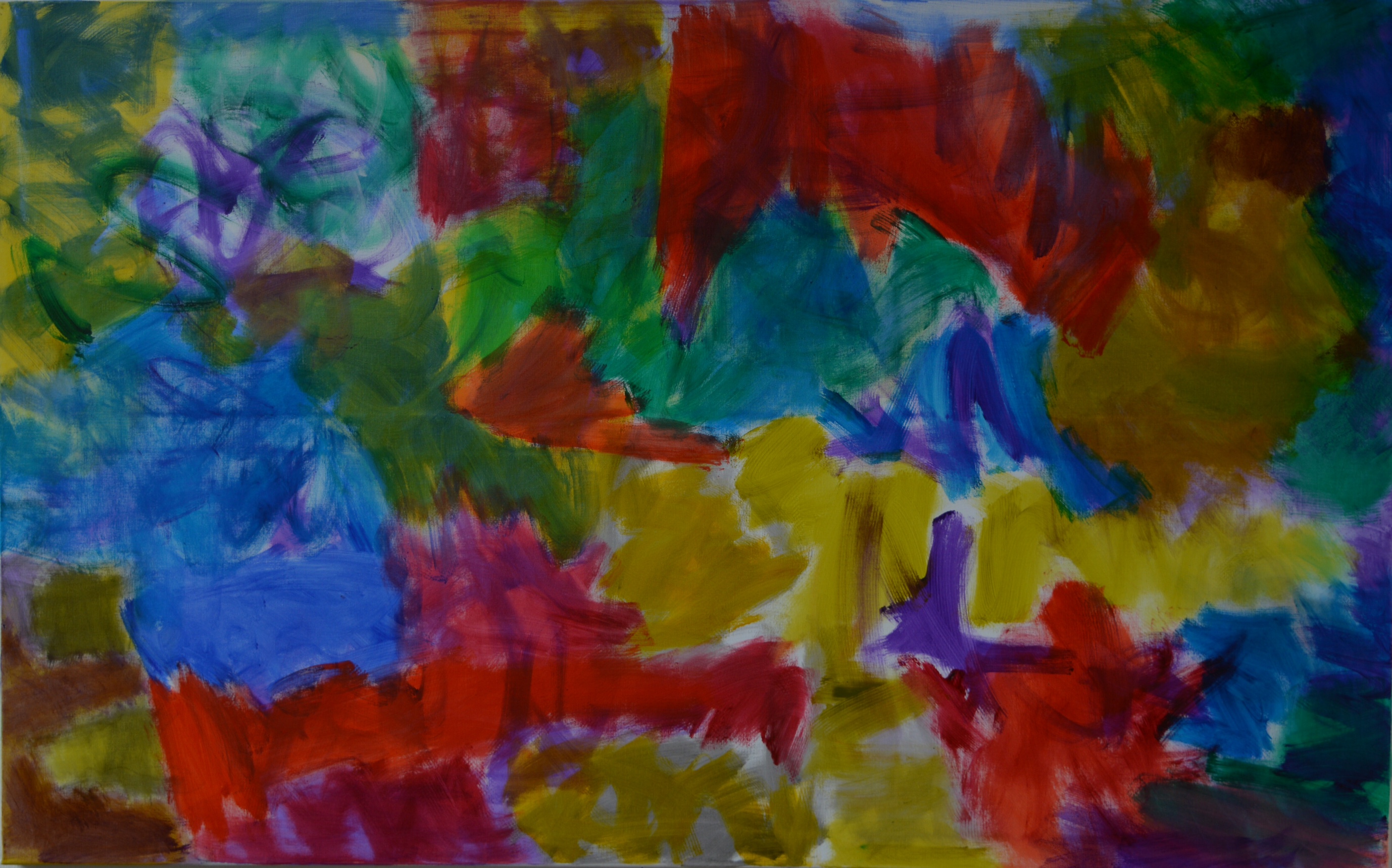
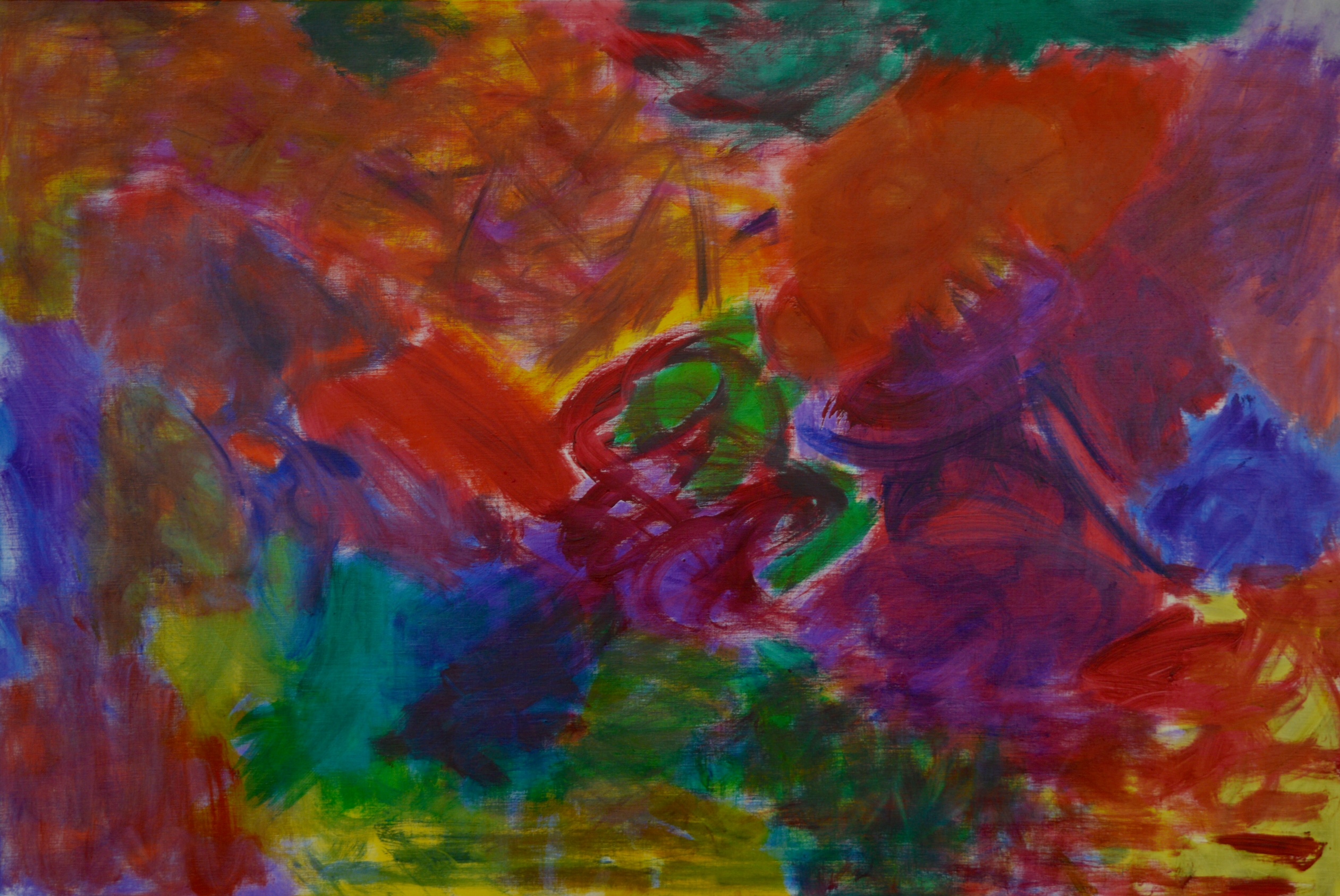
Sarah’s Tears, 2016, oil on canvas, 76x122cm.
9th July 2016, the artist’s studio near Bath.
Those present: Hilde Skilton, Mark Skilton, John Bunker, Anne Smart, Anthony Smart, Alexandra Harley, Nick Moore, Robin Greenwood, Sarah Greenwood, Charley Greenwood, Emyr Williams, Shelley Latham.
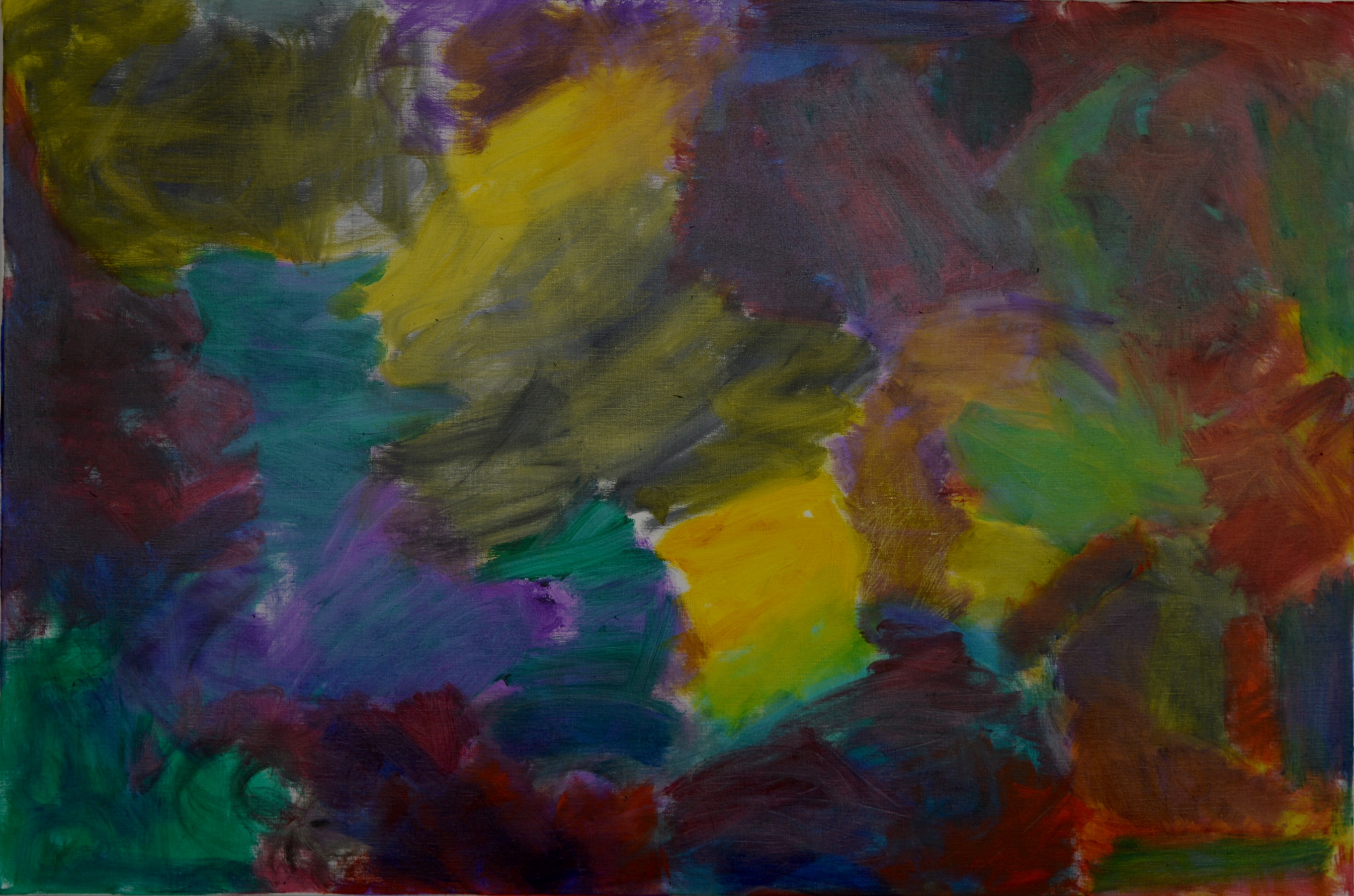
Noisy, 2016, oil on canvas, 92x122cm.
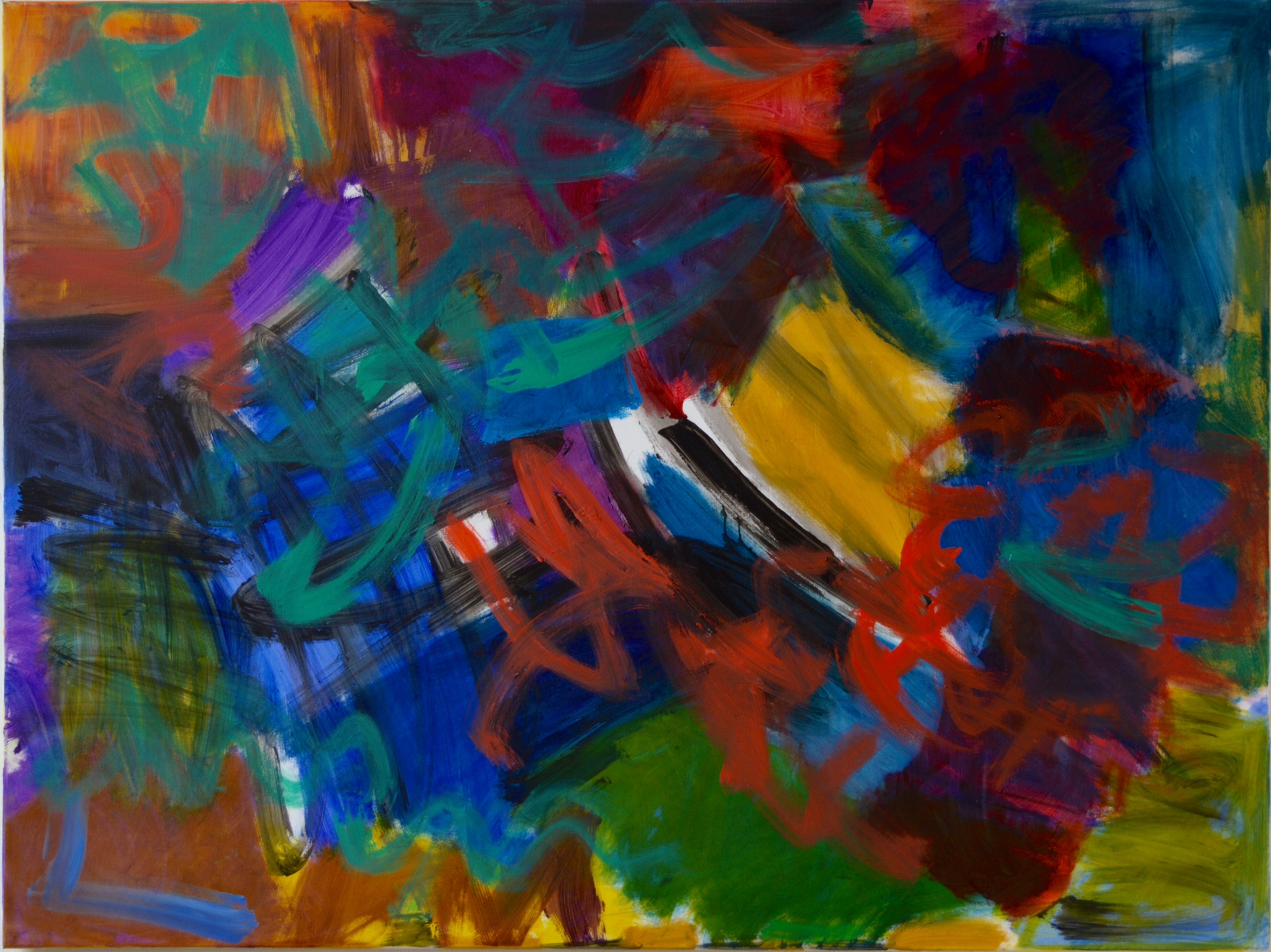
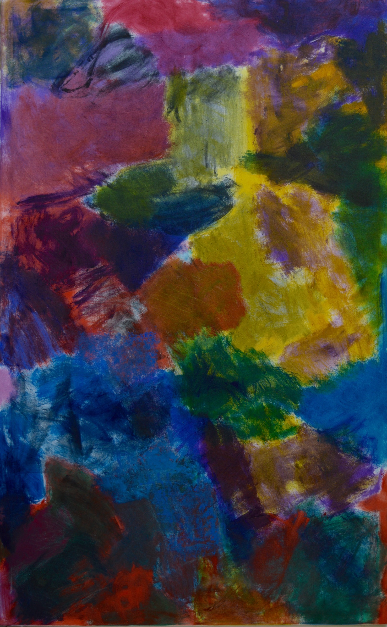
Flash Alex, 2016, oil on canvas, 100x150cm.
Left in the Corner, 2016, oil on canvas, 76x102cm.
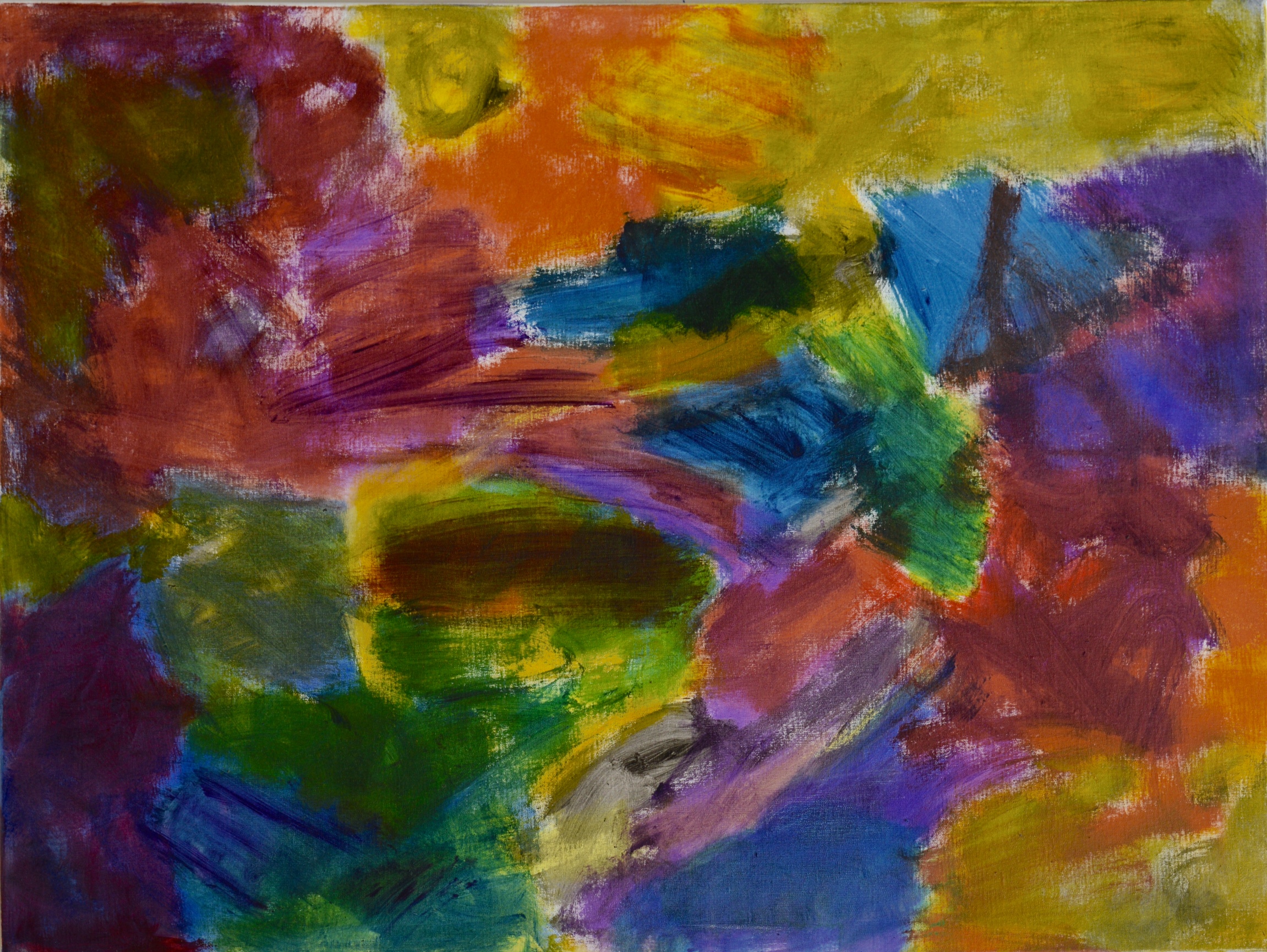
Red Middle, 2016, oil on canvas, 100x150cm.
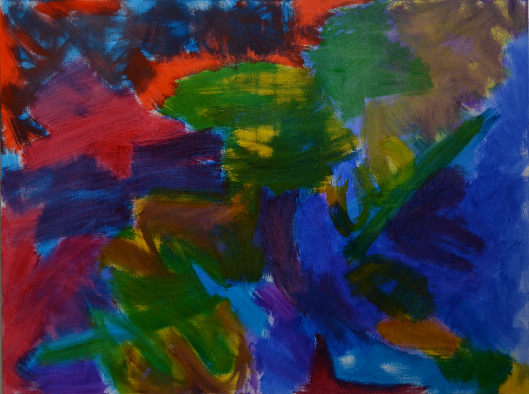
Red Corner, 2016, oil on canvas, 100x150cm.
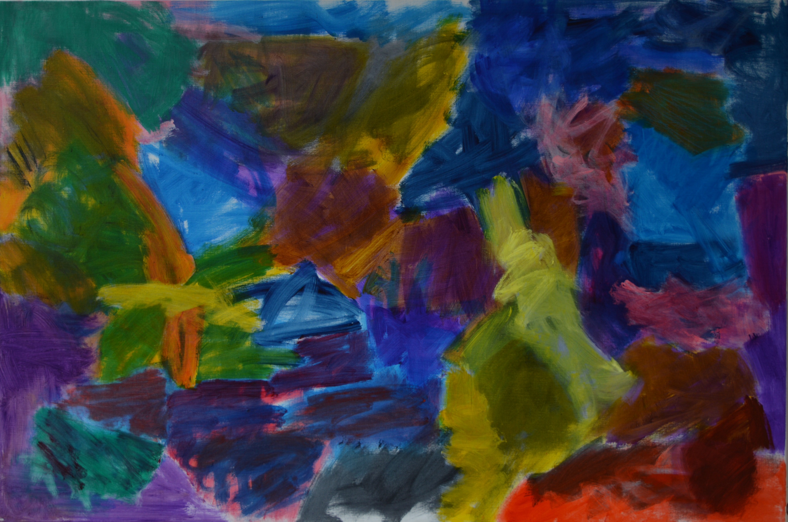
Something Rising, 2016, oil on canvas, 160x100cm.
Olive Oil, 2016, oil on canvas, 76x102cm.
Unknown, 2016, oil on canvas, 100x150cm.

Hilde seems to paint in a completely honest and open way, (the images are very clear when enlarged) everything can be seen and understood without any concealed areas.
There is the excitement of the first flush of paint, as a first layer on the canvas, which I feel Hilde has retained in the finished paintings. It is an important consideration when determining the stopping point. Sometimes it is all too easy to keep going and adding more and more paint and then losing the essence and original impetus.
These paintings have a strong delicacy , a contradiction, but I agree with Emyr about the watercolour quality. It is exciting to use a material such as thick oil paint (if that is what it is?), thinly but with great density and intensity as was stated in the screening.
I agree with a lot of the points made and I was initially drawn to ‘Noisy’ but then moved on to ‘Sarah’s Tears’ and ‘Flash Alex’. I really enjoy the gentle blending and overlaying of the colour into the form.
Sorry to have missed this but look forward to seeing the work in the group show.
LikeLike
A highlight of Brancaster for me.
I don’t feel they are like watercolours – I’m not an expert, but I don’t think watercolour looks like this or behaves like this. It doesn’t integrate the layers (too limited a word) like this. I think the look of these paintings is very original. Looking at them again here, I’m struck by how freely-moving some of the mark-making (also too limited a word) is.
One thing that I tried to say rather badly on the film is that the patches (also too limited a word) of colour respond to each other (almost but not quite) physically rather than optically; and so the edges/margins merge and blend and bleed and disappear (to reappear); and the space becomes both particular and mobile.
LikeLike
The watercolour quality was referring to the translucent handling , a good thing here. Oil paint is much richer and more malleable and Hilde uses it really well.
LikeLike
The translucent effect from the white ground showing through the paint is undoubtedly in play, but is perhaps over-emphasised on screen. The work is, to me, decidedly “oil on canvas”, with all of the “body” and “built” qualities that that implies, though without the excesses of either thick, gratuitous, impenetrable paintwork, or the opposite of “staining” into the weave.
LikeLike
Yes, it’s not really fair of me to judge the quality of these paintings on screen, even though I have seen Hilde’s work in the past. Apart from that are you suggesting thick paint is gratuitous and impenetrable?
LikeLike
Didn’t mean that because I have seen Hilde’s work in the past I know what these paintings look like. Past works do look like oil on canvas.
LikeLike
Fair point – no I’m not suggesting that ALL thick paint is gratuitous and impenetrable. Your comment has made me think more about what I do mean. For a start, it’s very good to see a new way of handling oil paint, which, as I have said, I think is original. But I think it is more than that – if you are painting with opaque planes and hard edges, it will possibly tend towards a spatial “push-pull” thing, like Hofmann. The space in these paintings is very different from that, and indeed, very different to Hilde’s own work from two or three years ago. The space here is more fluid and plastic, much less about floating planes, and I think that achievement is closely linked to how the paint is used, and how the whole painting is thought about. So, although how the paint is used IS critical, the materiality of the paint is never felt to be impinging upon the content of the work, but is always at its service.
LikeLike
I really like your reply especially your last sentence which has a very crucial point Robin, could one apply that to steel or whatever other material, and sculpture also? I think sometimes there can be a problem with materials ‘impinging upon the content ‘. The notion of materials being at the service of content seems sound.
LikeLiked by 1 person
Not to make too big a thing out of this, or to comment on the relative achievements, but by chance Emyr has just posted some of his watercolours from 2012 on Twitter, and the different feel of them from Hilde’s work is very apparent to me – floating, unintegrated layers which, paradoxically, have more of a kinship with Hilde’s more thickly painted work from 2013. https://pbs.twimg.com/media/Cn4eOFFWcAEcrLQ.jpg
LikeLike
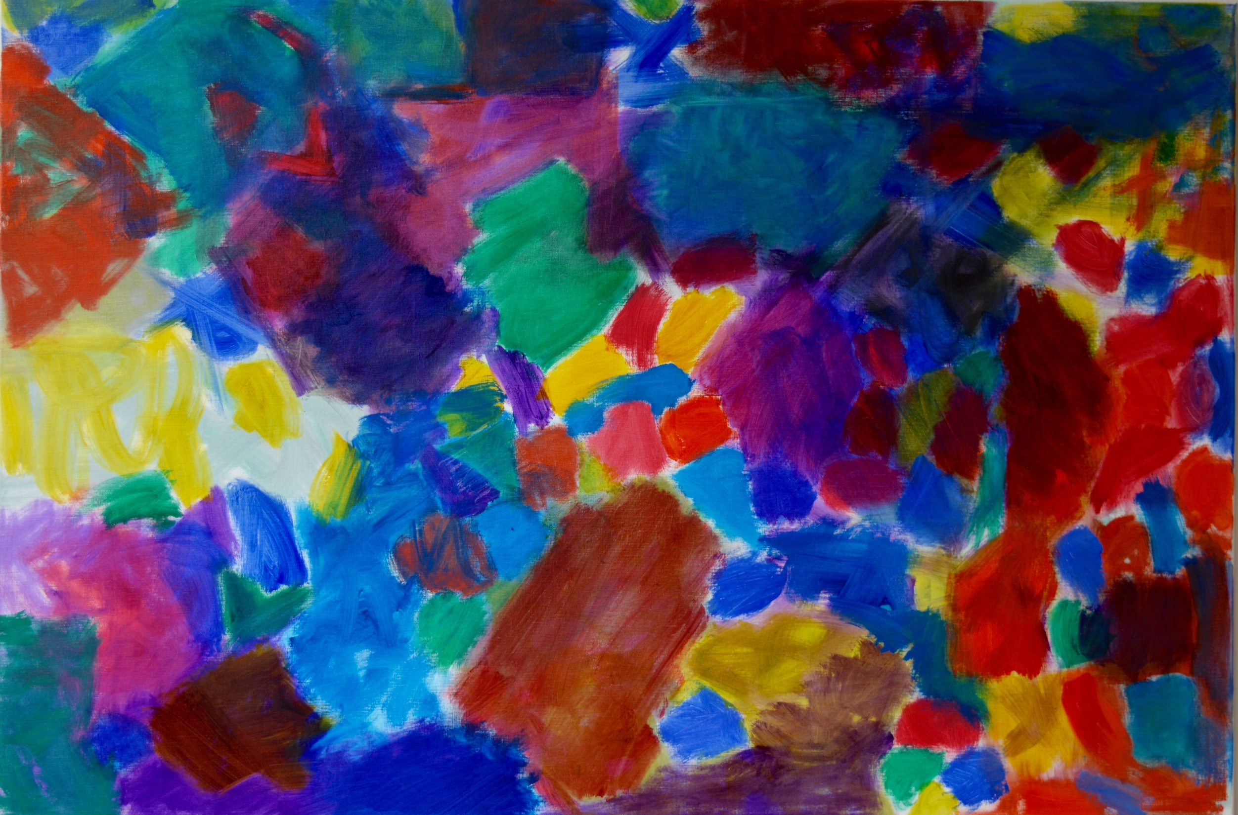
I’ve only seen the photos but I’d like to say something about the light in these pictures. It seems to me that there is a subdued but very consistent light in “Sarah’s Tears” (from behind), in “Flash Alex” (from the front) and in “Unknown” (rather interestingly from in front AND behind). With the others I am not so sure. “Red Corner” seems almost consistent, but I have difficulties with the top left corner, which appears to be backlighted in contrast to the rest.
“Something Rising” and “Noisy” both seem very confusing in this respect.
Does it matter? Is consistent lighting figurative?
Of course these effects may only be there on the screen.
LikeLike
1. A terrific Degas show just closed at MoMA in New York. It was called “Strange New Beauty.” No doubt the marketing department came up with the title. Still I can’t help but associate the title with Hilde’s new work.
2. The show was mostly about Degas’s monotypes. The monotypes helped Degas break with “old-fashioned” ways of doing things, and become “modern.” He dropped his pencil, used a dish rag instead. He worked in “darkness”—he forgot about order, embraced chaos. That’s the story.
3. I think there’s some “Degas” in Hilde’s work, some of this kind of “break-down.”
4. I’ve never seen any of Hilde’s paintings “live”—but I have enjoyed all her Brancasters: looked through them all again over the weekend. I don’t see a huge change/“break” in the work in the current Brancaster. The “break-down” thing seems to be a kind of driving force in all her Brancaster work.
5. There is something “negative” about the “break-down” thing. It’s about something “loose,” something NOT “familiar,” NOT “composed.” In one of the Brancasters Hilde talks about FAILING to make an Alan Gouk painting. Note: I think Patrick is absolutely right to insist on “positive” things happening in Hilde’s work at the same time—“beautiful” things getting “built.”
6. I’m not trying to say some of Hilde’s paintings are better than others—that this direction is better than that.
7. I’m making a more “theoretical” comment I guess—though I am NOT a “theoretical” guy. I’m thinking more about the comment Tony made about Mark’s work about putting things into a work. Obviously you do put things into a work—but that’s not all you do. You take things out too. Obviously.
8. Hilde takes things out. In a way she kind of deliberately doesn’t put things in: she just “lets things happen.” What’s interesting to me is that what’s left is NOT emptiness, NOT nothing: what’s “left” is a whole, giant, rich “world.”
9. I think maybe not long ago/maybe still today in New York (wherever that is) Hilde’s work would be dismissed—mostly because it’s a woman’s work—but I bet people would also talk about how there are no “ideas” in her paintings: there’s no “critical” dimension to the work. She just makes pretty pictures with pretty colors.
10. It’s nice that Charley Peters’s piece on the Mary Heilmann show went up at Abcrit the other day. I don’t want to get into a big thing about whose work is better—but Mary certainly has “ideas.” Do they help? Do they get in the way? And it does, it seems to me, help to think about whose work is memorable, whose forgettable.
11. In one of the Brancasters Robin mentions a spirit of enquiry in Hilde’s work. I’d like to suggest something grander. I think Hilde’s paintings are “about”/engage fully with the “idea” of the freedom of the human spirit.
12. I’m afraid what I’ve written is kind of nonsensical. Why on earth have I numbered the paragraphs? I’m really just trying to say what Mark said when he was talking about trying to make something that’s more than just a pile of steel—and that the “more” thing is intangible/immaterial. Maybe T. S. Eliot was getting at the same thing when he talked about poets having to have “personalities” before they go about erasing their “personalities.” Maybe Hilde and John Ashbery have a lot in common—crazy senses of humor for one thing. . .
LikeLike