Brancaster Chronicle No. 47: Hilde Skilton Paintings

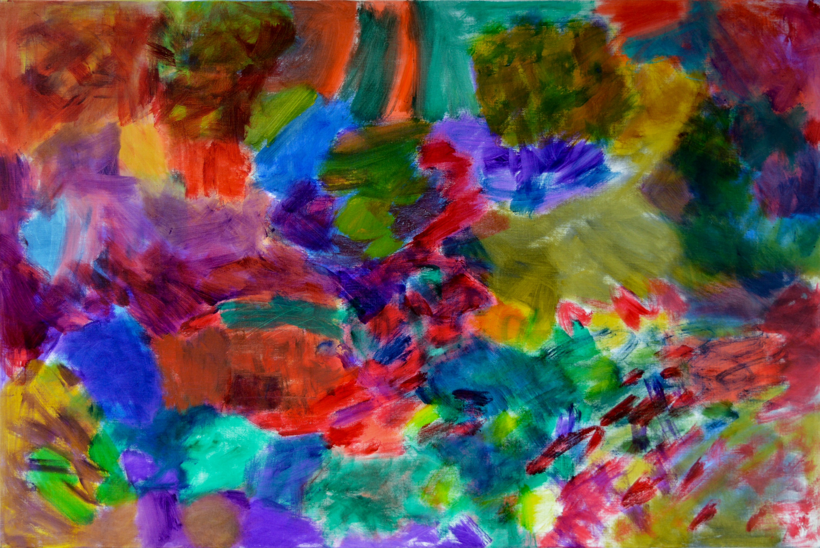
“Chameleon Colour”, 2017, oil on canvas. 100x150cm
15th July 2017, the artist’s studio near Bath.
Taking part: Anne Smart, Anthony Smart, John Pollard, Alexandra Harley, Robin Greenwood, Sarah Greenwood, Hilde Skilton, Mark Skilton, Noela James, Shelley Latham.

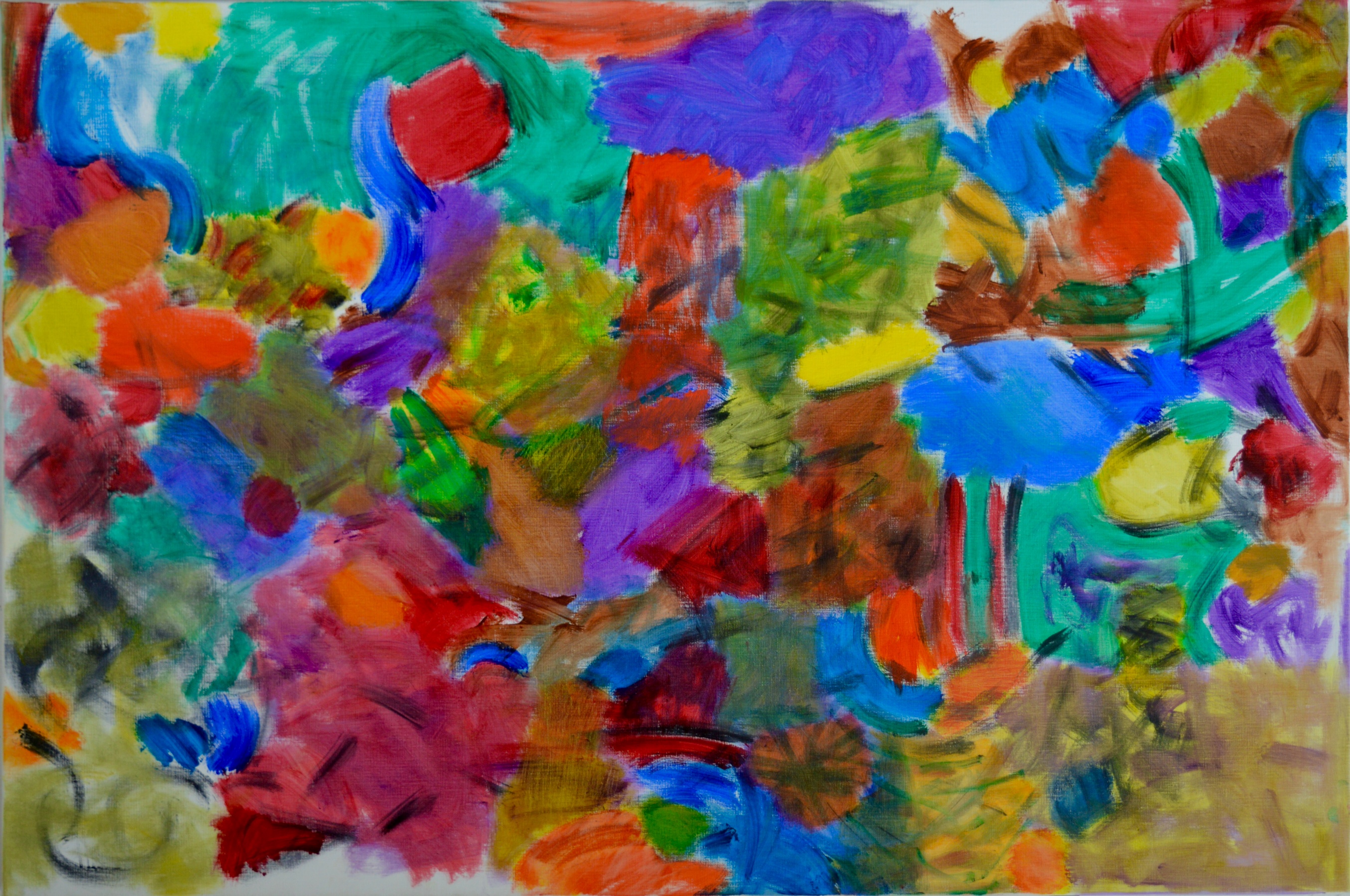
“Jacaranda Journey”, 2017, oil on canvas. 100x150cm

“Dark Green Fritillary”, 2016-17, oil on canvas, 100x150cm

“Little and Large”, 2016-17, oil on canvas, 100x150cm
“Worked Out”, 2016-17, oil on canvas, 100x150cm
“Agitator”, 2017, oil on canvas, 100x150cm

“Vertical Venture”, 2016-17, oil on canvas, 150x100cm
“Porcupine in Places”, 2016-17, oil on canvas, 100x150cm

Hilde’s Brancaster last weekend was outstanding.
I would like to suggest to anyone who is about to watch the film to spend an extra few minutes and look back at the images of her other paintings on previous Brancasters
I just did it and noted that whilst her other paintings are definitely working with what we term ‘good’ colour the new ones jump out ,even on screen, with a vibrancy and brilliance which would be difficult to match !!! There is much to be gained for this level of persistence and invention for herself and for us.
Thank you Hilde.
LikeLiked by 1 person
What aspects have made progress?
All-colour,density,space,movement,complexity.edges; the whole within the rectangle of the canvas.
Look at work from previous chronicles and all of these elements are there. Conscious changes were made after observations by Alan Gouk, Peter Hoida and all of the Brancaster participants. Alan Gouk said, that if the canvas was so smooth then the paint should stay thin. Pete Hoida pointed out the chalky nature that white had on colour. Changes also happened through discovery as the paintings were arrived at, some better than others but always a journey of discovery.
LikeLike
So what is good colour?
Colour structures the painting,creating space and movement; providing the means of getting through and understanding the whole thing. Hilde’s paintings create multifaceted spaces; spaces within spaces. The basic push and pull which has been the benchmark of abstract painting for the last forty years, has been expanded into a more complex, subtle, multiplex of spaces, which is starting to approach the kind of space that we can find in a Poussin for example.
For many years we have been aware that abstract painting has been unable to approach the kind of complexity and richness that we can find in representational painting. Hilde might have just knocked a hole through that barrier.
LikeLike
In my opinion, the big achievement of these paintings lies not in the colour – that is more subtly modulated and thoughtful than ever, though I don’t think it is particularly original – but in the inventive breakdown of the framing rectangle, which we have seen develop through the past three years in particular. These paintings, at their best, are almost completely free of compositional conceit and conventional structuring, whilst still being fully differentiated (i.e. decidedly not “all-over”) between different areas. And these areas are more and more integrated by transitions and variety of handling into a coherent whole that is in itself a new and original invention. They have a freewheeling quality that is ENTIRELY original! They are a big step forward from five years ago, even if I don’t think they yet have the complex unity of Poussin! Do we even want to compare our work to the figurative past? Well, yes, I do, as I’ve said before, but I thought I was ploughing a lone furrow in pursuit of that.
And good though this work is, the thing that still nags me about abstract painting – not just Hilde’s, by any means – is its lack of capacity for deep space, and the variety and tension of “near and far”, of three-dimensions resolved in two, which seems so critical to the more ambitious expressions of figurative painting. The space in these paintings, though wonderfully fluid, remains resolutely shallow. It’s a conundrum perhaps on a par with sculpture’s problems with gravity. And I think it will take some weird left-field move by someone to get past that, because I genuinely see it as a limitation of abstract painting. Maybe the lack of freedom in this direction will be compensated for by a freedom taken elsewhere, of a kind that figurative painting can’t partake in. No doubt this is a speculation too far.
LikeLike
Perhaps the illusion of deep space and also light could be challenges worth exploring for abstract painters. The challenge would be to maintain abstract credibility and continue a practice of ‘discovery’ while painting, rather than just manipulation.
LikeLike
The flatness of the colour planes,in Hilde’s earlier work,created such a strong surface, and sure enough when you get another colour plane alongside a shallow planar shift occurs. The way that Hilde builds colour now is not flat, there is depth within each colour, furthermore the transitions between each colour area are not clear cut, creating an illusion of deep space which is not a representational deep space but an abstract one.
LikeLike
Much as I like Hilde’s new work, you would have to point to somewhere where that is happening to convince me on the “deep space” thing. I don’t think they have that kind of tension in them. They have lots of great qualities, but I don’t see that – yet. It will be interesting to continue this when Noela’s work goes up in a few weeks time, because her work had for me, for better or worse, a much more violent sense of spatial shift.
LikeLike
Maybe we should post Noela’s next? What do you think? They are such different paintings from Hilde’s (though both are very good) that it might be interesting to talk about the differences.
LikeLike
Be better than talking about sheep, anyway.
LikeLiked by 1 person
First, I want to echo Anne’s words: “Thank you, Hilde.” I can’t really say why—or what it is I “learn”—but I feel I “learn” a lot looking at Hilde’s work. There’s nothing “teach-y”/preachy about Hilde’s work. She just seems to be doing something everybody should be doing—though I don’t really know what that is.
When I look at “Chameleon Colour,” I see a shy little sheep in the upper right-hand corner. I’m delighted the sheep seems to be looking at the deepest point in space: that spot behind the blue green mountain up and left of center, just to the right of the blue green gray tree with purple foliage. There’s a large orange purple bird upper left looking over at the sheep. Mark Skilton (under that tree: gray head, blue green t-shirt, blue jeans) seems to be leading a blue horse (to Mark’s right) and a bunch of children (to Mark’s left) out of the painting to the left, lower left. There’s a distressed blue green gray bird peeking out from behind the tree on the right under the sheep. (Is she watching Mark leave?) There’s a child with yellow hair climbing that tree.
I’m not joking, not trying to annoy anybody. All this activity happens “underneath” the color. I can imagine Hilde’s not even being aware of it. I’m not that interested in what it might “mean.” My only point is: it’s captivating—for me.
Hilde’s got a funny name. Sounds German to me. Makes me think Franz Marc MUST have been her grandfather. And Hegel her great-great-grandfather. Is it this “continental” connection that allows Hilde to make paintings that are so much more than just paint on canvas, paintings that are somehow “spiritual”?
What I’m calling “spiritual” might be dismissed as sentimental. Maybe Hilde’s dog-faced caterpillars are closer to Disney cartoons than to Gorky’s “insects.” Maybe that’s not bad. Franz Marc certainly wasn’t the greatest painter who ever lived, but the noble, complex “spirit” of his work—and Kandinsky’s—was, in some ways, at the heart of 20th century abstraction. Certainly, it was at the beginning of 20th century abstraction.
It is the great strength of the Brancaster Chronicles to emphasize the abstract dimension of painting and sculpture—but that can be a weakness too. Everybody knows there’s more to painting than just “good color”—or even “good colour.” In the course of “advancing”/making “progress,” things get forgotten. That’s fine. After a while, forgotten things are recovered. It’s wonderful to see a rabatement—that vertical division running through the blue green tree with purple foliage and the figure (Mark Skilton?) marching to the left under the tree, the division that breaks a square out of the rectangle of the whole canvas—in Hilde’s “Chameleon Colour.” Is a rabatement a compositional conceit, a conventional structure? Or is it part of Hilde’s “inventive breakdown of the framing rectangle”?
Last week Balanchine’s “Jewels” was performed in New York by 3 different companies celebrating the 50th anniversary of its premier. I didn’t see any of the performances. I’ve never seen a painting of Hilde’s “live.” Good scholar that I am, I want to connect Balanchine’s work with Hilde’s. There’s the color; there’s the rush of dancers across the stage/canvas. And then there’s this from Alastair Macaulay’s review in the NY Times:
“Nobody worked harder than Balanchine to establish plotless pure-dance choreography as theatrically engrossing. He was also, in several works, ballet’s greatest dramatist — there is no contradiction here, for drama pervades his non-narrative work. “Jewels,” often described as the first full-length abstract ballet, yields more rewards if you see it as containing multiple stories, situations and worlds.”
LikeLike
Representational art is fundamentally about what you know. Abstract art is about what you see. By interpreting abstract art as a story or images you are merely applying what you already know to something that you cannot see. Furthermore this distorts what you are looking at in to a compositional architecture which is not there.
LikeLike
On the day 12 months ago in Hilde’s studio “Sarah’s Tears” was seen by all present to be a breakthrough painting.And yes, Hilde’s whole exhibition this year was thought to be a move forward from “Sarah’s Tears” punching a hole and opening out the surface to create greater transparency and depth.
Now..after the event and recovering from being with the paintings we have a chance to speculate. How far can this go?
All of us have a take on this issue. Yes I think it would be good to bring Noella’s paintings into the equation….any comparison of the painters would be beneficial. But this is not just about deep space and how we deal with it.
I think it should be about everything.
In seeking the ABSTRACT is it not the case that we are teased and tantalised by premature successes? In Hilde’s paintings here we see her fabulous grasp and control of her own colour but maybe that achievement gives the opportunity for other key issues to fall away and allows ,in this case a figurative interpretation.[ tenuous though Jock’s Poussin pun is ]
Keeping all of the balls in the air at once could be an ambition that may achieve more ABSTRACT totality.
For me, when we all agreed how strong Hilde’s painting were it consolidated some the potential of all that is out there in the future.
LikeLike
Yes, but don’t forget Jock can read figuration into absolutely everything, and he does it on purpose. Personally, I think his interpretations are to be ignored.
I disagree with Mark’s definition of the distinction between abstract and figutative art. It seems to cast a slur on figurative art, as if it cannot be inventive and fully visual. But there is something in that argument too which may be relevant.
If there is consensus, I’ll post Noela’s film next. How about following that with yours, Anne?
LikeLike
Maybe it would be helpful, Anne, to say what all the balls are…?
LikeLike
Robin.
I for one would not like to see Noella next and then me…I don’t see a situation which needs to structure comparisons so quickly ….I think putting the films out as they are filmed respects the differences ..but am open to other views.
Everyones balls are different but I don’t mind sharing mine
Today my balls ,which are very difficult to keep up, would be…in no particular order…
A visual freedom gained by combinations of understanding through investigation of space both deep and flat,illusionary and real, form, colour, surface, texture, relationships, non relationships, movement,fluidity, scale, tension, intention, rhythm, dynamics, pause, detail, accidental specificity, light, deliberation, truth, accessibility, transparency, translucency, lack of hesitation, spontaneity, control, speculation,irrationality, rationality and so on …but that’s just today and I have only myself to convince and throw them all up.
I sense in my commitment to ABSTRACT painting that I would not choose to look to figurative painting for any content and meaning………..whatever the achievements of abstract art turn out to be they will surely be different to figuration?
LikeLike
That’s a lot of balls (!)
Let’s see if anyone else wants to change the running order… hello, anyone there…
Not sure what you mean by “I would not choose to look to figurative painting for any content and meaning”. Who would?
By the way, I’d like to stress the fact that Jock’s crazy interpretation should in no way be seen as a criticism or shortcoming of Hilde’s painting.
LikeLike
Gosh, just picked up on all this, I am perfectly happy to go next but I feel it is up to Mark to say.
LikeLike
I am happy to go along with whatever keeps the ball rolling.
My comment on representational art was not intended to be a slur of figurative painting, but as a comment on the representational content of figurative painting, which also; in the best of it; has an abstract component which makes it so much more interesting and successful as painting.
My motivation in commenting on Hilde’s paintings, stems largely from how we look at abstract art. I feel that we still have a tendency to look at abstract work with figurative expectations, which condition us on what to look for and what to not look for. Our vision often ends up getting stuck with the actual paint on the actual surface, instead of getting into the fullness of the abstract illusion, which is not a figurative one.
I think that much has been achieved in recent years clarifying our understanding of what is abstract, but our largely historical bias prevents us from appreciating it.
In this respect I think a look at Noela’s and Anne’s work might be beneficial.
LikeLike
I agree with a lot of what you have said.
In general however I am still trying to understand ‘seeing space’ in abstract painting.
LikeLike
Thinking more about Hilde’s work I feel some of the paintings, ‘Vertical Venture’, ‘Agitator’ and ‘Worked Out’ have a frontal space, whereas the others seem to have an aerial space, ‘Chameleon Colour’ has both in my view. I am not absolutely sure why this happens, it’s not necessarily to do with the marks laid on the surface because ‘Porcupine and Places’ has those yet still feels to me to have an aerial space, is that abstract space? Is deep space frontal?
LikeLike
Just a few more words about Hilde’s sheep. How does she compare with Marc’s horses and cows, pigs and deer? I know very little about Marc’s work, but I think it’s fair to say a Marc horse is clearly a horse—much more clearly a horse than Hilde’s sheep is a sheep. Still, I’ve never seen a horse as blue—or yellow—as some of the horses in Marc’s paintings. Marc’s animals are more “spirits”/feelings/emotions than actual animals—more about feelings of exaltation or desolation, about being at home in the universe or not being at home. Hilde’s sheep is shy, a little embarrassed about being a sheep. Still, she’s very serious. There’s nothing whimsical about her—no bad Chagall to her—even though she’s standing on top of a tree. Serious, but uncertain about her place in Hilde’s stormy/Romantic universe/painting. Is she a sheep or a color—or two or three colors? I certainly don’t know. I’m not looking for an answer from Hilde or Mark or Robin or Anne or Harry. I’m just reporting what I—and what I think we all—can see.
I’m certainly not trying to suggest Hilde is somehow “a figurative painter”—whatever that might mean to whomever. I kind of do want to suggest that this figurative/abstract thing isn’t as interesting in front of Hilde’s paintings as what I might call the German/English thing: Germans are in touch with their feelings; the English simply have no feelings. Of course, there’s no such thing as “a German” or “an English person.” Just as there’s no such thing as “abstract art.” “Abstract art” is an abstraction! And we’re all a mix of German and English “blood” and one or two other things. Everyone’s balls are different, as Anne says. Still—without rushing to a new Chronicle—when we look at a painting of “German” Hilde’s, do we not all see “spirit”? When we look at one of “English” Robin’s sculptures, do we not all see “matter”—very powerful, very abstract forms, (powerful because they’re abstract forms), but forms that kind of battle against the release of “spirit”?
LikeLike
So a rational and considered conversation between intelligent people about some of the mutual but very specific issues of abstract painting is out, then? Shame, because we have had over the past year or two exactly that for abstract sculpture and it’s been rather good, and as far as I am concerned, very helpful.
Very dissapointing. I’ll post Mark next.
LikeLike
I am sure an intelligent discussion about abstract painting can still happen and it would be very helpful .Perhaps you might be right to post the painters in a row because that could highlight different approaches more clearly.
LikeLike
Ps it was probably my ‘English’ (according to Jock) penchant for queuing that I was concerned about, in relation to Mark going next.
LikeLike
Flippin’ heck…..where did that come from ?
LikeLike
Hey…..my “flippin’ heck” comment is not in response to Noella but to Robin’s disappointment !…which I still do not understand
LikeLike
Anne,
Well, it comes from a frustration with the non-comments of some of the painters, combined with Jock’s persistent irrelevance, but also an impatience with your unhelpful list of 30 balls. It’s impossible to talk about everything at once.
At your recent talk there was a lot of discussion about light in abstract painting which I thought, along with others, was very confused. Noela has in the past suggested that light is a “topic” for abstract painting that might in some way compensate for lack of deep space. I hope we can get into that issue in these comments when your talk is posted, but that will be quite a few weeks away if we stick to the order of fliming.
Mark’s recent and thoughtful comment has clarified a disagreement I had with his earlier statement. I would still want to challenge his big assertion (and yours) that Hilde has punched a big hole in abstract painting, putting it on a par with Poussin (that was Mark, not you), and that her paintings have deep space. Let’s be specific: all of them? Where?
Just as I think it is easy and often wrong to generalise about a group of work on the day of the talk (though we all do it), I think it is unhelpful to smear across all the issues in these comments.
Any more thoughts then on order of posting? Mark agrees that Noela and Anne next would be helpful, Anne disagrees, Noela doesn’t mind…
LikeLike
Sorry Noela, I missed your earlier comment tucked away in the feed:
“Thinking more about Hilde’s work I feel some of the paintings, ‘Vertical Venture’, ‘Agitator’ and ‘Worked Out’ have a frontal space, whereas the others seem to have an aerial space, ‘Chameleon Colour’ has both in my view. I am not absolutely sure why this happens, it’s not necessarily to do with the marks laid on the surface because ‘Porcupine and Places’ has those yet still feels to me to have an aerial space, is that abstract space? Is deep space frontal?”
Good questions. Do you mean by aerial space like looking down on a landscape from above?
LikeLike
Yes, some of the paintings seem to make me look at them as if from above, not necessarily as landscape, and the space feels spread across the canvas rather than through and into it. Just wondering if deep space could be from above looking down, or frontal and looking into? And which would be more Abstract?
LikeLike
I found this on my computer yesterday:
The Moderate
Frost’s space is deeper than Poliakoff’s and not as deep as that of Soulages.
Patrick Heron, in Arts
‘Soulages’s space is deep and wide –
Beware!’ they said. ‘Beware,’ they cried,
‘The yawning gap, the black abyss
That closes with a dreadful hiss!
‘That shallow space by Poliakoff,’
They added, ‘is a wretched trough.
It wrinkles, splinters, shreds, and fades;
It wouldn’t hold the Jack of Spades.’
‘But where?’ I asked, bewildered, lost,
‘Go seek,’ they said, ‘the space of Frost;
It’s not too bonny, not too braw –
The nicest space you ever saw.’
I harked, and heard, and here I live,
Delighted to be relative.
John Updike
LikeLike
Noela, do you think Hilde’s work does have deep space? In areas, or the whole thing?
“Abstract space” has been mentioned a few times. Meaning?
LikeLike
Noella…
yes I wonder that too but am not sure which would be more abstract I think they are both open to figurative interpretations ..looking down from above may feel like being in a plane seeing the world below and frontally could have problems with the elements being displayed like a wall or a grouping of a display of objects…but this is something that for me more often than not gets played out in paint on the canvas….in your introducing that as an idea in respect of those particular paintings of Hilde’sI will have to go back and have another look ,on the day I did not think that.
Robin..
You asked me a question and I gave you an honest answer.You chose to judge that answer. I also made a statement in my Chronicle and you judge that to be vague.
If you ask a question and do not get the answer you need or are looking for..well ..tough!!! So what you infer by calling me vague is so that in your opinion you only want views that are specific [in your opinion] Who decided that a punt is irrelevant?
In my opinion Abstract art and punts are inseparable.
It is not helpful for anyone to take the pulpit and speak on Abstract art which is evolving and be so certain that a fellow artist is confused.
I do not do fixed ideas
And…if asked will always share my thoughts.
LikeLike
Pardon me! Feel free to talk about 30 things at once.
LikeLike
I don’t think I can see ‘deep space’ in Hilde’s work, it’s not something I have noticed or looked for, and I assumed space in an abstract painting would be ‘abstract space’ otherwise it would be figurative. But I don’t really know what it is, exactly. ‘Light’ is more understandable because it is more recognisable.
I do, however, remember being ‘drawn into’ Alan Gouk’s works on paper that he showed in the original HSoA a few years back. His large acrylics on canvas come out at you whereas the paper pieces pull you in.
Hilde has a light touch where patches of colour seem to dance across the canvas, so for me the work feels more like shifting movement rather than deep space.
LikeLike
Well, there is or has been an idea that space in abstract painting is about “interval”, i.e. across the canvas, as per your aerial thing, like distance on a map. Then there is the classic Hofmann “push-pull” thing, back and forth, with all the planes aligned to the picture plane, frontally. So what else? How do you read space in an abstract painting as different from space in a figurative painting? I think the suggestion so far is that Hilde’s have a rolling, tumbling, shifting space, unrestrained by an imposed architecture. All of which is great, but I still don’t see that as “deep”; so I guess, Noela, we agree on that.
Worth saying that there are lots of great figurative paintings where deep space is absolutely resolved in two dimensions. So what’s new for abstract painting?
LikeLike
If the space is deep, as in above and looking down, I imagine that could be as a result of multiple layering, each layer holding its abstract credibility and forming a recessive whole. There are rules that work to create deep space in figurative painting, but there are no rules for abstract painting, or are there?
LikeLike
The nearest I have come to thinking I’m seeing deep space in abstract painting (aside from no-account atmospheric stuff) is in Anne’s work from 3 years ago, where the difference between the larger areas contrasted with other incredibly detailed areas, so that the focus of the work seemed to change, to pull the viewer (well, me) in and out, like a kind of sucking in and pulling out, This is my punt, and I’m still unsure about it. And is that abstract space?
There are obviously (?) no perspectival clues in abstract painting (?).
LikeLike
Just looked back at Anne’s from three years back Robin, do you mean the set with Broiderie Landings, Logie La La and Ray? I didn’t get to see those, is it the scale thing rather than the darker recessive areas?
LikeLike
Yes, that set of work, and to some extent the year after too.
Yes, maybe scale, and how the viewer relates to it, or is allowed to look at it. I think changes of scale is an engaging idea in both abstract painting and sculpture.
But here’s a bit of a related punt (which may or may not turn into a Tiki Taka move up the field): You obviously can’t illustrate or blatantly represent depth in abstract painting without it becoming figurative, yet spatiality seems so crucial. So maybe space, near and far, deep and shallow, has to be engendered in the mind of the beholder. I’m beginning to think this very thing about structure in sculpture – that the sculptor does not make actual structure, but creates opportunities or potentialities for the viewer to imaginatively summon up for themselves a sculptural structure of their own – maybe even numerous different sculptural structures in each sculpture. Dangerous ground, I know, allowing the viewer to create their own meaning, because it sounds like I’m going all subjective. But its a very different kind of freedom of interpretation for the viewer from the sort Jock indulges in, because the artist really does have to take absolute responsibility for creating that potential.
It frees up sculpture completely from its limiting conditions of objecthood. And for painting?
LikeLike
I like what you are saying and I think I understand.
LikeLike
Space is space, there is only one type in abstract painting. The temptation to use terms like Arial and frontal is applying a figurative mindset. The spaces in abstract painting exist only in relation to themselves and the picture surface. In Jacaranda Journey the top R. Hand quadrant exists slightly behind the rest of the painting spaces. Yet within it other spaces give the illusion of receding further into a deeper space without losing contact with the surface.(don’t attempt to see this in the photo). I got a similar experience with Anne’s recent paintings where the whole space of the painting seemed to recede almost infinitely, without losing contact with the surface. I admit that this is not as clear cut as a ruined castle on a distant hill top, but I think that it is a big mistake to look at abstract painting in the same way as a figurative one. Although you can look at a figurative painting in an abstact way, which is annoying.. We all come pre wired to look for images in everything.
LikeLike
The thing is, Mark, some works do seem to invite an aerial rather than frontal vision without necessarily taking anything away from their abstractness, to my mind, but maybe I have a slightly figurative mindset?
LikeLike
Incidentally, I thought that Anne’s balls in the air were an excellent contribution. I have been thinking about them all day.
LikeLike
I agree, Anne , your balls in the air have encapsulated the excitement of abstract painting!
LikeLike
For what it’s worth from looking at the jpegs, I don’t think that the quality of these paintings lies in their spatiality. I see no space that is particularly deep or compelling in any of them. I think the reason may be that the coloured areas are mostly blended into each other, which contributes to the surface integration but at the same time sort of sticks everything together at the edges and so prevents any free movement perpendicular to the picture plane. I think this is what may be causing Noella’s “aerial space” – a lightly heaving but essentially unbroken plane, like a landscape viewed from above.
For me (again only jpegs, and very hard to judge on a screen) the most noticeable difference to last year is the more saturated colour, so that the light now seems to emanate from the paint itself rather than shining through it. I think this gives the paintings their special quality, maybe in combination with the freedom of organization, mentioned by Robin above.
LikeLike
Apropos aerial space, there´s a big Frank Bowling retrospective on in Munich at the moment.
His map paintings are explicitly aerial in the sense of looking down on the outlines of South America, Africa, Guyana etc. They are also aerial in the sense of being all surface and no depth, or at most a reluctant atmospheric depth. Since they are poured, stained, thrown, sprayed, puddled, “textured” etc. rather than directly painted, there is also rather little in the way of conscious or unconscious visual decision-making to see (David Sweet´s article “Touched and Untouched” at Abstract Critical is interesting on this). Take away the cultural symbolism, which for me is only apparent in the accompanying texts and films, and most of them are simply boring – impressive only by virtue of their enormous size.
Hilde´s paintings have more visual interest and spatial activity than these. Maybe some of them are not as resolved as the map paintings, but this is because their organization is structurally and chromatically far more adventurous than Bowling´s near-monochromes.
LikeLike
The timing of this “aerial space” question is interesting, as I’m currently finishing off a review that addresses this topic with some degree of attention. I don’t refer to it as aerial space, perhaps to avoid certain “bird’s eye view” connotations which would be inaccurate for abstract painting, except maybe in the case of the Bowlings that Richard refers to. For what it’s worth, also being limited to jpegs, I got no sense of aerial space from these works by Hilde. I feel quite upright looking at them. A painting that does spring to mind when thinking of that sort of downward space is Patrick Jones’ “Flat Screen” from three years ago, a painting that appears to contain some rather figurative structural elements.
I think we want to avoid over deterministic attempts to send us deep into the back of the painting’s field. But I also wouldn’t want to abandon that sort of aspiration altogether. I like what Robin says about the viewer creating their own meaning, as dangerous as it is. I think this an interesting development in your thinking, Robin. I would add that shifts in scale, combined with an attention to every aspect of the work, even at the expense of unity, could bring about a kind of changing space that is different to figuration in that you can’t always join the dots and say for certain what that space is attempting to be. I don’t think this undersells figurative painting either, because whilst I immediately think of the uncertain spaces in a number of Cezannes, I think the experience I am trying to describe that could be possible in abstract painting is very different to this. Perhaps I’m wrong and it is all figurative, but I think there is still enough doubt here to persevere with an abstract painting that attempts deeper space.
P.S. Post Noela’s next.
LikeLike
Harry, you just snuck in there at the last moment before I started loading the next film. I think you’ve swung it in favour of Noela, unless I get heavy representations to the contrary within the next hour.
Yes, an “interesting development” in my thinking, indeed, and it’s rather freaking me out.
New balls, please!
LikeLiked by 1 person
A simple ‘deep’ space can result in a disconnection between the near and far areas (the figure-ground problem). Of course this can work and be pleasing, but it isn’t ambitious, difficult to achieve, and it won’t please for that long, in my view (it won’t keep on giving to the viewer).
However, ‘complex and diverse’ space, when it works, will provide a richness and integration of different areas that will resist the problem of the domination of certain areas but hopefully keep the integration of areas, across the work, intact.
Both the sculpture and painting in the Chronicles wrestles with the tension between detailed repetition and large contrasts: the first can be quite dull (patterned), the latter can result in disconnected and potentially ‘dead’ areas.
I am not making any judgements on Hilde’s or Noela’s work here and will think more on their different approaches.
LikeLike