Brancaster Chronicle No.56: Harry Hay Paintings
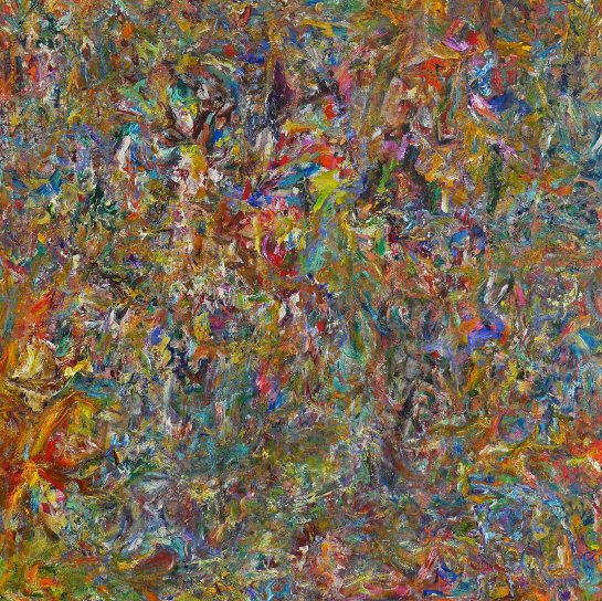 ‘Engine Shepherd’, 2017, oil on linen, 122x122cm
15th July 2018, near King’s Lynn.
Taking part: Anne Smart, Anthony Smart, Alexandra Harley, Robin Greenwood, Sarah Greenwood, Hilde Skilton, Mark Skilton, Noela James, Steven Walker, Edward Pile, Richard Ward, John Pollard
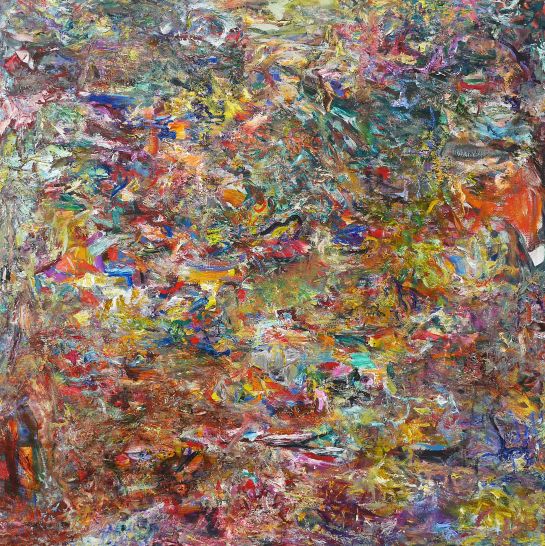 ‘Barstool Crown’, 2017, oil on linen, 122x122cm

Firstly, I want to thank all of you for being so generous with your time and offering such insightful thoughts. I thought the discussion was brilliant. I’d also like to say a big thanks to Anne and Tony for hosting the event and ensuring the paintings were shown in the best way possible, and also to John for all his help in getting them to you. I appreciate everyone’s efforts immensely.
To give a bit of context to these paintings, they sit time-wise as part of a group of three or four works that came about in the months following my chronicle last year. I felt like all those paintings carried on with the project laid forth by “Shadow Brigade”, the painting that Hilde refers to, a painting I felt quite unsure of when I exhibited it in Bermondsey. These paintings took their lead from that one, but each succeeded in doing something quite different from the one that preceded it. They were somehow able to each establish their own sets of problems, and I was able to come to some sort of resolution where I felt I wasn’t relying on another painting to show me the way. I think that level of invention and resourcefulness had started to slip by the latter stages of the year, perhaps necessarily so, because it helped me to see and better understand what makes these paintings work so independently.
Many of the works that followed these saw the mark making shrink further and multiply, but without expanding the variety of application. It gave those later works a more all-over look, with a shallower space, but one that might be less likely to attract figurative readings. Until last night, I had put that shift down to a complacency with the method of paint application. Seeing the video has changed my mind on that. It has made me realise that the marks multiplied because I was seeing the horizontal and vertical structures of Engine Shepherd and Barstool Crown as being the next thing to try and overcome, without fully appreciating the extent to which those obvious structures are potentially overcome already, by the character of the detail and how that detail relates throughout.
The method I had chosen to counteract these directional forces was to work the picture more evenly from all sides and orientations (not necessarily a bad idea at all), and to cut more and more into any bands or hints of linearity as they emerged or became too dominant, with the intention of freeing the eye to go where it pleases. The result was smaller marks and more of them. It probably worked to some extent, but at the expense of the kind of variety and spatial implications described in the works above, and also resulted in losing some of the kinds of larger shapes deployed in the two you’ve all just seen. Ultimately though, I see that phase as a necessary experiment, just to find out what would happen.
These two paintings above took a long time for me to come to terms with, and I think that is often a good sign. Going by the discussion, it sounds as though the apparent horizontality/verticality may not be a problem but a benefit. The paintings might need that sort of structure for the time being at least, in order for the variety of marks to play out in unpredictable ways without becoming incoherent. It might even lend an air of tension and surprise to the outcome. In answer to Hilde’s question about the horizontality and whether the evocation of landscape is coming from the painting itself or from the viewer’s own projections, I wouldn’t deny that the landscape quality is there on first viewing, but I would hope that that would dissipate over time, and it sounded as though it may have for many of those present at the discussion. I still think the artist has to take some responsibility, and be wary of what horizontals can do, particularly in combination with rather naturalistic colour. But at the same time, I wouldn’t rule out using them altogether.
I try to at least avoid having horizontals where the area above the divide recedes more than what is below it. This could be a good moment to bring up Robin’s query with the top left area of “Barstool Crown”, and how it relates to the rather prominent “stack” below it. It was interesting to hear people’s thoughts about how deliberate the paintings looked. I agree, they are. It might be worth stating, though everyone has probably already assumed, that almost all of that deliberation comes after the fact. I cannot remember exactly what went through my mind as I painted that top left area, but I remember thinking many times afterwards that it didn’t look finished. This had a lot to do with the blue horizontal that sits between the stack and the corner area. I disliked its abruptness when viewed up close. But as I stepped back from the painting, the problem went away, and I was unable to gather enough evidence against it to justify altering it. The same could be said for the unpainted patch on the right hand side. Anne’s assessment of it in the video is spot on. It just happened to still be there at the end, which was enough to convince me to let it stay. It didn’t appear to be a void or a hole, and didn’t look as though I merely wanted exposed canvas there for the sake of it either. But I think it is quite provocative, especially with the large patch of orange above it.
Another thing I found very interesting was Robin’s remark about getting more from the movement generated by the brushstrokes rather than the physicality of the brush strokes themselves. That thought appeals to me for a number of reasons, firstly because it privileges the viewer’s experience over the artist’s, and I would like to think that I am capable of being the viewer of my own work at the same time as being the maker of it. Secondly, are there spatial ramifications to that sort of reading, perhaps in a way comparable to how the sculptors may be treating space as something physical?
Finally, it was a joy to see all your beaming faces. I got so much out of watching this. It confirmed a lot of thoughts and hopes I had for these pictures, cleared up a few doubts too, and has given me much more to think about. Thank you very much!
Any questions, fire away.
LikeLiked by 1 person
One of the issues with these paintings is how they change depending on the viewing distance. When you are working with such small marks moving back leads to areas emerging. I think this can be really interesting. Both these paintings work really well fairly close to, the lyrical and multidirectional movement and complexity of marks are quite captivating. Moving back so you can see the whole work is when areas and forms manifest themselves. What works and does not work here is a crucial question. One issue is the possibility of figurative forms impinging on the viewing experience, largely because the rest of the painting will often struggle to cope once this happens.
‘Engine Shepherd’ has a shallower (but still fairly complex) space while ‘Barstool Crown’ has more obvious forms and so areas of bigger spatial relations (e.g. the stacks and top left ground Robin and Tony were talking about, the slightly floating darker saucer shape (central, near the bottom).
The flatter orange with bare canvas mark on the right also sets off a bigger space.
What does this all mean? While initially I thought Shepherd was a better painting, as it didn’t have such distracting contrasted areas, areas of wider but simpler space, I came to prefer Barstool. Figure ground relations are fine for me if they are complex and work over the whole of the canvas. In fact Barstool could perhaps do with more of these contrasting areas, breaking up the larger simpler areas.
The problem I also had with Shepherd was the large circular jagged form and its slightly simple ticker tape vertical movement.
Two good and really interesting paintings that raise some of the most pertinent questions.
LikeLike
Whilst I agree that these are both good paintings to be taken with the utmost seriousness, my thoughts, linked to John’s, are to do with exactly how one painted mark relates to another, and what that means, and how they work together. There is a degree of “reinforcing” of mark-making, where directions of application follow/mimic one another, albeit with different colour/tones, which leads one to see not only the vertical/horizontal impressions – and impressions is a key word – but also suggests the emergent bigger “forms”, rhythms or movements. All of those things begin to give the appearance of structure, but perhaps an imposed structure quite in contradiction of, and at odds with, what seems to me to be the intention of the work.
See my conversation with Richard about Heron on Abcrit for more on imposed structure; but in this case, it seems not to be imposed, but involuntary.
LikeLike
…which begs the question: “What might the intentionality of these works be?” My notion in a generalised sense (the specific sense in each case being somewhat ineffable) would be that it is to both establish and differentiate the surface of the work, with as much diversity as possible, but without destroying the unity of that balanced reconciliation. To add a third party to that balance, in the form an elicitation of macro-structures over and above the mark-to-mark micro-structuring that is built into the work everywhere, and developed across the whole surface with all things in natural relation (ideally), seems to me problematic.
LikeLike
I think you have overcome directional moves and stacking enough to have created a couple of very coherent works Harry. I don’t particularly have a problem with areas that become defined to some extent.
In ‘Barstool Crown’ the corners and the orange patch hold the painting in and create a sense of containment which offsets and holds the complexity within.
The top and left of ‘Engine Shepherd’ seem to have more intensity which allows the right hand side to act as a lead into the central area.
The two paintings have very different dynamics in terms of how the eye moves across and around, and whilst I appreciate many passages within ‘Engine Shepherd’, I find ‘Barstool Crown’ allows a more fluid journey continually round the whole painting.
LikeLike
Harry
I enjoyed both of your paintings.
I wondered if the combination of the brush strokes, their scale,colour and direction when painted with the relaxed confidence of application made the wholeness of the surface happen ?
Maybe it did? I don’t really want to know how. But I saw it there and enjoyed.
‘Barstool Engine’ seems the most dependant on figuration. I think that if you leave elements of the painting isolated,and maybe not scrutinised enough, it makes it easier for that bit, as it were, to be seen as a ‘bit’, even if as you work the painting it seems to be just a passage of paint or a patch of unpainted canvas.
Maybe naturalistic colour is a disadvantage? Maybe a collection of coloured brush marks come together but also leave a ‘grotto’ space which may pierce the abstract wholeness of the surface?
I am not sure about Robin’s question “What might the intentionality of these works be?”…if he was asking me I would answer that I was searching for fully Abstract painting.
For me intentionality operates in tandem with attitude.
It seems here that you are intending to achieve Abstract meaning and do so with an open ,free flowing and enquiring attitude.
‘Barstool Crown’ and ‘Engine Shepherd” buzzed that feeling out at me .I do not see any of this as a great problem simply as the difficulty of finding the Abstract which will pull your intentionality together.
This is an opportunity…and one we all need to take.
Thank you .
LikeLike
Thanks for the comments. If I had to elect one painting out of the two, I’d probably go for Engine Shepherd. Not because I think it is ‘better’, but because I feel as though I have to work harder to get into it. I’m yet to actually grab hold of what it exactly ‘does’, whereas in Barstool, those distances between areas do set up a kind of space I can traverse and feel comfortable in at times, which may make it more familiar. I think that may account in part for provocative elements like the unpainted patch or the large orange shape. It’s as if the flow needs to be disrupted somehow. Whether there is a danger of imposing a structure by bringing in larger shapes and passages, I’m not sure. I would hope that if they are arrived at somewhat naturally, that they will form a vital part of articulating dynamic and indeterminate structures, rather than unnecessarily consolidating just one. I certainly agree that there is a problem with the repetition of direction in the mark making, and as mentioned above, it is something I attempted to iron out in subsequent works, but perhaps with not enough consideration as to how to keep the space open and variable.
If my intention isn’t to make something abstract, it is certainly to make something that looks and feels ‘natural’. Crucially though, the hope that it looks natural, for me requires the exclusion of anything figurative, though admittedly that may still occur at times, usually because of the implications of perceiving space in painting. It shouldn’t necessitate the use of naturalistic colour, so stronger hues could be worth a try. What it does mean, is that I try to keep myself out of the picture to some extent. To conceive of something and then to go about trying to convey it, would be at complete odds with what I am wanting. This may explain what Anne perceives as a relaxed confidence in the paint application. I would say that I even feel a level of detachment when I am applying the strokes, maintaining more of an interest in what they amount to as a whole, rather than their individual expressive character. This to me, ought to result in the whole thing looking less artful, less contrived and more ‘natural’. When bigger shapes come into play, there is potential for them to look clumsy, because it is probably necessary that they are arrived at with the same level of spontaneity that their smaller companions can afford without looking half baked or unhinged. Perhaps careful integration can limit the extent to which the large parts demand attention, but in the case of Barstool Crown, I opted not to make the transition of scale gradual and continuous. It’s as though it needed to be abrupt, to disrupt the flow, make it more abstract by not implying perspectival recession, and more natural, as a result of not over engineering the link up of passages. But those issues are particular to that painting, and all these questions should be left up for grabs in future ones.
Thank you for the feedback. It’s given me a lot to go on with.
LikeLike
It is not without trepidation that I offer any kind of criticism of these two paintings, because I take them very seriously, and I’m somewhat in awe of the amount of work that goes into them and the measure of commitment that brings them about. That said, I regard most kinds of critical comment, unless it is downright dishonest, as positive. If the criticism is honestly felt, right or wrong, the artist has to take it and sort it out for themselves. And as Anne has hinted at here, with things as they are evolving now in Brancaster there is perhaps a unique and not to be repeated opportunity for everyone involved to look and learn and drive the whole thing forward with focus.
When I wrote earlier about intentionality, it was in relation to my perceptions of what the work itself “intended” or aspired to, what it seemed to me to be trying to do, rather than Harry’s own personal intentions, which I am not really fully party to. One thing I know for sure is that Harry’s attitude, and his ambition for the work, is 100%. That comes across very strongly both in the work and everything Harry writes or says about the work, and if I didn’t believe that I would not be making this kind of criticism in the first place. That’s not quite the same as believing in the absolute reality of each individual painting, which in the case of these two is muted by a degree of ambiguity. I think that is reflected in the talk and in these comments. It’s true that both ambiguity and contradiction have been spoken of as positive attributes, but I’m dubious about that; it is the manifold possibilities of a work to operate in different ways and provide different meanings that are NOT contradictory or ambiguous that is the very great thing that complex abstract art has the potential to do. And now that complexity comes up again, there seem to me to be right and wrong sorts of complexity, and that the aim of all art is clarity at all times, at each different moment, delivered out of that complexity. The complexity is not the aim, but it is the thing that can deliver all manner of clear intent from a single work.
This complexity, which these paintings are attempting to be full of, is undoubtedly embedded in the duality of surface and spatiality as previously discussed. Simultaneous disruption and reconstitution of the surface are intrinsic actions of this. The big question for me is where in that activity the intentionality (of the work) is felt to be…?
LikeLike
I’m happy for us to take this opportunity. I don’t take this sort of criticism personally at all. I don’t know that I can answer the question, but I’m prepared to accept that if the activity of the painting is confused, or contradictory, or involuntary, or without purpose, then the painting must lack intentionality. That of course doesn’t mean it’s ‘lights out’. There are plenty of other criteria by which to judge a painting. But I can think of more than a few examples of paintings throughout history that seek to or successfully destroy and re-establish the surface. What is to be gained, and what advantages (if any) are there to be had, from achieving that dual-function in this particular way? If it is worth pursuing, what elements or factors are preventing it from happening more purposefully?
LikeLike
Well, there’s lots of things I could say to that, and most of them would be presumptuous on my part, since I’m not having a go at you so much as digging around to see what I can learn from these works. But the thing I now find myself wondering – the thing that one shouldn’t really want to know – is how you start them, and what they look like early on, or half way through. Are they now possibly overworked or are they maybe unfinished?
Certainly not “lights out”, not so much for “other criteria”, whatever they might be, but because there is just so much potential in how you are approaching abstract painting.
LikeLike
Hi Harry, I’d like to come in at this point as Robin has suggested something I find I keep returning to. This is perhaps a failure on my part but I am still stuck on the areas of both paintings which have been left as bare canvas. (One more so than the other, but both are small areas of blank or hardly touched canvas) I feel they are important to mention as at a very early stage you have decided to keep them. I mean, I dont see them as isolated bits, I like them being there and they “work” and they contribute to the overallness of the paintings, but you must have been conscience of them and tolerated them being present for a long time. I think I am asking/wondering, what if there were more blank spaces to hold, force, push, slightly larger areas of colour?
LikeLike
Hi Steven,
You’re right, those unpainted areas probably underwent as much if not more scrutiny than any of the painted marks. Ultimately, if I’d seen them as views through to the back of the painting, I would have got rid of them, but as Alex pointed out in the video, they establish themselves up at the surface, so in the end I didn’t feel the need to lose them. I’m actually very excited by the possibilities of utilising them even more, which is going to require a slight change of approach on my part. This ties in very much with what Robin has just said.
These paintings undergo many transformations as I work them. They start off very turpsy, and with little to no plan. One mark responds to another and so forth. Some areas are washed in, some are more linear and drawn. I’ve often struggled with the early stages, and have had to employ a few mental strategies to try and convince myself that the preliminary marks carry any kind of consequence. In these paintings, I didn’t need to convince myself of that. I simply knew it to be true, and that might explain my openness to leaving those traces of the early stages, because I was seeing things of value in them from the word ‘go’. I think if I could expand my sense of openness to what goes on at the beginning, it could introduce a very interesting dynamic to the works, as I try to balance and connect those denser built up zones with a multitude of spare and immediate marks or lack thereof. If I’m not going to attribute too much weight to the marks themselves, then the so called ‘negative space’ should be treated just as much as a positive element, equally capable of delivering meaning, in unique collaboration with what surrounds it.
What I would hope is that the paintings have no stages, but remain crucial at every moment, as if I am trying to finish it with each decision, each action. Obviously it doesn’t work quite like that. Everything is balanced against my own frame of reference and sensibility, so something will keep driving the thing on. But more preparedness to see value in those initial marks could prove highly beneficial, and frames of reference are there to be meddled with.
Another thing I get from your comment, Steven, is that if the bare canvas was used more, it might become less of a distraction or novelty than if it only bobs up once or twice. Its presence could perhaps be made more integral.
LikeLiked by 1 person
Much of what follows has already been covered in the comments above, so this is just my way of putting it…
I think it´s worth asking what might constitute the wholeness of these paintings. What makes them right just as they are and not larger or smaller or different in any of their parts?
There are little bits of what seems to me to be significant relationality between some of the coloured marks. The red, yellow and blue in the middle, two thirds up of “Engine Shepherd” relate strongly to each other and call attention to the lilac blue squiggle halfway down on the righthand side, which in turn gives a nod to the warm pink above it and slightly to the right and to the red and blue marks one third up and just left of the middle. A lot of the intervening areas though seem quite arbitrary in this respect. It´s not this which is holding the painting together.
For me it´s the space that is having to do this, which (to my way of thinking) introduces an element of figuration: tree-space for “Engine Shepherd” and landscape-space for “Barstool Crown”. I don´t have any problem with figurative space. The difficulty for me with these paintings is that there is perhaps too little for the eye to hold onto and enjoy/be-intrigued-by within the abstract content (the literal coloured marks) so the eye, once it has found the space, tends to stay there rather than returning to the abstraction of the surface. That´s where something like the clear, white area of canvas in “Barstool Crown” is so valuable.
I agree absolutely that this is a fertile area for abstract painting. Most of the history of painting has been small marks after all. How to relate/combine/differentiate the marks to make each one specific and necessary to the work without resorting to figuration looks to be a huge and interesting challenge.
LikeLiked by 2 people
That hits the nail on the head.
LikeLike
Hi Richard
For me the uniqueness of Harry’s paintings lies in the fact that they do not settle. I was struck by the way that these paintings seemed to be different each time that I looked at them, completely different. I think that you are over rationalising these works, they cannot be viewed relationally or non relationally but are visually indeterminate. I think that the size of the marks is the key to this, each mark can work relationally with its neighbour and non relationally within the whole. In other works doing two different things at the same time, creating two different visual states simultaneously.
LikeLike
Hi Mark,
I think we’re probably seeing the same thing but evaluating it differently.
The point I was making is that there is comparatively little surface organisation of the marks in these paintings. This is maybe what you call visual indeterminacy and what is allowing you to see the paintings differently each time. The question for me is why this should interest me as art, since it doesn’t satisfy my eye’s quest for wholeness, an ordering principle, a sign of human activity – intentionality.
To a certain extent, I can find this organising principle in the spatial illusion of the paintings but I think they would be a whole lot better if there were an arresting sense of organisation at both levels.
These are the two visual states that painting has always sought to present simultaneously – coherent space combined with a convincing surface organisation.
There’s nothing mysterious or contradictory about marks working relationally at close quarters and non-relationally at a distance. I don’t think that these count as different visual states in the same way.
LikeLike
I wasn’t talking about the difference between space and surface or with the difference of viewing from near and far. I was suggesting that these paintings are indeterminate and that this in itself can be intentional.
Could it be that your desire for visual organisation comes purely from a representational bias and that visual indeterminacy might be more abstract?
LikeLike
To be clear, Mark, are you ditching the idea of clarity?
LikeLike
Sorry, no irony intended!
LikeLike
‘Engine Shepherd’ is perhaps more indeterminate, ‘Barstool Crown’ does seem to have more chromatic areas and, whilst fluid, could therefore have more of a sense of organisation. I suppose determinate could suggest fixed, which might not be so desirable in an abstract painting?
LikeLike
‘Indeterminate’ is in the same bin as ‘ambiguous’ and ‘contradictory’ for my money. All negative. I’m sticking on ‘manifold’ clarity.
LikeLike
I’m not sure how far the analogy carries, but consider the situation with poetry:
In a good poem every word is exactly right in multiple ways – sound, rhythm, shades of meaning etc. – so the whole work has a kind of inevitability to it. But this doesn’t preclude its having a different meaning/interpretation for different people. A good poem might “perfectly” express a variety of things, depending on the reader. I would call this “good” indeterminacy. (Indeterminacy of meaning?)
Now consider a poem whose words are imprecise and arbitrary. This might still find resonance in a reader, but I doubt that anyone would regard it as the “perfect” expression of anything. This, for me, is “bad” indeterminacy. (Indeterminacy of form?)
LikeLike
This may be getting pedantic, but “the indeterminacy of something is its quality of being uncertain or vague”, to quote Collins dictionary. That’s pretty unequivocal. And there is an awful lot of bad abstract art that fulfils those conditions. Being intentionally indeterminate is surely a perversity of purpose.
What’s wrong with manifold meanings/interpretations/activities, all of which could be positive? It works in nature, when the complexity of an organism allows it to function in many different ways without compromising its integrity, so why not in art? Is that not why we are now into complexity? Surely we are not into it to make things more obscure and perverse, or uncertain and vague?
LikeLike
I know Tony has put a comment of my BC, so thanks for that and feel free to add to it (not sure I understand it yet). But I’m still thinking about Harry’s paintings (nice one, Harry).
Richard’s comment about the half dozen or so notable and stand-out coloured marks, and other remarked-upon aspects like the orange patch and the bare canvas patch, chimes with something I’ve been stumbling towards from the beginning, and indeed, stems from a conversation with Harry on Abcrit a while back about the painted marks in mid/late Monet.
The fact that Richard is able to isolate those coloured marks implies to me that they are not truly “in relation” (different from Greenbergian “relational”, which I think is what Richard is describing when he jumps around between one prominent mark and another, across the canvas) and suggests to me they are the opposite of what Richard says about them – I think they are not really the abstract parts of the work, but tend more toward the literal, because their relationship to each other and to other things in the paintings are tending towards being “literal” relationships, i.e. those of position or geography.
True, those stand-out marks do bring you to the surface. But I wonder, could it be that some kind of closely modulated development of the tone-colours adjacent to one another, rather than juxtapositioning – or even positioning – could begin to move around the “form” or the “shape” of the spatial structures of the painting in somewhat less ambiguous, less figurative, and perhaps even more expressive ways? (This is a question!)
I have in mind the way that the space is built and physically shunted about at close quarters in something like, say, this Cezanne: https://pbs.twimg.com/media/Dj2BsS7XgAEPW6-.jpg
I know that is figurative, but there is a sense (to me) in which you can think of it – in its close-quarter spatial relations – in a more abstract way than the space in Harry’s paintings.
LikeLike
I’m going to be more general here.Both about Harry’s painting, mine and other Abstract paintings in relation to this Cezanne.
So much has been written about Cezanne and I know I have not read enough of it but I have studied this particular Cezanne a lot, especially in the way the space, as Robin says is ‘built and physically shunted about’.
Much more than that though this Cezanne painting , after 40 years of looking, takes my breath away every time I look at it either ,for real or in reproduction. I really want to know why and how he makes that happen.
I am thinking that I might be a bit closer now I have made a comparison with a non-figurative work.
Sorry Harry ,in no way does this diminish your painting.
I wonder that whist in actually making/building Abstract painting today we try too hard to make the ‘marks’ too definite . In Harry’s painting each mark tends to keep its identity. Yes, I see there is a strong sense of their intentionality bringing a ‘wholeness’, but do those marks, which at first attract attention, become too deliberate,too set down into the canvas?
I have done it.
Cezanne is aiming at reality.he builds the surface of the brush mark in conjunction with the surface of the whole painting but without enclosed and fixed boundaries ,moving forwards and backwards ,at the same time, in constant irresolution. Something I am aiming for in my work.
Those apples transcend reality and to me feel more abstract [ well does it matter any more what they are?]
I used to think that not having a still life in front of you must be a disadvantage.
Cezanne had a subject but ,as if by magic, his organisation of paint disturbs the surface of his painting [ especially this one]
Abstract painting needs to do that, and big time.
In Harry’s case perhaps the odd brush mark [ the turquoise ones I think,as mentioned by Richard]do not disturb the surface enough,perhaps they are too deliberate,and the piece of bare canvas is too alone [as mentioned in Steven’s comment] of course as he built his paintings Cezanne saw empty canvas just as finished as painted canvas.
Like Cezanne I would want my painting to have all of that naturally, not deliberately. Informed by my own intellect and be both beginning and finishing at the same time.
Is that a contradiction?
Could Abstract painting be that indeterminate place where the stuff of the painting being pushed downs also lifts effortlessly away and makes the surface and the space both together and apart.?
Thanks Harry and Cezanne
LikeLike
Thanks Anne and Robin. I think you’re both onto something there. I’m going to think on this and try to respond in more depth. On a note that may be related, there is a moment towards the end of the video of Robin’s recent chronicle, where Robin and Mark are discussing the content of one of the sculptures, and that expanding the content means exactly that, rather than literal expansion. Perhaps that is a good way to think about painting also, that expanding the content refers more to maximising the functions of it, as opposed to having an over-abundance of competitive visual material.
LikeLiked by 1 person
Harry ‘s handling of paint is so different from Cezanne’s (certainly in Robin’s example) I can’t quite get my head around comparing them.
I hear what Anne is saying about Cezanne’s brilliant way of building the surface ‘without enclosed and fixed boundaries, moving forwards and backwards, at the same time, in constant irresolution.’
I am wondering if resolution is a bad thing?
I have to say I can enjoy deliberate marks, swathes or patches of paint, I find it important to see the hand of the painter as it were. But could there be a shorter interest span to something more fixed perhaps?
Is a painting that is resolved too much, a little deadened? I don’t mean Harry’s work at all , I am thinking of the way I might approach a painting that is giving me problems.
Cezanne certainly keeps things alive.
LikeLiked by 1 person
When it comes to the relationship between space and surface, I think these paintings are more Renoir than Cézanne.
See, for example:
https://www.wikiart.org/en/pierre-auguste-renoir/landscape-near-cagnes-1910
compared to:
https://www.wikiart.org/en/paul-cezanne/in-the-park-of-the-chateau-noir
Cézanne´s marks are not so twisty and elongated and stand their ground on the surface more resolutely than Renoir´s.
I think it´s only the comparative isolation of the “stand-out marks” that makes them problematic/literal. If the whole painting had the same intensity they would be embedded in a whole web of “Greenbergian” relationality, which presumably would make them “relational” in Robin´s sense.
LikeLike
If we must make analogies with figurative painting, I would agree (I think I suggested Renoir in the Abcrit discussion about small marks). But I was not suggesting for one minute that Harry’s work is or should be like Cezanne’s or anyone else’s, I was merely suggesting a different possible manner of building spatiality and thinking about relatedness across the canvas.
But I don’t necessarily think the answer is increasing the intensity of everything. I think it is more about thinking of how exactly one mark relates to another adjacent mark and what that means and how that can be modulated and adjusted so that they become something bound together – and on and on, as space is rolled out across the canvas.
LikeLike