Brancaster Chronicle No.61: Sarah Greenwood Patchwork Quilts
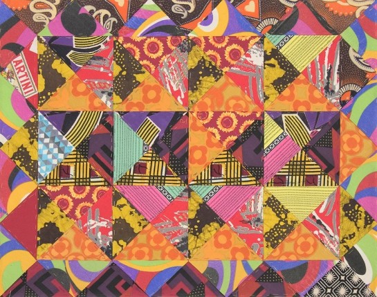
Untitled patchwork top, 57x73cm, unquilted, cotton fabrics, no border, handsewn (on paper), undated.
30th June 2018, London.
Taking part: Sarah Greenwood, Robin Greenwood, Anne Smart, Anthony Smart, Hilde Skilton, Mark Skilton, Noela James, Charley Greenwood, Alexandra Harley, John Pollard.
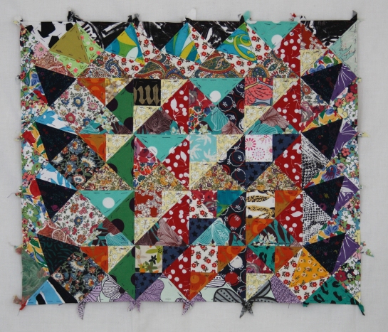
Untitled patchwork top, 64x54cm, unquilted, cotton fabrics, no border, handsewn (on paper), undated.
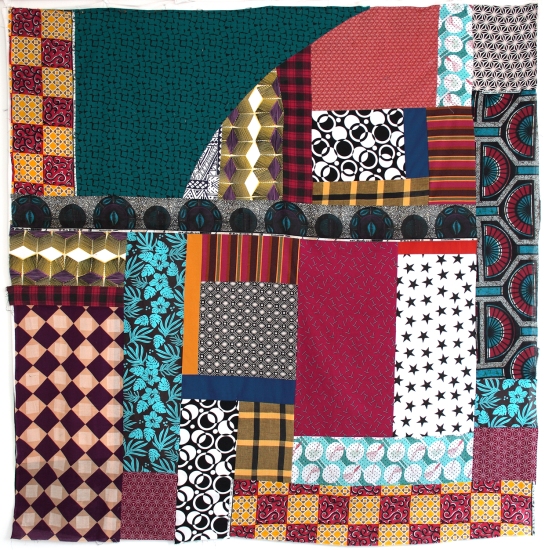
Untitled patchwork top, 203x203cm, unquilted, cotton fabrics, handsewn (on paper), undated.
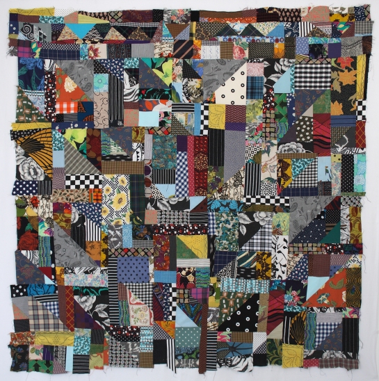
Untitled patchwork top, 149x143cm, unquilted, cotton fabrics, handsewn (on paper), undated.
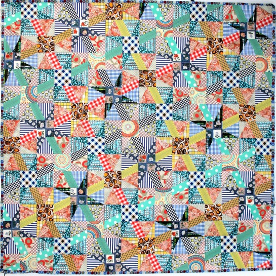
Untitled patchwork top, 201x198cm, unquilted, cotton fabrics, no border, machine sewn, undated.
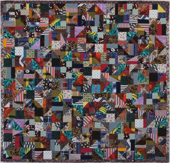
Untitled patchwork top, 186x180cm, unquilted, cotton fabrics, no border, machine sewn, undated.

Hi Sarah, it is really nice to see your work. It has a wonderful energy, complexity and visual density. I really like the way you use the colours so strongly, inventively and unsentimentally. Taking off from what Robin says about the shifting between patterns, merging and de-merging, being what the work is about. I quite agree that that is the fascination of the work. Sometimes patterns are maintained across each other and then it is the interpreting eye that switches between seeing the same material differently. In other places the pattern actually breaks into another or changes. The borders do make a big difference I think. As Robin says the border in 149 x143 works to moderate the interior. 203×203 has a border that is perhaps too thin and too repetitive and lets down the interior which is wonderfully askance and difficult to pin down, but so generous in feel. I wonder if putting 186×180 on a coloured cloth would help to make the edges read more. That one also starts to look like a collage as the pieces are big enough to keep their identity and resist being subsumed into a pattern, which is an interesting line to tread. 201×198 is clearly a collage, but perhaps in a too patterned way- a collage tending to a primitive pattern. It also makes it more dependent on the material itself for visual interest, which makes it less original and less ‘felt’.
I also wonder if having them so close to a square format makes them more static in overall feel and slightly neutralises the energy within them. I feel that with186x180 and 203×203 for example. 149×143 gains by being far enough away from the square while being in tension with it. I think it comes from the fact that they all have patterns on the diagonal and so the square format makes that overdetermined as they go to the corners. 203×203 gets its power largely by playing off the square with it rotation off the diagonal, but I still wonder if it would be stronger not so square? Or perhaps the border should be less thin and regular? But all this comes from the screen……..
LikeLike
I rather worryingly can’t remember which of these I have actually seen on a recent visit and which I only know from the jpegs.
203×203 I have definitely seen and it has an entrancing quality which comes in at least in part from a kind of push-and-pull arising not (or not only) from colour but from shape and pattern. The colours themselves are gentle and harmonious. Spatially you are not quite sure where you are, but you know with absolute certainty that everything is going to be alright.
I agree with the comments about 201×198. This is Matisse without the aubergines (and why not?).
Noela mentioned “architectural space” and I think there is no getting away from this figurative element to the spatiality, none off which interferes with the enjoyment of colour, pattern and shape in and for their abstract selves.
The spatiality of 186×180, once discovered, has something urban about it. The fact that these last two are simultaneously the most spatial, least (relatively speaking) abstract and least geometrical suggests to me that pattern (the grid) and all-overness (149×143) are good ways to disrupt or frustrate figurative associations, though both would seem to come at the cost of at least one aspect of deep, integrated, coherent space.
One last observation. 57×73 reminded me initially and disconcertingly of Howard Hodgkin. It’s the colours and the framing I think. The difference in Sarah’s work is the integration of body and border, so that the “frame” can be behind, level with or in front of the body. As such it is not just an easy way to deal with the edges and create depth but a properly integrated part of the image.
And I really like 64×54 too.
LikeLike
I like what Ed says about them.
He is very clear and concise .I particularly like the idea that he is picking up on “….wonderfully askance and difficult to pin down …” . Everything , absolutely everything which goes into the making of these is precise, in my thought.
This leads me on to my thought. Painterly.
I used to think it a description of the way paint is/was used. For example the colours, the application ,the flow all add to the luscious sexiness of a Matthew Smith nude and make it painterly. I like what Richard says about the relationship of 57×73 with a Howard Hodgkin, and he describes some of the problems that painting can get into. I think in Smith and Hodgkin the composition at the surface of the work rules, and separate bits work hard to get attention, perhaps at the expense of a wholeness ..
I see two stages in my thought. The first is when you first encounter a quilt. The stitching…the colour…the geometry …all these in combinations produce a physicality which hits as a wow ! You may ask why would anyone want to do that? Relentlessly make tiny decisions over and over and over again. I compare that to the way some people make abstract art.
By contrast Fred Pollock,s paintings [pick any one from his Chronicle no. 7 here on this site]They always seem to pull together these combinations in a brilliant way. I think they always do remain totally physical and you can always recall the whole painting.
The second stage is what I call a’ Northern Lights’ experience. This does not happen in all of them but it is the critical thing.
The one that does it for me here is 203×203 which for my identification I will call the ‘ Big green on the wall as you go into Sarah’s space’ .
This quilt becomes altogether less predictable[ a predictability as described above] and moves out of the stage one phase. I start to get an involvement that is an optical effect and as I said before it does not always happen.. But when”it” happens in 203×203 all the physicality disappears. Sarah creates the circumstances and you make the connections. When I am in that place I feel that because of this intensification, the physicality has been taken over and detached itself becoming almost NON physical and perhaps it could be a new way of getting to Abstract.? I think I see this as an “indeterminacy “that you actually have to make for yourself.
So with its weirdly chaotic but controlled intelligent exactness I remain intrigued by 203×203.
It can take a descriptive analysis such as the ones Ed and Richard give but for me it is inexplicable [although I have tried here and wonder if any one else has similar thoughts, not just about these quilts. I see similar thing happening in the Chronicles ]
203×203 is painterly at its best for me and it comes to me as Abstract.
When they do not work for me they are quilts.
LikeLike
Some intelligent comments so far, which I’m sure Sarah will be acknowledging soon – but my take on these works is different. For example, and without criticism of Richard’s comment, I would never have thought to compare 57×73 with a Hodgkin painting, and I am a little uneasy with any comment that compares these works to any kind of painting. I can’t recall a conversation with Sarah (outside of Brancaster) where that has previously happened. We have always talked about them as quilts, and if they got compared to anything, they were compared to other quilts, usually historical (with which, of course, Sarah is very familiar, me less so). I think, as quilts, they are pretty original, as far as I can tell, though the end result, their practicality for use as quilts, remains very strong in Sarah’s mindset, and allies them to a long tradition.
I don’t of course think this in any way diminishes them as art, but I do think for various reasons they are often quite distinct from painting. First and foremost, the categories of “literal” and “abstract”, which I frequently use as antonyms when talking about art, are here fused into one, by virtue of several factors; the quilts are objects, and have a “life” as objects, made of fabric, and are not optical images. Then there is the simultaneity of piecing patterned fabrics together in a single surface – note: not “on” a surface, because they are the surface itself, so, immediately, you have to take into account the patterns, the absolute multitude of discovered and invented patterns, which are found and brought together, not layer upon layer, but cheek-by-jowl, pattern inside of pattern inside of yet more pattern, in what is central to the making of the work, a cornucopia of jangling possibilities, which might or might not come together into a whole. And as quilts, they might be viewed in very different ways, such as “piecemeal”, i.e., bit by bit; or horizontally. That in itself might be quite an abstract idea, different from the idea of “wholeness” I have so recently talked about, where you might find continuity in the parts, or even in the “bits”, looking at it from different angles etc. I am almost tempted to suggest that this is a more natural way to view a quilt than standing back and taking in the whole, like a picture. Almost – but then these things so often seem to spark into their own life when on the wall, which maybe contradicts what I’ve just said. Nevertheless, they are at their best for me when they are not in any way like pictures, abstract or figurative (though sometimes they appear similar, and of course the computerised image will make them appear more so).
It seems to me the more painting approaches patterning and similar geometric effects to quilt making, the more it might be diminished (I won’t go into examples here); whereas the opposite applies to Sarah’s quilts, and the more they assert their absolute unique identity and difference to painting, the better they become, as per 203×203, where complex geometric ideas are taken on and somehow assimilated in an object that ends up free from the spatial values of painting’s characteristic articulations. It would be impossible to paint. And I’m not sure it is “spatial”.
LikeLike
I remember talking, after the filming, about whether one could make paintings take on the complexity of the patterning that is evident in Sarah’s quilts and somehow replicate that intensity and quality, but if that was the case one would be painting figuratively rather than abstractly, so it would be very different.
Looking at 203×203 on screen I am even more amazed and impressed by the diagonal rhythms highlighted by the small scale image. There are so many patterns within patterns which feel like they are superimposed but are obviously abutted, it’s a really fine piece of quilting.
LikeLike
I really enjoyed looking at Sarah’s quilts (one of my favourite exhibitions of abstract work). All had rich, vibrant, complex and powerful colour relationships. I’m reminded of the impact of some of Cézanne’s most complex, and colour saturated, paintings.
I veer towards 149x143cm as being the most advanced, ambitious, and whole, work, but only just. All the others have elements which separate different areas/content off in too clear a way for me, that results in these areas not seeming to belong to the rest, hence the problem of wholeness. I should say that I think (at least at the present moment) that you can have a simple wholeness which has little value, as it has neither ambition or longevity (i.e. many could do it and it will bore you before too long).
So where are the possible issues?
57x73cm has a border in contrast to a central space. Ok, the border is broken but it is still there. How much does the central content need the border to be ‘activated (i.e. ‘stand out’?). If so, what value does the border, itself, have?
64x54cm has a sronger border: top, sides and botttom.
203x203cm has a clear criss cross grid which separates itself from the rest of the content.
201x198cm is very different and yet also has a clear divider in the almost compete horizontal row of cricles.
186x180cm has a discernible arrow pattern.
149x143cm does also have a border but it is very narrow.
These are marginal issues, as these works have so much complexity, that draws you back in, so to speak, and I really enjoyed looking at them. But I would love to see some work where the above doesn’t happen.
LikeLike
Looking at them again, simply and without analysis, I find most of them immediately engaging and charming [not in the trivial sense]. The colour and rhythms on 57x73cm are so life affirming. 203x203cm is similar but open with a great swing. 149x143cm fizzes and pops all over the place but always in harmony. 186x180cm has a great informal but deepening density. They give pleasure without the burden of ‘meaning’, a play with rhythmic harmony that is perhaps more like the best jazz, or at least music, than painting. The pieces are the notes, and it is how they are arranged that makes the experience- the rhythm, the motifs, the mood.
LikeLike
I have enjoyed the visual experience of looking at the patchwork and find that it is important to see the entire piece as well as the detail. I would also say that to see them in their full size is also necessary. The images are simply a reminder which is needed to bring back the wonderful feeling of excitement at being involved with this imaginative and creative work.
LikeLike
N.B. Judging by the sliver of background that can be seen, if it is white, then 149x143cm and 186x180cm are slightly too dark in the images- they do seem slightly grey all over.
LikeLike
What a wonderful eclectic mix of sentiments. I’m particularly pleased to see some real critical opinion from John P, even though the work he likes most is the one I like least, 149×143. Such a variety of ideas from everyone is probably indicative of all our struggles to get a handle on work which we have nothing to compare with. I keep chuckling at the comparison with the mannerisms of Hodgkin – sorry Richard, but 57×73 is so NOT like a painting, particularly a semi-abstract painting, and I have yet to see a Hodgkin get anywhere near it in its undiminishing and co-ordinated disco dance of colour/pattern. The idea of “movement” and the idea of “space” seem inadequate on the one hand and irrelevant on the other as descriptions of what goes on here. I love it to bits, love the border, if that’s what it is, which I think is totally integrated, and I can’t get a fag-paper’s worth of criticism into any part of it. Same goes for 64×54. And 203×203 is the masterpiece. I come down to earth a little by reminding myself that we are looking at the cream of many, many years of work, and some of these are quite old. There have been failures, honest!
Worth saying yet again that these photos are not much like the real things at all.
LikeLike
But honestly, just look how those triangles round the edge in 57×73 absolutely lock into the rest of the geometry – it’s so totally “of” the piece. Definitely not a border!
LikeLike
Well, I wouldn’t want to push the Hodgkin thing. For me, looking at it as a painting, there were aspects of it (the predominant reds, yellows and oranges of the colour scheme, the rounded patterning on some of the textiles and the (visually possible) border) which triggered an initial association.
It would be interesting to hear how one looks at a quilt as opposed to a painting. I suspect it has something to do with geometry/patterning as an integral part of the art form rather than merely a “device” as it is in painting.
???
LikeLike
The border surrounds the rectangle made up of 3×4 squares. The border stops at the rectangle thereby emphasising it. There is no intrusion from the border shapes into the rectangle.
I said that it was “the most advanced, ambitious, and whole, work, but only just”. That isn’t the same as “likes most”. I’m not sure which one I liked most.
But I’m not as certain as you on all this. If I spent a good few more hours with the work I assume my opinions may well change.
LikeLike
Well, I see what you are saying, but I don’t see it how you see it. If the triangles don’t “intrude”, they certainly, so to speak, “infuse”. Their points are so strategic to the continuity of the whole thing that it seems to me unbroken.
LikeLike
Susanne Langer describes pattern/design as the synthesis of permanence with change.
As such it mirrors life itself, where an organism (permanence) grows and moves (change) without losing its identity.
LikeLike
Richard,
I think that being human involves constant becoming/change. Therefore, we continually lose (transcend) our identity in the way we create it, even though things may be reaffirmed and therefore appear the same. No core ‘self’ for me, which goes against the grain,
LikeLike
I don’t think Langer is seeing this existentially. For her it’s more about our perception of other organisms – acorns and oak trees, for instance.
LikeLike
Or the other way round – pattern helped us to arrive at our concept of an organism.
LikeLike
A relevant question might be whether creating abstract art (or indeed any ‘visual’ art) should be about creating something uniquely ‘other’ to the natural world, or not.
LikeLike
With regards to Richard’s query about how to look at quilts, I would say that you don’t need to look at them or think about them any differently from looking at painting because they will make their own differences, mainly in how they feel “in the flesh”, so to speak, as objects. For example, the textures, weights, densities of the different fabrics are all factors taken into account by Sarah, and there to be discovered, along with the way the fabric holds itself or “hangs” as “stuff”. This is on top of the fact that the fabrics themselves are designed and printed in different ways. In the long run all this counts for something.
A technical note: All these quilts are described by Sarah as “untitled patchwork tops, unquilted”. They all await the further process – if they ever get it – of joining onto a layer of some kind of blanketing material, plus a backing fabric, sometimes with its own patchwork design on the reverse, then the whole thing sewn through from front to back in a completely separate and often quite complex patterned design, maybe in coloured thread(s), often not following the pattern of the fabric pieces, which in tying the front to the back imparts a “quilted”, slightly embossed surface to the whole. A couple of the works in Sarah’s previous Brancaster from two years ago had got to this completed stage.
So at the moment, all these current works we are looking at are flatter than they will eventually (hopefully!) end up, when they acquire a shallow relief pattern to the surface. Obviously, that would further emphasise any different with painting. I also think that the act of sewing right through the completed work imparts something quite unique.
I don’t mean to imply in any way at all that painters (and sculptors!) can’t learn stuff and fully recognize the value of what Sarah is doing. I do, as a sculptor. But I think an appreciation of quilt-making’s fundamental differences to painting only highlights the plusses to be gained by looking.
LikeLike
I am a big fan of Sarah’s work.
Whether finished, unfinished or just held together with a few pins I never think of them as quilts. I know nothing about quilting and have never felt the need to investigate the discipline and have always been up for the challenge of what it is that Sarah is doing which is more than just technique.What I do know about her process ,and it is the only bit which matters, is that she will go to the ends of the earth and unpick the whole thing if necessary to make it right… like we all do!
For me, the best of them ,have 3 stages.
The pattern of the specifically chosen fabric, the specifically chosen geometric form and proportion and finally what they altogether create as multifarious re-structurings.
That said, whatever their pedigree, they are ‘ more than the sum of their parts ‘ I think.
Quite how these three stages are synchronised ,and sometimes they really are, remains a brilliant mystery.
LikeLike
If you never think of them as quilts, or if, as Anne says, they are quilts when they “do not work”, does that not disparage quilt-making rather, as if to suggest it is in some way inferior to painting? Or am I getting the wrong message here? I’m sure Sarah is always delighted indeed when anybody likes her work – for whatever reason. The question that lingers in the background is how Sarah as a quiltmaker benefits from comment that ignores all aspects of her discipline?
LikeLike
I have on numerous occasions with Sarah, over the years , spent time looking at and speaking with her about her work, and as I know nothing about quilt making have only ever been able to make my remarks in terms of her “Art’ content. To my knowledge she never came back at me insisting that I only talk of them as quilts.Surely if we were to only talk in terms of craft then non of the things we see emerging would emerge ?
As to your last question… surely Sarah has to answer that?
And one for you …you could answer this ….. Is Sculpture on a parr with Pottery?
LikeLike
Tony,
I fully concede your right to comment on Sarah’s quilts, and you have shown over the years great understanding of her visual achievements. That’s not in doubt, and indeed your lack of knowledge about other quilts may be an advantage in seeing more objectively what’s good about Sarah’s. But only maybe… and I don’t think you should make a plus of your ignorance.
Quilts can be great art (and, yes, so can pottery, better than a lot of sculpture!) and although I’d be pushed to say the best quilts are up there with the greatest figurative painting, I’d definitely say there are examples as good as the best abstract painting. As we might well agree, Sarah has some of that very quality. But still they are not paintings! And there is a lot of other really good stuff in the history of quilt-making.
These are personal judgements, and we all made different calls on these things. The thing is, what I don’t understand is why talking about Sarah’s quilts “as quilts” is talking about them as “craft”? Why isn’t that art? You wouldn’t stand for that in talking about your sculpture, and nor would Anne countenance the idea of a failed work of hers being categorised as “merely a painting” because it failed. Sometimes when we consider a failed sculpture we go in the opposite direction!
We have talked a little in these comments about the issue of the border in 57×73, a subject for discussion that gets to grip with some serious issues of quilt-making, borders being ubiquitous in the discipline, and having nothing to do with Hodgkin’s stuff or what goes on of that sort of thing in bad painting. If we knew more about the discipline, we could go deeper into that and other things. I’ve tried to introduce a broader look at this work because I thought it would be interesting to consider the bigger picture of what Sarah herself thinks about. Maybe you don’t agree and think it is a distraction, but that seems a limit to what can be of benefit to Sarah herself.
LikeLike
It is a great shame that somebody did not make the rules of engagement clear.
Most of the comments on Sarah’s work are from Abstract painters’ points of view and sensibilities.
On the subject of ..”…and I don’t think you should make a plus of your ignorance” well Robin , I had hoped that your rush to be judgemental may have abated but apparently not.
On the subject of status in the Arts, a failed figurative painting will be still regarded as a picture whereas a failed Abstract painting will be in the bin.! A failed Abstract sculpture may be recycled but most likely binned as well !
In that a quilt is firstly an object ,if it fails to be Art it will still be a quilt , and keep some person warm. I’m happy with all of that and do not see an insult at all to anybody.
So, I say,hoping to resolve this……..
Any deviation from our statement ….’ Brancaster Chronicles…Live discussions on Abstract Painting and Sculpture.’…… could have been made clearer.
On that point I raise my hand immediately because I MOST DEFINITELY encouraged Sarah to show her work and I would again. I thoroughly enjoyed her Brancaster Exhibition and I feel now as I felt then that I was looking at Abstract Art.
On the subject of 57×73 and the frame/border issue, I see why Richard would say that, for me, the decision to have mitred corners in tandem with a parallel frame would support that comm
LikeLike
Don’t know what you’re on about now so I give up.
LikeLike
Now look at the smaller squares running from top to bottom and from side to side….the border disappears. Just saying.
LikeLike
There are so many ways of seeing Sarah’s patchwork and they just keep giving.
LikeLike
Sorry, smaller squares made up of two triangles, on their side.
LikeLike
Yes, yes, yes, correct on all counts.
LikeLike
Hi guys… thanks for all your thoughtful and insightful comments – it’s been brilliant and so glad you enjoyed the quilts ….lots for me to ponder!
I’m really sorry that we got a couple of the photos wrong: the picture of 64×54 was orientated differently from the way it was on on the wall. Also the photo of 203×203 showed it with a border which I had decided I didn’t like so got rid of it.
LikeLike