Brancaster Chronicle No. 62: Hilde Skilton Paintings
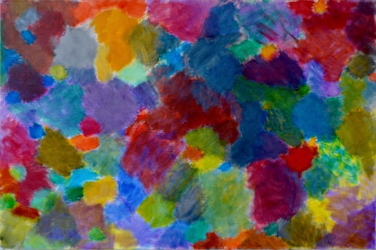
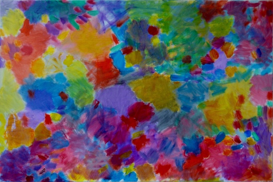
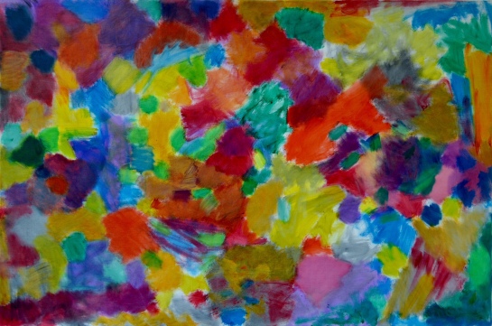
Wasabi Guacamole 2017/18 (all paintings are oil on linen, 150x100cm)
7th July 2018, the artist’s studio near Bath.
Taking part: Sarah Greenwood, Robin Greenwood, Anne Smart, Anthony Smart, Noela James, Alex Harley, John Pollard, Richard Ward, Charley Greenwood, Shelley Latham, Hilde Skilton, Mark Skilton.
Sentient Storm 2017/18
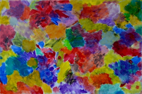
Insect Splat Count 2017/18
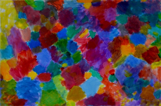
Racing Cane Toad 2018
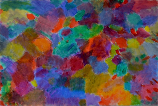
Gannet Colony Blues 2018
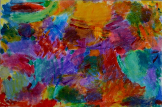
Arrested Ionisation 2017/18
Candyfloss Coma
Elastic Lavender

Hilde says in this film that over the past 3 or 4 years ….”complexity, i really embrace, as something to work with….”.
Robin remarks about the paintings having …”Complexity of colour’ and than that…”pure colour is in the mix , and then everything else is in the mix.”
It is simple.
Hilde’s paintings are complex.
But Hilde gives us EVERYTHING [ she knows about painting] in a straightforward ,non contrived,confident,pure, strong and subtle way. [ there are many more ways, if you watch the film they become apparent ]
Complexity can be confusion.
Coincidentally whilst I just had my lunch I read that John Pollard and Robin are debating complexity over on Abcrit..John says……..”detailed and repetitive pattered work, but the patterned element is, in a way,simple not complex.”
I am going to stick to simple and complex working together as two of the many combinations essential for a fully achieved Abstract resolution.
Thinking of Hilde’s complexities in the way she uses colour. It is clear that can be about putting colour on as glazes or layers. That gives us another way of getting into what the surface of the painting is doing. But that only emphasises how different the surface is to what we expect and how just another quick look will give another sense of surface ,maybe the way two colours actually abut and do not overlap. All this may make a new surface and probably enable the work become more Abstract. The thing is though , she makes it all so straightforward, so clear, so simple. The thing is though she makes it so complex because of that not in-spite of it.
it was remarked that Hilde’s paintings achieve a “free” sense of being. Mark calls it ” a place of their own”. And that means that every painting has its own character. It is extremely apparent that she works thoughtfully on how, for example, the same colour can do different things.
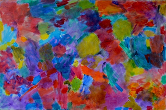
I was particularly moved by ‘Arrested Ionisation” .Visible layers of complex multiple decisions reveal themselves over time.These are about colour, tone location,scale, surface and on and on and on . Complex but so clear.
You can see all this and more as you look even more closely. As Mark puts it …”…it’s an intention which is arrived at.”
I agree. I love the painting. It is achieved through an intense period of thinking and building.
Here we see no agenda , complexity arrived at, along with simplicity and intention and Hilde says and I am going with her ! “..as you are working each painting does its own thing “.
LikeLike
You’re the top! You’re the Colosseum,
You’re the top! You’re the Louvre Museum,
You’re a melody from a symphony by Strauss,
You’re a Bendel bonnet, a Shakespeare sonnet,
You’re Mickey Mouse.
Well, OK, not Mickey Mouse! But to be honest, Hilde, I can’t think of any words. Sure, one can pick out one from the other, and they all have their own qualities, but what truly gets to me it the sheer consistency of quality, again and again, throughout all the work. Amazing and well done.
LikeLike
Hilde’s paintings always seem to get me thinking about light.
White is the certain indicator of full-spectrum light. In the presence of white the eye can relax and accept all the other colours as seen.
Where white is missing there is uncertainty, particularly in an abstract painting, which holds no figurative clues (skin, foliage etc.) to the quality of the light, which might be yellowish, bluish or some weird combination of wavelengths, so that the eye, not knowing how to compensate as it might automatically with tinted sunglasses, is left with competing possibilities.
In this respect Hilde’s paintings share the indefinable illumination of Matisse’s “Dance” and “Music”. They have something unearthly or subaqueous and a little claustrophobic and yes, definitely abstract and not anywhere outdoors in the sun.
I wonder if just a small area of pure white, strategically placed, would further clarify these paintings or would it destroy their special quality / make them less abstract.
It doesn’t take much white to settle the colours of a whole painting . Look at the difference between Matisse’s “Still Life with the Dance” and his “Still Life in Blue” both 1909. Or see how Cézanne (who almost always has a little white area in his paintings) fixes the colours with two or three dabs of pure white in his “Pont de Maincy” 1879-80.
Maybe this is figurative thinking. It seems to me that there may be several areas where there is a kind of trade-off between figuration and indeterminacy.
LikeLike
Just an observation Richard..which is connected to light and white in Hilde’s works.
If you look back to her first Chronicle paintings…say “Bumble Buzz” and “Three of Three”I think there is possibly some white added .
If you look through her Brancaster output up to her most recent work the strength of luminosity and transparency of her colour develops and becomes stronger.
The denial of her use of white paint ,but her massive attention to and regard of the white ground ,must be a bonus.
Her command of colour undoubtedly raises the stakes high and gains a stronger foothold to the Abstract. In her teasing open of the surface ,giving the opportunity to ‘feel’ the space behind the colour come out and through ,[and she has been doing this for three years] the light becomes integrated in the whole.
Whether her decision not to use white paint makes for uncertainty I do not know. But I think here we see so many decisions, combining and corresponding and syncopating with such surety, I do not personally get any ‘ trade off’ vibe leaning towards figuration.
I view the way you suggest the use of ..”just a small area of pure white” as a figurative idea/decision. I think it would be a device in a figurative painting used to emphasise or accentuate and because it [ the area of white] would be a ‘thing’ why use it in an Abstract way of thinking?
Hilde has already solved the problem of’ thingness.’ She has no ‘things’.
No things mean a greater possibility of Abstract,
LikeLike
It is interesting and illuminating to look back at previous Brancasters.
I feel there is more depth and complexity in the handling of Hilde’s colour when it is translucent, white can obscure too much sometimes and needs a lot of working and manipulating to get the best out of it against other colours. Hilde’s recent works glow and become richer the longer one looks at them.
LikeLike
Hi Anne,
The “trade off” wasn’t referring to Hilde’s work directly but to painting in general. It seems to me that the attempt to eliminate every last figurative element of space, light, structure, shape, colour, modulation etc. often (perhaps inevitably) results in indeterminacy and a consequent lack of clear, communicative form.
LikeLike
Hello Richard
Yes I understood you to be speaking of painting in general…I was thinking of Abstract painting!
It would be wrong, in my opinion , to discuss further your thoughts..”…the attempt to eliminate every last figurative element of space, light, structure, shape , colour, modulation etc. often[perhaps inevitably] results in indeterminacy and a consequent lack of clear, communicative form”………obviously that is not occurring in Hilde’s paintings here.
I am personally in awe of and inspired by these works of Hilde’s and believe them to posses a very clear and very communicative form. How does she get that ..only she knows.
I look forward to you saying more in my Chronicle.
In it you say something along the lines of……
….. whilst Anne’s paintings are astonishing in the end do they mean anything?…..
Probably the best comment ever on my work !
…nothing to do with Hilde’s
LikeLike
I have enjoyed looking at Hilde’s paintings since this new way of working began a few years ago. Rather than video or jpegs, I would like to actually see the paintings. The images shown on the video, look brighter, richer in colour and offering more contrast than the jpegs, which are quite dull. The video gives an idea, but I would also like sizes to be included. Well done Hilde, another great body of work.
LikeLike
Hi Keith. Apologies, I omitted from the post that all paintings are oil on linen and 150x120cm. I think the photos are fairly accurate, I wouldn’t call them dull (although depends on your viewing screen) but I think the colours are quite subtle and yes, seeing the paintings in the flesh is important.
LikeLike
Anne,
I don’t understand why you would want to so harshly expunge all “things” from abstract art when it is so patently clear that Hilde’s paintings are full of wonderful and inventive things, of every different kind and way of putting things together, and different shapes and sizes and colours and tones, all combined in very specific ways. Why exclude these differences because of an agenda that makes everything indeterminate in order to fit in with what is supposedly “Abstract”? Indeterminacy seems surely the enemy of “difference”! Don’t we all share that involvement with making “differences” whole? You only have to look at Sarah’s quilts to see her most profound examples of abstract art that are constructed entirely out of different “things” of one sort and another, and all very specific indeed, and carefully chosen and put together as “things” that will work together in very precisely determined ways. I don’t see the problem with the “T” word, and if there is one, we are share it, don’t we? Nobody wants a return to figuration.
LikeLike
If the painting invokes a feeling then you have ‘ communicative form’ and that surely is the meaning, even if it is a ‘claustrophobic ‘ feeling. Thank you all for your comments. Depth and surface tension, complexity and simplicity/clarity and indeterminacy is where l am at…some sort of tension also. Keith please do come to see the work.
LikeLike
Seeing them on the screen: there is famous description [or rather imagining] by William James of an infant’s, as yet unordered experience, as a ‘blooming buzzing confusion’. It comes to mind as the shapes bloom and the colours buzz in these paintings. But there is no sense of confusion, rather a sometimes steely sense of discipline becomes gradually clear. To combine these two apparently opposing experiences in the same works is quite an achievement- paintings are more often either one or the other. Likewise there is an expressive and slightly disconcerting tension between hardness and softness. Initially the bright colours seem to float, bloom, and radiate freely like the blessing of dematerialised vision, with unclouded innocence. Then one starts to notice the scratches of the brushwork, the hardened edges where one patch overlays another, the intrusions of a strokes of another colour or even black that seem to be more anguished and isolated, even lost. One notices that what appeared like a natural order of growth is in fact tightly controlled, and in places the colours are even locked together in a struggle without easy resolution. A dialogue between blessing and suffering?
I wonder if they would gain by having more colours that are not at the same level of transparency and purity. Like others, in the video, I think that the passages where there is opacity and murkiness help the work. Also the reds [and to a lesser extent oranges] are slightly dominant, and tend to to be fairly evenly distributed across the canvases, and usually in the centre. This inhibits the perception, and perhaps the development, of the possibilities of the blues and greens, which often seem to be promising something slightly different and interesting.
It is mysterious work….. self contained but intensely reaching forward.
LikeLiked by 1 person
It’s so intresting how all the colors somehow seem to harmonize so well together. Would love to be able to see this piece in person and really grasps the colors.
LikeLike