Brancaster Chronicle No. 63: Noela James Bewry Paintings

No. 1, 100 x 120cm (all paintings are acrylic on canvas)
8th July 2018, near Bath.
Taking part: Noela James Bewry, Jesse James, Sarah Greenwood, Robin Greenwood, Charley Greenwood, Hilde Skilton, Mark Skilton, Anne Smart, Anthony Smart, John Pollard.

No. 2, 100 x 150cm

No. 3, 150 x 100cm

No. 4, 100 x 120cm
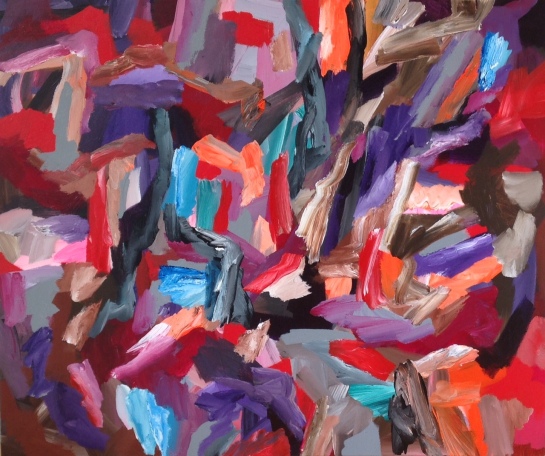
No. 5, 100 x 120cm
NEW UPDATES:

number 2 updated by Noela 10.10.18

number 4 updated by Noela 10.10.18

My favorites by a long way are numbers 1 and 3 (as labelled here), and I’ve been trying to work out why.
Putting aside the wonderful, bright, loosely cluttered and benevolent space of No. 1 and the fascinating, almost cubist tonality of No. 3, my (provisional and speculative) answer has to do with colour and with wholeness.
The prominent, saturated colours in No. 1, the (cadmium?) reds and (ultramarine?) blues are totally non-complementary. Each has to look elsewhere in the painting to relax into harmony. Red finds green in a kind of pervading whisper throughout the lighter areas, while blue finds browns, ochres, salmon pink and Naples yellow scattered in mostly rather insignificant patches among the rest. Both need the entire painting to find their balance. The eye needs the whole work to find its sense.
This contrasts strongly with No. 2, whose colours are evenly saturated and almost almost find a possibly imprecise but adequate
complementary colour directly alongside. I think this is the cause of the “clustering” mentioned in the discussion. The painting divides up too readily into chromatically self-contained units, and the eye is discouraged from seeing the work as a whole.
In the same way, those three and a half lovely areas of yellow in No. 3 need the entire painting for their integration into a delicate and sensuous colour harmony.
Nr. 5 suffers, for me, from the complete lack of the middle part of the spectrum, leaving the eye seeking order and satisfaction elsewhere – not in any harmony of colour, but in the cave-like spatiality and putative figuration.
No. 4 just seems unresolved.
I think Nos. 1 and 3 are fantastic abstract paintings, with the edge on Nr. 1 for its marvellous spatiality.
This, in spite of the figurative readings that both could easily accomodate.
LikeLike
Lots of good things to say about these works by Noela, and I’m pretty close to agreeing with Richard’s intelligent comments. Number one continues to be my favourite, as it was from the beginning of the talk, and how great it still looks in reproduction! There are so many lovely subtleties of colour and action combining, never standing still or repeating themselves.
Number two has well-documented problems which are seen even more clearly in reproduction, yet even so, it is not so very far away from being excellent, despite the nature of how some things move in rather repetitious ways – the very thing number 1 rather dazzlingly avoids.
The surprise for me in retrospect is number 3 because it seems now to be such a strong and whole thing that has not sold itself short on diversity for the sake of that wholeness – a trap very easy to fall into. There is hardly a single inch of this work anywhere that is not fully integrated into the whole structural content. There are no areas or edges or unfelt bits and pieces that “fall out” of the painting at the expense of other, more overbearing passages, and the work retains an almost complete mastery of abstract rightness throughout.
LikeLike
I like these paintings even more now after watching the film.
The conversations around the paintings emphasise what the paintings do, how they do it, and how we saw it differently.z
Richard picks up on colour and wholeness in his comment. And when I look at No. 3 I do realise how valuable it is when independent areas of colour move freely around and integrate with the whole painting whilst also working strongly in a singular way.In No.3 this complexity occurs. Robin , in his comment, describes this achievement of Noela’s as having ……”hardly a single inch ……not fully integrated into the whole structural content”. I agree.
Sarah said an interesting thing about No.2 . She intimated that the structure of that painting was ‘ arrived at’, and not involved with geometry. If a geometry was there I would expect it would be prepared and laid out before the work got going, a sort of grid perhaps. So I prefer that structure can be arrived at because whilst building it opportunities may present themselves,possibly enabling a more Abstract outcome….
Noela describes problems with figuration in her painting as distractions . This way of working ,[ as she goes along,seeing what may happen etc. ] gives her the opportunity to get rid of those ‘distractions’ which she does by painting them out and deciding what else to include.It all seems so straight forward., which is compelling. It also helps to open up more possibilities and, in my opinion, is one of the reasons why these paintings are so uniquely hers. She relies on herself and trusts her decisions and does not seem to be influenced by other styles of painting or by other painters.
I thought we were able to pick over the contradiction thing well in this Chronicle. I feel that is because she uses what we think of as contradictions very clearly which makes for more complexities. She seems to make sense of complexity and I understand more now that contradiction in Abstract art can be two or more different aspects happening together for advantage. As Robin points out, a healthy contradiction becomes specific because of its intention. Noela builds this intentionality by making it specific …especially in No. 2.
Going back to the layering, this was picked up a few times in relation to physicality .I think ,as someone said, it is true that Noela”s layering starts off being literal but in blocking and destroying the literal by making more marks on the painting she adds more physicality.
I usually think that how a painting is made should not be given a great importance.In the case of these paintings I have changed my mind.These paintings of Noela’s describe, in plain sight,an approach to Abstract painting that hides nothing. I like them better for that. I like the way she says about No.2, which may or may not have an arrow through it, that she could try painting some piece out and see what happens. See if the arrow disappears.?……
Noela….. I love the paintings and think ,personally, some are more Abstract than others.
It’ s your clear approach.
It’s what you put in and what you leave out
Fab.
LikeLike
Many thanks for your comments and assessments, much appreciated.
LikeLike
I have been working on nos. 2,4 and 5 and will upload images in a couple of days.
LikeLiked by 1 person
No.1 won the the day for me. I find myself now comparing this painting with my favourite from last year; ‘Untitled [3]’. Both are complex, in terms of forwards and backwards and side to side spatial dynamics. The important difference is that the earlier painting has more of a contrast in terms of larger more clearly defined areas: the blue two part shape on the middle left, the light blue/grey totem pole long shape from top to bottom on the right hand side, and the black long triangle shape, with yellow interior, sitting adjacent to the blue areas. This year’s painting resists such separation.
Which is better? Which is more ambitious? Or they just different in the way they present complexity?
I see the contrast in these two paintings as a useful example of one of the major questions for complex abstract painting (and sculpture).
LikeLike
John,
I took you prompt and looked back at Noela’s work from last year. Like you, I thought number 3 from last year was the best because I believed it was the most exciting and different and I got intrigued by its aggressive spatiality and contrasts. You hint at there being an important question between the work of last year and this – but I think last year has been easily superseded.
Maybe it’s just me, but this new work (3 especially) seems to be assuming in my mind a significance way beyond what I expected of it. It is related to its potential for providing a better understanding (for us all?) of quite how the delivery of abstract painting (and sculpture too?) that is both complex and whole comes together in some fresh way. We have definitely been knocking about with complexity for a while now, and with the idea of “wholeness” maybe too, but perhaps not with quite so much “together-ness” between those things. Here we start to see a way, or a good example, of how these things really work together, generated by how the work is differently thought about from normal – or maybe even more importantly, how it is NOT thought about in familiar ways – that makes it new and different from where abstract painting has often come from.
In the best of Noela’s work this year, “good bits” are not considered as a necessity to development at all, even though the striving for complex structure is still full-on. Such things as separate and over-contrasted parts that are conceived independently as important or exciting are put aside in favour of every-thing in a continuum (yes, I still like the word “things”!) that frees up the ability to move around the whole painting unhindered, whilst still keeping everything as different as possible. Everything becomes important, everywhere. I certainly feel personally that this is a “milestone” of some kind. Still thinking about it…
LikeLike
Thank you Robin,
hoping to upload reworkings of nos. 2 and 4 which I have been doing since my Brancaster discussion. I have changed quite a bit in no.5, it’s not ready to post so I shall leave that one.
Trouble is I’m not sure how to upload an image onto this forum. ??
LikeLike
Noela,
Robin might be able to help on this. I have had a try and a look and can’t upload from my ipad.
LikeLike
Hi Noela and John,
How I do this thing of putting an image in a comment on Brancaster or Abcrit is by Tweeting the image, then right-click copying the image location, then pasting that into the comment box – works every time!
BUT:
Here is the easy way to get over this for those who can’t do it on Ipads – send the images to me (or John – he can do it too) and I can just add them into the main part of the post, at the bottom, after the existing images.
OR:
If you don’t like that idea, and definitely want them in a comment, send them to me and I will Tweet them and paste them in, but it will be as a comment by me.
LikeLike
Thanks for that Robin, I shall go for the second optional as I am using an iPad.
LikeLike
Hi all,
as you will see, I have updated 2 and 4 at the end of the post.
LikeLike
No.2 is still making me feel unsettled, not sure about the top right area of yellow, there is a bit of an arched eyebrow feel I need to address, also the dark lines at the top centre. Thank goodness for acrylic paint which allows for major adjustments.
LikeLike
Anne said on Hilde’s post: “Complexity can be confusion”. Well, I don’t know about these changes, one way or the other, but I feel confused by the complexity! I’m still good with 1 and 3, without question, but though I like the fact you have had a go, I’m not sure 2 and 4 have improved. They look very different, and maybe that’s the photo partly, but maybe they have just “started again” in some way? That can happen.
LikeLike
No.1 is doing it for me. It’s a strange painting, maybe a bit unsettling, and although I don’t know what it’s doing, the painting itself very much seems to know what it stands for. It’s quite uncompromising and decisive in its regularity of marks and closeness of colour. But it doesn’t get boring or repetitive. You actually start to notice all the nuances, the shifts in application and the broadness of the palette. It doesn’t tend to push you in one direction, and doesn’t dwell on interesting areas or ‘bits’, and yet they emerge anyway, as the mind forms these unique relationships that one mark has to another. This painting looks like it couldn’t care less what people think about it.
I know this one has been singled out for praise a bit, and that can be frustrating at times, but I think it just goes to show how hard it is to arrive at those real breakthrough moments. Sometimes it takes a very long time to get back there again. Maybe pictures 2 and 4 struggle a bit by comparison because they do feel as though they could be edited or changed, so things aren’t really taking hold. Or conversely, a few things have taken too much of a hold and need to be re-evaluated. There’s nothing wrong with that, it is the reality of making anything afterall. But I don’t get that feeling from no.1. It’s quite comfortable in its role of disturbing everything and everyone else around it. It looks like it was made with a clear mind and a ruthless approach.
LikeLike
Yes, I think no 2 has become rather ‘complicated’ it seems to have become something that I can’t quite get the measure of, it has such a definite ‘energy’, for want of a better word, and I don’t feel the same control of it as I had for no1. And no 4 has become another painting, you are right Robin, that can happen, and often does.
I like your comments Harry, there is a certain ‘ruthless’ approach in no 1.
LikeLike
Another thing that impresses me about 1 and 3 is the way that their organisation acknowledges and sits happily in the frame but their brushwork appears not to give a damn about reaching the edge of the painting. Is this discipline (an element in Harry’s “ruthlessness”?) or are they cropped?
It certainly makes the space more expansive.
LikeLike
I like it when a painting both works as a world in itself and also implies that the world outside of it continues. Perhaps even that it is a particularly meaningful and valuable ‘part’ of that world. But I’m not sure on this as I think a work of art is a unique visual object in our/the world. Perhaps both views have a truth. Thoughts?
LikeLike
I think both views probably are true John, the ‘world ‘ of the painting would be part of the outside world beacause of the painter’s experiences and knowledge, which could filter through into the work, whether figurative or abstract. Mind you I do tend to agree with Terry Green’s post quoting Pollock (I think it was) , that paintings have a life of their own.
As far as venturing into the viewer’s space Richard, Alan Gouk’s large paintings on canvas do that pretty well, I’m hoping to see his exhibition at Felix and Spear which is on till early November.
LikeLike
I’m completely undecided on this, though I tend to want self-contained works for myself.
The not-quite discussion on abcrit touches on the same theme.
As I understand it, Frank Stella sees Caravaggio as the originator of a kind of pictorial space that connects with the real space of the viewer. He seems to be encouraging this as a way forward for abstract art, which might explain his crazy fairground paintings that literally venture into the viewer’s space.
I’m with Robin’s “Yuck” on this, but the wider question is interesting, even if Stella’s solution is unsatisfactory.
LikeLike
Hi Noela,
You said
“I think both views probably are true John, the ‘world ‘ of the painting would be part of the outside world beacause of the painter’s experiences and knowledge, which could filter through into the work, whether figurative or abstract.”
I would say that the painting is part of the outside world due to the physicality of it and the world. Once painted that view doesn’t need the painter in anyway. In fact I rather like the philosophical notion of the death of the painter. That is it doesnt matter what the painter thought, thinks etc, as each viewer judges the work in front of them on ‘its’ terms.
LikeLike
I see what you mean John, although we all share something as human beings even if we don’t accept things the same way, and of course a painting does have to stand on its own if it is any good.
I agree that one does not need to know what is in the mind of a painter because a good painting, or even a bad painting will resonate somehow and affect a response.
I think titles, or non titles, can play an important role in manipulating understanding. Someone said to me that abstract paintings shouldn’t have ‘figurative’ titles because that interferes with abstract vision…….
LikeLike
I think that if a figurative title interferes with seeing an abstract painting its probably not a very good painting, or the viewer lacks vision, one or the other.
If the actual painting has an overtly figurative element then it can be in trouble. Cue Richard and Ed on the question of figuration in abstract painting!
LikeLike