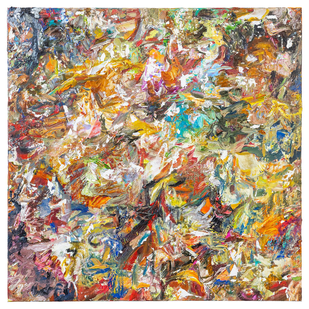
Word Go, 2019, oil and acrylic on wood, 70 x 60 cm
26th October 2019, near Kings Lynn.
Taking part: Anne Smart, Anthony Smart, Hilde Skilton, Mark Skilton, Sarah Greenwood, Robin Greenwood, Charley Greenwood, Richard Ward, Noela James, John Pollard
Untitled, 2019, oil on canvas, 91 x 91 cm
Untitled 2, 2019, oil on canvas, 91 x 91 cm
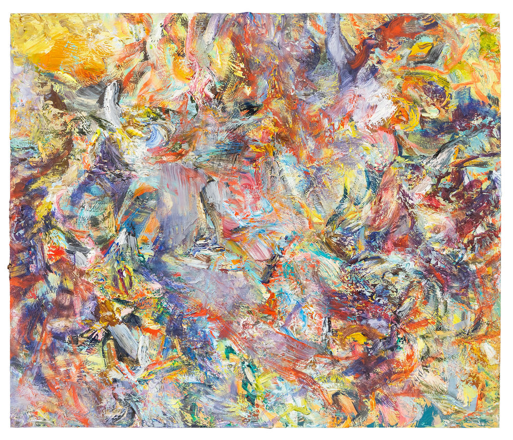
Feeding on Phantoms, 2019, oil on wood, 60 x 70 cm
Yarn Through The Spars, 2019, acrylic on paper, 49 x 36cm
Overture and Mantra, 2019, acrylic on paper, 49 x 37 cm
I don’t dislike any of this work, and the four larger paintings in oil are particularly strong. The first one, “Word Go”, is looking better and stronger the more I take it in. I don’t know the order these were painted, but that one looks like it is the culmination of some very intense and open-minded working that takes it to a place where perhaps the other works have not really reached. You cannot break it down, but nor can you say that it’s wholeness starts to simplify into anything like a known arrangement, in the way the two bigger square works tend to suggest. They have a more familiar centralising aspect that “Word Go” hardly touches upon. Plus, the colour in all its variety and differences of application is really compelling. Its a complex work with lots of different things happening, and the more I look, the more I need to keep looking to discover new ways in which it holds together.
Thank you Robin! I also see “Word Go” as the strongest. It was the most “challenging”, as Tony pointed out during the discussion. It was a challenge to paint it, taking on what was for me an entirely different approach, and once I felt I could do no more to it, it was very difficult to accept that it might have arrived at its final place. But all the while it has been sitting in my studio, it has continued to surprise me with its quite understated believability and openness, as well as its capacity to look different each time I see it.
I think you are right, Robin, to suggest it was made with an intensity and open mindedness. The seeds for this approach were actually planted after my previous Brancaster chronicle, during the discussion about the white, unpainted sections of the canvases I sent over last year. There was a suggestion that they could perhaps be expanded, or utilised in a more balanced and integral way. This got me thinking that my next step was to build an intensity into all of my mark making from the moment it starts to be made, under the belief that all of it could prove to be fundamental to what the painting becomes. I attempted this with several works, but “Word Go” was the one where it all came together. As Richard and Hilde pointed out though, you can’t really force a work like this. You just have to be open to recognising what it might be doing at the right moments. One of the central concerns of “Word Go” as I made it was to not let that larger green and white area slip back too far behind the rest of the painting. I don’t remember any specific decisions that I made to ensure it didn’t, just that I was very attuned to what was going on there.
I think it’s interesting that “Word Go” and “Feeding on Phantoms” were actually made at the same time. Of these works, they are the oldest, pre-dated only by “Fox News”. “Feeding on Phantoms” started out with the same intentions as “Word Go”, but I feel something got lost along the way. Perhaps I took something too far and could never get it back, and so the picture had to go and become something else entirely. I too have struggled with the grey atmospheric patch near the middle of it, but I also couldn’t bring myself to get rid of it. I just felt that for all its potential problems, it was contributing something to how the whole thing operates. I had a similar feeling about the top left section in one of the larger square works. I can completely accept why that might be deemed almost unfinished, but I also felt that there wasn’t a lot I could actually “do” to it, without disrupting the whole flow of the painting. That painting is the most recent, and I had considered it unfinished up until I was packaging the works to send, and made a last minute decision to include it over another one.
I think across all of these works, I have tried to maintain a very open and experimental mindset, and be more prepared to leave certain troublesome elements when they emerge, employ a wider range of approaches, and also work within certain parameters I am less comfortable with. My attitude has been to let these things come about, and sort through it all later, and hopefully just keep throwing more things in the mix.
It’s been such a thrill to have you all see these works and pour so much time and consideration into them. I’ve got so much out of it already, so thank you. Thank you Anne and Tony for allowing it all to happen.
The collaged pieces look fantastic on a screen and, even though the paintings are good, I think these smaller works are bolder, more eloquent and have the more exciting potential.
In the flesh they are let down by their fractured materiality. The screen mends/ disguises this and lets their amazing, distinct, complex spatiality come to the fore.
I think it would be worth trying to “do with paint” what the screen does to these. It probably involves a lot of work on edges, a lot of frustration with disappearing space and a great loss of spontaneity, but maybe at the end of the process you get to be able to paint directly and spontaneously with results like the collages here on the screen.
“Word Go” seems to me a step in that direction, though it still mumbles a bit where the collages speak loud and clear.
I’m tempted to agree, Richard. On screen, “Freeloader”, “Mad Salt” and “Mole Cricket” look especially good. The fractured collage aspect doesn’t bother me, and it could perhaps be developed in its own right by increasing the materiality even further, without destroying the reality of their abstract two/three-dimensional complexity (see John Bunker on Abcrit).
I think in the flesh they are outdone – by something that maybe is their lack of real scale or physicality – by “Word Go”, which remains for me very clear and strong. On screen, both kinds of work are much more clearly related than they seemed when seen for real, and a combination of these approaches might be worth considering.
A big thank you……I have really got much out of looking at these paintings. Both in the live discussion and then watching the film.
I have found myself concentrating on 3 of the paintings in particular.
‘Word Go ‘
‘Untitled’
‘Untitled 2’
They make me wonder.
If you take the dilemma of ‘relational’ and ‘non-relational’ painting [abstract] could it be possible to see these two ideals ,not as an either or construct, but a bit of both?
I think that the three paintings I have selected may be achieving this in varying degrees.?
In spite of your comment that you have tried to remain very open and experimental [and totally respecting your intuitional approach to making] ‘Untitled 2’ seems a bit contrived . In the film there is a lengthy discussion about the “white” and the “shattered” brush work which does pull the painting together.
‘Word Go’ ,in spite of Robin’s believing it to be “better and stronger” than others in his first comment,and “clear and strong” in his second, that achieved clarity, for me,makes it a little like a jig saw. It has a cut-out and harsh feeling ,even though the edges have been softened in areas and some gestures are relaxed. So ,I see a case here for brief nod towards a non-relational vibe as well its main interactions and relations of the areas of shapes and colour etc.
My instinct tells me that non-relationality should be singular. …but the paintings are challenging me on this.
In the end ‘Untitled’ is non-relational and all the better for it I think? There is the controversial “grey” and “blurry” area at the left hand side bellow mid- level,picked out by Richard and others in the film .I find this painting the most challenging and having the most possibility of a truly abstract resolution.
‘Word Go’ is ,I agree, more accessible ,and has been the most ‘liked’…but…’Untitled’ is,for me, proof that there is more purchase to be made by grappling with the so called “fuzzy” or “blurred” actual areas, rather than just abandoning them to chance.
I also believe that if ,in ‘Untitled’ ,that difficult area was to be painted with the same definition as the rest of the painting, that would not make the entire painting more whole and more abstract. It would probably make the painting more difficult to resolve without slipping into a [unconscious] device, such as controlling the painted surface with the use of the white brush
marks as in ‘Untitled2’ or by the use of a [very] tenuous jig saw style grid in ‘Word Go’.
1…”that achieved clarity is a little like a jig saw”…
2. ..”the use of a [very] tenuous jig saw style grid”..
Both of these refer to there being other factors at play in the achieved wholeness…
I have also mentioned soft edges but there is ,as I see it ,an undercurrent of its wholeness being dependant on parts. Those parts,as I suggested having a variety of edges. The jig saw analogy being a way of illuminating an edge around those parts.
if the term jig saw is felt to be inappropriate a good substitute would be ‘collage’…in my opinion.
PS… obviously the lines of a real jig saw do not necessarily follow the edges of any objects in the picture.They will be random.
Of the oil paintings, “Word Go” and “Untitled 2” probably bear the most correlation to the collages, and I’m intrigued by this sense that they dip in and out of appearing to have anything to do with each other. I kind of like that. In Untitled 2, that correlation is at its most explicit, where the use of white through scraping back to the canvas was developed in tandem with the tearing that occurs through works like “Mad Salt” or “Yarn Through the Spars”.
My concern with Untitled 2 was not so much to do with the white areas themselves, but that they represented something of an imposition on the picture, that once this method began to be employed, it had to be implemented with certain equal measure across the canvas. I struggled with this at times, and often found the white to be too harsh, but eventually I came to accept it. I stopped seeing the white areas so much, and once I was no longer working on it, any issues I had with the process itself were somewhat forgotten.
Untitled (blue and orange) was made straight after it, and I think my mindset there was to completely forget any kind of methodology the picture ought to adhere to, other than to just keep the paint mobile and see what occurrences I could bring together. It accounts for two very different pictures.
I’d also like to add that I’m very pleased that the online discussion, aided by the documentation, has brought the collages back into the mix. I’m wary of committing just now to any particular way forward from here, but I’m very pleased to see certain works being returned to in a new light, and that even ones that at first seemed to be unanimously accepted, such as Word Go, are also gathering a degree of criticism. I think that of all the work I have sent across for the Chronicles so far, this is the group I am most excited by, mostly for their capacity to be returned to anew, and continue to offer themselves to insight and discussion.
I enjoyed the amount of variety across Harry’s chronicle. ‘Word Go’ was the best on the day for me; I like that the green/white area both stood out but didn’t dominate the rest of the painting’s structure, largely because the rest was smaller in scale, more complex and full of interest itself. Perhaps the actual green/white area works so well because it both seems to recede behind its surroundings ‘and’ sit on top; doing both jobs at the same time seems to often be an important part of successful complex abstract painting.
Untitled was a luxurious painting with beautiful colour harmonies but would one tire of this beauty in the end? I struggled with Untitled 2 on the day as the white marks flickered so much that my eyes couldn’t settle on the work as a whole (you really don’t see this on the photograph). This problem did get better the more I looked but it still dominated too much. Feeding on Phantoms was an intriguing painting. Further away the smeared/blurred central area simplified the work as a whole, yet when you got closer that bothered me far less. There is an awful lot of good ‘stuff’ in this painting; perhaps the blurred area is just a little too big for me, it simplifies just a little too much. But maybe living with it for longer would prove me wrong.
While none of the collages worked as well as the paintings for me I would like to see Harry continue to explore this.
Overall I loved the experimentation going on with this group of paintings and appreciated the quality!


I don’t dislike any of this work, and the four larger paintings in oil are particularly strong. The first one, “Word Go”, is looking better and stronger the more I take it in. I don’t know the order these were painted, but that one looks like it is the culmination of some very intense and open-minded working that takes it to a place where perhaps the other works have not really reached. You cannot break it down, but nor can you say that it’s wholeness starts to simplify into anything like a known arrangement, in the way the two bigger square works tend to suggest. They have a more familiar centralising aspect that “Word Go” hardly touches upon. Plus, the colour in all its variety and differences of application is really compelling. Its a complex work with lots of different things happening, and the more I look, the more I need to keep looking to discover new ways in which it holds together.
Brilliant set of work, Harry.
LikeLiked by 1 person
Thank you Robin! I also see “Word Go” as the strongest. It was the most “challenging”, as Tony pointed out during the discussion. It was a challenge to paint it, taking on what was for me an entirely different approach, and once I felt I could do no more to it, it was very difficult to accept that it might have arrived at its final place. But all the while it has been sitting in my studio, it has continued to surprise me with its quite understated believability and openness, as well as its capacity to look different each time I see it.
I think you are right, Robin, to suggest it was made with an intensity and open mindedness. The seeds for this approach were actually planted after my previous Brancaster chronicle, during the discussion about the white, unpainted sections of the canvases I sent over last year. There was a suggestion that they could perhaps be expanded, or utilised in a more balanced and integral way. This got me thinking that my next step was to build an intensity into all of my mark making from the moment it starts to be made, under the belief that all of it could prove to be fundamental to what the painting becomes. I attempted this with several works, but “Word Go” was the one where it all came together. As Richard and Hilde pointed out though, you can’t really force a work like this. You just have to be open to recognising what it might be doing at the right moments. One of the central concerns of “Word Go” as I made it was to not let that larger green and white area slip back too far behind the rest of the painting. I don’t remember any specific decisions that I made to ensure it didn’t, just that I was very attuned to what was going on there.
I think it’s interesting that “Word Go” and “Feeding on Phantoms” were actually made at the same time. Of these works, they are the oldest, pre-dated only by “Fox News”. “Feeding on Phantoms” started out with the same intentions as “Word Go”, but I feel something got lost along the way. Perhaps I took something too far and could never get it back, and so the picture had to go and become something else entirely. I too have struggled with the grey atmospheric patch near the middle of it, but I also couldn’t bring myself to get rid of it. I just felt that for all its potential problems, it was contributing something to how the whole thing operates. I had a similar feeling about the top left section in one of the larger square works. I can completely accept why that might be deemed almost unfinished, but I also felt that there wasn’t a lot I could actually “do” to it, without disrupting the whole flow of the painting. That painting is the most recent, and I had considered it unfinished up until I was packaging the works to send, and made a last minute decision to include it over another one.
I think across all of these works, I have tried to maintain a very open and experimental mindset, and be more prepared to leave certain troublesome elements when they emerge, employ a wider range of approaches, and also work within certain parameters I am less comfortable with. My attitude has been to let these things come about, and sort through it all later, and hopefully just keep throwing more things in the mix.
It’s been such a thrill to have you all see these works and pour so much time and consideration into them. I’ve got so much out of it already, so thank you. Thank you Anne and Tony for allowing it all to happen.
LikeLike
The collaged pieces look fantastic on a screen and, even though the paintings are good, I think these smaller works are bolder, more eloquent and have the more exciting potential.
In the flesh they are let down by their fractured materiality. The screen mends/ disguises this and lets their amazing, distinct, complex spatiality come to the fore.
I think it would be worth trying to “do with paint” what the screen does to these. It probably involves a lot of work on edges, a lot of frustration with disappearing space and a great loss of spontaneity, but maybe at the end of the process you get to be able to paint directly and spontaneously with results like the collages here on the screen.
“Word Go” seems to me a step in that direction, though it still mumbles a bit where the collages speak loud and clear.
LikeLike
I’m tempted to agree, Richard. On screen, “Freeloader”, “Mad Salt” and “Mole Cricket” look especially good. The fractured collage aspect doesn’t bother me, and it could perhaps be developed in its own right by increasing the materiality even further, without destroying the reality of their abstract two/three-dimensional complexity (see John Bunker on Abcrit).
I think in the flesh they are outdone – by something that maybe is their lack of real scale or physicality – by “Word Go”, which remains for me very clear and strong. On screen, both kinds of work are much more clearly related than they seemed when seen for real, and a combination of these approaches might be worth considering.
LikeLike
Harry
A big thank you……I have really got much out of looking at these paintings. Both in the live discussion and then watching the film.
I have found myself concentrating on 3 of the paintings in particular.
‘Word Go ‘
‘Untitled’
‘Untitled 2’
They make me wonder.
If you take the dilemma of ‘relational’ and ‘non-relational’ painting [abstract] could it be possible to see these two ideals ,not as an either or construct, but a bit of both?
I think that the three paintings I have selected may be achieving this in varying degrees.?
In spite of your comment that you have tried to remain very open and experimental [and totally respecting your intuitional approach to making] ‘Untitled 2’ seems a bit contrived . In the film there is a lengthy discussion about the “white” and the “shattered” brush work which does pull the painting together.
‘Word Go’ ,in spite of Robin’s believing it to be “better and stronger” than others in his first comment,and “clear and strong” in his second, that achieved clarity, for me,makes it a little like a jig saw. It has a cut-out and harsh feeling ,even though the edges have been softened in areas and some gestures are relaxed. So ,I see a case here for brief nod towards a non-relational vibe as well its main interactions and relations of the areas of shapes and colour etc.
My instinct tells me that non-relationality should be singular. …but the paintings are challenging me on this.
In the end ‘Untitled’ is non-relational and all the better for it I think? There is the controversial “grey” and “blurry” area at the left hand side bellow mid- level,picked out by Richard and others in the film .I find this painting the most challenging and having the most possibility of a truly abstract resolution.
‘Word Go’ is ,I agree, more accessible ,and has been the most ‘liked’…but…’Untitled’ is,for me, proof that there is more purchase to be made by grappling with the so called “fuzzy” or “blurred” actual areas, rather than just abandoning them to chance.
I also believe that if ,in ‘Untitled’ ,that difficult area was to be painted with the same definition as the rest of the painting, that would not make the entire painting more whole and more abstract. It would probably make the painting more difficult to resolve without slipping into a [unconscious] device, such as controlling the painted surface with the use of the white brush
marks as in ‘Untitled2’ or by the use of a [very] tenuous jig saw style grid in ‘Word Go’.
Massively interesting.
LikeLike
Very interesting – but could you explain what you mean by a “jig saw style grid”, Anne? I can’t see that.
LikeLike
1…”that achieved clarity is a little like a jig saw”…
2. ..”the use of a [very] tenuous jig saw style grid”..
Both of these refer to there being other factors at play in the achieved wholeness…
I have also mentioned soft edges but there is ,as I see it ,an undercurrent of its wholeness being dependant on parts. Those parts,as I suggested having a variety of edges. The jig saw analogy being a way of illuminating an edge around those parts.
if the term jig saw is felt to be inappropriate a good substitute would be ‘collage’…in my opinion.
PS… obviously the lines of a real jig saw do not necessarily follow the edges of any objects in the picture.They will be random.
LikeLike
Of the oil paintings, “Word Go” and “Untitled 2” probably bear the most correlation to the collages, and I’m intrigued by this sense that they dip in and out of appearing to have anything to do with each other. I kind of like that. In Untitled 2, that correlation is at its most explicit, where the use of white through scraping back to the canvas was developed in tandem with the tearing that occurs through works like “Mad Salt” or “Yarn Through the Spars”.
My concern with Untitled 2 was not so much to do with the white areas themselves, but that they represented something of an imposition on the picture, that once this method began to be employed, it had to be implemented with certain equal measure across the canvas. I struggled with this at times, and often found the white to be too harsh, but eventually I came to accept it. I stopped seeing the white areas so much, and once I was no longer working on it, any issues I had with the process itself were somewhat forgotten.
Untitled (blue and orange) was made straight after it, and I think my mindset there was to completely forget any kind of methodology the picture ought to adhere to, other than to just keep the paint mobile and see what occurrences I could bring together. It accounts for two very different pictures.
I’d also like to add that I’m very pleased that the online discussion, aided by the documentation, has brought the collages back into the mix. I’m wary of committing just now to any particular way forward from here, but I’m very pleased to see certain works being returned to in a new light, and that even ones that at first seemed to be unanimously accepted, such as Word Go, are also gathering a degree of criticism. I think that of all the work I have sent across for the Chronicles so far, this is the group I am most excited by, mostly for their capacity to be returned to anew, and continue to offer themselves to insight and discussion.
LikeLike
I enjoyed the amount of variety across Harry’s chronicle. ‘Word Go’ was the best on the day for me; I like that the green/white area both stood out but didn’t dominate the rest of the painting’s structure, largely because the rest was smaller in scale, more complex and full of interest itself. Perhaps the actual green/white area works so well because it both seems to recede behind its surroundings ‘and’ sit on top; doing both jobs at the same time seems to often be an important part of successful complex abstract painting.
Untitled was a luxurious painting with beautiful colour harmonies but would one tire of this beauty in the end? I struggled with Untitled 2 on the day as the white marks flickered so much that my eyes couldn’t settle on the work as a whole (you really don’t see this on the photograph). This problem did get better the more I looked but it still dominated too much. Feeding on Phantoms was an intriguing painting. Further away the smeared/blurred central area simplified the work as a whole, yet when you got closer that bothered me far less. There is an awful lot of good ‘stuff’ in this painting; perhaps the blurred area is just a little too big for me, it simplifies just a little too much. But maybe living with it for longer would prove me wrong.
While none of the collages worked as well as the paintings for me I would like to see Harry continue to explore this.
Overall I loved the experimentation going on with this group of paintings and appreciated the quality!
LikeLike