Brancaster Chronicle No. 87: Harry Hay

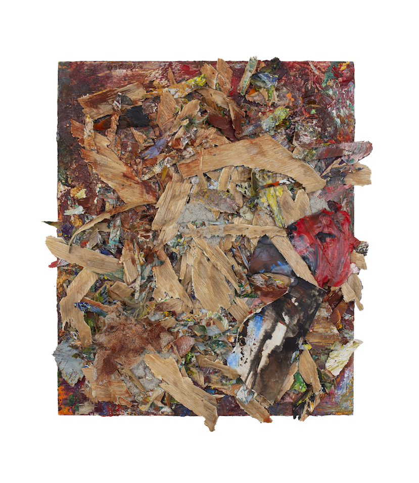
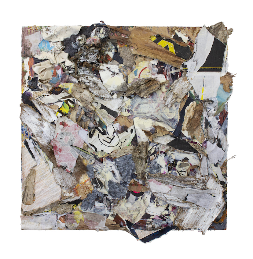
Scoria, 2020, mixed media on wood, 30 x 25cm.
Artist’s Statement
In these works, I’ve tried to not hold anything back, and have gone about that by being more ambitious and more experimental with my materials. I’ve used bark, wood shavings, concrete, old posters, paper pulp, studio junk, even fire. It is undeniable that they provoke some figurative readings. The world is in the materials and those histories and associations can be a hard thing to divest something of. I’m well aware of this, and frankly, not too bothered by it on this occasion. But in offering them up for analysis as part of the Chronicles, I would like to take the opportunity to see past those associations conjured up by the materials, and uncover what else these works might achieve.
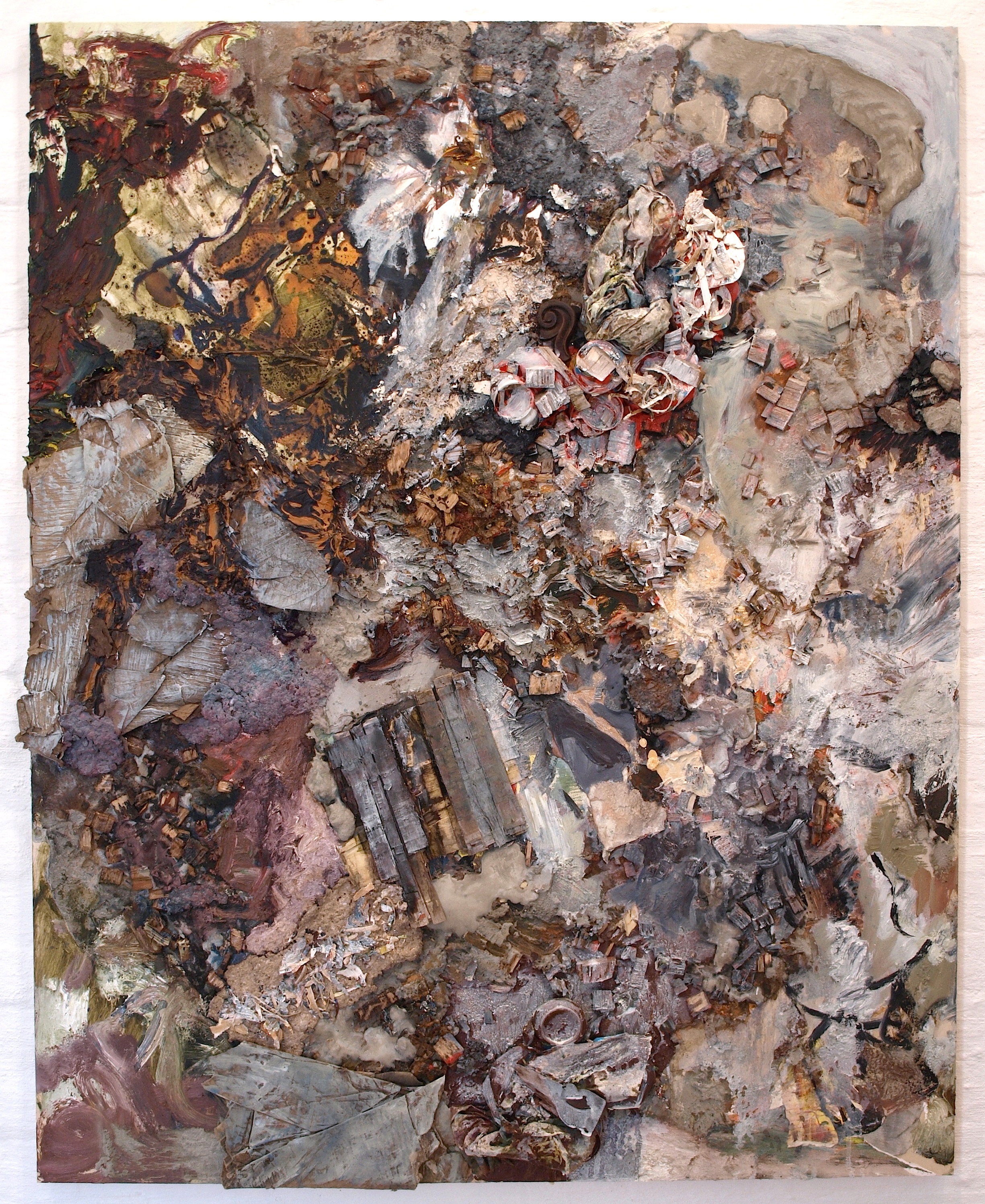
Recrement, 2020, mixed media on wood, 30 x 25cm.
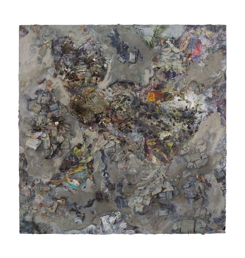
Fen Gargle, 2020, mixed media on canvas, 101 x 101 cm.
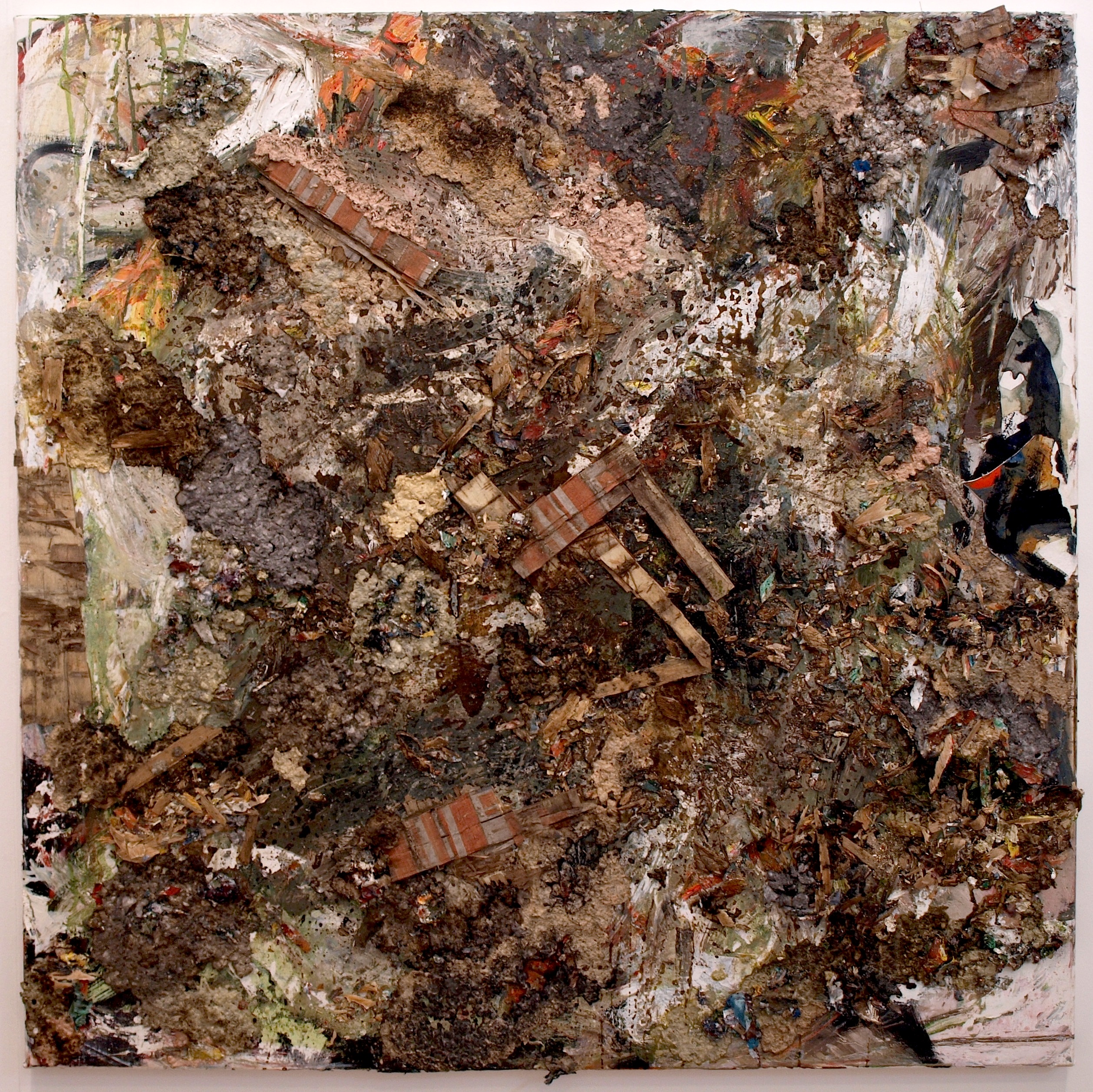
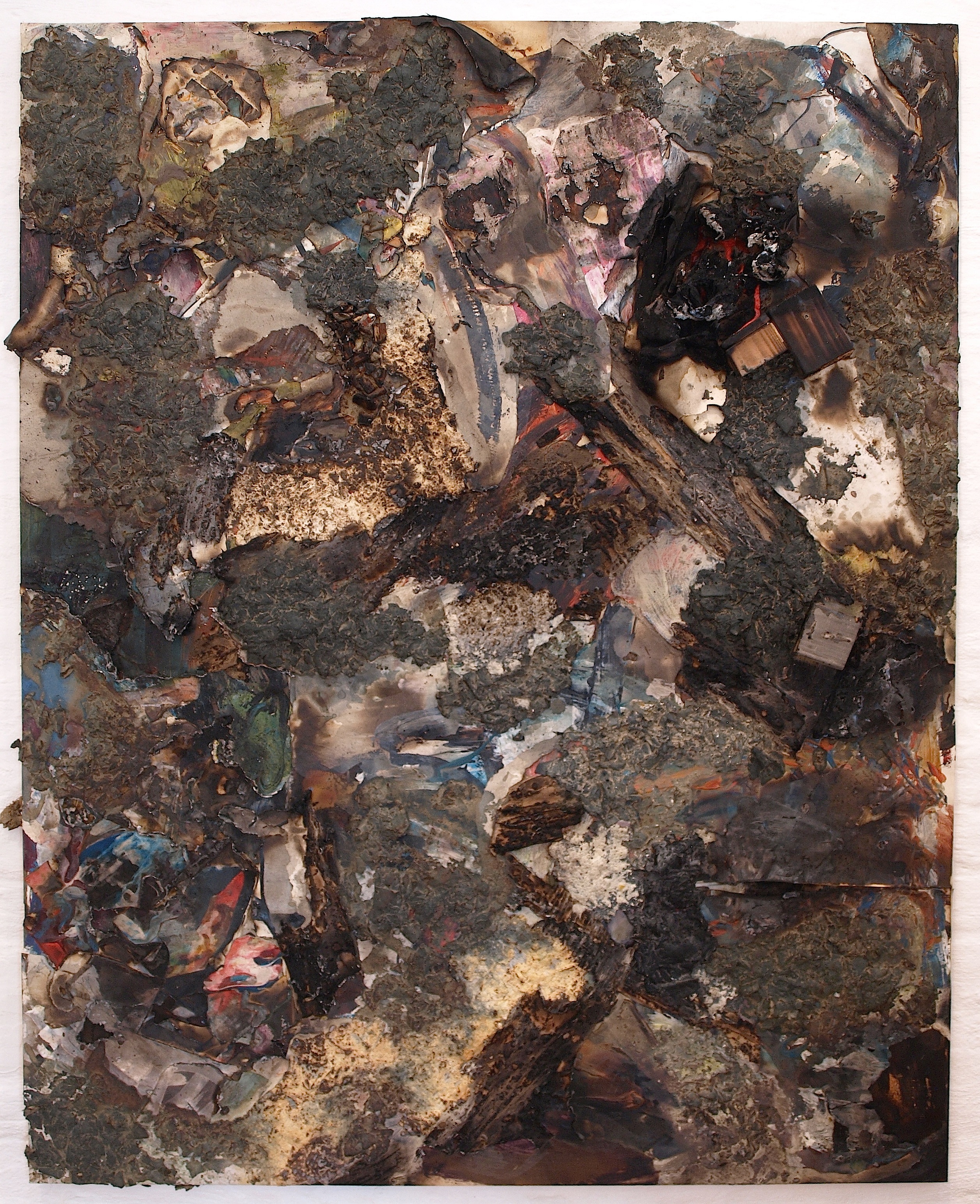
Batter From Brimstone, 2020, mixed media on wood, 150 x 120cm.
Churning in the Eddies, 2020, mixed media on wood, 50 x 50cm.
Hooflets in the Flow, 2020, mixed media on wood, 50 x 50cm.
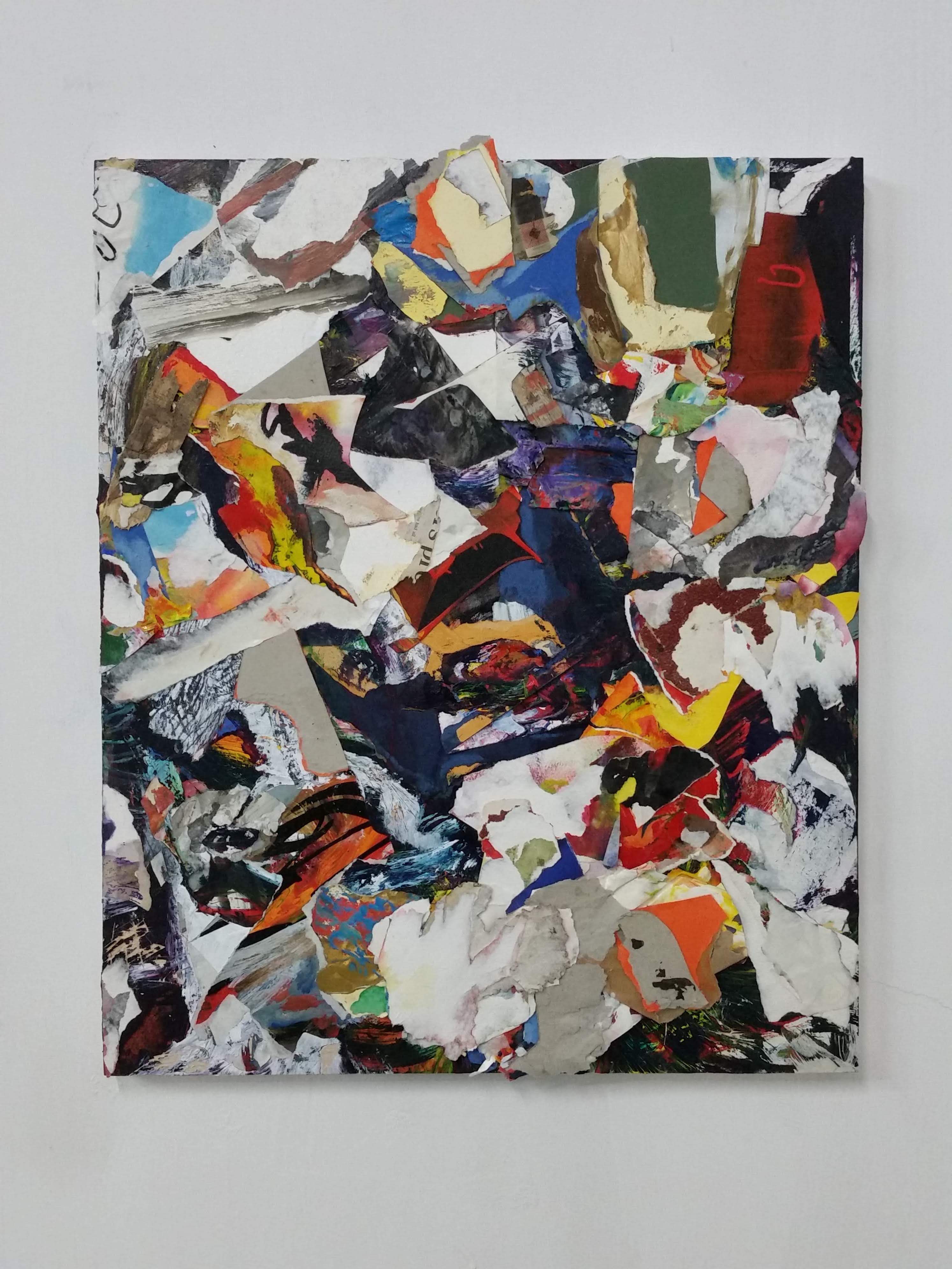
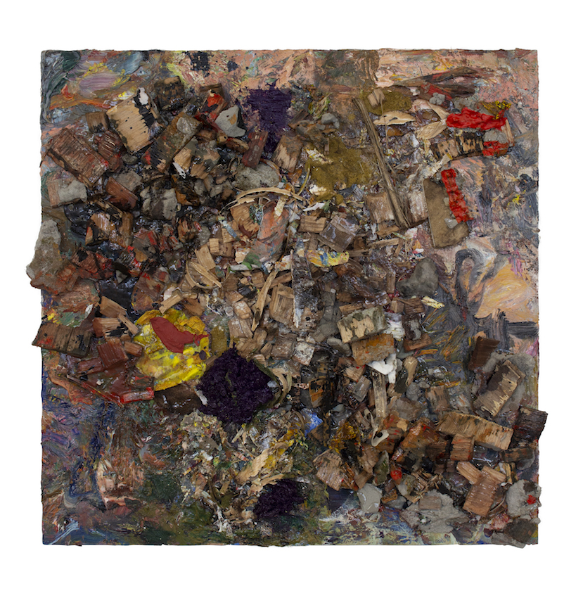
All the Little Devils, 2020, mixed media on wood, 70 x 60cm.
Rubberduck to Sodbuster, 2021, mixed media on wood, 120 x 120 cm.
Scaling the Sooty Grunter, 2021, mixed media on wood, 150 x 120 cm.

Dear Harry ,Fascinating stuff.Looks like a google map of my back garden! fascinated to see the real thing.I imagine the size to be one foot to one and a half ,approx? Look forward to experiencing them.Are they memories?
LikeLike
Hi Harry, seems like Patrick and I are quick off the mark ha.
I do like these works, I am enjoying the materiality but it is not so dominating that I can’t see beyond it.
Robin Greenwood commented about materiality in one of Hilde’s early Brancaster Chronicles saying ‘the materiality (of the paint) is never felt to be impinging upon the content of the work, but always at its service’
I feel ‘at its service’ applies to your work here.
I immediately like Hooflets in the Flow and Batter from Brimstone. The way you have incorporated beautiful subtle colour in Battle from Brimstone really works for me, I mean there is great colour in them all, enlarging the images is vital for theses works.
It is interesting how some have aerial space and others frontal space, that could just be to do with viewing on screen though.
As with Steven’s paintings I shall carry on looking and comment again later….great work.
LikeLiked by 1 person
“The world is in the materials and those histories and associations can be a hard thing to divest something of.” Harry, l am going to be looking at this work with these words of yours in mind…it seems to be so evident that not to work with this seems counterproductive.
LikeLike
Thanks for the comments Patrick, Noela and Hilde. There does seem to be an aerial space to quite a few of them, even in the flesh, according to recent responses from people who have seen them. Perhaps that is a result of the materiality. I suppose, Hilde, that the obvious materiality was something I wanted the works to be able to transcend. For instance, where I have used concrete, I have tried to make it not read simply as “concrete”. Where I have combined paper bark with torn posters, I have tried to counter the potential for one element to override the work. At the same time, there is a contradiction, because why would I use a particular material, if I didn’t want it to be recognised as such? I think I’m going for some kind of balance between the two, and trying to use whatever I can to get myself somewhere that feels unfamiliar.
LikeLike
Hi Harry
When I first opened your Chronicle, I looked at the painting before reading your statement and immediately thought your colour had become a lot calmer and more subdued, although it did seem to have an interesting illusion of texture. Then I read your statement and realised that it was not an illusion, which was a bit of a surprise and a dissapointment.
In your previous Chronicles, you were able to create, through colour an unsettling, fluid surface, with shifting surface tensions, indeterminate,spatial and bigger than the frame that bound them; all very visual. By contrast these works are calmer, more placid with a blending of colour in a common ground and being dominated by the literalness of the material. Which begged the question; what are you trying to say here?
I don’t think that these works are about colour or abstraction for that matter, these are about the environment and arts relevance in it. Given the current climate emergency and the fact that my work has a sizeable carbon footprint, it is something that I ask myself with increasing frequency. Even if this was not your intention the current situation together with your decision to involve the environment literally in your work has determined that these works are more conceptual rather than visual. The main device of conceptual art is literalness in different contexts; in your case the literal environment on a wall in a gallery. The problem with using literalness is that it can never become more than the material itself.
In order for an art work to become REAL it has to deconstruct the familiar illusions of reality that we all build around ourselves and reconstruct a new visual reality on its own terms. Using the literal shackles a work to the familiar and mundane.
LikeLike
I think there’s a great sense of rhythm and movement in these works which suggests that Harry has pushed his great skills in handling paint and surface into a new and, to him him, unfamiliar realm. Personally, I think this kind of exploration is to be applauded. The sensitivity to surface and tone shine through even though he has chosen such tough materials to wrestle with here. It’s a matter of where you decide to place yourself conceptually in relation to these works, me thinks. To a certain degree all art is abstract and to a certain degree all art is conceptual. I’m opening up to these paintings. I’m seeing great movements of shapes and textures rolling over, under and around each other, but I’m also seeing precision and a great touch activating all these complex and exquisite surfaces. Personally I’m scanning ‘All the Little Devils’ with great joy, but I’m also getting a lot from ‘Rubberduck to Sodbuster’ and the gloriously somber ‘Scaling the Sooty Grunter’. It’s a cliche to say ‘I can’t wait to see what happens next’. But I really, really can’t wait to see what happens next!
LikeLiked by 1 person
Hi John. I don’t disagree with your assessment of these works, I am just a bit perplexed as to why Harry should chose “such tough materials” in the first place.
LikeLike
Hello harry,
These works are to be commended for their risk taking and ambition. I find them all to have elemental qualities, some are an expression of one element, some have an expression of more than one.
For example, when I zoom in on Batter From Brimstone, I really enjoy the very active craggy terrain with fossilised camouflaged space ships. The materials have become something else for me. The 3 defined triangular areas are locked together quite beautifully. My eye is led from the bottom left up to a central area and then up to the left through some light frills and rests onto the dark moment on the darkest area on the right edge. Something similar occurs in Fen Gargle where there is a sweep left to right up to a central focal point. The area with the strong contrasting almost black and white on the right is where my eye stops. There is a sense of a wave crashing.
In All the Little Devils there are some very exciting moments to discover. I really like how you have stacked the material in certain areas. Lights on darks around the right side and the bottom right corner, then the contrast centrally where there are darks on top of lights. I love the dark green at the top. I enjoy almost all of this one. When I catch a glimpse of a letter or a word my eye sits there perhaps a bit too long. I feel there is a similar response to seeing the fonts or the letters which stand out at first as do the breaks of the edges does in Rubberduck to Sodbuster, but I enjoy the flow from top left to bottom right again I sense a wave crashing onto a shore.
Thanks Harry, I am really enjoying looking at them.
LikeLiked by 1 person
What I find compelling about these works is the way they reveal their collaged complexity, it is like finding jewels in the mire.
The rustic materials seem to accentuate the placing of the colour which seems random yet completely controlled.
There is so much to see, a completely different character to each piece.
They are visual and, for me, have a deep connection to the world engendered by the choice of materials.
LikeLiked by 1 person
From Tony
Hi Harry
Your painting with the overhanging bark is my favourite. “Recrement 2020 ”
I think however it could have taken a very different route had the support rectangle not come in so early. Should it have come in at all? In the photos the bark looks to have structural intent and could with more physical intervention have become the support and taken the painting down ,for me at any rate, a more ambitious road and maybe become more original.
For all the list of unusual materials I feel the paintings content, looks ,certainly in photos, to be fairly conventional in their configurations and ‘feel’. It should have looked more difficult and different to have pulled that ‘list’ together.
They look too comfortable and your desire to transform the materials has taken the ‘sting’ out.!
Best
Tony
LikeLike
From Tony
An after thought.
Maybe they became visual too quickly? …before they had divested their physical characteristics {their materials } so that the physical ,in so needing to be re-invented ,still had a role to play.
Why not have both – have it all !!
LikeLike
I tend to agree, Tony, that these don’t go far enough. I’m always thinking about the next work, and however much I might appreciate the support for my previous oil pantings, I am not in that head space right now. Tony, I find your advice exciting because I can see myself wanting to get more involved with the materials, seeing what I can get to happen, before any notion of support comes into play. That seems like a promising avenue to explore.
It must be said that I think the photos are being a bit misleading. Of the paintings that contain elements form the natural world, there are only two. They are Rubberduck to Sodbuster and Scaling the Sooty Grunter. The rest are all sourced from within the studio, even Recrement.
I don’t agree that bringing elements from the natural world into a painting automatically makes it conceptual and literal. On a pedantic level, we would be forced to argue about paint being too tough a material because of all its associative baggage. I don’t see how there can be right or wrong materials, except from a technical standpoint.
I’m grateful to everyone for their comments. Thank you John, Steven and Noela for your enthusiasm and unique takes on the works, and to Mark for letting me know your thoughts. In an age of likes and instant gratification it’s great that a forum like this exists where we can have our work challenged.
LikeLiked by 1 person
Hi Harry
The associative baggage of paint, is our stock in trade. Without it we would have nothing and everything. The problem with including materials from the environment(not just nature), is that they are deterministic; their very identity as things determines their use and outcome.
LikeLike
Some of these appear to play between landscape painting and being the terrain itself – especially Batter from Brimstone and Hooflets in the Flow. This creates an enjoyable granularity and a tension between the illusionistic and the literal. It reminds me of the partial scale invariance of a real landscape, i.e. how a small rock close up looks the same as a large rock far away, except for the fixed scale of the crystalline structures. If I were to continue the analogy, these paintings are at the level of zoom where the fixed scale crystalline structures become visible through the more organic chaotic fractal of landscape.
Unlike the two mentioned above, Fen Gargle seems more clearly just the terrain itself, with less illusionistic depth, so is less interesting to me.
The churn in Churning the Eddies is great fun. There is a strong right angle in the centre separating off the bottom left quadrant from the rest. I am trying to work out whether that is essential to creating the churn or not.
Scaling the Sooty Grunter I think I’d need to see in the flesh to grasp as I’m struggling with zooming in and out to take it in.
The dynamic shape of Recrement is immediately exciting but I find myself looking much longer at Scoria. It has more mystery and the purples in the top right, and the yellow in the top centre work brilliantly with the wood shavings.
But of the whole set probably Rubberduck to Sodbuster is my favourite. Maybe because while it has individual elements that have a grain to them, the whole thing has a grain to it at a higher level.
LikeLiked by 1 person
I really like the bottom half of ‘Scoria’ but struggle a little with the top half: perhaps too much of the wood shaving looking areas and the grey concrete. I think that in the flesh this might well improve and look less flat and much more active that the photo, which seems more blurred and soft than some.
There’s a strong graphic shape to ‘Recrement’ and the bold red blob on eh right hand side which connects to the black and white shape below work; they seem to be balanced with the top quarter which has a gorgeous brokenness. Are the ‘shaved wood’ pieces too dominant again th0ugh?
I like ‘Fen Gargle’. How successful it is relying on how those three stripes’ strips work in collaboration with everything else. I really like the everything else.
‘Batter From Brimstone’ is fantastic, albeit with an annoying top right corner which seems incongruent with the rest of the piece: I’d love to see the rich broken content extend to that corner. It matters less as you move into the painting. Considering the materials are so predominant Harry has kept a lightness of touch throughout the work: it is both strong, visceral but rather beautiful and delicate.
The problem for me with ‘Churning in the Eddies’ is the large central triangular shape which I struggle to get pass. The top right corner strip to the left of the red blobs blunts the space, and helps to compartmentalise too simply the whole work: take that off and who knows? Most of the content is fantastic brokenness.
‘Hooflets in the Flow’ is my least favourite. It would be interesting to see it in the real but I mostly see a boat, broken surface shape, and a surrounding grey ground.
‘All the Little Devils’ can be seem as the dysfunctional wild child of John Bunker’s ‘Meltemi’ and ‘Petromax’s Mirror’ from his recent chronicle. It’s an interetsing comparison and I have no value judgement as to their various merits: I like all three.
‘Rubberduck to Sodbuster’ looks really interesting and needs to be seen in the flesh. The photo is a bit ‘soft’ and I’m guessing that you need to see the contrast in the white areas to appreciate it.
‘Scaling the Sooty Grunter’ is one of my favourites, at the moment. Its complexity is subtle, nothing dominates, everything delights.
I like Harry’s experimentation with materials and think this is worth pursuing for a while. On the possibility of materials working beyond their literal materiality that, for me, depends on the success of how everything works together in relation.
While one can always come back to the identity of its materials, a successful work will largely transcend its materials.
All comments are completely open to revision because of some of the material: they need to be judged in person, even more than paint paintings.
LikeLiked by 1 person
Harry…the texture of the materials dominate in this work and l can only think how much more impact l would experience stood in front of them. Perhaps even movement and surface tension of a different kind would be apparent ; which is something l think is necessary in a visual painting.
LikeLike