Brancaster Chronicle No. 89: John Pollard Paintings
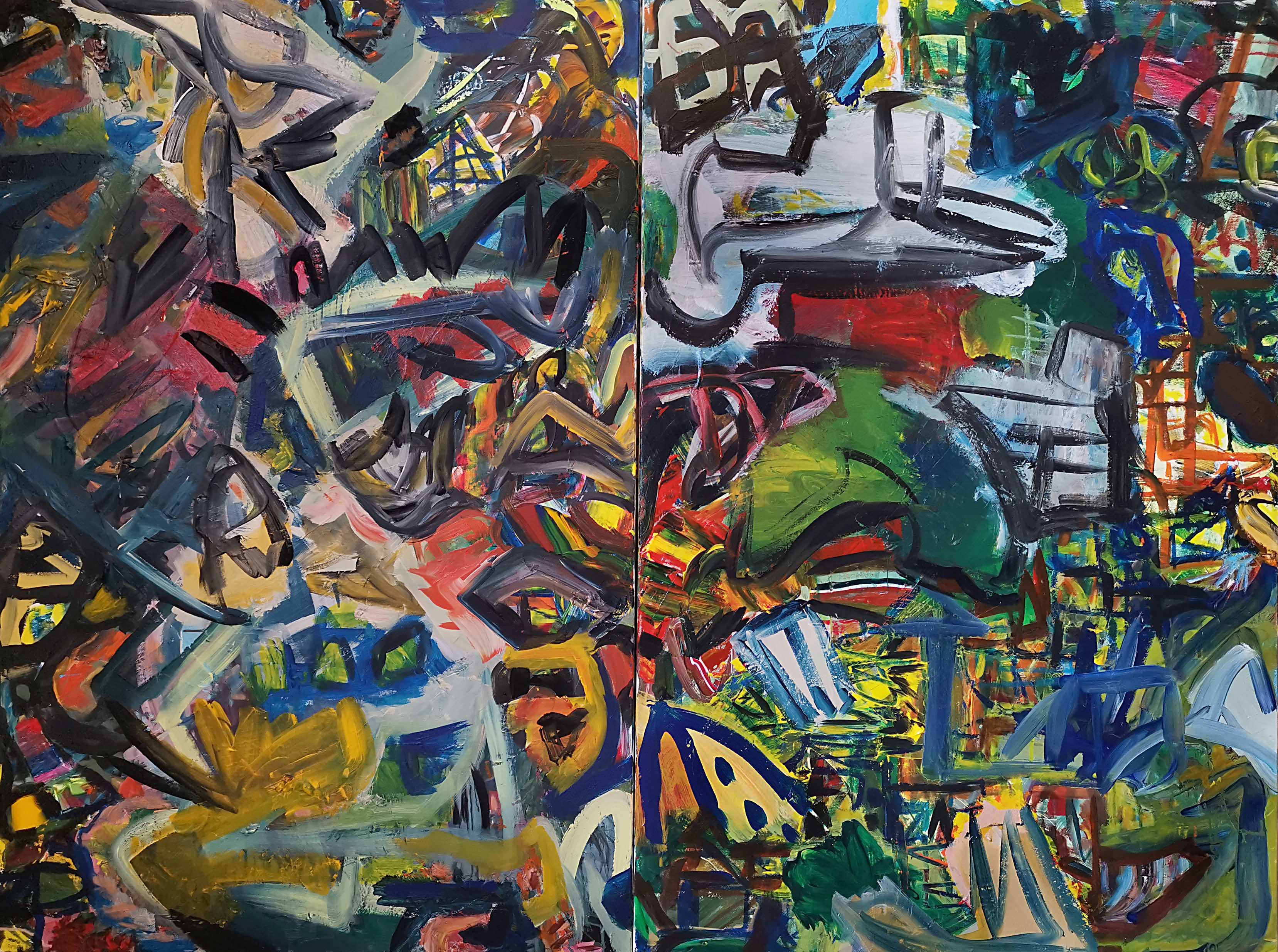
Fondamenta dei Mori (diptych, acrylic on canvas, 120x160cm)
Artist’s Statement
If I had guiding principles they may be something along these lines:
- I make abstract art as it still has meaningful potential to be realized.
- I strive for complex diversity.
- I make abstract art as it can best reflect human freedom (‘free’ from any external subject).
- I generally work without any preconceived ideas. I will often do more looking and thinking than actual painting.
- The freedom of the art object: the artwork has both an existence in itself and as something whose meaning and value can be unconcealed by each viewer. The meaning will always be the responsibility of each viewer.
- The death of the artist: the artist has no special insight into the value of their work (message: think for yourself).
- I don’t create paintings to ‘express’ my identity. They do, however, have something to do with ‘creating’ my identity.
- I create paintings to try to add a new object of visual value and meaning to the world.
- Paintings should continue to keep ‘giving’ to the viewer. The meaning of a very good painting will not easily be exhausted. You should have an ongoing valuable relationship with it.
All paintings 2020/2021

Daemon Times (diptych, mixed media on canvas, 80x160cm)

Insignia of Lockdown (Gupta’s Tears), (acrylic on canvas, 150x120cm)

Escaping Me (acrylic on canvas, 132x340cm)

Tempered Grace (acrylic on canvas, 80x80cm)

Hid Dud (acrylic on canvas. 80x80cm)

“What Is This?” (acrylic collage on canvas, 50x60cm)
Og-Telebot (acrylic collage on canvas, 50x60cm)

Escaping Me has a hieroglyphic quality which is interesting. the drawn lines dance across the canvas. with Og-Telebot the torn paper adds a different geometry to the drawn lines, a rigidity to the structure of the canvas with the edges. It is a very interesting parallel
LikeLike
Hi John, some great work here, ‘Escaping Me’ feels calligraphic to me, but I can also see what Alex means. A good size and format to it as well.
I see a greater emphasis on using white which is a change from the past couple of Brancaster sessions.
I really like how the white edges perform in the ‘Daemon Times’ , there is a shattered jewel like quality to the collages which works convincingly across the two panels.
‘Tempered Grace’ has a seductive appeal to it with scraped out textures and reds being dragged through the blacks and greys, feels like a continuous movement all in one go, crashing through the canvas, lots of energy.
Will carry on looking and write more about others later.
LikeLiked by 1 person
Hi John…for now I just want to say that ‘ Tempered Grace’ is my go to painting…to take Noela’s words ‘feels like a continuous movement all in one go, crashing through the canvas’ l could not have said it better myself. Wow it is crazily all there!
LikeLiked by 1 person
I have been wondering, John, how relevant your titles are, especially ‘Insignia of Lockdown’ and ‘Fondamenta dei Mori’?
I certainly feel Insignia of Lockdown has a frantic, cacophonous and discordant atmosphere to it, multi layered and complex, and powerfully discomforting.
Still looking at the work and enjoying ‘Hid Dud’, I like the way you have used the linear blacks in relation to the red and pink areas, the bits of blue and then the orangy like area at the top give a coherent feel throughout the painting.
LikeLike
Hi Noela.
I guess the titles are relevant in the way that I created those ‘and’ the paintings, but the actual link between the title and the work is almost meaningless, certainty in terms of the ‘value’ of the work. It is interesting that you use the words ‘frantic’ and ‘discomforting’. I don’t see that at all, although I’m well aware that others do! I see ‘lively’ and ‘challenging’. I’m interested in whether you can have a good ‘frantic’ and ‘discomforting’ abstract painting or is it necessarily problematic?
LikeLike
I don’t think it is problematic, it’s just the feeling it brings to me, not everything needs to be comforting, and the more I look at it other elements such as the whites, yellows and blues, come to the fore. Definitely a painting that keeps giving all kinds of experiences, and that is a good thing, if not always comfortable.
LikeLike
Thanks Noela, I’m interested in the uncomfortable as it is not uncommon and for some is part of a value judgement, but perhaps not the right forum to go into this, although you could relate it to the look of the work rather than subjective feelings (I’m not uncomfortable while painting, not in this work anyway).
LikeLike
I think this painting covers most of your guiding principles.
LikeLike
Many thanks for your comments Noela, Hilde and Alex.
LikeLike
From Anne
John…I am so happy to be showing my paintings in the same time frame, as it were, with your work..and I really appreciate your comments.
I am liking looking at them at different times.
They are so active.
Vital and dynamic.
When I say I’m looking at them at different times …that sort of covers my own various moods. These paintings remain constant whatever my state of mind. Calmly active.
Your decision making throughout these seems to correspond with an aesthetic choice which you follow through on.For example…in “Hid Dud” the black paint workings seems both deliberate in action and tone, and in “What is this?” you use white with the same emphasis. For me this shows careful and thoughtful consistency moving to a sensitive resolution. Definitely thoughtful.
Both “Daemon Times” and “Fondamenta del More” are crazy. Crazy good.
Each dyptich gains strength from its partner. In both the disparate clamping together gives an added ‘wow ‘…i have not made my mind up really whether that is a bonus ..it could be that there are 4 strong paintings and not 2 ?
“Insignia of Lockdown” is great. Holds so well together. Quietly confident. Its fluidity is increased by the realisation that individually lots of the areas of paint applications and detailed ares are in themselves quite rigid…an exciting anomaly !
i think “Escaping Me’ does not get a good run out. As you know I contacted you to ask if you had made a typo mistake with your measurement !!
It would be more interesting if the photo showed you standing next to it ! however …it has so much force and movement it still looks good. A proper big one that!!!!
Thanks John
LikeLike
In ‘Fondamenta dei Mori’ the larger areas of whites, green, yellow and red in both sides work to offset the black marks that travel across each canvas. They lend variety and also allow the more complex areas to come into view. There is a kind of balanced activity and rhythm with wilder passages, the two sides seem to have different characters but I feel they connect via the linear elements.
LikeLike
From Tony
Regarding Fondamenta Dei Mori
John’s vigorous and confident delivery of brush strokes, come together immediately to form groups which in turn are highly suggestive of ‘frames’ etc. etc. Three dimensionality in fact ! All the paintings we have been looking at this year have so far contained this suggested element. But where Steven’s No 1 painting is made up of large, complex units of colour , these of John’s go further in forming something !
In line with him continuing with his “complexity with variety” , these are now found together in what amount to transparent structures. What unifies Fondamenta Dei Mori is the ‘back lit’ areas which overcomes for him, the dilemma of painting objects in an abstract painting. In other words , what would have been a complete mystery for his static frames, as to what was on the other side, has been over-ridden by yellow light coming forcibly through the apertures.
Does this go some way to secure the whole as abstract ?
LikeLike
Hello John, I’d like to take a look at Fondamenta dei Mori.
On my first observations I felt the left-hand panel was visibly closer to me than the right and that change or difference in scale was perhaps too much (greater use of a calligraphic black line perhaps than the right-hand panel) and with only the almost central middle yellow form being the only obvious visual connection between the two panels I wasn’t sure about why they were put together. However, when I began to look closer and, in more detail, aided by Hilde’s great comments about “being on the same plane” and “the shifting of space” I have shifted my stance about it. Thanks Hilde!
John, you have a fantastic ability to make strong and varied colours work together. I am very impressed by the colour you use; for example, at the top of the right panel there’s a great section of a bright cool blue sitting on a warm yellow next to warms grey, opening out into a large grey form with a graphic, loose black line. I am only highlighting one of loads of great colour work. I always ask myself how does John make the colour so cohesive?
Benefitting from the backlit yellow background which peeps through often and with the left and right edges almost threatening to impose, control and squeeze (a bit of sensory pinball), the fluid middle sections sweep left to right and hint at a game of (not quite snakes) and ladders????? Totemic poles, a green lung shape which I really enjoy.
Sometimes, when I look, things feel inverted as if I’m looking at the painting in a mirror. I occasionally get the feeling I am looking at the reverse of something and that I am meant to read it counter intuitively.
Unabashed and forthright. Complex and diverse and definitely abstract.
LikeLike
In ‘Daemon Times’ colour rubs up directly against colour via tears in contrasting surfaces and textures. The kind of visual interference you manage to get with the input of non-painterly materials creates a marvellous scintillating visual thrill that keeps the eye active and engaged. Also, I think the collage work generally is allowing you to break out of using black line as a short-cut to an all-over sense of cohesion and design. For me, it tends to trap colour rather than liberate it. On the other hand, I wonder about making more of dragging paint- colour into colour? Its happening already in ‘Tempered Grace’ and ‘Hid Dud’… Exciting times in the Pollardian universe!
LikeLiked by 1 person
Many thanks for all your comments. I enjoy absorbing your different phrasing, it actually really helps in seeing things in a different way. I think this is my most experimental Chronicle: it doesn’t mean the work is better but it does mean that the diverse work opens up various avenues, which is really important to me.
I still like black, and I try to keep it diverse, multidirectional, and try to prevent it becoming an inverted static ‘ground’.
I’m a restless, physical artist and while I do realise its drawbacks and I try to mitigate for this with judgement and long periods of reflection, it is also my strength and direction. Accidental or spontaneous mark making (which I think is vital to create diverse and meaningful relationships), has to be consciously structured into worthwhile relational wholes.
I should say I’m chuffed that Steven likes the colour so much: perhaps I’ll start calling myself a colourist!
LikeLike
Looking at John’s work again after a few weeks, I’m really liking the look of ‘Og-Telebot’. Perhaps it’s got something to do with the large areas forming around the corners of the work, that pale blue “D” that forms around that torn collage segment, opposing the pink corner, inscribed with its own strange and indecipherable rune.
It all seems to dissolve and disassemble fluidly into the rest of the work, perhaps the Blue “D” less so. But I like it for its boldness. Perhaps this makes me less drawn to a work like “What is This?”, which maybe suffers from a lack of contrast within the work.
‘Daemon Times’ is very exciting and I really applaud John’s level of experimentation in that one. The variation of the marks in ‘Daemon Times’ seems to really drive at John’s core concerns… complexity with diversity.
Of the non-collage paintings, my favourites are ‘Tempered Grace’ and ‘Hid Dud’. I enjoy the scraping that creates veil like layers of depth, kept in check with the surface I think, simply by the colour and the deft touches of black cutting in and out of the space. The multi directional movement within them is really good too, perhaps more open and from the shoulder than the more drawn gestures in ‘Insignia of Lockdown’ and ‘Escaping Me’? Although admittedly, these latter two are rather large works and would need to be seen in the flesh before committing to a judgement of them. Perhaps the scale of the gestures are quite similar across the works? Perhaps I’m responding well to the internal scale of ‘Hid Dud’ and ‘Tempered Grace’.
Really exciting and diverse bunch of works, John. Look forward to seeing where the experimentation takes you.
LikeLike