Brancaster Chronicle No. 6: Emyr Williams Paintings
First posted on abstractcritical.com 16 October 2013

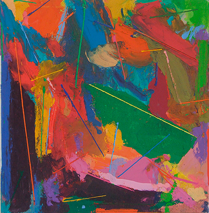
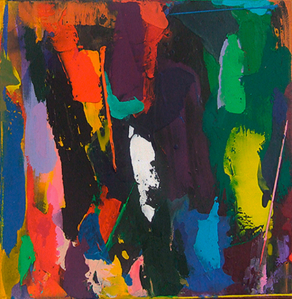
Stepaway, 2013, 91.5×91.5cm, acrylic on canvas
14th September 2013, the artist’s studio near Chelmsford, Essex.
Those present: John Bunker, Emyr Williams, Anne Smart, Anthony Smart, Robin Greenwood, Sarah Greenwood, Alexandra Harley.
Emyr Williams: I have been working for a couple of years on pre-stretched canvasses, the first time I have done that in 25 years. That has been a big factor in the way I approach things, and made me want to change a lot of things in the work. It would have been nice to say ‘hey’ that’s a fait accompli, this is where I am, but actually the paintings are much more problematic than that. What I want from them at the moment is a springboard into where I want to go with it next. I do like working on pre-stretched canvas now I’ve had a period of time doing that, never having done that before. There is something about having the return edge [on the canvas] that I feel I need at this point. I started doing paintings about 20 inches square. I had about 30 to 40 of those on the go. One of the good things about that was that I could put them all up and take them all in at a glance and see what was going on. I did lots of other things; collage, drawing, and working on different sizes, but that [20×20 inches] was the size I used to drive the work and make the changes. Slowly, there were a few things happening in them that made me increase the size. That set up some problems in how I would translate from that size to that size [small to big]. Now there is probably a more explicit tactility to them than in the past. I’ve always been impassioned about the quality of the surface of the painting. I am now trying to get more variety into a single painting with different kinds of surface… and the way colour relates to surface is something that I’m keen to push further. An experience of colour can change depending on the surface that supports it. That cadmium red can look very different… the sheen of it… the translucency of it, the degrees of opacity, to almost a velvety finish. Can you see through it or not? All these factors I try to control. I am trying to find a greater amount of ‘colour-surface’ within the work. I’m at the start of trying to do that…
Anthony Smart: This ‘control’, what’s that about?
Emyr Williams: Having an intent, so it’s not random. It’s the choice of how I want particular colours to appear… do I want to see what is underneath it… do I want it to be very matt, or have a slight sheen to it? These are questions about the quality of the paint I’m going to create, so it’s not randomly done. I’m trying to get hold of these things, give them a quality, to an expressive end, that gives you a different experience of the colour, ‘tempered’ in some way, so that you don’t take it for granted.
Alexandra Harley: So do you have a clear idea when you set out of what you are trying to achieve?
Emyr Williams: No, it is organic, but I find it interesting how you can break up the surface, use it in different ways. I’m trying to explore the possibilities….
John Bunker: For me what’s interesting and compelling about these paintings is the sense of oscillation in the way I’m looking at them as I move in and out. Is this to do with the sensations of layering… and edges coming forward, over and under? The hard lines of colour, I am intrigued by those. What are they about…?
Robin Greenwood: The lines [in a number of the paintings] are, I think, something important to talk about. I was going to have a guess at why you had done them, because they appear all over the place. I going to suggest that you are using these lines to try to make the colour patches into something more specific, to sharpen them up… give something to contrast against or spatially place them… to say where that patch of red is in relation to that thing… to do something…
Emyr Williams: …structural!
Robin Greenwood: Structural? Yes, well, I just feel there must be a reason why you keep putting the lines on. It might be that you want to compensate for the patches of colour not being quite adequate to do what you want, not specific enough. It’s like you want some drawing on the top of them that will fix them in space.
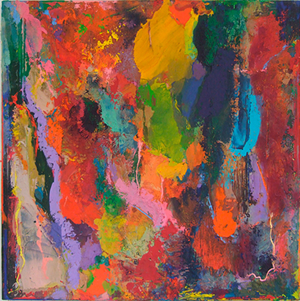
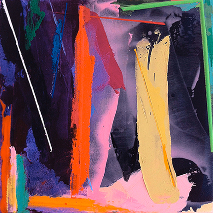
Jigjag, 2013, 91.5×91.5cm, acrylic on canvas
Emyr Williams: Most of the time they serve a number of functions. I don’t set out knowing I’m going to put them in. Sometimes I use them to ‘cut the fat’ of a colour… so if there is an area of colour where I think there is too much of it, I may want to cut it or chop it… sometimes sink them into the colour, sometimes over the top, sometimes they declare an edge.
Robin Greenwood: You seem to be trying to make the painting less ambiguous…
Emyr Williams: Maybe more ambiguous. I don’t know spatially what the heck is going on…
Robin Greenwood: Why would you make it more ambiguous?
Emyr Williams: To surprise myself. It has to be more than is in my mind; it has to be something I have no clue about. Trying to make the ‘what ifs’ happen; and it is more instinctive than that. Having got that blue and then wanting the pink in there [in ‘Stepaway’], it’s a question of how you are going to do it?
Robin Greenwood: So these colours [top centre right in ‘Stepaway’], the darker turquoise looping round, the pink line at the edge of the turquoise and the patch of orange… that seems to become something more specific. If you had thought it [the turquoise] was enough on its own you would have left it.
Emyr Williams: I had this red and purple [left of ‘Stepaway] which needed lifting. I have a responsive approach – I put the red and purple and then I put in the yellow line in, as a response. When I put the lines in I have options; I can have them as clean lines, or sometimes dragged or manipulated. In the end it’s just another way of painting, putting the colour in and finding a different kind of surface for it.
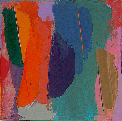
Anthony Smart: I was struck by ‘Jigjag’; it is the odd one out in the group. The rest of the paintings are predominantly vertical; this one is spatially more active in colour terms and position of the largest elements, and then these ‘biting’ thin patches of colour come in. in this painting more than the others they start to rotate spatially. The lines enforce the green in the ‘tipped’ position, or this warm blue, skewing and rotating this whole group. It is for me a much more spatial painting and I sense the success of the lines in this one. I’m very happy looking at the lines in this painting. I come to this one [‘Rasio’] and it seems more predictable; basically it’s a ‘vertical’ painting. ‘Persuader’ is the example without lines, and that proves how successful ‘Jigjag’ is. It’s quite weird and amazing what’s going on in there.
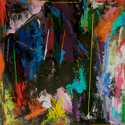
Persuader, 2013, 91.5×91.5cm, acrylic on canvas
Emyr Williams: I was acutely aware of the ‘verticality’; you have hit that square on. I was talking to John about the diagonals and how forceful they can be, and the next step would be to take that further and start to spin around all over the place. This painting had originally been light and delicate. I need to go with the space more, find more turning elements, more unpredictability.
Rasio, 2013, 91.5×91.5cm, acrylic on canvas
Anthony Smart: In this one [‘Head Over Heels’] there is a bit of a ‘lampshade’ object in it; it is sort of shaded in 3D…
Emyr Williams: The thing that bothered me about it was that it’s a tonal thing that’s going on and I’m not sure about that. It just happened, so I left it. One thing that never changes is that I like to use clear colours that you can see working against each other, that you can construct with. In these ones I felt perhaps the colour possibly had not kicked in yet because I am so turned inside out with surface, and getting hold of new ways of putting surface down with different qualities.
Robin Greenwood: There are millions of different qualities of surface. Why would you want to go through them all?
Emyr Williams: I have narrowed them to a few. The opposite would be to take the pink and just put it on [without worrying how it goes on].
Robin Greenwood: It would not make a great deal of difference to me if this strip of yellow here was shiny or matt or had pumice in it. What would interest me more would be where is that thing in relation to that thing, what spatially is happening.
Head Over Heels, 2013, 51x51cm, acrylic on canvas
John Bunker: But the surface does have an impact.
Emyr Williams: It’s the surface which determines how you experience it. It’s trying to create the space and luminosity.
Anthony Smart: Emyr is arming himself with a vocabulary of how he paints. I think all that is really good, but I don’t think one colour against another is going to make a whole painting. It’s just vocabulary…
Emyr Williams: The totality has to have some sort of luminosity. It glows in some way. The colour is alive and creates space.
Anthony Smart: That’s still vocabulary…
Emyr Williams: That’s like saying form is vocabulary in sculpture.
Anthony Smart: No, because you can’t have form without meaning.
Emyr Williams: OK, I suppose the meaning is the way colour constructs the experience of space and how it interacts with the other colours for the quality of light.
Anthony Smart: Right across the painting?
Emyr Williams: Right across every single part. And the paintings I am tuned into most, not just my work but other people’s, do that.
Anthony Smart: What about this hole [in ‘Jigjag]?
Emyr Williams: I like that and I am glad you picked up on it. That’s something that I want to look at more, things that turn and are more spatial.
Anthony Smart: It seems to me that the main architecture of the painting is that big thing and what is supporting it, to make it specific, is what you are talking about. There is no point in contemplating or manipulating the subtleties without some big thing to hang it on.
Stepper, 2013, 51x51cm, acrylic on canvas
Emyr Williams: Exactly, I agree. I made a lot of collage over the last 2 years and some screen printing. I found that some of the qualities of my paintings were chasing the qualities of the screen prints. This brought me right up against what I wanted of my paintings. Even the size was an issue.
Anne Smart: Regarding size, when you said these were ready-stretched canvases, did you not find that a little restricting? Working within those confines makes them feel ‘tight’. My favourite is ‘Stepper’, which to me it is the most luminous. It looks the most felt. I thought, looking at the photos of these paintings, they would be bigger. I am excited by them, but confused by the scale.
Robin Greenwood: I agree with you, ‘Stepper’ is my favourite too, and I think it is because the colour sits into the painting so much better, as opposed to these other things which sit on the surface more. These things [in ‘Stepper’] just create their own space. I would suggest working on a bigger scale; they are all a bit tight for me.
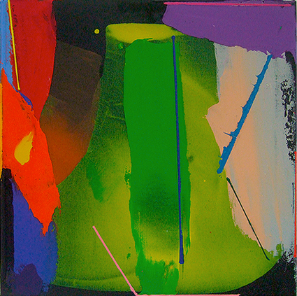
Anne Smart: Some of those, when you are emphasizing the edge, for example that green right angle in ‘Oiler’, it feels as though it is trapping the space
Robin Greenwood: I think there are many good things in this work, but I do not yet get them as whole things… In [the centre of] ‘Persuader’ I like this tonal stuff; it’s not just an area of yellow, but it fades into the green; but even then I am not getting the whole thing. And the same with that lighter open passage on the right of ‘Rasio’, where you have tried to get wholeness by drawing round it.
Oiler, 2013, 51x51cm, acrylic on canvas
Emyr Williams: Actually it was the opposite… I would rather leave them unresolved at the moment, so I can have them to inform me…
Anne Smart: If you can trust anyone you can always trust yourself. You will remember these qualities, so you don’t always have to store them.
Alexandra Harley: A quote from Picasso was that if you paint a red somewhere and then paint it out, if it’s important it will come back again.
Emyr Williams: I would like to make a really large painting and can feel the possibilities involved in that. When a painting is a certain size it holds you at a distance, when it is smaller you feel it physically in a different way.
Alexandra Harley: Maybe if you created something much longer it would generate a different rhythm What about the square format ?
Emyr Williams: In a square format you cannot escape. It’s an awkward shape…
Robin Greenwood: There is something very enigmatic about all of this…
Anne Smart: I don’t know about enigmatic, but I hear all of what you say and yet I can’t help being drawn to the one painting [‘Stepper’] that is the least textured and yet in real terms is more subtle and less forced in terms of colour…
Robin Greenwood: But Anne do you think he should do six of these [‘Stepper’]?
Anne Smart: No, I would say try to be more relaxed in the others…
Emyr Williams: I have done 50 or 60 of these [small paintings like ‘Stepper’] and that’s the best one.
Anne Smart: When you are working on your own, one does get completely obsessed, you absolutely know what is happening, you are thinking about nothing else, morning, noon and night, and it can be devastating when you get people into the studio who don’t even notice the bit you have been obsessing about. I can’t quite correlate there being so many of these…
Robin Greenwood: There is a sort of something about these paintings that I find slightly generic, like I have seen them before, they remind me of lots of other abstract painting going back 30 years. And I think that is fine because it looks like you are working out of some other place that you have been, into something new. That’s why I thought Emyr had put the lines on, to make them something more specific than abstract paintings made of patches of colour; we’ve all seen that before.
Anne Smart: ‘Specific’ is interesting here. To me it means ‘precise all over’, not about detail.
Robin Greenwood: Well, specificness is also about making differences.
Anthony Smart: But it can only be specific in relation to its totality. You can’t build it in there and there and there. Specific to what? Things can’t be good in their own right, they have to mean something.
Robin Greenwood: Relationally, you mean?
Anthony Smart: The point is the whole painting has to amount something. It can’t be a lot of patches of specificness. Can abstract art have in its making a process similar to that of some figurative art, where steps are taken, drawings made and little by little totality is constructed?
John Bunker: What you said this morning was really interesting about Abstract Expressionism and it having to happen very quickly – there is just ‘now’ and a ‘hit’. What we are talking about is almost the opposite to that, consistently working away, building up and up. It’s not that you need a master plan, it’s that the preparation was a way of looking for something that may amount to an advantage.
Robin Greenwood: So how would that apply to Abstract painting? How do you take something out of one painting and use it in another?
Anne Smart: You wouldn’t, but John this morning said how weird it would be to put his four works together because he would see repeated forms. You do not have to keep repeats that result. It’s uncanny how important things will emerge later.
Emyr Williams: For me it’s like sport. I have to do a lot of weight training and road work to build myself up. Then I can begin to put things together…
Robin Greenwood: …and then you get older and your knees go! Are you saying that you are preparing for something? I can’t go with that, it sounds like some ‘profession’, and you can control your ‘career’.
Anthony Smart: I’m siding with Robin a bit here. Looking at that painting and that particular part of it, if you know what’s wrong with it, why haven’t you done something about it? It sounds like you are building forward to a main event?
Emyr Williams: In the past I’ve known what I want to do… look at shape, try to find inventive ways to do that. Gradually I realized that’s not enough. I want something more challenging, to feel my way through different spatial issues, trying to think ‘what is the ambition here?’ I am getting a better sense of what I want to do. For instance, can I skid colour on top of another colour, as in this piece [pink across the top lefty corner of ‘Rasio’]?
Robin Greenwood: You can. The question is ‘why would you do it’? The argument here is about ‘practice’ versus ‘for real’.
Emyr Williams: I want to get the right consistency of the pink across the corner and be able to do it again.
Robin Greenwood: You are describing an academic exercise… The real issue is why would you cut the corner off the painting? Isn’t that the bigger issue? You have to take in the totality of the whole thing. Getting that pink right is not therefore a technical issue…
Anthony Smart: Let’s tie this back to what was said in the Mark Skilton crit. He said he made lots of volumes, really interesting and exciting, then he starts putting them together. Now all this is logical and do-able in sculpture made of steel. It is not do-able in wood or stone, etc. Can you do what you are suggesting in paint? Mark can move his ‘volumes’ around all day long by trying different things, and then carry on tomorrow. Your paint will have dried by tomorrow…
Adieu, 2013, 51x51cm, acrylic on canvas
John Bunker: There are so many permutations in free and natural space. I am intrigued by this topic of permutations. When you talked about Mark’s progress, I feel you are talking about time, moving things around, over and over again. The thing about painting is again this thing about immediacy, it’s happening right there, one hit, boom!, walk away… and what you are talking about is finding out what your materials can achieve, day to day, in the studio, as it happens.
Emyr Williams: Part of the reason for showing these particular paintings was the nature of what this debate was about, which was to show problems in the real world happening. A number of months ago I thought, well, where do I go? Do I try to shut the doors, batten down the hatches, produce some nice ‘finished’ work. I felt that would undermine the whole endeavor of what this was about. This felt in a way like being naked in the jungle, but this is where I am at the moment. This painting ‘Persuader’, for example, is the first time that the ‘structure’, if that’s what you call it, the bits of colour, form areas from the inside, outwards. One thing in all of this, slightly uncomfortable for me, is to work the paint whilst it is in the painting, rather than putting it in [and leaving it] as I have done previously. It means a lot more hard work, because I will lose a lot more control. It’s a bit like Lester Piggott, who used to ride high in the stirrups. He could consequently fall off in a heartbeat. He floated above the thing. It feels dangerous.
Comments made previously on abstractcritical.com:
- Emyr Williams said…
https://dl.dropboxusercontent.com/u/8621673/EW-close-ups.jpg
Here are some images of the work in close up to give a better idea of the surfaces and how the lines look. Hope this is useful.
Posted at 5:03 pm on October 21, 2013
- Noela said…
That was very helpful, I love the paint quality, very seductive, and I feel it is no bad thing to be seduced by paint.
Posted at 5:29 pm on October 21, 2013
- Noela said…
I haven’t seen the paintings in the flesh yet but I feel the lines seem to work better,for me, when there is more of a connection with the painted surface beneath. In Adieu they are moving with the colour passages. In Oiler they seem to be emphasising the directional qualities. In Stepper there seems to be an emergence with the more complex colour passages (I like this one a lot too), and in Head over Heals there seems to be a variety in the thickness of the lines which creates more interest. I feel Emyr might got into a bit of a groove ( very easy for all of us I am sure) but sometimes that is a necessary part of painting. It is a process of finding something . The rich colour is just fantastic though.
Posted at 8:58 am on October 21, 2013
- chris edwick said…
What happens first when colours are applied to a surface is spacial illusion. The lines placed onto these paintings sit emphatically on the canvas surface like late arrivals at the cinema who force you to lean left and right to peer round them whilst you try to keep up with the action on screen.They jar, disrupt and separate you from the reading of the “other” painting beneath. It’s like a collision of Patrick Heron and Ben Nicholson ideologies flicking 2 fingers up at each other in argument.
The paintings beneath the lines have an inventiveness of application searching for something new and keen to find some new way to say something but the standard repetition of this small scale marks them as exercises in forming new words.It’s like listening to someone practising a perfect annunciation of “the cat sat on the mat”. When the practice ends it will be time to say something. I know that when Churchill made his 2nd World War speeches he spoke with intensity and clarity but ultimately it was what he said that mattered.
Posted at 2:55 pm on October 19, 2013
- Mark Skilton said…
Hi Emyr
Well this is certainly an exuberant collection of paintings. I am impressed by your energetic approach.
Although I understand and agree in principle to the thin lines that you apply, I find their straightness and thinness irritating. They appear almost like a decorative afterthought, whereas if they were painted with a bit more purpose and conviction they would work as an essential structural element, allowing you to get back in to the painting and build more spatial complexity.
Posted at 7:33 pm on October 18, 2013
- ken said…
Hi Mark,
I am both bemused and intrigued by these thoughts especially as their “success” would seem to depend on the inclusion of lines, elements that Adieu and Persuader both seem to lack. The former painting seems the flattest of the group standing almost in defiance of what might be a stock approach in the others. The lesser of the paintings in terms of spatial complexity you might say. Is Adieu then in your view more or less successful?
By spatial complexity might you just as well mean content rather than the form(s) we see in these particular works? The idea of what you may mean by spatial complexity might be a red herring that constrains rather than liberates our experience of them. To think otherwise would after all be to view, as you suggest, a different type of painting.
Posted at 2:02 pm on October 30, 2013
- John Pollard said…
It seems to be really hard to do good and interesting abstract art which retains a complexity. It also seems to be hard to transcend oneself and make a leap forward; critics seem to suggest that if only an artist could let go of some hang up, hindrance, their work would move forwards leaps and bounds. I’m not sure about this; baby steps seem more the order of the day, certainly when one has got past first base, so to speak.
It is not fair to judge this work properly without seeing it, but I’m not sure I like all the lines. I like drawing in paintings but these are patterning the surface and almost making the colours more inhibited, polite, keeping them in order. My favourite is ‘Persuader’, the one without the lines. On ‘Oiler’ I love the white line but then the green angle seems to inhibit the central shapes, when I feel they shouldn’t be inhibited.
However, sometimes inhibiting works, and looking at these images of Emyr’s paintings and reading the conversation reminds me that you can’t be too rule bound. Perhaps we need to keep an oscillation between polarities going to move forwards, even though we might favour one extreme or another- just a thought.
Having said that about the lines maybe it’s not about the lines per se. Perhaps it is that sometimes they work and sometimes they don’t.
I enjoyed the work and the conversation. I like the critiques but it is good to see that there is much encouragement as well.
