Brancaster Chronicle No. 10: Anne Smart Paintings
First posted on abstractcritical.com 28 August 2014

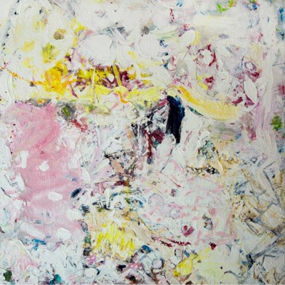
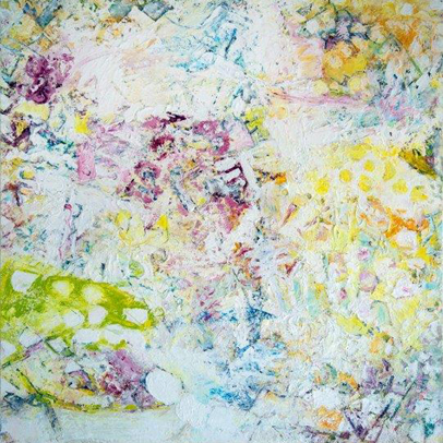
Broiderie Landings, 48inx48in
5th July 2013, the artist’s studio near King’s Lynn.
Those present: Anthony Smart, Anne Smart, Emyr Williams, Robin Greenwood, Sarah Greenwood, Alexandra Harley, Patrick Jones, Desmond Brett, Helga Joergens-Lendrum, David Lendrum, Sam Cornish, Mark Skilton, Hilde Skilton, John Pollard.
Patrick Jones: Can I say that I really enjoy many things in this painting Broiderie Landings. I am trying to refer it to the spatial qualities that we find in sculpture, but I can’t. I’m really intrigued by some of the thicker areas, the layers of paint, the handling. It is very beautiful; somehow they pulse together for me. It has an enormous richness. I must admit that Boy Boy Boy doesn’t do it for me, partly because of the size of the elements. But Broiderie Landings I responded to and will try to talk more intelligently about what it is I really love about it.
Mark Skilton: I like the way parts of it seem to actually lift off. I keep looking at the profile of it and am amazed at how flat it actually is, because from various distances parts of it seem to almost bulge out, so you get this funny rippling feeling and these warm yellows seem to almost come off the canvas. And those two do it as well, Folie Ba Ba and Logie La La. They both have this feeling that parts of the painting coalesce together and actually bulge away and lift off the canvas. It’s like particular areas seem to separate themselves. I don’t know how they do it, but as a strange illusion it just seems to be particularly prevalent in these paintings. I think I remember you doing it last year as well, I remember being aware of how the canvas seemed to be curved. This time this is rippling much more, and is much more vibrant.
Folie Ba Ba, 43inx43in
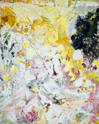
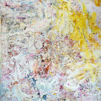
David Lendrum: I like Feather Ledded and Broiderie Landings. I think it is because of the layering – you get colours coming through from underneath. But the parameters of your colour are close enough in value that is not too big a contrast and they work well as a unity. It is also the movement of the marks and the way in which the colours change, the saturation from more intense yellows through to much more pastel shades. The layering and the looking through to the previous layers, the application and the process and the whole sweep, the gesture of the painting just works as a whole. In ones like Ray where you have got a big darker blob, to me it doesn’t work as well. It’s too dark, I would also say, and the same with Boy Boy Boy as well…
Hilde Skilton: No, no, Ray is brilliant…
David Lendrum: When it’s going from light to dark you don’t get the surface across the whole thing in a unified way. The dark part becomes too strong an element, your eye just focuses on that. There are other things I like about the painting, but it’s tempting to try to put in these slightly “subverted” shapes and it doesn’t really work within the wholeness, the context, of the surface quality.
Ray, 37inx30in
Sam Cornish: What do you mean by “subverted” shapes?
David Lendrum: It is as if there is a shape there, but she is trying to conceal it by going over with the white again. You can see it there, a slightly subtle sort of shape. This seems a different sort of process from the way the rest is done, and the way Feather Ledded is done, in a completely all-over conception.
Patrick Jones: Can I take exception to what you said about this area of this painting, Ray, the dark area on the right which I think is very successful. I can see there was also a dark area on the left which has been painted over. I do not think that it does jump off. It’s obviously different from other areas, but I think that its tone and its colour work. What Mark is talking about, the “rippling” effect in Broiderie Landings is extraordinary and unique and I have never seen anybody do that before. And that to me is a thing with tremendous powerful possibilities. When you look at it from the side, it is not that deep. It’s new, and a wonderful, undulating thing… Though I feel the illusion of volume needs to be a bit more amplified…
Hilde Skilton: I think it happens with Folie Ba Ba and Logie La La as well, which are my two favourites, and I do like the fact that there is the contrast in the tonal range. I think it is a challenge, because Broiderie Landings – not that I do not like it – is more within a tonal range, so there is going to be more of a chance that it holds together. This is far more challenging. That dark area in Ray, that you mentioned – that is a challenge. The way Anne has actually pulled it out, pushed it in and brought it up all around it. I also like the physicality of Folie Ba Ba and Logie La La. I think the marks are bolder and more varied, so I’m for these two.
Mark Skilton: Would you say that in those darker areas you get a greater sense of space or an illusion of depth?
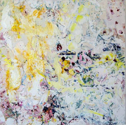
Logie La La, 43inx43in
Robin Greenwood: These little pockets of dark in Folie Ba Ba and Logie La La are very three-dimensional. But for me I still go with Broiderie Landings. I still think, head and shoulders it is the best painting in the room. It’s not that I don’t like Folie Ba Ba and Logie La La, I think they are very different and I think what you said about them being adventurous and exciting, I am all for that. I just think that for me, at the moment, they don’t really quite get it together. I see different elements in them, and I can’t quite put them together: I see these little three-dimensional pockets, I see some patterned things, and I also see borders round the edge. So the elements of those just don’t hang together as they do in Broiderie Landings. I was looking at it this morning and thinking: you go from one passage to another to another, you’ve got the whole thing working together and I had this weird thing, where the colours just start to really come on fantastically strong; it’s like it wasn’t white any more. We know that Anne uses lots of white, but this was coming on as a really powerful, intensely coloured thing, because it was all working together. This painting never lets you down anywhere, it goes on and on. You can move around it forever…
David Lendrum: That makes it good.
Sam Cornish: I think Feather Ledded and Broiderie Landings both seem to have quite a natural, I don’t want to say “naturalistic”, feel, almost a natural light. There is a sense, not of a representational painting, but of light that you might experience in …
Patrick Jones: Impressionism! What is wrong with that?
Sam Cornish: Nothing.
Hilde Skilton: It is good, and I do think that Anne’s colours are just really getting so much stronger and better. But I think the challenge is the tonal contrasts in Folie Ba Ba and Logie La La.
Sam Cornish: I think the thing Robin said about the borders is interesting. There is a strange sense that they begin to happen in the middle, not that the borders are empty…
Helga Joergens-Lendrum: The more exciting parts are, if you look at the left-hand edge of Feather Ledded, there is not so much strong tonal contrast or colour contrast, and if you move to the middle we have stronger contrasts, and busy oranges, and pink, and the very dark blues; and if we go over to the top right hand side we have these large areas with these large brush strokes and also shorter ones, accentuating, almost like dots, yellow areas, which look very exciting and create an accent. Is that what you mean ?
Feather Ledded, 48inx48in
Sam Cornish: It might be something to do with that whole thing of wanting to see the side because you don’t quite believe they are as thin as they are… Also I think with their “Impressionistic” colour and the light, they are elusive and they appear out of the corner of your eye. There are different effects, and I kind of sense them changing all the time.
Patrick Jones: InBoy Boy Boy I think these smaller elements with the green and to a certain extent with the pink in Folie Ba Ba, where the small round units… well, to me the excitement is more in those rougher elements…
David Lendrum: The more random elements like the green and pink spots in Boy Boy Boy and Folie Ba Ba are a little bit too deliberate. Whereas in Feather Ledded it is the whole process, the sweep of it. It doesn’t feel as if you have to make it any more interesting because it is already interesting enough.
Emyr Williams: I actually like Boy Boy Boy, because Feather Ledded and Broiderie Landings, nice and strong as they are, are kind of conventionally integrated in terms of the dark to light – they are strong paintings because of that. But what you are picking out as problematic areas inBoy Boy Boy and Folie Ba Ba I find the opposite. I find there is more ambition in these positive and negative feelings. And that intrigues me more because of the different sense of scale happening because of that, and a particular shaping. Whereas in Broiderie Landings, the gesture, the mark making and the almost accidental nature of this is carrying the painting. So it’s going to work because lovely paint that is accidentally felt will do that. Whereas when you start to become very particular, you are really risking it becoming too particular and losing some of these qualities.
David Lendrum: For me, Feather Ledded has unity, because it all works within the language. Boy Boy Boy has got different languages.
Emyr Williams: Yes, but Boy Boy Boy is more exciting for me.
Robin Greenwood: Because it fails…?
Boy Boy Boy, 43inx43in
Emyr Williams: It doesn’t fail at all. It has got some terrific things in it. It has got this colour coming through and there is something happening up there that talks to full chromatic range. Anne did some of that last year when she got all the colours working in one area, it really hits home. I think is a slower burner, it’s got this big funky thing that, the more you look at that painting, it is really important.
Helga Joergens-Lendrum: In Feather Ledded you have on the bottom and the left half of the picture larger brush strokes and the painting looks as though it has been painted by chance. It appears to be, but of course it isn’t, there is a bit more scraping then painting, whereas if you look to the right hand side you see the yellows, my impression is that you find more marks of the brush, where you deliberately put on marks and dots here which integrate, seem to grow out of the left hand side, whereas I found this very interesting because it seems to me this idea of having a large amorphous area, then you go on with more deliberate circles or spots and as Emyr was saying the contrast between white on green and green on white. You find everywhere a circle motif is repeated in variations and that small white on white circles appear to be drawn with the end of a brush and by doing that, by bringing the surface in everywhere over the picture you integrate it. You bring in another element and that makes the picture very rich and exciting – you have on the one hand these amorphous areas and on the other you have more precise circles all over the picture, it brings them together. I think this is very exciting. It is almost like a contrast of more chance and will, although the chancy areas are willed as well. You can see very clearly the brush marks painted in to it. And I thought this was a development from this painting to where the dots are coming in more slightly, more careful almost, into this being then a clear concept of the dot parts and more random parts, you create a picture out of that. I also think that all these pictures are absolutely beautiful. There is a really nice series of paintings here. You use changes, variation, choices of colours, mark making, light over dark, areas shimmering through from behind, it is nice to see this range of experimentation.
Anne Smart: Thank you.
John Pollard: I would worry about equating style with value because if you like Boy Boy Boy and Folie Ba Ba, where there is more contrast as a style and then take Feather Ledded or Broiderie Landings as being a subtler, more all-over style, that doesn’t give a value to me of the individual quality of the painting. That is more of a preference. So for me it is whether the individual painting works. I can imagine painting with this kind of style, like Folie Ba Ba could be my favourite painting, but it just happens that it is Broiderie Landings – it works in the best way, not because it has not got a more contrasting element. In fact, looking at it more I might make a case for Logie La La, for me to live with for a while, because I think it is almost sitting in between the two approaches. It has got the elements of contrast but they are not so obvious, and I am intrigued by this dirty orange area and the kind of balance that the red reads through the painting at the corners. I would like to spend more time with that one.
Patrick Jones: Robin talked about the colour in Broiderie Landings, and the colour is extraordinary. And I’m afraid, with respect, I think there are two painters in here. One of them is extremely ambitious – and I think Mark touched on it with the way the painting ripples, and it is to do with the colour and not the tone. I think that the tone is not particularly interesting. For me these relate to Larry Poons, which are incredibly rich and detailed, highly ambitious. I feel these could be even thicker and more full on. This is the weakest picture, Boy Boy Boy, and for all of the reasons that Helga mentioned, I dislike this one the most.
Emyr Williams: Well, I think it is absolutely cracking. One of the things about Poons work is it has a sense of the external. These paintings have that, that’s why I think Feather Ledded and Broiderie Landings are more conventional in terms of their integration. It is as if it’s a light you have already experienced in the world. It’s a “landscape”, for the want of a better word, even though it isn’t. It has that quality and you get the same feeling in Poons when there is heroic scale. A sense of a sublime landscape whereas Boy Boy Boy doesn’t have that. That is why I like it, that seems to be self contained. That’s the world, it all adds up, it all works, bang.
Patrick Jones: Are you talking about Impressionism? Anne has a red painting in the house Yeah Yeah Yeah (2010-2011) which is an extraordinary picture, really full on, and some of these have that quality even though they are white. Some of these ideas regarding tonality just don’t do that. I don’t really know the process very much, it is the first time I have seen these paintings, but the things you are saying to do with the “outside” in Broiderie Landings, I just find that extraordinary! I have never seen anybody do that before. I’ve never seen anybody do what Anne can do.
Robin Greenwood: But you think you have seen Folie Ba Ba before?
Patrick Jones: Yes.
Robin Greenwood: I agree.
Patrick Jones: Tell us a little about the way you make them. I am not familiar with them. Do you work flat on the floor?
Anne Smart: I work on a table, a higher than normal height table. I work on board because I work in an additive and subtractive way. I find that I lose fewer canvasses that way. Board is substantial. I use hands, brushes, chisels. I take paint out. Every single centimetre is worked, obviously. Helga, that was the nicest thing anyone said to me. You seem to see inside me and say more than I could for myself. Thank you. It’s difficult to say how I work, in a different way every day. I don’t have a formula. It’s changing, depending on what I am looking for. It’s an impromptu situation. I am not deliberately going out to find subtlety, but that does intrigue me, the balancing of tonal and subtle, strong and soft, in other words, those things that you can find a way of working through to get to some indefinable middle point. Then you could be close to what you are looking for.
Mark Skilton: I think that the colour temperature, these warm yellows and cool pinks in Logie La La, you have got a warm yellow and cooler blues, almost icy… something of that feeling created by the temperature is more apparent in this kind of painting than I have been aware of in anyone else’s painting.
Patrick Jones: It is amazing that these paintings do work so well, given that they have so much detail and minutiae in them. You would expect them to fragment. At 4’ x4’ in size in Logie La La, you feel you are looking at so much detail. This draws attention again to the physicality. In Broiderie Landings, this thick white piece of paint here, this to me is some suggestion of the way forward, to make paintings even thicker, load them up three-dimensionally, because I have never seen anyone do that before, what Mark pointed to, the undulation, which is partly to do with the amount of stuff you have got on there and the way it has been handled… and it’s not been smoothed over…
Robin Greenwood: Mmm… but it is not just that white thing, is it? It’s that white thing with this which is so fantastic. And then on you go, up through the other parts.
Anne Smart: I have worked much thicker, Patrick. For me, it’s about how would you differentiate between areas like that. But the thickness, I stumble across things like that. For me, “surface” and “texture” are quite abhorrent. I do not want to say my work is about surface. I am always trying to counter things.
Alexandra Harley: I like the forms that you have painted on there, you do have quite often this motif of “spots”, for the want of a better word. But you have reinforced that with physically made spaces. Logie La La has drawing into the surface and carving as well. I like that and feel there is more physical presence with Folie Ba Ba and Logie La La. Also, it feels much more physically robust, more tangible.
Sam Cornish: I don’t know if this will be a helpful tangent, but in the house there are still life paintings and figurative paintings. The things that Emyr picked up on in Boy Boy Boy and I noticed it in this painting, is that the dark areas seem to be like objects on an expanse, within the field of the rest of the painting. In away, like a Cezanne still-life will have a table cloth making a field for concrete objects within it.
Emyr Williams: These ones, Feather Ledded and Broiderie Landings, are going along with the process of the painting, and they do seem very successful paintings. Something like Boy Boy Boy is almost trying to beat the process, willfully put something specific in there. That is a lot harder to do. It will jump and jar and feel very particular, and as a result be less abstract, in a sense, whereas these will naturally feel more generalized and abstract…
Robin Greenwood: I think the opposite. Things like the spots in Boy Boy Boy are more familiar, more generic. Spots are familiar.
Emyr Williams: It is not like that is a graphic-y spot…
David Lendrum: The white on green and the other one, greeny on white, I find a bit predictable. Personally I prefer the ones that look as though they have happened as a unity where there is not any deliberate trying to force shapes or patterns in. It should come out of the process in a natural way. I think it is really hard to do a painting like Feather Ledded. In Folie Ba Ba there are two types of language going on in that.
Sam Cornish: Patrick, you said something about tone… you thought the colour was better than the tone. Could you clarify what you mean ? Where is one successful and the other not.
Patrick Jones: I would say that in Ray, the dark green area separates out because it is darker. I do not think that is an issue in terms of colour. To me, with the colour Anne is doing an extraordinary thing. Robin said it, that the painting suddenly isn’t a white painting. You walk in here and you think that they are all white paintings and then you look at Broiderie Landings and suddenly they are not white at all. It is full of richness and colour. So I see the Impressionist thing that you mentioned, Dave, to do with tiny little flashes of colour, or the outside thing that Emyr talked about, there is something in that, all of those things go together for me. How you channel the ambition to make the pictures?That is not a question of loading more colour on it, it’s what you are doing with the space as well. But the tone is not interesting. The colour is extraordinary even though it has been jammed down with white.
David Lendrum: There is so much variation in them all. Pinky white, yellowy white , greeny white, lily white…
Hilde Skilton: And Boy Boy Boy and Folie Ba Ba don’t have it ?
Robin Greenwood: They have it for me in a slightly more mechanical way. I think there is more variety in Broiderie Landings than there is in Boy Boy Boy and Folie Ba Ba.
Hilde Skilton: No!
David Lendrum: It has a shaped and patterned quality to it.
Hilde Skilton: Oh, Dave, I think you are wrong because the physicality of these marks is wonderful; and the challenge of the tonal range. I am not saying Broiderie Landings is not working and I do love the colours and the white and the way that its happening. But in Boy Boy Boy and Folie Ba Ba I am getting challenged more, and I think that Anne is challenged more…
Robin Greenwood: There seems to be an argument going around that being slightly perverse and challenging is OK, Well, it might be OK for Anne, but I am not sure that I want it when I am looking at her paintings. That is sort of her business…
Hilde Skilton: I like the tension!
Robin Greenwood: Broiderie Landings is full of tension…
Hilde Skilton: I am not saying it isn’t. I am just saying that it is different. Different tension. Broiderie Landings goes in and moves in and out and Boy Boy Boy and Folie Ba Ba just jar you a bit more…
David Lendrum: The thing is how do you get from that bit, to that bit, into that, to that in Folie Ba Ba?
Robin Greenwood: Yes, exactly.
David Lendrum: They don’t link…
Robin Greenwood: Whereas everything that is different in Broiderie Landings is all linked. This is all a piece.
Desmond Brett: This is a question of the wholeness again. This wholeness thing. Uniformity…
Robin Greenwood: Uniformity is not what we are talking about…
Desmond Brett: There seems to be this need for it to be whole…
Alexandra Harley: True.
Helga Joergens-Lendrum: I think that one could say that in Broiderie Landings we have here not many deep darks, the tonal range is narrower, more pastel colours and pure colours, like the reds and the saturated colours, and that creates this harmony perceived as wholeness. If you look at Boy Boy Boy and Folie Ba Ba we see a far larger tonal range between dark blue, almost black and the total white and there are some areas where we have the greatest excitement, they are put directly next to one another, the brightest ones against the dark blue. This contrast of light and dark and of the colour contrasts, orange against blue, and then the harmony of yellow against orange, blue and red. That creates this excitement and I think that some people really enjoy the lower tonal range because that is perceived as a whole. Whereas these ones, there is so much going on with dark and light, forwards and backwards, deep and shallow, which gives them a different excitement and I find it fascinating that you do this. We have here these paintings and they are all completely different. Different approaches to a more pastel colour range where darker colours are coming from the background. Pictures with very strong contrasts, pictures with something very, very deep which could be seen as a hole. But it is wide ranging, they are all different and I would not want to say anyone is better. They have their own integrity and character.
John Pollard: I think that it is judging individual paintings that is really important, rather than saying that one style is better than another.
Hilde Skilton: No, we are not saying that.
Robin Greenwood: I do like the contrast,what Helga is discussing, this contrast and tone, I actually really like these things here, the dark bits. What I don’t like in those two paintings are not those tonal things. It’s these other things…
Hilde Skilton: But that has a lovely feeling there too.I am dealing with one painting as a different thing to the other.
Sarah Greenwood: But do those feelings go together? Is it a good painting? Whether it is exciting in that bit or any other bit, is it a whole thing, do they complement each other? Do you move from one to the other, so you don’t just jump from one to the other, from one excitement to another, which is what Dave was talking about, getting from A to B. Where are you going… is the painting telling us where to go or are you just going, by yourself. Has Anne given you enough clues, to link all of these things together? I love bits of them, I find it difficult, I love the bottom of both of these, Folie Ba Ba and Logie La La, the space of the bottom, down the right hand side but there are bits where I get a bit lost, I’m not quite sure where I am going. Why am I going from there to there? What is it that I am going to look for?
John Pollard: But some people seemed to be implying that a painting with these contrasts could not work…
Robin Greenwood: No, but we are faced with a sort of pair, Broiderie Landings and Feather Ledded, that are similar, and another pair that are similar, Folie Ba Ba and Logie La La…
Hilde Skilton: So, just to put you really on the spot, which works for you?
Robin Greenwood: That one, Broiderie Landings, every time.
Patrick Jones: I don’t often agree with Robin, but in this I do. When you pointed to the pink and white area in Folie Ba Ba and said “I am not sure where this is going” – that’s also a problem that bothers me in this painting.
Robin Greenwood: There’s something on top – I mean that is so unreal compared with
Sam Cornish: What do you mean by “unreal”?
Robin Greenwood: Well, get the dictionary out…
David Lendrum: We have got two different worlds, here and here, and that’s when the unrealness comes in…
Robin Greenwood: That is not one world and another world – that is not a real world.
Anne Smart: I will say one thing. This is the best anyone has ever spoken to me about my painting. Both sides of the argument. I really have got a lot out of it. It has been fantastic. But I want to be in that place of danger. I want high risk.
Robin Greenwood: But it has to work. And then we are going to argue about whether it works or not, whether it is real or not.
Hilde Skilton: Just for the record, it’s real and it works.
Comments made previously on abstractcritical.com:
- Dyan Ross said…
Rich, intense, opinionated discussion about Anne Smart’s beautiful paintings. Helga Joergens-Lendrum seemed to intuitively dissect Anne’s process after the event and her observations added so much to this critique. I wish I’d experienced such generous and stimulating argument from peers during my MFA crits; it would have helped so much.
Posted at 11:01 pm on September 1, 2014
- John Pollard said…
Well worth another think about these conversations about Anne’s excellent work. I still stick by what I said on the day about the issue of ‘style’ and ‘value’.
‘Broiderie Landings’ was, for me, the stand out painting of the group because it worked as an individual object. And I don’t think it is any easier to do a piece like this than a piece with a more obvious stand out area. I also think that ‘Broiderie Landings’ does have the range of tone/contrast that the others have but it is much more subtle.
I realise it is a relevant question as to whether a style/type of painting is more ambitious, or original, but not so much for me as it is for others. Perhaps ‘Broiderie Landings’ is more unusual as an abstract work due to its subtle complexity. Interestingly, it felt the least abstract of the works, but I don’t think this is a problem.
This conversation, and Anne’s paintings, reminded me that I very much judge paintings on an individual basis. Once you start grouping work, equating style with value, you risk taking your eye off the quality of the individual object, and you are more likely to bring in outside influences on the work you are creating.
And, for me, the allure of abstraction is that it can encourage you to lessen external distractions and influences, leaving yourself and the object to a dynamic co-creativity, and here there seems to be greater freedom and greater possibilities, albeit with more uncertainty and anxiety.
Posted at 9:28 am on September 1, 2014
- Noela said…
I think you made an important point about working and relating to paintings on an individual basis. When there are series of works it can be very easy to get caught up in style, as a viewer as well as a painter. It can often be an easy option to just start another piece, if things aren’t working out, and then run the risk of sometimes diluting the concentration of what is trying to be achieved. There is often only one , or two if you are lucky, stand out pieces in a series (speaking personally,not about Anne’s work).
Posted at 10:03 am on September 1, 2014
- Patrick Jones said…
This was a truly inspirational day ,seeing Anns paintings and Tonys sculptures.The Chronicles experience ,of which I was the last artist ,in Bristol last weekend,seems to me now to be amounting to more than the sum of its parts.The generosity of dialogue between artists and critics about the work on view is something I have been looking for for years.The healthy ego which is so essential to be a surviving artist, is quashed to allow critical feedback which I found extremely valuable.Already it is unique in the english art world for its specificity,maybe it will have a broader and more far-reaching effect as artists benefit from each others insight.
Posted at 7:32 pm on August 31, 2014
- Peter Stott said…
The search for aliens carries on.
Posted at 12:08 pm on August 29, 2014
- Antoinette Jacobson said…
So great to read these comments and hear you all again. Just wish I could see the paintings in real. Computers and internet don’t quite allow that. There was an American woman in the early 1970s who worked near Bennington, I don’t remember her name, I think she died.. I wonder if she was married to Phillip Wofford.. She painted very white paintings with color coming through, which I remember liking alot. Maybe more translucent and misty than Anne’s which seem so earthy.
Posted at 8:34 pm on August 28, 2014
- John Bunker said…
Really enjoyed the dialogue here. It feels punchy, upfront and honest. Proves the work must be up to something to get such strong contrasting opinions!
Posted at 1:53 pm on August 28, 2014
- Noela said…
Exciting discussion about some beautiful looking work. Anne’s last Brancaster paintings seemed to be much more about white, whereas these works seem to have strong colour squeezing through. On screen the paintings that immediately stand out for me are;’ Boy Boy Boy ‘ with its great feeling of movement , green motoring in from the left , central broken passages of blue and yellow spotted area spreading from the right; ‘Logie La La’ seems to have some satisfying dark punctuations and I enjoy the way the acid yellow and warm yellow wanders around the surface; ‘Broiderie Landings’ looks so rich and almost seems to have a marbled intensity in places, a painting one could always find something new in. The scale would make these works pretty impressive I imagine. There seems to be an ‘overallness’ with directional sections within.
