Brancaster Chronicle No. 16: Hilde Skilton Paintings

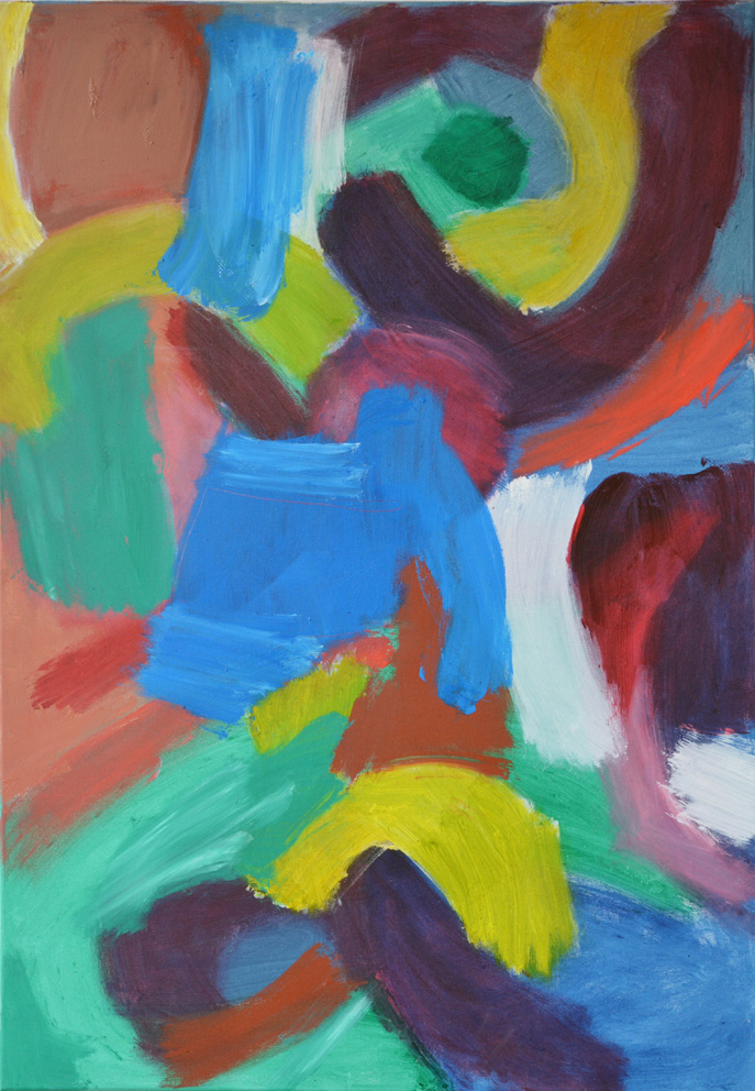
Jakana Jive, 2014, oil on canvas, 102x76cm. [No.1]
23rd August 2014, the artist’s studio near Bath.
Those present: John Bunker, Anthony Smart, Anne Smart, Robin Greenwood, Sarah Greenwood, Patrick Jones, Mark Skilton, Hilde Skilton, Noela James, Nick Moore, Saul Greenberg, Sam Cornish.

Finch Fandango, 2013, oil on canvas, 120x80cm. [No.2]
Noela James: I would love to say how much I love your colour palette, and particularly the way that you bring that ‘coral’ colour into these pieces. Well, the coral it is just a beautiful colour and it works very well, particularly in this one, No.2, the way that the warmth comes through as a kind of counterpoint to the acid green and the turquoise, it just really relates very well. I don’t know if that is just because I am focusing on that, but they are a huge success, the richness and the excitement. There is a lot of variety in No.7 and No.9 with the shapes. I do think that the shapes ‘fit’ with the colours. I am much more aware of the shapes in No.8, and maybe in No.1. Is that a new one? Are you still working on it?
Hilde Skilton: No, not really.
Noela James: I find that the shapes are distracting in No.1 from the coloured areas.
Hilde Skilton: That’s interesting. Could you explain that a bit more for me? How that happens.
Noela James: Well, the part of that painting [No.1] that I really love is the top with the turquoise and the coral, the way it moves around, but then I get distracted by the yellow which is too much and that sort of ‘sweepyness’ I think it is fighting. I lose the sense of the colours, in a way, because the shapes are taking over, they are fighting for attention. I suppose I enjoy relating to the colour more than to the shape. The shapes are not so prominent in the others.
Robin Greenwood: I thought that No.2 was a very spatial painting. I think it is my favourite… In No.1 the shapes tend to reinforce themselves…
Noela James: A little bit too much for my liking I think. I am not so happy with the shapes. They remind me of things I don’t want to be reminded of.
Mark Skilton: Robin, you thought that No.2 was a more spatial painting. What makes it spatial?
Robin Greenwood: I don’t know… I was hoping that a painter could explain it to me. Anne?
Anne Smart: Well, one of the things which may have something to do with spatiality is the way that all of the use of colour in each one is different, there is no heavy duty application of any single colour. So each one has its own modulation, they have been put on in different ways with a different variant of tone, some are flatter, because of the way she moves the paint around.
Robin Greenwood: There is a great spirit of enquiry which goes through all of the work…
Anne Smart: Yes, and I think that will have something to do with it.
Robin Greenwood: Yes. But that doesn’t explain the spatiality.
Anne Smart: Well, not in that particular one. I would have to have a much longer look at No.2. Well, if you were looking for spatiality through all of the paintings, one way to achieve spatiality is the way the colour is put on and there is no flatness to the edge of the boundaries of the shapes.
Anthony Smart: This pale yellow in No.4, joined by orange in this tonal range etc. evenly spread across the surface does rather flatten them.
Anne Smart: So you feel No.4 is flatter than No.2?
Anthony Smart: I agree that No.2 is more spatial.
Robin Greenwood: Do you know why ?
Anthony Smart: Why for me No.4 is flatter against No.2 is because there is an even spread of equi-tonal range of pale colours. Whereas in No.2 you are abutting colours in quite strong sequences without taking an even spread across the thing.
Noela James: There is a central green which takes you into the picture more, or a central darker area, maybe that is something…
Patrick Jones: Can I say that I was drawn to No.4 as soon as I came in because of the light in the picture that the different colours create. It creates an aura of light which I don’t find in the more spatial picture No.2, and it is not just to do with the lightness of the tone, it is to do with the yellow, yes, it is to do with the yellow. No.2 is more recessive; No.4 is more pushing forward, and that is to do with the colour of the lights and the tone.
Hilde Skilton: I find them both spatial, but it is quite interesting, other people’s perception of it; so I am listening to you, Tony, when you say that one has less space, I don’t see it but it’s interesting that you do…
Anthony Smart: What is interesting, and this pops up in sculpture, is it a different kind of space, really? Less space implies what? It has got the amount of space it can have, across the parameters of the painting, so is it a lack of depth of space? But really, it’s the quality of the space that counts, not necessarily the amount that it has.
Hilde Skilton: Yes.
Anthony Smart: So it’s how much it registers, how much is in the painting that is important. We spent all this morning with Mark’s sculptures as if it is all the same thing, but it isn’t is it ? Because the material changes. We have kind of hinted at this.

Brimstone Burst, 2014, oil on canvas, 120×80 cm.[no.4]
Mark Skilton: So the space in No.4, is that in front of the painting coming outwards, as Patrick was describing? Whereas in No.2, is the space receding behind the painting?
Sarah Greenwood: No.4 being light and coming towards you… is that because you have a tonal range with the light blues and the yellows and the mainly darker elements, the reds and the browns are, because they are warm, coming forward as well, they are not receding, so it appears to be happening closer to you. This sort of opening up of the space with the contrast of the light and the dark and the contrast of the warm and the cold, well that is sort of how I am reading it. You don’t go into it, it comes to you, the light and the dark contrasts come towards you.
Hilde Skilton: Yes.
Patrick Jones: Particularly if you look at No.4 in relation to that top edge, this seems to me to come forward from the top edge. It is projecting, whereas if you look at the coral pink in relation to that edge it is being pushed in No.2.
Anthony Smart: Isn’t that pink forward of the top edge?
Noela James: I think the pink goes back. That is what is strange about it. It should come forward but actually it is receding.
Anthony Smart: Well, it’s forward for a start off for me. This painting is in semi-darkness in comparison to these. Let’s move them around.
[paintings are moved around]
Noela James: I think No.2 still has recession, compared to No.4.
Patrick Jones: I think it has now lost out considerably to No.4 by moving its position, because the light is now bouncing off the surface. Now I am much more aware of all the tones in it. But also there are a lot of dark tones in No.4, which is basically a very light painting.
Robin Greenwood: I must say No.2 does not look good there.
Anne Smart: Well that is probably because No.4 is a really good painting, and in fact the best. The paintings are about colour and about space but they are also about other things.
Robin Greenwood: Tony’s point about space, of not necessarily ‘more’ being ‘better’, is a good one, otherwise you have a massively deep space.
Anthony Smart: No.2 looks really good. I prefer it in that position.
Sarah Greenwood: If you stand over there the light is catching it differently, here is not too bad.
Patrick Jones: Can I say something else about No.4? I think the elements don’t feel as locked together, they feel looser, more free from each other, and floating in the sort of space they are creating.
Robin Greenwood: That’s good ?
Patrick Jones: I think in No.4 that it helps greatly, the elements are loose of each other and are free to find their own positions and it gives the painting a real sense of freedom. The others feel like each form is joined to the next one. I am enjoying No.4 more and more…
Anne Smart: I would agree. That is a reason why I like it so much. However you have managed to do it, whether it’s the shape of the pieces, or the way you have put on the colour, there is some reason why No.4 has a greater fluidity. For me, that is a move on from some of the more fixed, shaped, sections of colour that you had last year. That is a big progression for me. I feel it flows more and there is real rhythm.
Robin Greenwood: Were they not actually looser last year? The areas of colour were actually moving and floating in a much more loose fashion, I recall.
Anne Smart: Well, OK, apart from the fact that I think some of the problems of last year’s work was they were loose forms, but a bit lost in space…
Robin Greenwood: An atmospheric space?
Anne Smart: Yes, and now there is a fluidity continuing without that. I sense a flow from here to here [from left to right] all over, up and down and through, and it is to do with the direction of the colours and the fluidity which that brings. For example, in No.6, I feel the strength of that fluidity, but to use it as a sort of example of what I am talking about from last year, I think that pinky bit here looks like something from last year because it is a sort of background. So the fluidity is in the stronger viridians and reds and blues… so that goes along and is great. But I feel it to be too much of an image, because this sideways movement here becomes a background going into deep space here, and in this one, what I like about it is there is no deep space. It has a surprising fluidity and it has an added excitement because the blue and the yellows don’t have the sort of stereotypical sense of what space could be in the real world. They are more abstract. The blues do not recede in this painting, so the blues and the yellows work really well together, so I feel a sense of the whole thing without any sense of the literal. So that is why I like it.
Hilde Skilton: Anne, if that colour changed, would that be different?
Anne Smart: I don’t know.
Sarah Greenwood: Are you saying this makes a shape. Why does this green not become another background?
Anne Smart: I think it is worked into the whole thing. It goes with the flow. The movement within the mark, not just the colour. Somehow it all builds in. It’s like a painting done ‘on the hoof’, the way it is painted is continuous whilst disparate.
Sarah Greenwood: So it’s the pink that is the same. It’s not that they are worked in the same way.
Anne Smart: I think it is to do with the acceptance of that whole right-angled edge and this whole edge here. I think she just lost the flow there, and for me just changing the colour would not help.
Robin Greenwood: Anne, what do you think about the shapes going off the edge of the painting? Which they tend not to do as much in No.6. Do you think that’s important or not?
Anne Smart: I don’t know. I think that the orange cross in No.4, locks in there and I think that what Patrick said about that was spot on. It’s surely just a combination of things that make it? The luminosity is part of the structure, everything is part of it all, the colour is part of the space, everything is part of each other.
Robin Greenwood: Yes. And, well, look at No.2. The colour is really fantastic in that.
Anne Smart: Well, maybe that is as good, yes.
Mark Skilton: Would you say that No.2 also has fluidity?
Anne Smart: Yes, I would.
Hilde Skilton: Yes, I agree with Anne, it is to do with the way it all comes together.
Mark Skilton: So it’s not just about the shapes and marks, its whether the colours relate one to another that creates fluidity…
Anne Smart: I think it does. We could move on to talk about No.7. What do you think?
Quail Quadrille, 2014, oil on canvas, 100x70cm. [No.6]
Patrick Jones: Firstly, in No 6 that is a really awkward shape [of canvas]. Personally, I can’t get anything to work for me in that format. Its proportions and the amount of activity that you have got into it which is coherent, it is amazing. I am very impressed. I do think scale is important… But also, what we did when we moved the paintings around, because of the changing light No.4 has just now got the best light in the room. So maybe we should put something else there now?
Noela James: Interesting how that spot for No.5 really transformed it. The blues and the purples look very rich and really ‘floaty’ out there.
Patrick Jones: I find that No.5 in its smallest parts a bit irritating and again in No.8. To me, there are just too many elements for the weight of the picture. It is personal, but I just can’t handle that many forms in a painting of that size. Although the colour is lovely in No.5, I am aware of the shapes, the ‘shoehorn’ shape and various others, they are too ‘spindly’.

Tui A. Tango, 2014, oil on canvas, 102x76cm. [No.5]
Sarah Greenwood: I also find that too narrow… but then I find it’s not too narrow, it’s that it’s got this blue line which separates it. Because you have blue on either side, and it squashes it.
Sam Cornish: It’s interesting that we are talking about the flow; and the thing that struck me in No.4 is that I don’t get much sense of lateral movement, although once you look again, you see that the shapes move sideways, but for me the more important move that they make is towards me, and I think that when the shapes move too laterally you have a main movement which is across the surface of the picture, and that is not as strong as when they are coming out and facing you, coming off the picture.
Noela James: Interesting point.
Patrick Jones: And yes, because you get certain shapes which are just, how can I say… if that shape is there, well, that shape has to follow it, like a jig-saw puzzle. If this blue doesn’t pass behind it, then this shape is determined by that shape, so you get a series of shapes which are formed by ‘putting their arms around’ the next one, and not by their spatial determination. If they are spatially determined, then it goes behind or comes in front. Do you see what I’m trying to say?
Anne Smart: Yes. And that painting of a form does those things which could be seen as the things you just said, which I presume to be slightly negative towards this one and more positive to that, because in that the whole thing flows physically, you feel the sense of the movement which is being invented by Hilde, she is making that movement; whereas here, that is more interlocking, and the feeling here is much more studied, and in my view tends towards losing its true abstractness, and you cannot help but see a much more three-dimensional ‘figurative’ thing. You read these as edges, so you could read that as, say, the top of a container, so you could easily go in the direction of seeing that figuratively.
Sam Cornish: I think I sort of agree with that. This one, No.5, you can imagine the bands of colour as bands of material or fabric that have been woven together you can almost see how one bit is beneath the other and how one bit is quite literally created with its coloured fabric but I am not sure that has to with how abstract it was but more about a kind of relaxed looseness as an image and I think that is what they achieve . No 4 and No 9 when they just are kind of loose and relaxed and springing.
Patrick Jones: And that one No. 5 looks much better , around where Nick is at the stove. Could we talk about No 9 please because that one is a lovely painting. To me that is almost as good as No 4.
[There follows a conversation about the order in which they were painted: Nos.7 and 9 were painted after last year’s chronicle in 2013. Nos.2, 4 and 6, in 2013/14. Nos.5, 8, 1 and 3, are the most recent.]
Sam Cornish: I quite like this zigzag [bottom left green mark in No.9]. I think that is the most completely free mark that is not interrupted to make a ‘shape’, and I think that avoids what I saw as a problem in the bands of fabric in No.5. It stops it having that kind of weight, and it is not so distinct from the shapes that it abuts, so it doesn’t completely go round the edge of that red shape that’s above it, in the way that a lot of the thinner bands of colour do. Actually, now I am looking, there are other marks that are like that, but that is the most prominent.

Speckled Wood Foxtrot, 2013, oil on canvas, 120x80cm. [No.9]
Patrick Jones: In the area in No.9 on the far left you have actually scrubbed it and rubbed it, and to me there is a lot of strength in the painting, which comes over slowly. They are probing paintings. That is what I am very much enjoying about them. No.9 has got light and dark in it.
Noela James: I think it is interesting how that light in the top right shines out. I really, really enjoy it; like the coral, it comes through the purples and greys on the right hand side. Just the way the paint is applied is very, very seductive. That little black spot above the coral kind of balances it.
Nick Moore: What I enjoy about No.9 is the vigorous way in which you have attacked the paint as well. I was going to say ‘painterly’, but I think we said last year we would try not to use old terms. All of these areas here, which have been cut and reworked again with more than one colour in them, I think for me make it really alive, and this is what attracted me to one of the paintings from last year as well. For me, that speaks of a different kind of energy. The areas of colour either come through from the back and they overlap like the pink and the black in the top left there. For me this painting has a lot of energy.
Robin Greenwood: It is the most like last year’s…
Nick Moore: No…
Hilde Skilton: It is less ‘floaty’ than last year’s…
Noela James: I was interested when you said that you don’t use brushes. That has got a very ‘brushy’ quality to it.
Hilde Skilton: Well, let me just check on that. I have not for a long time, but that has been reworked from a painting before the last Brancaster, which may be why you see that. And also the brown colour…
Nick Moore: You have the layers…
Hilde Skilton: I just carry on and do whatever I want to do until it says something to me.
Sam Cornish: I think that No.9 and No.4 seem to do something quite unambiguous. The way that they position you as a viewer in relation to them. I kind of feel I am looking slightly up and into something, into this place, in a quite singular way. I don’t know if that is just a fanciful thing… Whereas in No.7 I feel much more as if I am looking down at something. The weighting is at the bottom of the painting. The orange, and that density, is already at the bottom, and so you look into it.
Sarah Greenwood: Is that because the orange and the blue is strong, and a point that you look at?
Sam Cornish: Whereas maybe No.5 does not give me that sense.
Nick Moore: That is interesting, because No.7 also has a kind of architectural quality to it, where it is becoming three-dimensional on the right hand side there. I am getting caught up in a view down into something, or along back into it, like a street or something like that, getting a view right down it.
Sam Cornish: That is sort of what I meant.
Nick Moore: It’s a way of talking about how I get carried in down through here, as if you are going down through here, where you have got an edge, and it kind of goes off at an angle down here. It has a perspective.
Sam Cornish: It tends to fall downwards…
Nick Moore: Yes, it is an optical thing. But it is very particular and it does not appear in any of the other ones, and I find it kind of interesting that that has appeared amongst all of these much more organic things. I am not saying that it is bad, whatever it is. Well, I just keep coming back to it, because it is very different from the other ones. But that’s it – there is a sense of going down into it.
Greylag Goose Gavotte, 2013, oil on canvas, 120x80cm. [No.7]
John Bunker: Interesting, because I think that No.7 is probably my favourite painting here because it doesn’t do anything that everyone talked about. In some way or another, I find it a much more gripping ‘hit’. I don’t know whether it is something to do with the sense of… there seem to be strong, wide shapes and small discrete shapes, and colours coming through other colours, very delicately, and it feels very poised as a painting. We mentioned searching or probing…
Hilde Skilton: What do you mean by poised?
John Bunker: I guess as Nick says, maybe it is an architectural thing. I don’t know, but there is a quality, say, where that green goes into the orange and the tiny piece of yellow in the right hand corner pushing through, pushing things back, just a tiny glimpse, pushes everything back into the painting. It is a very powerful image.
Sarah Greenwood: Is that just because it is centralized? There is this sort of ‘area’ of things happening. One area of things happening, which is in the middle, and then there are other things happening around the outside.
Sam Cornish: It doesn’t have the sort of checks and balances that maybe characterize the others.
John Bunker: Yeah. I guess I find them too balanced. I am more driven towards contrasts.
Hilde Skilton: How do feel about No.3?
John Bunker: Again, I think it was another of the ones I was drawn to. The more I see it, the more I enjoy it. I think there is this issue, which is the relationship between the shape and the colour, and is there a tension there? But I think it can be a dynamic tension, so I am intrigued to see where this kind of painting will go, ‘cos in No.5, as Sam mentioned, one thing is being laid on another; but I also think I am interested in the dynamic touch between the colours, and the way the shapes are moving into each other, and, as Patrick says, they do get locked down by each other. That is also an interesting start, a kind of pull, a push-pull. I am interested in the way things have gone, we have seen this kind of painting before and now I am seeing something a lot more probing and investigative, somehow.
Sam Cornish: Risky, maybe?
John Bunker: Yeah. Maybe it’s easier, I don’t know.
Robin Greenwood: I am going to disagree with you completely. The problem I have with this [No.5] is that these are linear things, and so the movement within the painting is a linear and descriptive kind of movement. Whereas – and I have changed my mind while we have been talking – I now think that this [No.9] is the best painting, because I think that the movement here is spatial movement, and particularly this and this and all of these things doing very different things. In the moving backwards and forwards in different directions, no two things are doing the same thing. So they are not ‘describing a movement’, they are just ‘moving’, and I think that makes it spatial, because they have got the room to do that. Whereas in there [No.5], they have not got the movement. So it is movement-as-direction in No.5, or movement-as-space in No.9. That’s what I am seeing.
Hilde Skilton: OK, so what about No.1 then? Because it is different again…
Sarah Greenwood: Well, I think No.1 looks like No.5, but there is something else happening there. What struck me when I first saw it was the red, apart from it as colour; in looking at it again I realized that the red is not just these directions, but it is weaving in and out of the whole painting, so it’s doing two things at once, and there may be other places, maybe the blue is also doing that. So it looks like you are trying to combine both things. You are trying to…
Hilde Skilton: …do everything…
Sarah Greenwood: Yes. But rather than it being so directional, as in No.5, it is quite fixed. But this one is going somewhere else. No.3 is doing something else as well.
Hilde Skilton: I am interested that you think that one has mileage, because I found that one literal. I struggled to get away from that, but there was still something about it…
John Bunker: Yes, there is something worth pushing through.
Anne Smart: I think the feel I am getting is that it is a combination of these things which is coming through more.
Robin Greenwood: All different things?
Anne Smart: All combining…
Robin Greenwood: Yes…

Turnstone Twist, 2014, oil on canvas, 100 x 50 cm.[no.8]
Hilde Skilton: You know, you all do talk so well about colour and that sort of thing. I just never think it’s good enough.
Noela James: You don’t think it’s good enough to just talk about colour?
Hilde Skilton: No, no, I want to do better…
Noela James: Better colour?
Hilde Skilton: Better, better, better. And I am going to say this, take it as you wish. I absolutely love Alan Gouk’s use of colour and the way he makes it work, and I can’t do it like him. But I am going to say that’s what I want.
Noela James: I think you have got a very long way in No.2. The way you use colour there is very clever, the way the colours work.
Sarah Greenwood: Well, No..4 is not really Alan Gouk colours. It is your colours.
Anne Smart: And that is their strength.
Sarah Greenwood: It is really good. Using that red; the reds and browns they are so strong.
Anne Smart: And specific. As I said to Sarah about this colour, I personally don’t like it at all, I would not use it myself. You have made it work for me, I have questioned what it is, where has it come from. But you have used it in combination with everything else and it is just the right colour in the right place. Everybody has their own way of putting things together. So Alan Gouk puts stuff together, but there is no way that this painting is not as strong as you may think of his painting, because in your own way you have done it. Patrick, what do you think. You know about colour…
Patrick Jones: I agree. Yes, you should keep going in your own way, because of this quality you have got. I will be critical – I think the dark tones in No.9, the black and the brown and the dark green, are not specific enough in terms of what they are supposed to be, they all just look dark. The weight that they have in the picture, the rest of the picture has colour and depth on top of each other. I would watch what you do with the darks, watch where you put them because it is in quite a few, and I also find the edge of this [No.1] visually incoherent and it gets… you are telling so many different things there, and I am much happier with that big orange area there, as Sam was saying, more variety. I think you have something quite special of your own.
Noela James: I actually think that the dark in No.9 work well. It gives a complexity which is different from the others, and certainly makes the yellows really shine out.
Mark Skilton: It has a translucency.
Noela James: And, yes, it has that contrast.
Hilde Skilton: That is maybe why Patrick is saying that it is not specific enough.
Mark Skilton: Well, it is a different approach. In Nos.2 and 4 you put your colours down in a very purposeful way in the areas where you put them; whereas in No.9 you put colours over the top of colours over the top of colours. There is a different kind of thing. I find No.9 the odd one out in all of these because of that. It just has an entirely different approach.
Sam Cornish: Interesting what you say about Alan Gouk’s painting, because what I was incoherently trying to say about why when I find them successful is that they have a kind of relaxedness. This is the complete opposite to what I would see as success in Alan’s painting. His best paintings are the ones that are taut and difficult and kind of a bit overbearing almost, and a bit… well, a different range of emotions.
Nick Moore: A toughness?
Sam Cornish: A toughness, exactly. A sense of a grand scale. That is a sense of what I see in Alan’s painting. Whereas these are intimate.
Anne Smart: But I think still tough.
John Bunker: I think they are very taut.
Sam Cornish: But there are different sorts of toughness.
Anne Smart: Soft tough?
Sam Cornish: There are, yes, different sorts of toughness. I’ll leave it there.
Patrick Jones: I must say I am very pleased to have John Bunker’s appreciation of No.7, the deep space, because I am looking at that painting more and more and as an area or zone where I feel really comfortable. That central area, somebody mentioned the delicacy. That is a lovely piece of painting; now, whether it needs these dark tones…? It is part of the tension of the picture. I don’t know many people who can do that. Just lovely colour, and a feeling of space.
Anne Smart: For me this is the most difficult, No 7. Because that’s probably the best piece of painting, but the whole thing is the least successful, and so I find it difficult to look at because it does have a sort of conventionality, the whole thing, a bit like a 1950’s painting – something to do with the way it is put together – does not tally with the boldness of this section, which I feel is quite new. And as Patrick states, not many people can do that, I agree. But the way you have fitted it in to that, were it my painting, I would be changing it and trying to make it more like this section.
Sam Cornish: Is that because we are more attuned to seeing ‘all-over’ paintings. You mentioned the 1950’s…
Anne Smart: Well, it looks a little like a Roger Hilton…
Sam Cornish: I completely agree. I wasn’t going to say, because I wasn’t sure what I would mean by it. But I do agree, but is it just because we are attuned to the movement in the painting which came after that kind of ‘all-overness’, that makes us kind of uncomfortable with those kind of arrangements?
Anne Smart: But we have got the opportunity to see something, in my opinion, that is not as successful as that one, because this is not worked up properly. This whole section, whilst beautifully painted, does not make sense with what she has got here and made here. This is worked wholly together. This fluidity here is different to the fluidity here, but it is fluid, proving that in abstract painting, fluidity is a lot of things, and for me this one here, No.7, has no fluidity except in this passage here.
Sam Cornish: Is it to do with these shapes? It feels more designed.
Anne Smart: I don’t know. The colour in here is great.
Sam Cornish: Is it more composed?
Anne Smart: I think we are talking about a style rather than a vision. It has a style we are familiar with. This makes its own style, each makes its own, even though they are different. But the style of this one is a barrier, in a way.
Nick Moore: Are we saying that all of them except this one have a style?
Anne Smart: Well, there you are. I do keep saying: ‘In my opinion’!
Nick Moore: Some painters already, dare I say, paint in a sort of style. Whereas this one [No.7] actually breaks that. I think that is why I am drawn to it, because it is as if you try to bring in the rest of it into the picture, the middle part, that we were talking about, the very rich piece of painting, if you try to bring that up all the way over, it would end up just being another ‘all over’ painting. I think for me the strength of that is that really beautifully painted section is enlivened by the fact that the rest of the work around it is a bit further back.
Anne Smart: So do you think that this painting, No.7, is more abstract than No.9?
Hilde Skilton: That’s a good question.
Nick Moore: No, I do not think it is more abstract.
Anne Smart: Is it as abstract?
Nick Moore: Yes, for me it is.
Anne Smart: John Bunker said that it had a very strong image.
Nick Moore: Well, I was talking about that as well. On the right hand side it looks as if there is a kind of three-dimensional recession in there, but that is something that I can ignore and can choose to see it or not, and I think that gives it another kind of sphere of interest, because that is something you have to work with, whereas with No.9 it is very much on one surface, if you like. I don’t know how to explain it, but, yeah, in some ways that would appear to be more abstract because you can’t grasp any particular kind of objects or any deep space in it. So, yeah, maybe No.9 is more abstract, in a way; in another way, it isn’t, depending on how you look at abstraction.
Sam Cornish: Or maybe for you, Nick ,that is not the crucial question, the extremity of the abstraction is not the crucial issue, it’s by-the-by.
Nick Moore: Yes. I find the painting [No.7] incredibly powerful, much more so than any of the other ones, and I guess that’s the thing that one can’t explain sometimes. You will get gripped by something, and it’s a kind of emotional response, and there is some kind of depth to it, some kind of visceral quality that actually speaks and grips you, and says ‘Yeah, Wow’, this is quite a powerful thing, and that is my response to that painting, and that is why I stick by it. The fact is that for me it has the most aliveness and the most energy, and I feel I connect with it easily.
Noela James: I think I agree with Anne though. There is a familiarity to No.7 which the others do not have. They seem to be much more individual. No.7 is a very powerful painting, but the others feel more ‘Hilde-ish’. Something about the way you use you shapes…
Nick Moore: But that [No.7] is from Hilde as well!
Mark Skilton: So, Anne, are you saying that you thought No.7 was less abstract?
Anne Smart: I think that No.7 is figurative.
Mark Skilton: With that strange illusion of space that it has. Isn’t this the same conversation we were having about the ‘legs’ on my sculpture? It is something which alludes to something we are familiar with.
Anne Smart: I don’t think so, really. You can do something about it in painting. You probably can’t in sculpture, it may be structural.
Sarah Greenwood: But does that preclude you from doing a junction like the yellow, the dark green and the grey because it looks like the image of a cube, like the top of a box, with a light side and a dark side? So does that mean that you can never do that, because you are stuck with everybody thinking it’s a cube?
Anne Smart: Well, it depends how you work. And what attitude you have got whilst you are working, and whether you pick up on things like that while you are working.
Sarah Greenwood: But if you don’t notice it, nobody notices it, and just one other person does notice it… I haven’t registered that as an architectural thing at all.
Nick Moore: Yes, I can just come in and out of it. Were you aware of that when you had done it, Hilde?
Sarah Greenwood: And does it matter if somebody sees it like that? As you say, you can come in or out of it. How do people cope with that?
Hilde Skilton: I am not seeing any of that. I am getting a feeling, and it’s the feeling that takes me, and it’s a feeling with the colours. And Sam is right, there is a feeling of the gravity in this one which is different to the one Anne likes, No.4. So there is a difference, but again, that is just the way that painting took me.
Sarah Greenwood: Yes, I can see it like that if I make myself, but it doesn’t matter. One thing that did strike me is that that does appear to have a more geometrical underpinning to it. And Sam mentioned moving across the canvas rather than it just happened, and in No.9 I do see a geometrical structure in it, which is the right hand side, and you move across the middle. The right hand side is tightly built, almost like a brick wall, and you move across the centre. So we were talking about looking at it from below as it were, how we look at it, the darker top makes it heavy, and I thought, well ,it’s a bit geometrical really, but then suddenly it’s that green that sort of just lifts it up and stops it moving across as a geometrical set-up.
Anne Smart: Yes, and then it dissipates.
Chiffchaff Cha Cha, 2014, oil on canvas, 102 x 76 cm. [No.3]
Sarah Greenwood: Yes. And then we have not really discussed No.3, which does also have this geometric underpinning. But then mixed in with the more fluid and curving shapes, was that something that you were specifically trying to do, to pin down, or did it just happen?
Hilde Skilton: Sorry, I can’t really answer that. What you must know is that I do very strange things when I start, and I do those just to jar myself out of feeling comfortable, and then strange things happen; so that’s why I can’t always say I know ‘why’.
Anne Smart: What is outstanding about the complete show is the variety. There are certain things that you can pick up on, and you feel that you have pushed them to that point where you take it forward, and then you go back again. I like that. You have given us the chronology and it does not make that much sense, and I think that is really good. Because it is not like you are stopping, it is still all up in the air. When I first came in yesterday I thought that [No.1] was the first one you did, but now I am clear that it is the last one.
Anthony Smart: So what do you think about that last one?
Anne Smart: I like it a lot and do feel it to have things that are pulled in from the others, some of which may not be as successful, like in No.5. I can see that this No.1 is a better painting . Why? Because she has already done No.5…
Hilde Skilton: Good. Thank you everyone.

Just to say I really enjoyed visiting Hilde and Mark’s studio, (felt honoured to be asked) and also Hilde’s paintings look very vibrant and richly coloured in the flesh. They have a quality to them which makes one want to look at them for a long time.
LikeLike
Likewise Noella,Seeing Hildes paintings was a great pleasure.Its a shame readers cant get a sense of the day,the studio and atmosphere.What I responded to most was her bravery and daring to jam pack the paintings with colourfull shapes.To me this was the strength of the work,there was no deploying of strategies to avoid all the problems this approach can cause, yet plenty of courage in resolving them.A real treat.
LikeLike
Colour works differently in nature to the way that colour works with the medium of paint. If there is light and space coming from colour in abstract painting, it does not occur in isolation, but when different colours activate each other. Alan Gouk’s small paintings show colour working extremely well. In Die Schmiedezauber 2A, the colours, the tonal range, shape and texture all add up to create tension accross the surface. The red/orange in the centre is set off by the yellow and green, with a drag of orange and yellow mixture on the right challenging the space; purple pushes through and melts into the Orange/red.There is an intelligence that underpins the intuitive working with the medium.
The other painting that I enjoyed, albeit very much structured by the rectangular shape of the canvas, is Las Cuevas di Albarracin 3a. There is a distortion of space created by the texture and tonal range of colour.
My favourite painting in the show is Within the ravine. Here the use of the medium produced unexpected spatial tension. The Matt browney colour, poured on in the centre, sort of dissolves this area allowing it to expand outwards. The flow of paint, deliberate marks and different colours, coming together as a whole, creates an experience which is difficult to talk about.
http://www.hampstead-school-of-art.org/autumn-event/events/alan-gouk-new-small-paintings.html
LikeLiked by 1 person
I managed to catch the last day of Alan Gouk’s exhibition ( fantastic show even though everything was really closely hung in the ‘front room’ of the charming Hampstead School of Art ) , and I feel there is a colour palette connection between you and Alan in the way you both use rich warm colours, some earthy, some intense, and juxtapose them with acid colours. However, Alan Gouk’s melting fluidity of paint sucks one in and envelops the space, whereas your paintings seem to reach out more and have a conversational quality ( not sure how to describe this more effectively ).
LikeLike
Hilde, guess what I see in Alan Gouk’s Within the Ravine, specifically in the “browney color poured on in the centre.” I see a crucifixion.
I’m not trying to be silly—though maybe I have to admit to wanting to be a little provocative, to wanting to wake Robin from his fantasies about abstract art and the end of figuration. When I was very young, I scoffed at talk of hidden or secondary imagery. Then I met Sidney Geist, and heard his talks about secondary imagery in Cezanne. (Some of Sidney’s writing about Cezanne was collected in Interpreting Cezanne. Not all of it. I bet there’s another book’s worth that will never be published.)
The “crucifixion” I see in Within the Ravine is very different from the secondary imagery Sidney sees in Cezanne’s paintings. Certainly I’m not trying to pretend to bring the intelligence and devotion Sidney brought to Cezanne to Within the Ravine, a painting I’ve only seen online. The “crucifixion” I see is an incidental “event” in Within the Ravine: incidental—my guess is it was not made “consciously” by Gouk—but I see it as fully integrated with the painting: the “crucifixion” doesn’t “stick out.”
I see a “Descent from the Cross” in Las Cuevas di Albarracin 3a. It’s partly structured by the rectangular shape of the canvas (as you say); but it’s also partly structured by all the not always un-cross-like rectangles Gouk has ever painted—and playing against all those rectangles are the bent brushstrokes. What about content and subject matter? Is Gouk Rubens or Keats? Is Keats Rubens or Gouk?
Maybe this is just silliness, but I think there’s a difference between these “figures” I see in Gouk’s work and the “figures” I see in Emyr Williams’s work or Alexandra Harley’s. In Gouk’s work the “figures” just happen: they don’t really ask to be noticed—and I think that has something to do with Gouk’s being so totally “inside” the paintings. In the Williams and Harley work the “figures” seem to be asking for attention—and most importantly “attention” from the artists: they’re not as deeply “inside” the work as Gouk is. Derain and Munch are screaming at Williams. For some reason he won’t listen. He pretends to be carrying on a conversation with Matisse. Harley’s “abstract” sculpture is so good, it’d be crazy to stop making more. Making a figure probably seems wrong, too easy. But that’s what she’s got to do. I know. I live in New York. I know everything!
(Needless to say there are many other people—many smart, serious people—who talk about seeing figures or secondary imagery of some kind in paintings and sculpture of all kinds. Last night at MoMA, Todd Cronan was talking about hands in Matisse’s pictures of plants and leaves.)
Now what does all this blather have to do with your work, Hilde? I think drawing is a connection—a connection, not the connection. I was delighted to read John Bunker bring drawing into the mix in the current Abcrit thread. You talk about abandoning the drawing element in your first Brancaster Chronicle. At the Studio School, my home base, we’re taught that Rothko threw out drawing in order to allow color to speak. Alan Gouk says something like that in his Abstract Critical video conversation with Robin Greenwood: Gouk talks about drawing taking you INTO the painting, getting in the way of color coming out at you. But there’s a lot of very Hofmannesque drawing in Gouk’s work. (But–but, but, but–there’s a sense in which Gouk draws from “inside” his paintings as NOBODY EVER before has. Normal people—and great geniuses—from the beginning of time have stood outside their pieces of paper, brought their pencils to the surfaces, etc.) Robin disagrees with John about drawing. I hope someday we get to hear his argument. Drawing is a big, big topic. Louis Finkelstein connects it to the word “coherence,” a word he uses in his great talk on Soutine. I guess I think “coherence” is my key to getting at your work. Maybe it’s not the word “coherence”—maybe it’s Soutine. Anyway I can’t summarize Louis’s talk. I’d like to send you a copy of the book that includes a transcript of the talk, Louis’s The Unpicturelikeness of Pollock, Soutine and Others. IF—if, if, if—you’d like to read it, send me your address: maybe send it to the Poussin Gallery and the Poussin Gallery can send it to me. Louis was a terrific painter (a color nut) and an absolute terror as a writer/talker. You might get as much of a kick out of his work as I’m getting out of all you Abstract Critical people.
LikeLike
Just as Cezanne gave so much of himself by virtue of his massive contribution to painting, such that it is disrespectful in the extreme for Geist (a really crap sculptor and critic) to read inadvertent imagery into his work, seeing skulls in the shrubbery and other nonsense; so too it is stupid and irrelevant of you, Jock, to spoil Gouk’s work for others by smearing it with your fantasies. Don’t both Cezanne’s and Gouk’s work have enough going on in them that you have to go and make up stuff like this? Pictures in the fire and faces in the wallpaper are childish things, and should be dismissed out of hand. Maybe Emyr will try a little harder next time to avoid people seeing unintended stuff like this; but maybe Alan Gouk has done enough already to convince you not to indulge yourself at his expense. What possible contribution to the discussion does this ‘cruci-fiction’ make? What are we supposed to do with it? Pick it up like dog-poo and put it in the trash, that’s what.
So now we know; you have an agenda (not so hidden) to rubbish abstract art because you just don’t get it. And you want us all to admit that we are all really figurative artists who should return to some images you can understand. I have news for you; no good art, even figurative, is dependent upon ‘image’ for quality and meaning, not even its primary image, never mind some imbecile made-up secondary imagery. That’s why you need to see actual paintings rather than reproductions; and why paintings that use the same imagery can differ wildly in the attributes that make them powerful and real. It’s why figurative art is so full of dire fantasy at the moment, because it has nowhere real to go, other than into yet more stupid imagery; or it is academic figuration like your own, in which there is no shame, but no excitement either. It’s why to attempt real abstract art now makes complete sense in history.
LikeLike
Whilst I appreciate your advice Jock, I don’t see art as a game of Where’s Wally. Though I welcome your criticism as it’s given me plenty to chew over and as Robin suggests I’ll do my best to make the next ones Wally free.
LikeLike
That it was disrespectful in the extreme for Geist to see inadvertent imagery in Cezanne’s work is an argument I’ve heard before—and one for which I have some respect. Cezanne’s work certainly does have plenty going on in it—and the dignity/kind of supreme aesthetic order that is part of his work is kind of the opposite of the messy/”Freudian” stuff that Geist “discovered”/talked about. Geist NEVER denies the dignity/supreme aesthetic order side of things though. He simply says there’s more to it than that. He convinces me, and has added enormously to the richness of Cezanne’s work FOR ME. I quote this (the last) stanza of Daryl Hine’s poem “Swifts Grab” when I try to explain to the poor unconvinced people I know what Geist has added to my “understanding” of Cezanne:
Victim, if you please, of our disorder,
The orang-utan Jonathan at play
With inedible bits of silver paper
We watched at Phoenix Park the other day
Frig himself, caracol, frisk, and caper,
Entertainment for a hobbledehoy,
Moves me more than may be sane or proper
To tears there is no hand to dry for aye
Flowing through unintelligible order
Like a river, like the Milky Way.
“Pictures in the fire and faces in the wallpaper are childish things, and should be dismissed out of hand.” You’re right, Robin—but Geist doesn’t talk about “pictures in the fire.” One day you—and Emyr—will see The Light. That IS part of my agenda!
Maybe I shouldn’t talk about Gouk’s work never having seen anything but reproductions—but I’m amazed by those reproductions, and, thanks to Hilde’s comments, I was struck by a connection between rectangles and crosses. I think that connection is obvious/undeniable/factual/not a fantasy. It means something TO ME—something more than what’s “obvious,” but I don’t really know what—in the context of Gouk’s work and Rubens’s and Hofmann’s. You’re welcome to throw my observation in the trash, Robin. You could say why Gouk’s work shouldn’t be connected to Rubens’s or Hofmann’s. That you get so riled up about it is interesting to me. I often felt people in the audience at Geist’s Studio School lectures were going to throw rotten tomatoes at him: so many people were so incensed—but that just made me think maybe Geist was onto something. The thing is I’m not trying to spoil Gouk’s work for anybody. I’m not trying to “explain” it. Geist wasn’t trying to “explain” Cezanne. He wasn’t trying to say Cezanne is this; Cezanne is not that.
One more thing. I think it’s wonderful that the “secondary imagery” Geist sees in Cezanne’s work is so different from the “secondary imagery” I see in Gouk’s, and so different from the “secondary imagery” I see in Emyr’s, and so different from what Michael Fried sees in Courbet—and, of course, I don’t think “secondary imagery” has anything whatsoever to do with images (it’s about “forces” and “forces” getting “released” or not getting “released”).
As for my agenda: it’s true I have real difficulties talking/thinking about “abstract art” as a “category” (and “figurative art” as another “category”—somehow different in important ways from “abstract art”). Maybe I think “Abcrit” or “Abstract Critical” are “bad” names for websites. But I don’t have better names. And the really great thing about those names is that they give something “clear”/specific to bang my head up against—and, of course, much more important: you all are very serious about abstract art making complete sense now. I take you (you as people/artists) all very seriously. The catch is, as you point out, there are many things (ideas) I just don’t understand, things/ideas I resist.
Emyr: maybe Wally’s not a figure: maybe he has something to do with meaning: maybe art’s not a game. Come to my Saturday sculpture class, I’ll give you advice: the same advice the marvelous sculptor Sidney Geist gave me: roll clay into “cigarettes” and make nice little academic figures. It’s great advice. Nobody listens to me. Thank Goodness! I certainly am not pretending to offer you advice about your paintings. What I am trying to say is that I see something “alive” in your work. At MoMA the other day I looked at a show of contemporary painting (lots of people are calling it “abstract” painting): all I saw was deadness: I think I tried, but I just couldn’t respond. Even though what I’ve seen of your work is “secondhand,” it’s refreshed Derain for me, and Munch. I’m going to stick heads on your “Wallys.” They’re asking for it. They’re “talking” to me. Feet too. Who knows what next? You and Robin and Hilde are zebras (“abstract” animals). You’ve come to Brancaster Lake for a drink. I’m a creepy predator lurking in the shrubbery (with a bunch of skulls). I’m going to eat you all for lunch! That’s what art is all about!
LikeLike
In response to the above, I would like to include this extract from the catalogue to Alan Gouk’s exhibition.
‘As to the content of these new works, I must leave that open to the imaginative responses of sensitive viewers,but not just any response will do. There is,or there should be, a fitting degree of objectivity about the associations aroused by abstract colour pictures. As Robert Motherwell wrote(in 1944) : “The content of painting is a response to the paintings qualitative character, as made apprehendable by its form. This content is the feeling ‘body and mind’.” The figurative painter tries to illustrate striking visual experiences; the abstract painter internalises them and let’s them permeate the whole imaginative process, trying to create striking visual experiences of their own, which will measure up to the original “magic moments”.’
Alan Gouk July 2014
LikeLike
I missed the day, but visited the studios at a later date. Although I only saw last year’s work online, I notice that these are employing a more structured approach. Last year’s had a more generalised circular set of marks supporting the colour. An ambition to neutrality with – I would suggest – an inherent assumption that the colour would thus be given more free reign. This approach sublimates any ‘drawing’ too. These works actively reject that approach and seek out their own inter-relational qualities. As a result they float less and perhaps sting more too. The softness of their application does hide a bit of uncertainty as to how each colour meets and the colour hedges its bets in this regard. The palette is sensitive and there are examples of good orchestration though, but at times I would have liked to have seen a little more punch in the colour and maybe even a wider range in the lighter hues. I look forward to where they go next.
LikeLike
I’m still reeling from Hilde’s wonderful take on Alan Gouk’s current show. But I think there is something else going on in her own work. Understated, but nonetheless robust, I like what Hilde does with structure and shape. The most engaging pieces for me have a tautness and diversity in their interlocking forms that is something special! They shunt into, twist and pull at each other. Some are more translucent than others, some with feathery edges, others with harder ones. Of course this is about colour, but I enjoy the sparsity and mute qualities there in. I stick by No7 even though Anne picks out its suggestions of recessive figurative space. As I see it, No 7 and 9 are going somewhere different.
LikeLike
Annoying as Jocks post is ,it opens up the most salient point in the debate on Abstraction.This is that imagery in an Abstract picture is open to various interpretation ,according to the viewers perception.Picasso famously convinced Braque to complete repaint a Cubist picture ,because he could see a rabbit in it.He also hated the idea that the viewer had such power over the interpretation of his work.I would go further and say that rather than being a depositary for visual junk,Abstraction really weeds out the faint headed and hearted .when it comes to appreciation.People who have bought my work have done so after a huge amount of soul searching before spending the money.This is due to the importance of the decision they had to make ,in terms of their appreciation of culture.
LikeLike