Brancaster Chronicle No. 18: Nick Moore Paintings

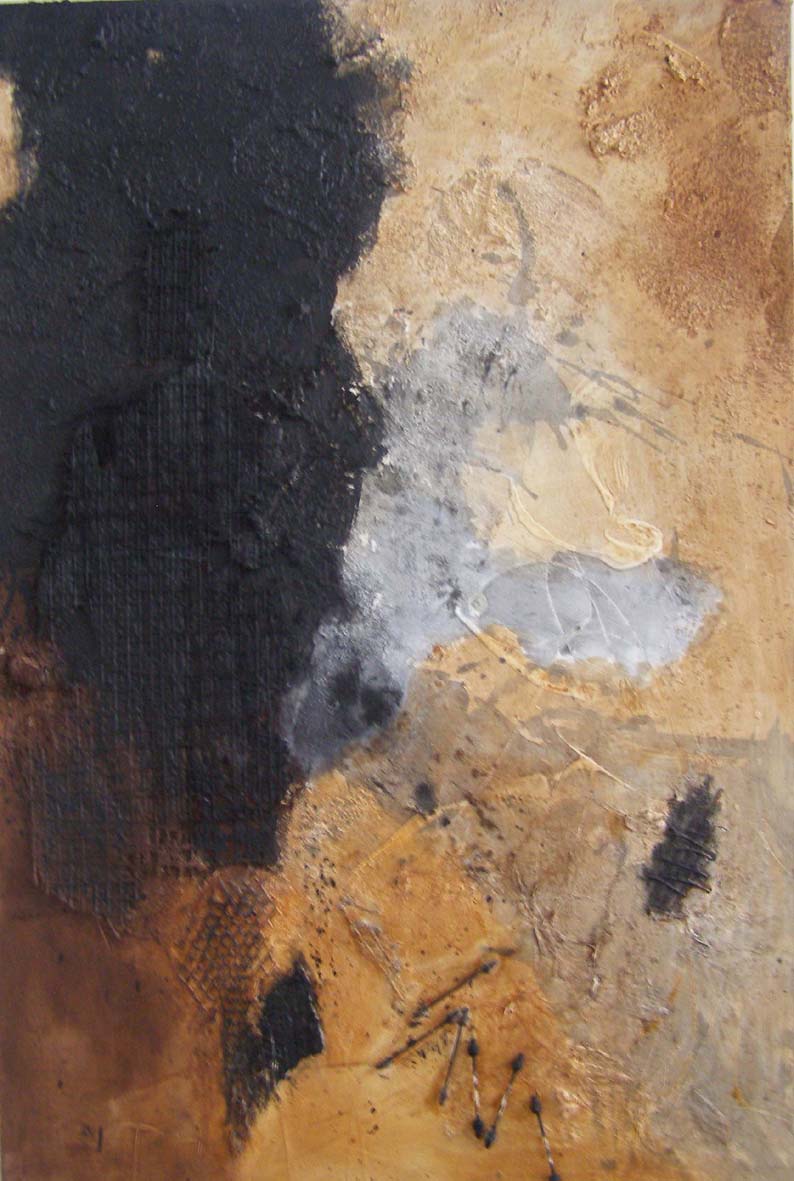
[No.1] Cryptic Figures, 2012, acrylic, ink, mixed media on canvas, 10ftx6ft.
24th August 2014, the artist’s studio in Bristol.
Those present; Nick Moore, Mark Skilton, Hilde Skilton, John Bunker, Sam Cornish, Robin Greenwood, Sarah Greenwood, Anne Smart, Anthony Smart, Ben Wiedel- Kaufmann, Noela James, Emyr Williams, Patrick Jones.

[No.2] untitled, 2013, acrylic, ink, mixed media on canvas, 6ftx5ft.
Nick Moore: Just to explain the numerical system – we start at No.1 which is the big diptych from 2012; then we go No.2 from 2013; and Nos.3 and 4 from 2014; and these smaller ones in the corner here, Nos.5, 6, 7 and 8 are all very recent. Nos.7 and 8 are things I am exploring at the moment, they’re still in process. My work is currently in a process of transition, I guess, from highly gestural I suppose in one way, to more ‘material’, so I hope that process is embodied in the paintings that are up on the wall.
Mark Skilton: By ‘material’ you are also meaning the textures you are using on the surface?
Nick Moore: Yes, they are becoming more textural, using different materials rather than just paint.
Hilde Skilton: …and there is less drawing.
Nick Moore: Yes.
Sam Cornish: In No.8 they still have gesture in them, to some extent, and the older ones still have material in them… One thing that No.8 seems to be doing is where in the gestural ones, say Nos.2, 3 and 4, the black seems stamped onto the top of the rest of the picture more or less in general, in No.8 the back [of the painting] – other elements – are pushing forward a bit more, almost in an equal way, in the way that they are active and they come off the picture. I think that’s probably the main struggle in the paintings – in the gestural ones – is to embed these kinds of lively drawn marks into the whole of the picture, rather than just being on a background.

[No.8] untitled, 2014, acrylic, ink, mixed media on canvas, 3ftx2ft.
Mark Skilton: They are projected out by the way that Nick paints; it’s as if he has this sort of backlit kind of ground to start with, working up through the browns, grey and then black on top, so then getting all of that to come through… the black in a lot of them seems to be floating… Not only is it sort of projected, pushed outwards, by this backlit kind of display, but it also tends to be mobile. A lot of these I think could almost move or they have a sense that they could be anywhere on the canvas. There doesn’t seem to be a particular reason why they are in a particular place, and I think with this last one, No.8, the areas are slightly more realised on the canvas; they have less room to rotate and hover about, even though it’s got the same sort of light-to-dark kind of spatial arrangement, the browns pushing out past the black, as Sam was saying. They also seem to be a lot more stable.
Hilde Skilton: Maybe because they are onto the edge…
Mark Skilton: And they are also more substantial in their size; they are bigger elements, bigger parts of the painting, rather than being these events that happen to float around on the surface.
Sam Cornish: Picking up on what you say about how they go from light to dark, how the light is in the back and the black is on the top, there are some interesting things in the later paintings where the white is put on top of the black [Nos.5, 6]. Doing that instantly makes the black seem more connected to the rest of the picture, and even in say No.4 where there’s that white rectangle at lower right, which is encased in the black lines, or in No.8 where there’s that little white egg-kind-of-shape, those instantly fit or sit down into the picture much more convincingly than having the black…
Anne Smart: I agree, the black seems to be more part of the whole thing rather than an addition, doesn’t it?
Sam Cornish: Yes.
Hilde Skilton: I would like to talk about No.1. I do see the progression and I do hear absolutely what you are talking about; but in this one, to me, in a funny way, the black is the first colour on top and yet I think that the backlit area is so much more activated, it’s so strange, it just happens and it’s not sort of… maybe it’s the proportion, and also you have put this brown colour on top of the black. Not so sure about this right hand side, but I can understand why he did that [vertical] slash down it, because you could see that that was just going to go away, fade away [at the edge of the painting]. So I find this one really interesting and I also like the… I know in the others he’s got textures with black, then black with matte, and more shiny black and all that, and browns made up, but in this one it’s very structural.
Mark Skilton: Is it the colour in particular in this that you think makes the difference?
Hilde Skilton: Maybe it’s the proportion, too, of black to the brown area and the grey area; and look how many layers there are here of grey and black and then grey again.
Sam Cornish: The black structure kind of captures the back.
Sarah Greenwood: Because it actually goes off the edges. It ties itself down to the areas of paint rather than floating in the middle.
Hilde Skilton: When we saw Nicks show [at Sidcot two weeks previously] it went from ‘Zen’ calligraphic, to forceful, to breaking up, and now building up again and funnily enough those things all follow through. But for me No.1 was the forceful one; the ‘Zen’ ones aren’t here, but I’m seeing that in all of them. But what we noticed in these last ones was this thing of breaking up. I think that’s why Mark was talking about these things starting to move around; whereas this one, [No.1] like Sarah says, is holding those edges.
Noela James: It feels like this one is much more about the black than perhaps some of the others. The others seem to have the background fighting a little bit more for dominance.
Hilde Skilton: But it’s not! That’s the point, it’s not just about the back, the black, there’s loads of it, but…
Mark Skilton: The greys and the browns are coming through.
Noela James: In comparison to the other ones, this one has more black in it.
Hilde Skilton: Yes.
Nick Moore: There is actually a definite conscious progression from this series [‘DarkLight’] of which No.1 was the last, into making single canvases and actually breaking the black up so that it’s not so predominant. And then in the process of that as well – it’s interesting you have picked up on this in No.8 – wanting to actually make that whole canvas much more material-based and textural, so that there is a much more even spread with the texture; so that it’s not just big black marks. It actually is – I think somebody used the term – embedded, which is great, because that’s what I am trying to do, to embed the paint into texture and equalise the other colours along with the black so that there is more of a balance.
Mark Skilton: What do you want the texture to do in the paintings?
Nick Moore: Well, texture for me, it’s a very personal thing, it’s about something more visceral, really, in a way that flat paint doesn’t do for me. If there’s texture in it, it brings something else to it and that’s what I am interested in at the moment.
Hilde Skilton: It does bring something else to it, but what else does it bring to it?
Nick Moore: I can’t explain, other than what I am saying, that it is something about feeling…
Patrick Jones: It’s about the surface; you are aware of the literal surface of the canvas in relation to the depth. Is the texture part to stamp out where the surface of the picture is, do you think?
Nick Moore: I think it is to enliven the surface as well, to make something different happen.
Hilde Skilton: A lot of the things you stick on are very specific – bits of roofing felt, bits of scrim, there was one with an old plastic bottle stuck on it, which seems a bit too literal. Somehow, it’s not just the texture…
Nick Moore: That’s why I think, talking about Nos.7 and 8, those are much more playing with actually embedding [the shapes], so it’s not just a single thing that’s stuck on, it actually becomes more part of the painting.
[No.7] untitled, 2014, acrylic, ink, mixed media on canvas, 3ftx2ft.
Anne Smart: I think with No.8 it is irrelevant that it’s semi-collaged – it does look like real paint and I think that the strength of this one is the fact that you’ve got multiple depths in the painting. You can go into its different depths, so you can be aware of the back-light, as it were, and all of the modulations of that; and you can read these pale grey sort of Chinesey-washy-things, and that’s a depth. And you get that sense of depth, but then you get this top depth of the black and then this extra depth of the brown [on top of the black], which to me in no sense dismisses the ones in between. You can flick from this one to No.8, and No.8, bizarrely for its smaller size and its appearance of modesty, is achieving that same amount of double depth, which is quite exciting. But as Mark says, I don’t feel that it has that literalness that I think some of the others do. I don’t know what you’ve done to achieve that and its quite interesting that the black bit we were talking about earlier has three holes in it – it looks like it’s been painted, so that you get the translucency of the black; and it’s the first time I’ve seen that black and I find the black in that a bit more integrated than the ones where you put the white on top of the black [Nos.5 or 6]; that seems to bring that space back, and it’s a bit weird, and I’m not sure if that’s working. And I think the white in the big one, No.4, is like a highlight that we are attracted to and I’m not sure about that either.
Nick Moore: There were actually more white areas in these, which have been painted out, so there is a very strong process happening between this and No.8, which is what I have been working towards. These ones happened along in between as a way of trying to grapple with that problem of the black and the texture.

[No.4] untitled, 2014, acrylic, ink, mixed media on canvas, 6ftx5ft.
Anne Smart: But the joy of this painting here, No.1, is that it’s got so many different ways of getting into it, and I think one of the other good things about it is this verticality thing which, although you’ve got these diagonals, the strength of the vertical through the painting is really strong, which also adds to the complexity of the space and depth. So you’ve got this mass sitting here, but you’ve also got the actual [physical] dividing of the canvas [into two panels], which is quite interesting because the marks go across it. So is it relevant to the actual painting, because they’re not two disparate things? But also, the dribbles are lines which are acknowledged rather than just looking accidental; so that the way that you’ve moved around, something we see a lot, everybody who has painted, that’s happened to them, but you seem to be holding them well in terms of what I think is the primary concern of the painting, which is this depth. And the black to me isn’t the most important thing, which I find quite surprising.
Emyr Williams: Just a general question about your palette… it’s a wilful decision about the amount of colour your using so you’ve got these earth browns, black is obviously the key to it and you are cooling it with a grey and some white. Why have you chosen these colours?
Nick Moore: Basically the black, burnt umber – and the grey is a half tone of the black – building up with thin layers of burnt umber was a conscious decision to limit my palette down from what used to be more high-key colour (you can see bits of that up here on the shelves). It was because I wanted something that was more elemental, something much more earthy; it was an inner decision, Kandinsky’s ‘inner necessity’ if you want. It was a decision I made and I have been working with since 2007.
Emyr Williams: When you say earthy, can I press you more on that?
Nick Moore: OK, rusty, elemental, I guess those kind of things I am drawn to, there is loads of rusty stuff hanging around and I love the kind of…
Emyr Williams: Do you see it as more organic, natural…?
Nick Moore: Yes, it’s about depth as well, and black is a very maligned colour. Again, it was a conscious decision to work with black.
Noela James: Nick, you said you had a lot more white in the other pictures that you then painted out.
Nick Moore: There was, like that one there; that’s the only one that I left, No.4.
Noela James: All the ones over here [Nos.2 and 3] with the grey bits…

[No.3] untitled, 2014, acrylic, ink, mixed media on canvas, 6ftx5ft.
Nick Moore: They had certain white area in them, yes, which I painted out. Another part of the process from No.1 to No.8 was that some of the single canvases I did started off with a decision to leave an area of white, just to see what happened. And in the end I think almost all of them except two have been painted out.
Noela James: And what happened when you saw them, what made you paint them out?
Nick Moore: It was detracting from the whole.
Noela James: They were too dominant, in that they detracted from the black and the rust?
Nick Moore: From the whole thing, yes; it just didn’t work.
Noela James: I would really like a bit more white, but it’s interesting that it put you off.
Anthony Smart: The thing that’s been going round and round in my head is that the black is… it’s the opacity of the black, the deadness, it’s impenetrable; and when you started to talk about texture, bringing texture in, as a way, I assume, of making more of the black, to bring the black to life, I’ve been sitting here and I have been cutting these paintings up; and I have been wondering why I’ve been cutting them up. I’ve been doing that [covering up part of the painting]; there’s too much black. I’ve been trying to change the balance, and then I suddenly realised that if you take this thing, let’s just imagine we cut that down to that [right hand side of No.1] taking a rectangle out of that, a section out of this big slash that was referred to earlier, suddenly there is transparency come into the black. You have already got it in a painterly way without starting to pile on slightly worrying texture when you’ve already got a better balance. So, yes, OK, so the ambition of a ten foot painting has gone, but maybe something is answered in terms of getting rid of the opacity of the black. You’ve already brought transparency in. I find that more dealable-with, not because I have reduced it in size, but because somehow the proportions of all your palette are contained in a dose that I can go anywhere I want to with. But I bang up against that – the amount of black. I don’t know what the hell I’m doing when I bump up against that. But when I get that to that… and that… [in the middle of the left hand panel of No.1] I am now wanting to take a slice of it; not to make a painting, but to feel…
Anne Smart: Are you saying that it is how its making you look at the painting?
Tony Smart: Yes, it is making me want to break it down. But the earlier ones do that, but when I get into your later pictures, particularly the last one, No.8, suddenly that is in a way, this. You kind of already had it.
John Bunker: What interests me about the three paintings here, Nos.2, 3 and 4, it links in to what Tony is saying to a certain degree, and has always slightly frustrated me about No.1 and some of the other bigger paintings. It was interesting to hear what other people said about the large black structures creating different kinds of depth behind them, if I got that right. For me, I always felt slightly barricaded out of those paintings, straightforwardly, the way they hit the edges. It’s that thing about the idea that the painting could go on for ever and ever, where are they going to go, where are these lines heading. With these paintings, even though there are lots of issues which I think have already been touched on, I’m intrigued by the way the black is operating with the edges. I think Mark said at the beginning they were floating about and moving about; I wonder if there’s a kind of the potential for a choreography of marks that is beginning to arrive in these paintings somehow; so we have gone from slashes across the painting, creating these different senses of depth, and with these paintings I’ve got a sense of the fact that in a way the black marks are now trying to somehow move or dance in the painting. Somehow.
Tony Smart: And is that making them more accessible, more penetrable, more transparent?
John Bunker: It makes it more accessible to me on one level, and I think the problem is to do with the depth, this issue of what is back and what is forward. I’m getting fascinated by what the black shapes are doing in the space, and I’m wondering… and at the moment that seems to be all about the edges. I’m interested in how the black shape hits the white or the grey – is it coming away from it? Is it entering it? So I’m getting involved in a different set of preoccupations with the paintings somehow. Does that make any sense?
Anne Smart: Do you think that that, how it’s affecting you, how you’re describing it, is a good thing in abstract painting? So that a painting grabs you and makes you look at it in that way, so you’re actually looking at it in an almost…
John Bunker: …illusionistic way…
Anne Smart: …and it’s encouraging you to do that. It’s this way of painting, a way to make the painting more abstract in the way that you are looking at it. So you’re describing sort of how it’s making you feel, you’re looking for depth; is that good? I mean is the looking for depth a sort of abstract thing? That’s what’s making it more abstract do you think?
John Bunker: I wouldn’t necessarily say an illusion of sense of depth, I would say a dynamic interpenetration of shapes…
Robin Greenwood: I wasn’t clear whether you were saying the black marks did or didn’t relate to the rectangle, the edge?
John Bunker: Yes, I think in these ones, I think there is more of a sense of that for me, that they are responding to the structure in which they’ve been placed. I felt with No.1 and some of the other larger paintings [at APT].
Robin Greenwood: But you talked about a sort of choreography…
John Bunker: Yes, I feel that that’s beginning to happen…

[No.6] untitled, 2014, acrylic, ink, mixed media on canvas, 2ftx2ft.
Anne Smart: Do you feel it’s integrated, or do you think the dancing shapes are dancing and moving across in a sort of big empty space, and they are more isolated as forms, and the browns are in fact a delineation of some sort of infinite space?
John Bunker: For me, the way these paintings feel slightly different and intriguing to me, is the sense that the black shapes are responding to the edge of the painting in a different way to No.1 and the earlier, larger paintings. And that for me deals slightly, but not completely, with this infinite ground business that you are talking about.
Sam Cornish: It’s interesting to hear what you say about these as a beginning and although I like No.8, I think probably the most, it almost feels a bit of a shame that the problems in Nos.2 to 4 have been dealt with in a way that completely gets away from the freedom of the marks.
Robin Greenwood: There’s a slightly more conventional organisation.
San Cornish: Yes, it’s a bit more… tying it down in that way.
Robin Greenwood: It’s more orthogonal.
Sam Cornish: It works much more, but doesn’t have the risk of Nos.2 to 4.
Nick Moore: There are actually three other ones which I am working on which started like this [Nos.2 to 4[ and are now an in-between stage between Nos.2 to 4 and No.8, so that there is still more of the tension between the black marks and the umber ground.
Sam Cornish: It’s not so much the tension that I feel is the problem, its these sort of dancing marks are something which, if they can be brought more into the rest of the picture rather than… We talked about texture and its capacity, and I think the textures on these ones seem too forced in comparison, whereas this brown I like [left hand side of No.2] where the black comes into it; that texture feels natural in a way that this really doesn’t [the black textures], particularly the found objects. This painting, which isn’t one of the ones on display [small black monochrome elsewhere on the wall], the texture there seems much more integrated into the shape, the texture forms the shape, rather than the texture is applied to the shape afterwards. There’s obviously a practical difficulty in making the texture that gestural…
John Bunker: I often find this an issue for me when I’m making collages, is how a piece of found material then suggests a mark making process; or suggests something that could be done by hand in a different way. That was something I noticed first of all about these. I find this, [in No.4 left hand side of painting], quite successful. The fact that it’s a mixture of… I find this combination of both the found element with edges with something that moves into a painterly, almost like a reaction to that – I find that exciting and interesting, that there’s that combination of things that doesn’t settle, doesn’t quite fit. So for me that’s really exciting, the fact that you’ve then landed a piece of material in the middle, so it’s working both ways – you’ve got a kind of double dynamic going between what’s painted and what’s placed.
Patrick Jones: Nos.2, 3 and 4 have got an intriguing difference between improvisation and methodical, much more conscious thinking, and I personally don’t look at the black shapes when I look at these pictures, I look at the grounds, which Mark said were backlit – but some of them are exceptionally beautiful and engaging. This whole top section here, in No.4, it’s not easy to get that to happen, not just spatially but…
Robin Greenwood: …or the top right hand of No.3, which I think is really interesting.
Anne Smart: And I think the thing that Patrick’s saying about the thing that makes the painting work when you get something like that, it visually compares itself to this and you get the balance of the two things, so that the way that the painting is working and building together with what John’s picked up about the collage, it works well in unison.
Sarah Greenwood: It’s almost as if in this one the ground is beginning to organise itself, it’s beginning to become a positive element; the black has sort of anchored itself down here but there is also a suggestion that there’s a whole section of painting down here; its brown and the ground sort of moves…they’re all beginning to coalesce [lower left No.2].
Anne Smart: They are all actually doing that a bit…
Sara Greenwood: It’s more pronounced in this one, because you’ve got this dark…
Robin Greenwood: But then on top of that you have these black things… I mean, the odd thing I find about the black things is how bland they are inside. Even though it’s a very gestural thing, and I presume you have done that with a big brush or mop or something, you have lost all of that, and it actually becomes a shape, very flat.
Anthony Smart: And what’s interesting is that bit of the black mark, and this bit of the black mark…
Robin Greenwood: …the ends of those things are the bits that start to do something.
Anthony Smart: This is a black mark, but it reads through that in the painting
Robin Greenwood: Yes, but all of that is slightly redundant.
Anne Smart: But is it redundant? Are you making it… you’re talking as though it is redundant but is that making you look more at these things… does it need to be slightly bland, is that critical?
Robin Greenwood: Does it need to be so big?
Anne Smart: Does it, I don’t know…
Robin Greenwood: Well, obviously, you start to read the stuff underneath…
Anne Smart: And then you compare it with that, which is the same sort of mark but its airy, spacey… [middle of No.3]
Robin Greenwood: Which actually I don’t like very much.
Anthony Smart: No, I don’t either.
Sarah Greenwood: Robin, in that one [No.4] this black, as John pointed out, is beginning to take on a life of its own, it’s broken up, it’s got bits stuck on the top of it, it’s got this extra bit of mesh here, breaking into it here…
Anthony Smart: But surely this is isolated even more, bringing it so into the real world [using the collage] that you’re leaving the painting behind somewhere.
Sarah Greenwood: But you’re breaking into it here, it seems to be spreading out more.
Sam Cornish: It’s interesting; Robin was talking about this big wiggly mark in No.3 at the top, and I completely agree that the ends are the interesting bits, and what Tony was talking about the opacity of the black, it is bland, and that is obviously something that Nick must have noticed because of the texture, which is a way of getting over that problem and making the black spatial.
Robin Greenwood: …and it does…
Sam Cornish: …and this bit here, the right hand bit here, in the bottom right hand corner, is much more…
Anthony Smart: It’s in the room…
Sam Cornish: Well, maybe it’s not a complete solution but…
Anthony Smart: The point I tried to make is that I think that a lot of the solutions that Nick is turning to – sticking things on or squeegee-ing things on in relief – more painterly solutions abound in the paintings already, and there’s a fantastic… that’s amazing, that whole [No.2 slightly to the left]; proportionally that is dealable with, with that amount of opacity, because of all this lot. When I first came in I thought it was some weird almost sculptural thing or something, but it’s a black mark; he’s got a fantastic range of ways of making black marks other than the deadest ones, which are these ones…
Robin Greenwood: …the big ones…
Anthony Smart: Yes, but when you catch a slice of it in with…
Robin Greenwood: How do you mean?
Anthony Smart: Well, to take a slice, I mean that’s a great mark, right through there, discounting that much of it, so you’ve got, say, that, but in the same rush of all the other stuff.
Noela James: Are we looking at the grey or the brown when you say that mark?
Anne Smart: He’s talking about taking a section like this and how the black would…
Anthony Smart: Yes, now I’m not saying that makes it a painting, I’m not reorganising his painting, I’m trying to see that as one huge mark.
Mark Skilton: It becomes fluid, doesn’t it…
Anthony Smart: …and it’s got ‘backwards’ and ‘forwards’.
Hilde Skilton: Were talking about translucency; but the whole thing is that that happens because of these massive marks.
Robin Greenwood: What, the black?
Hilde Skilton: Yes, I think the black sets it off… I mean this one, I’m really loving No.2, because… I don’t like the stuck-on bit, but I think that the expanse of that grey area, I mean everybody is talking about black, black, black, but the way that grey area works and the white in there, the browns… Tony, what you’ re saying as well I agree with, this mark here, that mark there, that area there, but I think it works because of the big black marks.
Mark Skilton: How do the big black marks make that work better?
Hilde Skilton: Because they push in and then those areas can… it’s a different character coming in…
Ben Wiedel-Kaufmann: So is there something different with the black going on in Nos.3 and 4, than in No.2, in the sense that you get a series of black forms which push, as Tony is saying, into the room, or at least black on the surface and that then begins to balance out amongst themselves in a sort of different relationship to what’s going on behind. Whereas what were saying about No.2, it seems to be about a gradation and trying to get away from that black that sits back. When you’re looking at No.6, it seems that that is more integrated; the black in there isn’t sitting so far forward and you can’t just deal with it as two flat forms, you have to deal with it through the rest of the picture. And No.8, interestingly, is the only one where you don’t have a balance coming out of two blacks, but the black is sitting there as an element equal to the rest. I agree, I really like the textural bits in No.3 as well, that one on the left, intrigues me but, especially in Nos.3 and 4, the balance of the black becomes a thing you have to get past in order to get to the rest of the picture.
Robin Greenwood: What do you mean by the balance of the black?
Ben Wiedel-Kaufmann: What have we got, one, two, three, four blacks…
Robin Greenwood: Like a sort of compositional thing?
Ben Wiedel-Kaufmann: Like an anchor, yes.
Anne Smart: I’d agree, yes.
Anthony Smart: Do you also mean balance implies the proportion of the surface that is black?
Ben Wiedel-Kaufmann: They become like shapes that are flat on there, and that interrupts our reading of the textures to an extent I think, because they become like maths…
Robin Greenwood: It interrupts our reading of the painting?
Anne Smart: Are you implying that you keep having to refer back to it, you get into something and keep having to go back to the black?
Ben Wiedel-Kaufmann: It brings you back, yes.
Anne Smart: So it’s almost like a flaw or something?
Sarah Greenwood: The things in the background don’t have a chance to do anything…
Ben Wiedel-Kaufmann: But even the things in the foreground, like even the texture of that one shape on the left and that bottom right which I like, that texture, I think it’s interesting spatially, but it begins to be about this balance that goes across the front. Which is interesting, what John was saying about choreography, in a sense that that could be something but it feels like here it’s not integrating with the depth.
Robin Greenwood: Is it just in that one, No.3?
Ben Wiedel-Kaufmann: Nos.3 and 4 have it much more.
Hilde Skilton: No.2 is better, yes?
Ben Wiedel-Kaufmann: I think it’s different, yes, I prefer it, but there’s something about the shapes in this that I like. I think it’s because you read ‘wiped-out’ colour, so the unexpected spatial thing in No.1, where are you going to get that from if you move away from that kind of framing structure? How are you going to break up spaces and get an unexpected jump with this kind of chromatic?
Anthony Smart: With Patrick standing in front of that painting and reducing or fragmenting the black even more, stay where you are Patrick, it’s key…
Patrick Jones: Then he’ll edit me out! [laughter]
Anthony Smart: The proportion of the black has changed the dynamic of the painting so the rushes of the black compared to the black down here in No.5, the black has gone hard over onto the left-hand side in the painting and almost vacated the rest of it – and similarly with this, right down in the bottom right hand corner, and up in the top left. So suddenly the blacks have become more self conscious in these; but in these, I am starting to think they are almost there. These are my favourites now, I’ve changed my mind. [laughter] These things move now and look how the balance is shifting.

[No.5] untitled, 2014, acrylic, ink, mixed media on canvas, 2ftx2ft.
Patrick Jones: Nick’s chosen to put up these three paintings for us to see, the panels are the same size and I can see from the arrangement of the chair in relation to the panel, he’s sat there, he’s looked at them and he’s thought: ‘I am going to change this and that’. When Tony makes comments about the relationship of the black and the ground, those are the sort of relationships one could use when one cropped paintings, where you cropped out a section and left a little bit of black and a lot of ground and obviously that’s what Nick’s not doing, he’s not cropping, he’s trying to resolve the whole panel, which he is familiar with because of the size, if you see what I am saying, so it’s all very well for us to say we like this section…
Anthony Smart: You’re wrong; you were taking out a piece of the middle of the painting when you were standing there, not messing about with the margins. I don’t think there is any problem with the margins at all. I still think it’s to do with the amount of matte, the impregnable bit of black, and building literally on the surface is only going to bring it into the room. Something needs to happen pictorially.
Patrick Jones: Obviously Nick could decide after hearing this, to paint over these with white or something to knock them back, but it seems these pictures have a history, don’t they? That’s what I am trying to get at, they have a history of Nick’s thought over a period of time. They’re not fast pictures, actually, they’re quite slow pictures that have been built up over months. Am I right, Nick?
Nick Moore: Yes, over some time.
Patrick Jones: And they’ve got that feeling about them, ponderous in a sense, but also dramatic. And although I think I prefer the dramatic bits where the drips fly across the ground, I think those are the bits that are the most exciting. I’ve got a similar problem, which is sitting for a long time with a painting, spending time chewing it over and trying to decide what’s the most effective way to… you know, you can lose something, but maybe you gain something else, which is to do with spontaneity and more conscious organisation. But, yes, in terms of the means he’s using, I have difficulty with the collage thing, for instance I can’t relate that stuck-on thing to that splash, I find that quite tricky.
Anne Smart: There seems to be two sort of thoughts; I mean what Ben was saying, I was sort of agreeing with him, and what Patrick is saying, they’re highlighting the decisions that are made whilst working, by the person who is making this, and the judgements that you make yourself; but I wondered if Ben was touching on the fact that the painting would be better if there was less black in it – is that what we might be saying of it? Do we think there’s too much black in it?
Sam Cornish: It seems to me to be a shame for that to be the solution, to have less black. It’s the nature of the black that is the thing that holds it back. And likewise, it would be a shame to lose the calligraphic bit, as well as to do with the opacity. Maybe it’s to do with the edges, the way the edge comes out into that sort of spiralling, whiplash [in No.3] kind of mark – if those thin spindly whiplashes could be brought so they were active on the black shape, so almost the other way round, that would be something really interesting.
Hilde Skilton: look at Nos.5 and 6, there’s less black and you’re getting a different feeling to the paintings.
Patrick Jones: Could I just say something about the choice of brown, because Emyr picked it up, but in No.2 the edge that we like on the left isn’t the same brown as the umber, it’s a more blacky/blue/brown; whereas these sort of quite warm sienna reds I find that more difficult to swallow with the black and the grey than I do the umber and the black and grey, because it brings an element of warmth into the picture.
Nick Moore: It’s all umber actually.
Patrick Jones: But obviously when it’s mixed with something else, it’s changing.
Hilde Skilton: Here you have painted it on top of black, which is good, it’s starting to happen.
Sarah Greenwood: In No.1 you’ve got large amounts of black, and then this sort of textural bit in the middle which is brown over black, so it becomes more integrated and in No.3 I’m seeing that brown – quite thick paint in the top right-hand corner, and then some texture in the black… Was that brown, have you painted over that brown?
Nick Moore: [laughs] Yes…
Sarah Greenwood: How would it have been if that had stayed brown or the brown had been on top, so then it would have given it a whole different…
Anthony Smart: You’re talking about bringing the brown onto the top of the black… I think you’re right Sarah, I agree.
Anne Smart: Well, you’ve started to do that, as you’ve said in No.1, brown on top of the black, which adds to the depth and spatiality…
Sarah Greenwood: But it also differentiates-out the other black, the big long verticals.
Anne Smart: It makes the variety of blacks even greater.
Sarah Greenwood: Which is what I think he’s trying to do in these, putting this texture on, because it then looks like a black and grey, so then that starts echoing across where these greys are crossing the splashes.
Anne Smart: So then going back to No.8, when the ‘found’ piece has got holes in, then you’re able to see through to the background, which is a similar sort of thing because you’ve got a comparison with… there is some brown added into that, so that this is merging…
Hilde Skilton: They all have different feelings, it’s great, such a shallow range of colour. Actually there’s quite a deep range of colour – isn’t it wonderful how they all have different feelings, they really do.
Anthony Smart: I was just going to remind Nick that yesterday in Hilde’s crit, you flagged up the amount of work on painting No.9, how she worked up all the elements, and you said how they were all worked up in different ways – not only was the colour different, but the way the thing was handled came across as in its character in different ways; and so when I came today I’m thinking, what’s his going to be like, and I kept thinking, he will have worked this up… and that’s the bit that you haven’t.
Hilde Skilton: That’s the bit on No.2 in the centre of the heavy black mark.
Emyr Williams: Can I say about the texture in them, the thing I have been looking at since we have been discussing them is an element of politeness in them, and what I mean by that is when you go in with a texture, you’ve kind of done it in a way that is controlled and safe, whereas when I first saw them I thought you’d come barnstorming into a bar; but rather than smash the place up you bought everyone a drink… [laughter] You know, each bit is safely controlled texture, something like that or something like this [in No.2]. I think you could go in a lot harder, a lot more aggressively with the textures. If you’re going to do something like that, then rather than just leave it like that, then do another bit, go for it, and really whack that out there. And if you’re going to stick things like [flattened] take-away cartons on, whack them on there. If you’re going to put your ground in, you know what’s coming next, so get more out of the ground first. I think you need to smash the bar up a bit. Can I just say I think it’s a very wise decision to come down in scale because that forces you then to do that, I think in the last [smaller] ones you’ve started to think more about the scale and the commitment to that surface and I think it’s going to scare you more.
Nick Moore: Part of the reason for working on that smaller size was because I’ve always found it difficult to work on a smaller scale just because of the energy of the work. But with this, with putting more material in it, the texture, at that scale, it seemed more handlable at the moment; so my ambition is to take that back up to this [larger] scale again.
Emyr Williams: Exactly.
Nick Moore: Once I have found my way around with that a bit more.
Emyr Williams: That’s exactly what I thought.
Anthony Smart: I think that the lack of inter-involvement, not to end up with these things as isolated relational bits…
Emyr Williams: He’ll sort that…
Anthony Smart: OK.
Emyr Williams: I’m standing up as a painter here, I know it will come, I think he’s dealing with it.
Nick Moore: I feel like I am getting to grips with it, yes.
Sarah Greenwood: Does he need to have more commitment to the whole surface?
Nick Moore: Yes, a lot of what you have been saying… there are two stashed around there which weren’t in the exhibition, which are similar to these [Nos.2, 3, 4] which I have been working on and expanding the texture in them into larger areas, at the same time as working on these small ones, so they’re bouncing off each other. So a lot of what you have said about isolated bits of texture is currently being worked on to integrate it more in the painting.
Hilde Skilton: To have a more overall feeling?
Nick Moore: Yes, and it’s been great hearing all these comments about these ones, because I now see these ones as a transitional phase. In a way, I don’t see these ones [Nos.2, 3, 4] as finished paintings somehow, they’re part of a step on – each one of these is a step towards what is happening now.
Robin Greenwood: Will you carry on with these?
Nick Moore: With these ones? Yes, I probably will.
Noela James: Rather than start new canvases, you could just carry on with these.
Nick Moore: Yes, which is what I have been doing with the other two I have been working on. I realised that they’re not actually that satisfactory in that way, so I have started to re-work them using what’s here now as a basis, and also working off Nos.7 and 8.
Hilde Skilton: Well, leave No.2!
Nick Moore: I’m not going to paint the lot over, I look at No.2 now and think, yes that black could be much more animated, and I know how I could do that.
Noela James: How could you do that?
Nick Moore: Like Emyr said, smash the bar up a bit more…
Hilde Skilton: Now I say: leave No.2! [laughter] And maybe those two [Nos.3 and 4], work on them, but leave No.2 for now, because you’re going to see it a bit differently later.
Nick Moore: I’ve got two that I am working on at the moment, so I’m not going to touch these yet, so then when I have worked the other ones, then I’ll come back to have another look at these.
Noela James: You don’t think you’ll bring white in?
Nick Moore: I have no idea, but probably not, they’re in Nos.5 and 6, there’s white in there which has been painted back out again, just so there’s a suggestion…
Noela James: I rather enjoy the sparkle of the white coming through.
Nick Moore: I don’t know, is the answer. I’ll just have to see, I don’t pre-plan in that way. Well, thanks for your attention and thoughtful comments everyone, this has been a really helpful experience.

This was a great day at Nicks studio in Bristol.I was completely aghast at the self- lessness of the comments ,which were perceptive and intelligent in equal degree.Everybody went out of their way to avoid their own hang-ups and look objectively at the work on show. There was a great deal of humour as well ,which made this a classic experience.
LikeLike