Brancaster Chronicle No. 68: Robin Greenwood Paintings
9th March 2019, London.
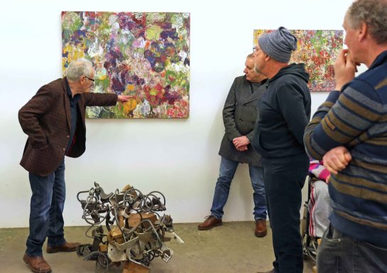
Taking part: Robin Greenwood, Sarah Greenwood, Charley Greenwood, Simon Greenwood, Calum Greenwood, Anne Smart, Anthony Smart, Hilde Skilton, Mark Skilton, Noela James, Alexandra Harley, Richard Ward, Steven Walker, Patrick Jones, Luke Pagarani, John Pollard.
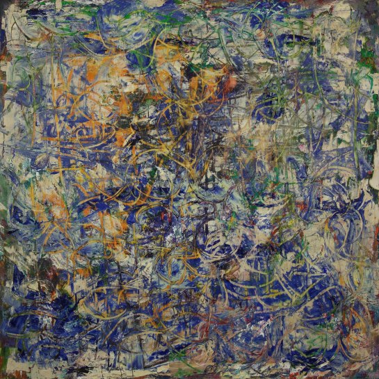
untitled 2019 103x135cm oil on canvas

untitled 2018-19 102x124cm oil on canvas
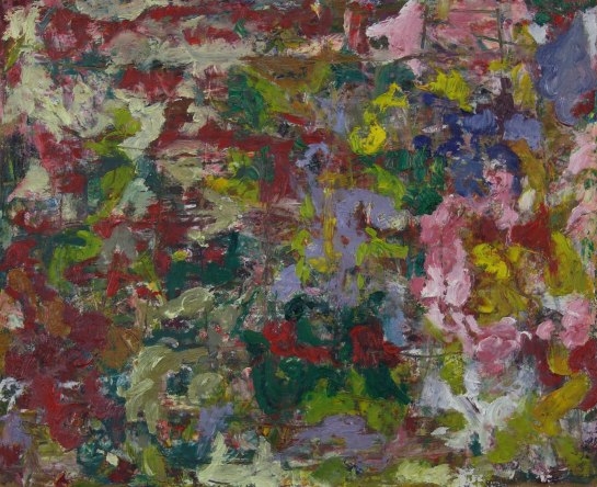
untitled 2019 92x80cm oil on canvas
untitled 2019 61x41cm oil on canvas

untitled 2019 53x46cm oil on canvas
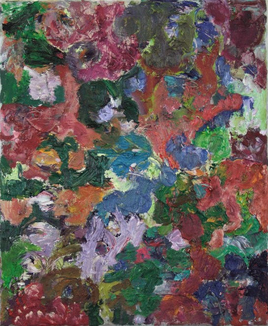
untitled 2018-19 56x46cm oil on canvas
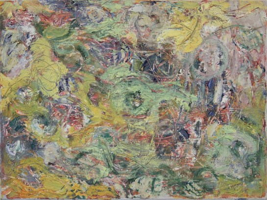
untitled 2018 70x78cm oil on canvas
untitled 2018 54x39cm oil on panel
untitled 2018 61x92cm oil on canvas
untitled 2018 61x61cm oil on panel
untitled 2018 61x56cm oil on canvas
untitled 2018 60x121cm oil on canvas

untitled 2018 60x114cm oil on panel
untitled 2018 60x36cm oil on panel

untitled 2018 54x54cm oil on panel
untitled 2018 54x39cm oil on panel
untitled 2018 51×136 oil on canvas

untitled 2018 51x46cm oil on canvas
untitled 2018 51x41cm oil on canvas

untitled 2018 51x40cm oil on canvas
untitled 2018 50x68cm oil on board
untitled 2018 46x66cm oil on panel
untitled 2018 46x57cm oil on panel
untitled 2018 42x54cm oil on panel
untitled 2018 31x41cm oil on canvas (2)
untitled 2018 31x41cm oil on canvas

I found this Brancaster illuminating in the sense that it exposed the point that there is no ‘right way’ to paint or view abstract painting. It is a matter of personal preference and desired mode of production.
Robin has made a striking body of work which has touched on several ways of working and appealed to each of us differently.
I think I understand your point Robin about not wanting layers in a work to be the dominant thing, I’m thinking would Albert Irvin’s layering technique fit that description? Just trying to think of an example.
LikeLike
Robin…I say yes to Noela’s “striking body of work” that you have shown. Amazing…more than amazing
Since the day I have had thoughts about the paintings.
One of them is a sort of lightbulb moment for myself so I hope it is worth mentioning.
Noela remarks on yourself not wanting layers in the work to dominate. this makes me realise that in Abstract painting what you do not want could have more importance than what you do want…
On the day it was clear that “layers” mean different things to different people…lots of the constructs of Abstract painting have the same effect…..maybe colour or space even?……
Having something to focus on is one of the keys [ a sort of subject matter of your own mind]..some aspect that I would not want because I have decided through experience that I do not need that to achieve an Abstract resolution …
Another one…..I have seen the paintings in the flesh and on line…For me…the photos manage to make the work in terms of quality too slick.
I don’t like that. I really enjoyed the rawness of the real thing. The difference between the feel of the ones with bare wood gauged out and the more “painterly” ones does not happen in the photos.
Maybe this is a sort of physicality but the rough and uncompromising way the work is achieved is something to be celebrated.
LikeLike
Ha…
That was from ANNE
LikeLike
Yes, Anne I agree, knowing what one doesn’t want in abstract painting could be a clear path.
LikeLike
A fantastic and extremely varied collection of paintings that was a joy to see and is a joy to think about.
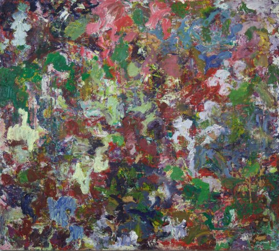
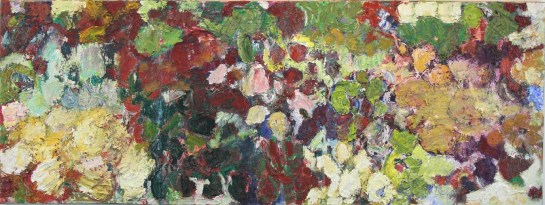
For me, what these works have in common are the predominantly soft, organic forms and the wonderfully orchestrated, slightly muffled colour, based on brownish reds, cool greens and a host of subtle greys.
Against this unifying background, the paintings explore different ways of combining and reconciling the two dimensions of surface with the three dimensions of spatial illusion.
The intense materiality of a painting such as No. 2 (not very apparent on screen) guarantees that the surface is always visually available but makes it harder to create space. The relatively feeble space-making power of warmth and coolness in colour needs something stronger to cope with this kind of surface. Layering is one such method but I think Robin is right to avoid this – it’s a potentially crude, one-way thing that limits the viewer’s freedom, buckles a strongly material surface and can weaken a less material surface to the point of destruction.
The other space-maker that is powerful enough to deal with this kind of physicality involves, I think, an element of figuration. No. 12 is a case in point. Here it has only required the slightest hint of a background, aided and abetted by some scalar perspective and a bit of layering, to release the rounded forms into a fluid and light-filled, deepish space, in spite of the insistent surface. In No. 2, by contrast, the forms struggle to escape from their own materiality.
No. 17 is also interesting in this respect. Here the figuration is more apparent but at the same time indefinable. This might be a landscape space, a tree space, a still life with flowers space, a garden space etc. etc. The surface is as strongly present as in No. 2 but the spatiality is breathtaking.
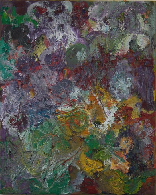
Where there is less physicality at the surface, the space can be achieved with subtler means.
No. 6 has thinner paint and is impressively spatial without losing its two dimensional surface. In this kind of painting there are so many complex factors at work, establishing an integrated surface in spite of the spatial illusion, that it becomes almost impossible to analyse. This is “eye-work” at a very sophisticated level, reaching something of a climax in No. 7. There’s all
sorts of visual stuff going on here – two or three different backgrounds are on offer, none of them insistent; spaces appear and dissolve or melt into each other, colours advance and recede – all in the simultaneous presence of an immensely satisfying, perfectly flat surface.
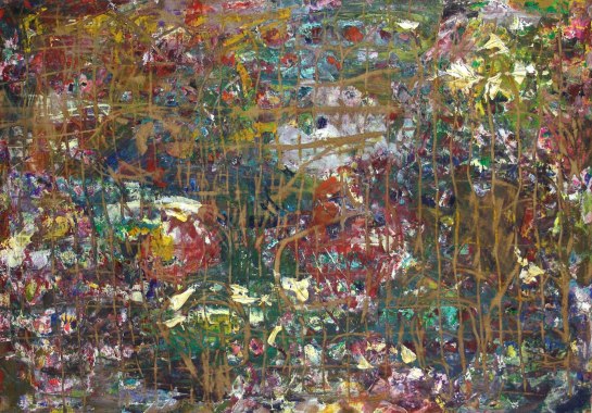
The “grid” paintings and paintings like No. 9 are yet another approach to space and surface. These too are less insistent in their physicality. They are also less determinate in their shapes and colours, which makes their spatiality less pronounced and their decision-making less clear, compared to say No. 18.
I find them fascinating but can’t yet decide whether I like them or not.
LikeLike
It’s just occurred to me that the “grid” paintings have a lot in common with woodcuts.
Where the “grid” becomes less regular, as in No. 10, the effect is something like that of a complex Dürer print where, for the viewer, the lines are there before the figurative image catches up.
LikeLike
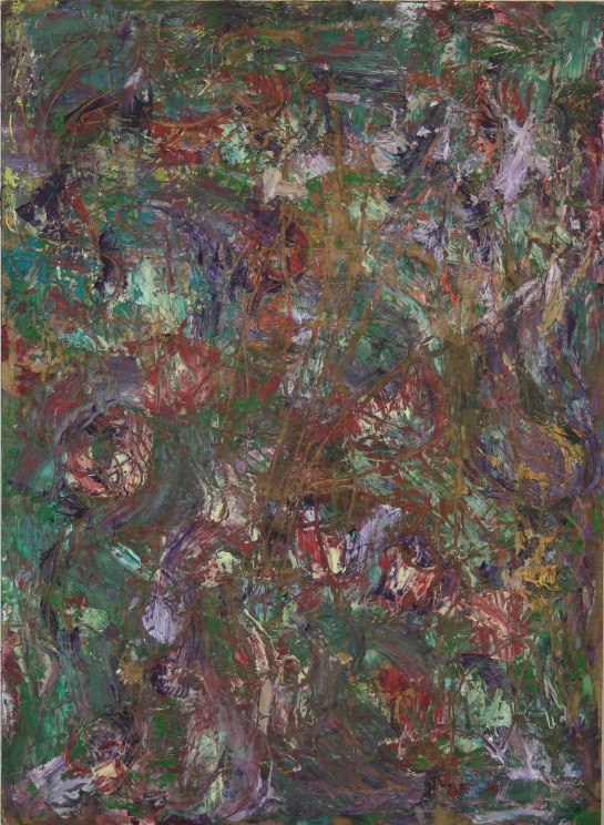
My initial reading of the scrapings when viewed through photos was that they simultaneously move into the picture and out towards us at the same time. This would appear to fit in with Robin’s desire to reconcile three dimensions with two, and deny the emergence of layers, ironically by revealing what lies beneath, but obviously without any irony present either. Just a no-frills approach that is very refreshing.
But it is also very good to see that this methodology or outcome was not adhered to as a presupposed “way” to approach future pictures. We’re not really looking for answers here, just more surprises.
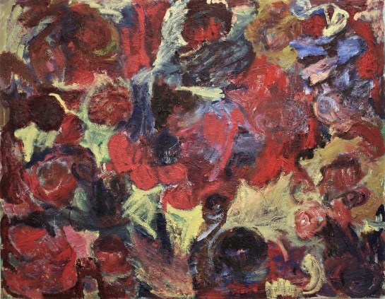
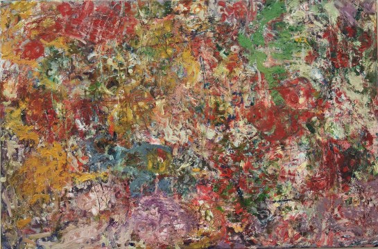
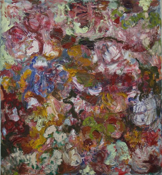
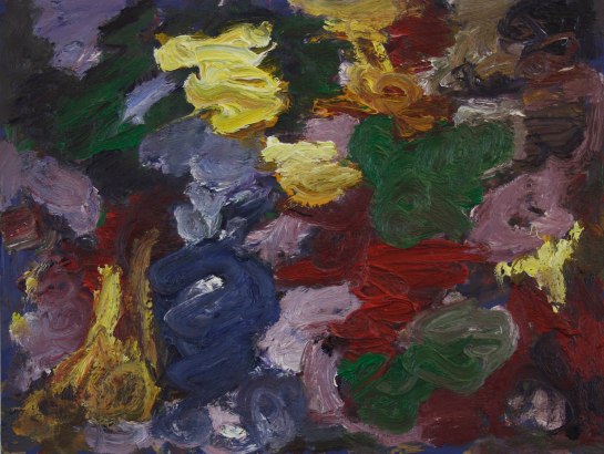
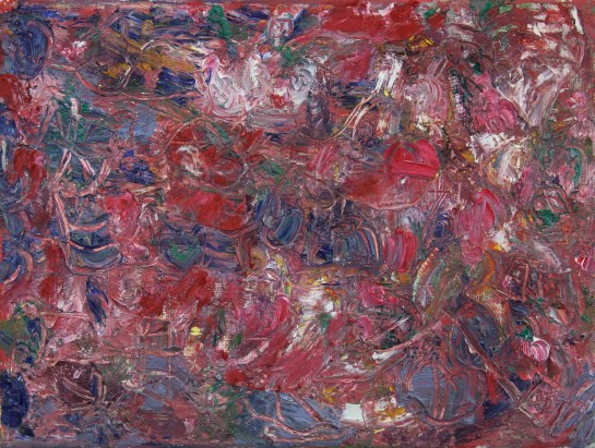
I really admire the Red “Goya” painting for its attempt to isolate “forms” or moments somewhat and see if they can remain abstract. Like Anne said, we may be confined to talking about it in a figurative way, for now, but there is a feeling it gives off that I’m responding to that doesn’t seem indebted to figuration, at least I hope not.
Well done Robin!
LikeLiked by 1 person
The red “Goya”, as it seems we might call it, is amongst the most recent of the paintings in the show, worked quite heavily prior to the exhibition from a starting point quite similar to some of the other paintings, and beginning to look to me, before the talk, like the work that really took me somewhere a little bit new, despite some rather familiar problems of figure/ground. I must admit that I have now done a small amount of reworking on this painting, covering over a little central-ish section of the off-yellow with a dark-toned area, in order to pull together more the three-dimensional movement of the big varied-red passages across the main parts of the painting, and play down the off-yellow in its tendency (sometimes) to act as a background. I’ll try and photograph the change sometime; but in a way, what I’m suggesting about this work, and what made sense to me before and during the talk, is that it already has a character that links it to the three-dimensionality of much of the figurative painting that I admire so massively from the past, where the two-dimensionality is used to absolutely hold everything in place, without overriding what it is that the three-dimensional “things” state so specifically themselves to be and do together. I say that in the knowledge that we cannot talk about these abstract “things” in the same way at all as we can talk of things in figurative painting.
In these recent paintings, I have avoided layering as far as I can (which is where the method of scratching-out some of the paint surfaces in the smaller works derived from), particularly layering in colour. I realise this is recognised as an attractive and potentially coherent way of making abstract painting, and some of these works – perhaps the one(s) that Patrick and Hilde liked – do get themselves involved to some degree in that “push-pull” colour thing, mainly because of the organised abutment of circular colour-forms. I don’t dislike these paintings, and I am satisfied by some more than others, but I cannot now see that way of working being quite as good a way for me to continue, because I need to focus more on how the WHOLE of an abstract painting can fully get to grips with reconciling three-dimensionality right across all of its two-dimensions, and from different directions (!), in a way that even the very best figurative painting only occasionally achieves, mainly because of its attachment to, and immersion in, the spatial structures, vertical and horizontal, etc., of interiors, exteriors, landscapes and actual figures and animals.
I suppose my (madcap) theory is that new abstract painting has to work not only without those elements that have driven much of the best of figurative painting, but they now have to ALSO do without the return to paintings’ more recent and much over-emphasised two-dimensionality, incorporating the design, composition, drawing, repeated shapes, flatness and colour-layering that has dominated.
Abstract sculpture might have a few clues…
LikeLiked by 1 person
This was an impressive display of painting; I got a sense of a constant restless and ambitious searching. The much admired ‘untitled 2018-19 102x124cm’ might have ben one of the best paintings out of the 27 but not the most interesting or ambitious; it opens up some nice big spaces, easy to read and familiar, and works its form and colour in a rather beautiful way. It’s not a simple painting but in some ways, it is simpler than its companion piece, Red Goya, which at first sight seems to embody itself a simplicity: a rather simple dominating central lighter red bundle with a yellow background underneath and to the sides. Yet, to me, some of the yellows also sit on top. There also subtle differences in the various yellows, as well as the reds. This disruption of spatial position of content is really interesting. It seems a worthy ambition to make the various content play a multiplicity of roles in a painting; keeping the coherence of the work overall can be the challenge with such complexity.
I think the scratching works more or less successfully, and sometimes looks arbitrary and lacks integration, but at other times seems more integrated, although the term integration, like the term ‘coherence’, can be a reductive, simple, and uninspiring achievement: it can become samey and repetitive.
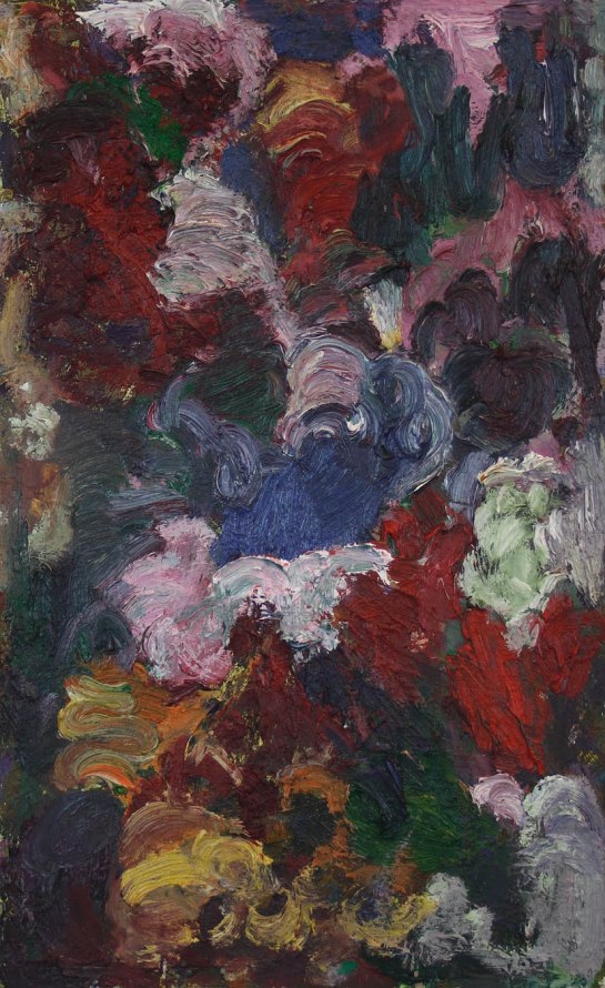
The light blue blob Robin was taken by when discussing ‘untitled 2018 54x54cm’ is a good example of this integration question. Does it go too far as a contrast to the rest of the painting? Does the blob ‘stick out’ lost in relation to the rest of the painting? Or is it simply working because it sits on a yellow ‘wave’ and is counterbalanced by the yellow blobs at the top left quarter?
We didn’t get round to talking much about some of the paintings but there would have been plenty more things to explore if we had. I’m glad Robin finally showed his paintings at a Brancaster; about time!
LikeLike
I also read some of the light yellow areas in Red Goya as perhaps sitting on top, rather than as background. So they could also be read as though they are there to simplify things, so I’m all for altering them as Robin mentioned he has done. I have no problems with the ones on the right hand side. What a great passage that contributes to, towering up the side of the picture. I’m also interested by the little blue patch in the one talked about towards the end. I think it’s good to have provocative things like it. It brings to mind that pinkish lozenge in Richard’s last chronicle. How far can you go with these things and still be able to pull them back to something working to the whole painting’s advantage?
LikeLike
As far as I can remember, the yellows ARE painted on top, but their “fill-in” shapes (lots of concavities, tapering extremities) push them back visually behind the red, maybe with a little too much force.
Foreground / background seems to me to be an extremely mild form of figuration, if it counts as figuration at all. Same goes for scalar perspective, or does everything have to be the same size?
I´m not sure that the colour is entirely resolved in this one. There seems to be something missing, compared to nearly all the others.
LikeLike
LikeLike
https://twitter.com/RobinGreenwood1/status/1111945971620040704
LikeLike
https://twitter.com/RobinGreenwood1/status/1112392493998448647
LikeLike