Brancaster Chronicle No. 72: Hilde Skilton Paintings

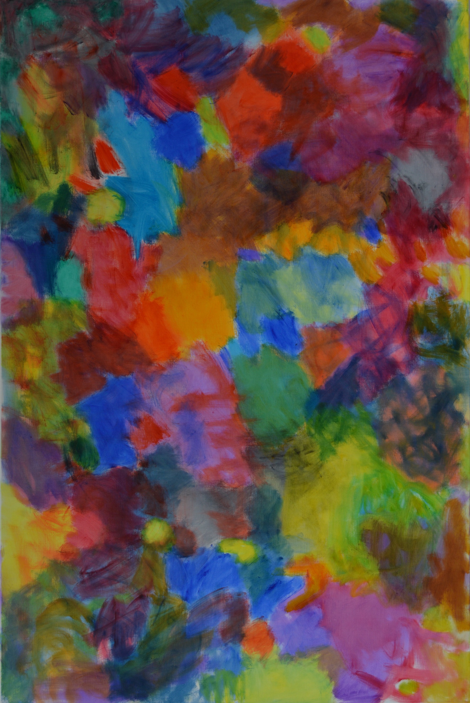
Methane Lakes, (all paintings oil on linen), 150cms x 100cms. 2018/19
20th July 2019, the artist’s studio near Bath.
Taking part: Hilde Skilton, Mark Skilton, Anne Smart, Anthony Smart, Sarah Greenwood, Robin Greenwood, Charley Greenwood, Shelley Latham, Noela James, Steven Walker, John Pollard


Just a few thoughts
I wondered a lot about what both Mark and Hilde call the “punchiness” of her colour
I thought in these latest works that Hilde uses a stronger blue. By that I mean that although there are variations of blue throughout the work she seems to have introduced one which has more depth of colour and tone.
[ I would refer here to ” Meeting at Olympus Mons” as an example noting the two areas right of centre and below the mid line.]
I thought it to be disruptive. I do think that disruptive can be a positive. Especially for a collagist.
Looking back at earlier work by Hilde, last year and beyond her use of colour seems more calm and comes together,not really in a relational way, but in a way which ,as she presents them, seems to ‘work’.
So back to this years work…
The colour ‘blue starts to take a lower order, not a back seat, but the other ingredients of the painting the focus,direction,brush work[?] harmony,translucency and more arrive at a sensitivity. .
I think these paintings challenge the thought that in Abstract painting you can go in anywhere and come out anywhere which has been given a ‘like’ by us all at times.These paintings are highly ‘tuned up’ all over and for the most part I think the colour ‘blue’ is just working away harder not in a disruptive way but in a way to enhance the resonance of the whole.
Also there are other matters always to be discovered in these works.
I am particularly attracted by the quality and variety of the surface brush work. I sense a different way in these of activating space and that not isolating these marks to one particular area of colour but in a way overlapping them produces another way of creating wholeness seen at best in “Venusian Dawn”
I personally have no desire to try to analytically describe these paintings.I see that as exciting.
Maybe it is an Abstract thing ?
LikeLike
What is detail?
Is it the busyness in the material that we first see before the meaning?
In thought out and well built paintings,such as these of Hilde’s this detail/busyness has been developing over the whole of her Chronicles.
This group,for me,start out in this respect ,that the opening out of the paint surfaces now becoming ,not just the disturbance of the of the paint surface seen at the beginning, but now a conclusion to the ‘why’ is this detail.?
The spaces of the paintings are not just reliant on the juxtaposition of the paint patches, but have become a physical flowing of space and colour within and throughout the paint and its achieved depth.
For myself, this is an example of “complexity with variety” beginning to realise a greater purpose.
LikeLike
Thank you Anne and Tony. Your comments are inspirational!
LikeLike
Just so you know, you can now click upon all the images of Hilde’s post and get an enlarged view, thanks to John P. and a consultation with WordPress. I was beginning to get frustrated with not being able to do that with anyone’s work since Emyr’s post of two years ago, and It has been significantly irritating, especially with the painting – though perhaps nobody else noticed?
John will now (we hope) work his way patiently, backwards, through all the last two years of posts to ensure that you can eventually get big images of all the work. I repeat, all you should need to do is click on the image. If anyone has any problems, contact me or John.
LikeLike
Interesting balance of colour Would love to see the work on a larger scale. Well done
LikeLike