Brancaster Chronicle No. 86: Steven Walker Paintings
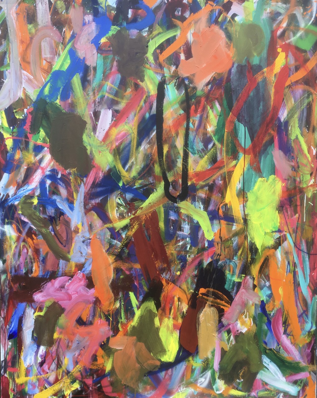
No.1 (150x120cm, acrylic on canvas)
Artist’s Statement
The works are in chronological order, beginning from early 2020 up to March 2021. I have not given them titles yet. During this time, I have been preoccupied I think with trying to become looser and happier(?) when working and I think I was also attempting to connect my spontaneity with more order through experimenting, feeling and looking, reacting and responding, separating or assembling areas in the light of new glimpses or discoveries. I was out drawing a lot during Lockdown. I wanted to see if the unexpected colour combinations or forms which occurred in these observational drawings could find their way back into the paintings.
I look forward to reading your thoughts.
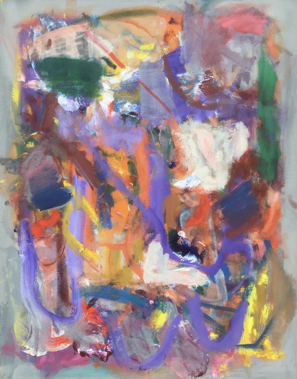
No.2 (150x120cm, acrylic on canvas)

No.3 (150x120cm, acrylic on canvas)
No.4 (150x120cm, acrylic on canvas)
No.5 (150x120cm, acrylic on canvas)

No.6 (140x100cm, acrylic on canvas)

No.7 (95x75cm, acrylic on canvas)
No.8 (95x75cm, acrylic on canvas)

No.9 (120x100cm, acrylic on canvas)

No.10 (120x100cm, acrylic on canvas)

Steven,Really enjoying these.No 4 grabbed my attention straight away.Two slight gripes,are the photos your own,as they seem a bit blurred or faded,but could be my computer.Thanks for the plain titles,as others make me cringe.I always wait for some development from you,as lack of talent isn’t your problem.Ive mentioned before ,Id like to see larger and smaller shapes,less all over.defineatly no 4 ,fantasy world,my favourite.Impressive body of work,Best
LikeLiked by 1 person
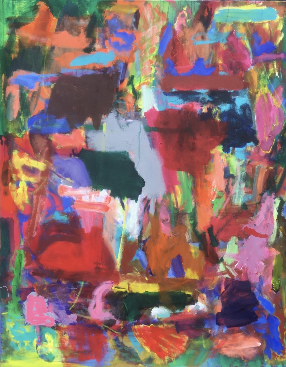
Hi Steven, I was immediately struck by nos. 2, 4, and 8, I think because of the colour combinations.
The purple swoops in number 8 complement the oranges and yellows but are offset by greens, grey/brown (bottom right) and white, very nice. I have been looking at the edges and the mixed grey ‘framing’ in no. 8 works without it being obvious, I think it holds the action without too much inward pressure.
The colour and shapes in number 2 feel free yet controlled. The mixed reds from peachy to brown/crimson really sing well with the mixed blues that range from cool to warm.
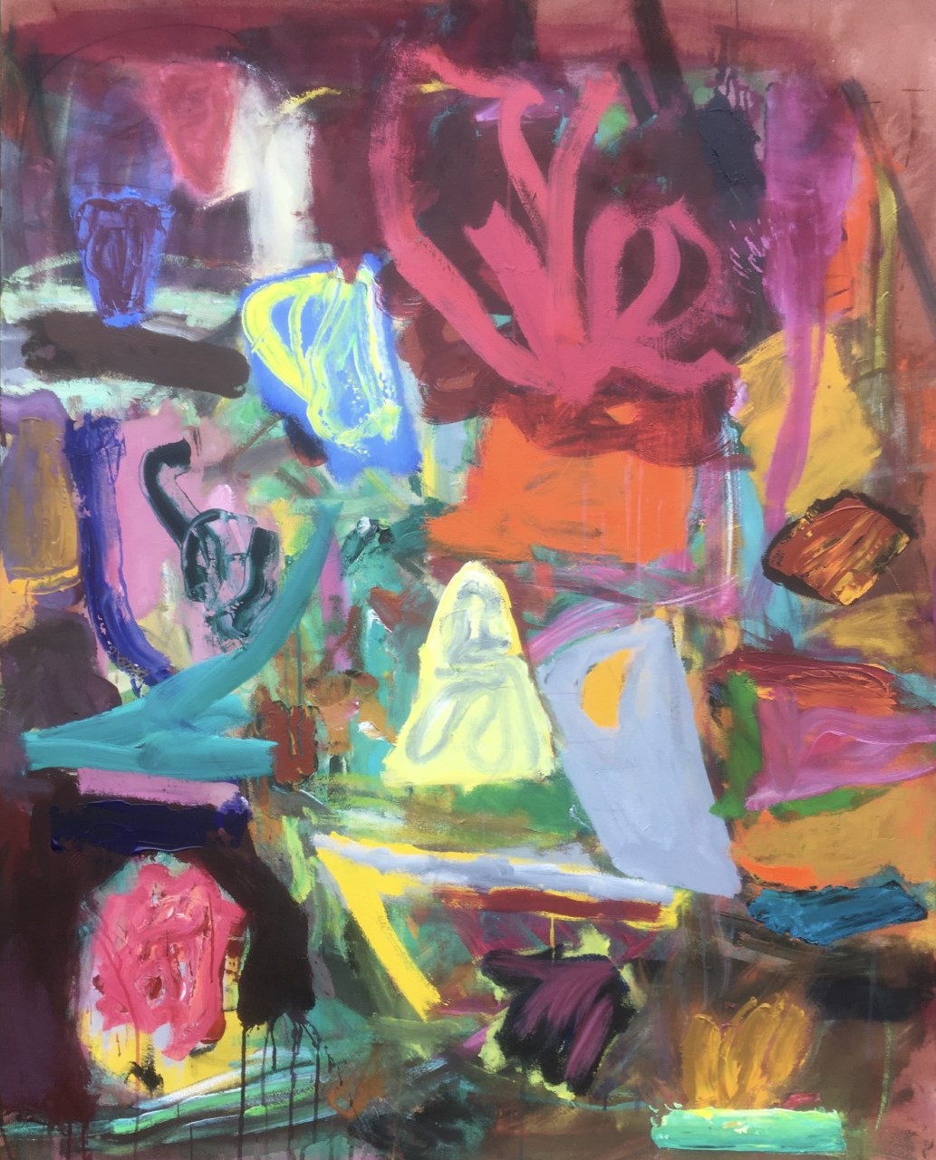
Number 4 seems very different and more three dimensional, Patrick describes it as ‘fantasy world’ and I kind of agree, and it has an appeal which I can’t quite put a finger on.
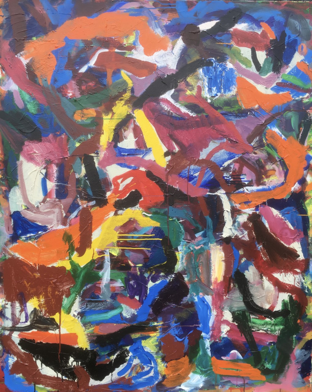
I like the linear qualities in number 5, the interweaving of blues, reds, oranges, browns , black , yellows, I think the up and over, backwards and forwards movements work very convincingly.
I shall carry on looking at the other paintings I haven’t mentioned and write more later.
Immediate responses are good to have, but then can evolve and change to be able to appreciate other paintings with a slower burn.
LikeLiked by 1 person
Love these paintings , from the depths of desaturated colours to the jewel brights popping forward , the variety of marks and gestures that move the eye around . These are paintings that make me just want to keep looking .
LikeLiked by 2 people
From Anne
Hi there Steven
It’s not that I am not having a wonderful time looking at these paintings.I agree with the comments so far. Fabulous .
So fabulous i don’t know which to look at first. Or I start to look at one and think I’m missing something in another. I am finding it hard to pin one or two down and think about analysing in more depth. Then I think that’s a good thing.
Patrick says he is drawn to No 4…and when I look that is the one I am least drawn to !…so to say why…well I think because it is the one with the most separate areas [ thing like things ] in !…so that would be more humorous than a serious comment. ..What I wonder is …as I scroll down them online…and I have done so lots and lots of times…how similar they are in ambition..so vital ..so out there…so intuitive, crazy and fast. They all have the same pace. i can almost see you making them. that amount of creative is awesome.It’s also a bit scary. Well it is for me to see all at once.!!…This is not a negative point. It could be brilliant.
Patrick vaguely mentions development. They are presented to us chronologically…do you see a development.?.actually what on earth is a development?…especially here….In my thinking abstract painting today is more about tomorrow…I think that has something to do with a forward traction when what you are making gets better …but that ‘better’ can only be in your own head I think ?
What you are saying you are preoccupied with [ in your personal statement ] seems a bit unfocussed. It is obvious that you are already “looser” than most …don’t know if that brings happiness but if you’re loose as a painter you should not find yourself bogged down with technical issues..so that must be good?…but to “connect my spontaneity with more order through experimenting, feeling and looking, reacting and responding…” well those things also seem pretty loose…if anyone was not loose I would expect them to be trying to do those things ?….
a random thought…and in no way advice !…..
You go out into the world..it looks like daily from your instagram feed…and produce the most magnificent landscape drawings and paintings.{ as well as all the abstract paintings !! ]… I am there in those places … Their sense of ‘place’ is astonishing. Their sense of ‘space’ is also astonishing.
You have something rare. it’s going to be more than one thing. But to me one of those things, and it’s a big one ,is your observational precision.
Boy oh boy those drawings and painting look loose….but that does not come from nowhere. Accuracy abounds.
Abstract painting,[ like figurative painting ] in its loosest form, should be as tight as a drum…..but how?
You have something to keep looking at when you are out in the village with your stuff or up a mountain or in your own back field. Something real to talk to and the knowledge that when it is finished ..you will know.
Stuff like this has been said before ..pros and cons of representation and abstract.. its not new.
But your abstract painting has turmoil coming crashing in with all the energy that’s going on in your head..
Maybe just look ..try to work out what finished in an abstract painting means……and if not being ‘finished’ is as important, more important or not important, for you ,.and really ,really, really OBSERVE those brush marks, pools of paint, forms and colours you make yourself , and make them important.
You mentioned in a comment about Noela’s work how you were “quite jealous” of the luminosity she achieves.
It’s no bad thing to be jealous. I am without doubt very, very envious of your constant and relentless out pouring.
Amazing.
Please can I have a little bit of help from someone to get down to looking at one of these paintings in more depth.
LikeLiked by 1 person
H Anne,
Thank you for your very generous, warm and sympathetic comments.
I am very pleased you like my drawings. My compulsion to produce rigidly observational drawings, almost every day, and rigidly abstract paintings might seem odd to some, but I feel my modus operandi is sitting well currently. There is a development, I like your idea of “forward traction”, although it can take over a year sometimes to acknowledge that there has been some improvement, so including very new work here is a bit of a gamble. I guess the important thing here is to be aware enough to see it.
It is interesting for me to view my drawings as observations of spaces, after reading your comments, rather than as I have done, as experiments in what a line is capable of achieving. I certainly feel my mind broaden and open up more fully after having been rooted somewhere drawing in the landscape, and that feeling is something I keep hold of when I go into the studio to paint abstractly.
If the correlation between my drawing and painting is about space then I think I can continue to do both, but the moment I feel there is any dilution of the two approaches I might have to change. Osmosis may be important.
Also, there is another idea of space. The space we inhabit in ones mind when painting. I am thinking of the idea of doing at least 2 things at once. Looking and making.
LikeLike
I really like the thinking here and maybe it could be brought to bear on the tension between stillness and action in these works. Where does the work fold into rhetorical action for its own sake? Where do colour-forms hold each other in perfect tension? The black loop moment from number 1 highlights these kinds of questions. I’m drawn to moments when colour shapes become split up by active line that engages and reacts to them rather than the sort of line that seems to wander about the picture looking for something to do. But then this seeking process has its own kind of drama, its own kind of ‘freedom’. Great to see this level of engagement (both physical and conceptual!) with the activity of painting and look forward to seeing the work in the flesh soon.
LikeLike
No 2 had me involved before l started analysing….there was a shift/ shunt movement happening…initiated by a few areas of colour in the centre…light grey, dark green, dark ( l think) maroon and pinky/red/orange…this movement does not settle. I find this exciting. Then l started looking around and could see how colour areas to the left below …red/orange on maroon…and to the right above …brown and ultramarine…were influential and so on. So far the best for me…now l can give my attention to others!
LikeLiked by 1 person
I think they are more successful when there are ‘enough’ thinner marks (the larger areas seem to hedge their bets as colour). I know you have mentioned the landscape work and I’m assuming these are a search for an accord rather than any specific assimilation or adumbration?
In number 1 that black loop is pictorially inspired – are the dun grey greens a little too opaque? (maybe one is – the top left of black?) Sometimes there is a feel of sitting inside the rectangle coming through the subsequent sessions to the start, perhaps. It feels that you want to get the colour working but are also concerned with the tone: staccato colour needs tone to give it a spine and I can see you reaching for the black to infuse them with that spine at times. They are hugely enjoyable to look at and I like the attack which, although familiar, is refreshing to see. There is so much going on and you keep seeing new relationships emerge and then dissolve back – that’s a lovely quality.
I am not convinced in the reasoning about spontaneity, though we’ve been over that one, so it’s a rabbit hole for me. Ultimately it’s not anyone’s concern either as how would anyone know what went into them? Really good work and look forward to being able to see them properly one day!
LikeLiked by 1 person
I have been looking at nos. 6,9 and 10 and enjoying the organisation of the colour and form in them. No. 9 has a loose lively grid which comes and goes, the dark blue and black lines hold the painting together. The blocks of colour are not restricted but seem to form a moving wall , they create a sense of stability as well as speed. I like how you have used the white areas, they bring light into the painting and it does feel joyful.
In no. 10 I am picking up on a kind of honeycomb with a triangular ish window feel, some blocked in and others showing the action behind. This painting has a jerky rhythm to it which I can get into the more I look at it. I am liking the purple/ browns against the blues.
The linear qualities in no. 6 travel satisfyingly round the canvas and the accents of bright yellow really work to give the oranges, purple and greens a lift.
As Linda Robinson says these are paintings that make you ‘just want to keep looking’.
Also I have a feeling these works would all look much better in the flesh, hopefully we can see some one day.
Thank you Steven.
LikeLike
Dear Noela,
Thank you for taking the time to write your comments. I thought I should mention that these works in question have either begun as stained canvases, or, had a gesso primer, which I didn’t stain.
I notice you have mostly commented on works which began as stained paintings (No.’s 2,4,8,6,9 and 10). (Only No.5 being the gessoed exception) The staining was to initiate a different beginning to some of the canvases as I felt the outright, completely impulsive way I used to begin a piece was becoming too formulaic. Impulsive without self editing. I was asking myself if doing this was necessary, and how can I adjust this. It was creating a sort of background in which the shunted shapes slowly but eventually began to appear, whereas with the staining, the shapes took a form very quickly. Impulsive, yes but a bit more controlled. I am now wondering how to proceed. I don’t like to tie myself up in knots, but I have done here. Should one work from impulse to impulse? Can editing be self restricting (Making versus judgment)? When does a formula become problematic?
LikeLike
I have read all the comments so far, on both Harry’s and Steven’s paintings and can go along with most of what has been said, both in favour and in criticism.
But for me, one particular comment stands out; Emyr Williams: “In no.1 that black loop is pictorially inspired…”
I agree.
As a consumer of result and observer of method, I ask why that should be so ? My answer must be – because I have not seen anything quite like it before; it is original.
So much in these and in so many other paintings is familiar. I accept what it does without any difficulty; it provides me with an aesthetic comfort zone. Satisfying but not disturbing. My mind/eye is not discomfited by the visual demands.
LikeLike
Hi Tim,
I wonder, is the work in Matisse’s “good armchair” territory?
Perhaps a way forward for me is to challenge what the surface is doing in terms of the viewers “comfort zone”. Maybe I need to consider this. No.1 is one of a series of 6 I made at the beginning of 2020. I was conscious in the making of keeping the paintings “open”for as long as I could. The making of this series progressed on to more recent work where I was developing ideas about deliberately not balancing the whole, but looking at the needs of smaller areas within the whole. This was a change for me as I would previously try to paint with the whole in mind. I like the notion of balance and purity as the work advances towards finding a resolution but I also like the idea of challenging the viewer. I remember Hilde describing a piece of mine from a previous Brancaster as making her feel “queasy”.
I was also interested in your thoughts on originality? Is originality overrated? Originality comes with maturity. Or, it should, I guess. I am very pleased that you and some of the others in the group enjoy the black loop but If I was to comment on my influences at the time of making, it would probably be quite obvious that it’s not so original. Doing so would offer clarity but it would then lose its allure, like a cold pancake. Mind you, what I enjoyed about painting that loop was taking the gamble. “Will this work or will it not?” There was a lot to lose.
LikeLike
I agree, that black loop is something I keep coming back to in these, in a way where I am not bothered but intrigued. No.4 also keeps me returning. It has forms in it that threaten to break off from the rest of it, that red boot like form, almost a leg that rises up on the left before locking in with that dark green and lilac grey. That grey in the middle is something of a focal point for me, but one that knits everything together, offering a strong diagonal to cut through the strong horizontals and verticals. I like the way this painting teeters with form, but resists it also through a kind of structural integrity.
I’m also enjoying No.6 for its movement and am particularly drawn to the greyish scraped away area on the lower left side. Perhaps not as striking as the black loop, but a subtle shift that offers a change of pace amongst the energy. Thanks Steven, I’m finding repeated viewings to be offering up more of these subtleties.
LikeLike
An initial caveat on these thoughts are the top quarter of all the paintings looks slightly washed out, lacking saturation and contrast and it would make sense that is down to the lighting when photographed. My guess is that viewing in good lighting would mean these look better in the flesh, more together with a stronger integrated structure.
No.1 The blank elongated ‘U’ is very powerful but quite poised within its relationships with the rest of the content, but does it dominate too much? If it does it’s marginal, as the rest of the painting fights back with its mad complex spatial layers and vigorous jostlings. The bottom half of the painting is fantastic.
No.2 is balanced, strong but quiet: I really appreciate its lack of repetition and very clever shunting of colour and shape.
No.3 ditto
No.4 is simplified a and its various ‘shapes’ seem a little lost, floating somewhat disconnected as if they don’t want to relate to their neighbours.
No.5 is quite different: the intertwining, more linear, shapes work well but perhaps the black and oranges dominate too much. I really like the bottom half (photo issue?).
No.6 lacks the innovative shapes of the first four paintings for me. This may have much more pop and integration in real life though.
No.7 is interetsing: It is a bit figure/ground for me, although the ground (edges) are a very narrow area. But I really like the content. There is some great colour and the bottom yellow/white may look and work much better in the real.
No.8 Too simple figure/ground for me.
No.9 Again the photo may underplay this work but the white ‘blocks’ and dark blue drawing/shapes don’t feel convincing.
No. 10 is weird! I look at it and as I move around the canvas the black lines form a shape which jumps right out of me, separating itself from the rest of the canvas. I try and get back into it but they jump right back out. But in realty maybe not?
I would like to see these in the flesh (although I have enjoyed looking at their photographs): I think they will look more together and integrated as whole pieces and the colour will be stronger.
I really enjoy Steven’s energy and contrasting subtleties.
LikeLike
Hello Steven – Your response to Emyr’s (and my) comments on ‘the loop’ raises many issues, which is good.
Matisse’s ‘armchair’ is a seminal remark, if you are Matisse that is. The problem, being only oneself, is to find other routes leading in the same direction, if that is where one wants to go.
Like all great observations, Matisse;s remark has led to an outpouring of painting which sits in the ‘comfort zone’, but does not stir the soul – much
.”…I like the notion of balance and purity as the work advances towards finding a resolution…”
Maybe “balance and purity” should be what you discover in the resolution, not what you set about creating as a “notion” ?
I agree that ‘originality’ is a bi-product of “maturity”; i.e. experience. Again, “originality’ is something you find, eventually; not something you can deliberately set about creating.
Yes indeed, the “influences” creating the ‘loop’ were quite possibly of the most banal kind; or not, as the case may be. But that is nor what is important. What IS important is the result, in this case as I saw it, and as Emyr says: “inspired”.
Yes, quite. Too many “cold pancakes”, or at any rate only luke warm.
Please carry on “taking the gambles ‘ !
LikeLike
From Tony
Steven
Your Painting no1 I liked from the outset.
It is a radical painting and a very difficult one at that.
To bring together all of those brush marks colour and space without a format .
I empathise strongly with what I perceive to be the aims of this work, I also want that non format format .
I think the painting pulls together all of the elements , everything knowing where everything else is , always on the move , without resort to the stabilising of shape which your second series reaches for.
I read this as being about freedom of colour and space …it is about freedom , and about everything that refuses to give way. Obviously abstract.
LikeLike
Hello Tony,
Fascinating for me to read your response to No.1.
I feel for my progress that was really important for me to read.
Thank you!
LikeLike
Hi Steven,
I really enjoy the looseness and vibrancy of these. Just what I needed! There are many wonderful meetings of colour, shape and line through all of them.
I am always aware that seeing paintings so reduced and through screens changes their experience a lot- and that this is particularly difficult with abstract work where every value is important to its ‘reading’.
Generally the images seem crisper and deeper in the lower half than the top- I guess that is an effect of lighting- or focus? [just noticed John said same]
1 is the most impressive for me- great layering and all over rhythm- upward energy- held together by ‘staple’ just touching the centre. A slight worry that the staple is too obvious… but it works. 2 wonderful hovering clouds of colour building up. Again the dark green/grey contrast in centre is a perhaps bit harsh but gives focus and drama. Great edges. 3 interesting but the yellow/black centre is a bit overpowering. 4 looks too bity and resembles other bity abstract art. Yellow centre too bright for me, slightly generic painterly gestures. 5&6 lots of potential but not quite together enough to read as finished for me. 7 is one of my favourites- I love the way it climbs up itself. Deep centre but very discrete. Yellow vs blue patches at bottom touches of genius. 8 is wonderfully graceful and gentle. Very mysterious, avoids being pastel bland through the unexpected colours and complexity of the mark making. Want to hug it. 9&10 look a bit like constructions make from coloured card, perhaps too attention seeking- theatrical- displaying themselves? I suspect 10 works better at actual scale- imposing, monumental probably. Its growing on me.
I hope that is helpful- they are a real and immediate pleasure to look at! Edward
LikeLike