Brancaster Chronicle No. 65: John Pollard Paintings

15th July 2018, near King’s Lynn.
Taking part: Anne Smart, Anthony Smart, Hilde Skilton, Mark Skilton, Robin Greenwood, Sarah Greenwood, Alexandra Harley, Noela James Bewry, Steven Walker, Edward Pile, Richard Ward, John Pollard.


What if?……
What if John’s paintings did not have some black lines in them?
I think that was something we all asked of ourselves in his film ?
Robin says in a comment recently that there are more interesting questions than clear answers.
Regarding John’s use of black….Tony asks if it is the black that takes you across the surface? …Robin wonders if it is that the black is linear?….. and do the macro and micro structures go together?… Hilde asks if John thinks he is drawing…someone asks what would happen if you took the black away…then regarding the colour Tony asks a double question wondering if the other colours in the paintings question where the black is?……and we go on asking more questions…are they to John or is what he is doing ,the painting in fact, asking the bigger questions?
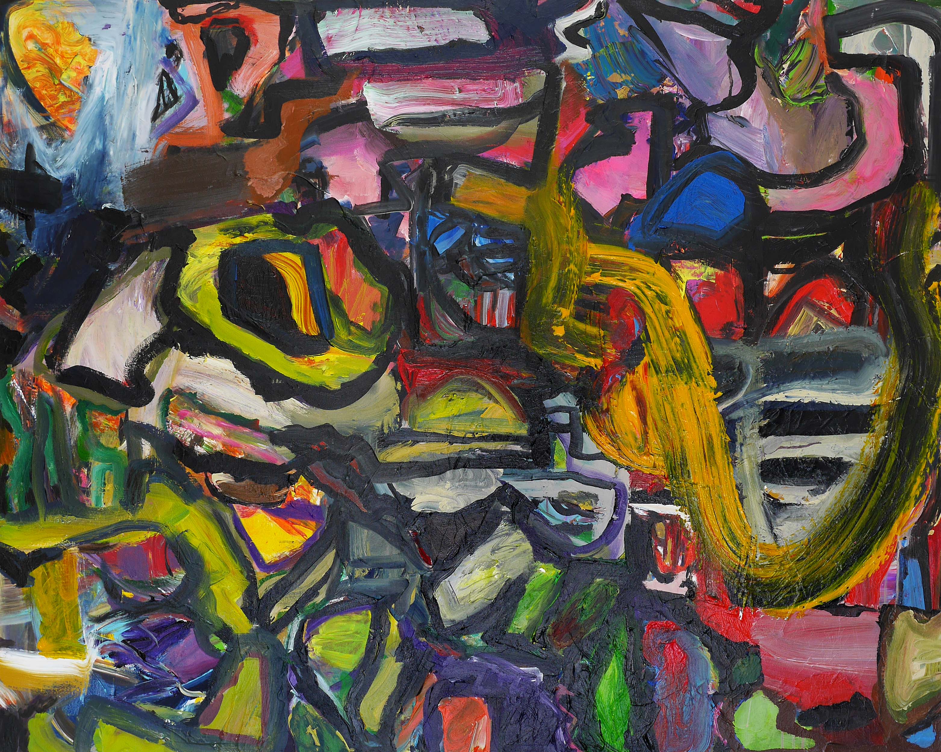
The questionings for me brought to the forefront the painting ” Day of the Lords ”
I like this painting because it is for me more painterly as a whole thing. [ as was mostly agreed after Steven and Tony had a go at what painterly means ] For me also it roams about the canvas weirdly ,which I like because it is not conventional. I like the combinations of colours and how the shapes within it seem to spin around in a particular space to themselves so they are both a part of the whole and remain identifiable as themselves. I could go on. This was the one which attracted a lot of attention and I think that our own personal taste became more revealed the more we discussed it.
I wonder if that hinders a conclusion as to whether the painting is successful or not.?
Asking myself again why I like this painting so much I think it is more to do with the …what if? thing.
And I think is has a lot to do with being abstract.
Hilde asked some questions about space in a comment after my film. So did Noela wondering if different types of painting produce different types of space. I read the question and came up with lots of answers, and suppose others did too.
I get the feeling that the clear answer is not in fact what the abstract artist is searching for.
For me, the best of my work and the best of the other painters’ and sculptors’ work ,is that where the painting or sculpture almost revels in the quandaries and possibilities they send out.The sense of those made available by the works own dynamic, open and free stance and its potential…?….
Recently I have found I do not need to be excited by a resolution ,in my own work and in other artists, but feel more liberated and fulfilled by that potential of the what if ?…….
So these questions have a sort of hierarchy…..the best being the ones the work asks of us when we look at it.
John”s painting “Day of the Lords ” was ,I found after the event and after a lot of consideration , the one that asked of me those best questions. When, in that painting I asked myself “What if there were no black lines ?” ….In the end I thought “Of course there should be those black lines because they are not black lines as such but a part of a whole abstract painting.
LikeLike
My impression is that the lines are an imposed solution to problems (real or imagined) that arise during painting rather than an integral part of a resolved creative expression. The resulting paintings work, but they don’t really fly.
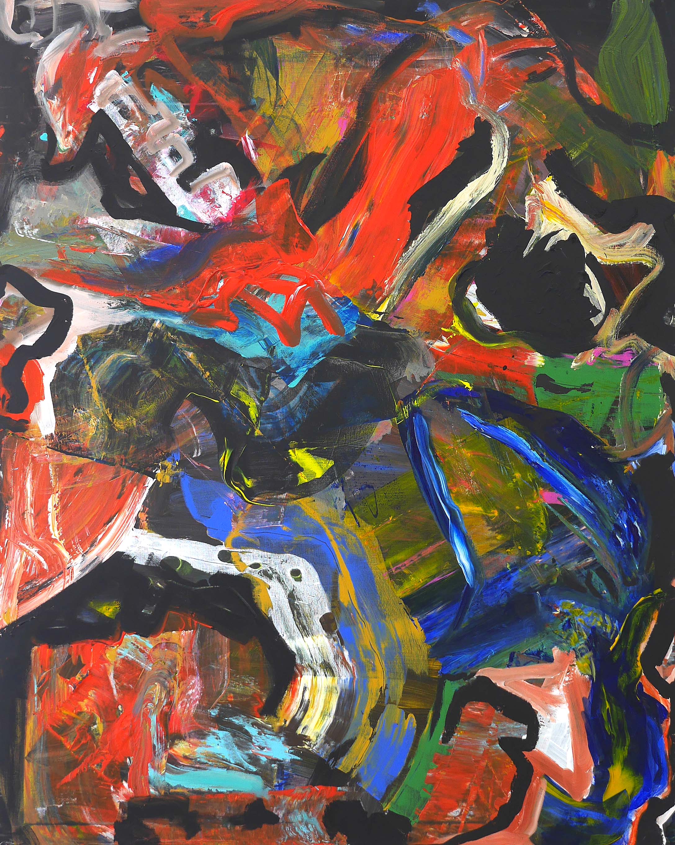
“New Dawn Fades” may not be the most successful painting here, but I think its open structure probably offers the most promising way forward.
In the other works the enclosing black lines prevent any intense interaction of colour.
With the pressure thus removed, colour can become inaccurate or even arbitrary and the ultimate effect is a bit like coloured-in drawing, even if the process is actually the other way round.
John’s colour looks good to me. I can’t see any downside to setting it free.
LikeLike
I think the black intensifies the colour, it holds it rather than traps it.
In last year’s Brancaster, the black in ‘Madcap Bits and Pieces’ was more contained and ‘slower’ and perhaps sat more comfortably with the colour.
There is greater intensity and graphic speed in these paintings which make them more overwhelming and powerful visually and perhaps, as Edward was suggesting, unconsciously psychological (if that is a thing).
I feel the paintings really need the black.
LikeLike
Just click on „John Pollard“ and scroll between “Shadowplay” and “Sober Joy”.
Put very crudely and tendentiously: Drawing addresses the intellect, painting opens up your heart.
LikeLike
I always like your comments, Richard, but this one is itself very tendentious, as is the spurious notion of setting colour free. For what? And there are lots of bad painters who will tell you all about opening up their hearts. Oh, please! Too much! John needs to flex his painterly muscular a little more, and think a little less, but that is a long, tough road for us all. Like many, this guy is maybe failing a little, but for reasons I like a lot, and I have faith is what he’s doing with both the colour and the black lines.
Can’t find your reference.
I don’t agree with any comment so far, even Noela’s, because the black cannot just be used sensibly as an “intensifier of the colour”. Again, for what?
Hopefully, I will write more soon.
LikeLike
I am not sure if John is intentionally using black to intensify colour, it’s just that that’s what black tends to do visually. I mean Matisse, Manet, Picasso use a lot of black. It feels like John is working with black to see how far he can go with it, and how to handle it, to see what it can do within the abstract ‘world’ of his paintings.
LikeLike
OK Richard, so I now get your reference, and I assume you think that “Shadowplay” is drawing/intellect and “Sober Joy” is colour/heart. I think “Shadowplay is the better painting, and the best of John’s work here. I like it even more now, even though I think it has some flaws. I’ll try to explain more later, but keep in mind that I certainly think intellect and feeling ought to be combined in great art. Go ask Constable and many others. It’s the way towards making complexity and wholeness come further together, and where things/parts become more unified with and by each other.
LikeLike
Robin
You’re right that it’s more a matter of degree than any absolute, but there is truth in the drawing/intellect
vs. colour/feeling distinction.
I think it was Leonardo who first said there are no lines (but only edges) in nature.
Lines are a conceptual remove away from our everyday perception.
This is the sense in which drawing appeals more to the intellect and colour more to feeling.
I thought this was well illustrated by these two paintings.
For me, the immediate effect of “Sober Joy” is more mysterious/visceral/heartfelt (and yes, “heart-opening”, in the same spirit that an intellectual argument might be “mind-blowing”) than that of “Shadowplay”.
“Setting colour free. To do what?” – you ask.
To interact more fully with other colours.
To form a coherent, uncompartmentalised virtual space.
To form more varied and interesting edges, where colour meets colour rather than line.
To communicate more directly, uncompromised by the potentially overwhelming or spatially conflicting addition of drawing.
Colour and line both want to create virtual space, but at different levels of conceptual “digestion”. Where they agree, line tends to dominate and make colour redundant. Where they disagree, there is confusion.
It’s probably a minority view, but I think Matisse only manages to combine line and colour by suppressing the role of colour in the space of his painting. You can see this in the “Red Studio”, which is nearly monochrome – the space-making is done entirely by line.
The intricate patterning on the fabrics that form many of the “planes” in his other paintings serve to destroy their spatial effectiveness, leaving the field open for his drawn figures, tables, perspective lines etc. to make the space. His colour is mostly employed to create the surface design, not the space.
Without drawing, colour has more to do and more freedom to do it. It is easily compromised or made redundant by line.
So yes, there is very much a sense in which it can be “set free”.
LikeLike
I think, or rather feel, far more ‘heartfelt, visceral’ activity in these current paintings than ‘Sober Joy’ from John’s last Brancaster. I don’t think I agree that lines are about intellect and colour about feeling necessarily. The lines in ‘Shadowplay’ are perhaps initially dominant, certainly expressive, but the more you look the more the colour takes over. The lines keep everything fluid and interesting. ‘Interzone’ seems to work more coherently on the screen, maybe because it is backlit and one can see it more clearly.
I am enjoying John’s quest to integrate black, linear elements into his work and am really interested to see how it will develop.
LikeLike
I’ve been trying to write about some of this work for a while and getting “side-lined” by Richard’s ideas (not a criticism at all), so I have to start with this simple view: black is a colour, and you can see that working quite well in some paintings by John from the past, like “Brutal World” of 2016. The black in that work is certainly not simply drawing – or at least, no more so than how the colour is sometimes used as sort-of-drawing. I think, though, that if you can get it right, it becomes superfluous to discuss them as separations. I think you can look at the accomplishments and disappointments of both the colour and the black lines from a lot of these works in both ways, because sometimes they interact together very well, and sometimes they get stuck on a dominant idea in their own right that disrupts the potential of synthesis. Neither way of using black or colour is clear to me as something to single out for dismissal because they have good possibilities, and neither is a “pure” system, intellectual or emotional.
I like a lot of John’s ambitious attacks on painting even when I don’t think then always succeed, because he has so many direct ways to make attempts at “abstract-ness” – including when they show quite strong figurative tendencies. Richard must have at least partly persuaded me not to worry too much about that! And let’s celebrate the way John is working at diversity to avoid all the tired thinking (outside of Brancaster) on “objects” and “backgrounds” which you can see brings a hindrance to both abstract and figurative art alike, old and new. I saw that happening in both Gouk and Heron paintings recently, and it’s great to see it bypassed.
“Day of the Lords” seems to me to be one of John’s wackiest works, seen with quite figurative tendencies – like maybe Tintoretto-esque space-planning put together with overstated Chagall imagery, with a degree of grossness (dare I say the mask-faces of George Grosz or other German Expressionists) in over-indulged colour-shades. Even then, I don’t dislike it, because it gets on the way to integrating some of these weird parts together, only occasionally falling foul to background spaces when it enters a rather different kind of ambition altogether, like up the middle-part “bird-shape”. I just hope this one gets put aside, an interesting offshoot!
Out of all these new paintings, “Shadowplay” has most of the good options at work in the integration of all the parts into a complex whole, mainly because of how all the fantastic differences of things are subtly resolved. That’s very inventive, perhaps John’s most ingenious play on structure/not structure to date, even though it might be deceptively overlooked as being too simple. It’s not, because all the work of amalgamation has been done. The result is supple and vibrant, where “Day of the Lords” is rather garish by comparison.
I do question the diagonal organisation/separation of the larger top-left/bottom right sections of “Shadowplay”. I think that does not quite engage to its best potential. I’m reminded of how finely Noela did that in her “Number 3” (which I now see as better even than her “Number 1”), when she followed this terrific tendency of both her and John’s best works to make every single last part of the painting whole and background-free whilst using deeply clear and large engagements of forms that are always moving and charging. Maybe if she could learn from John it would be in the more inventive tonality of the rich colours in “Shadowplay”, as opposed to her use of a more predictably pastel palette. Both paintings are excellent.
LikeLike
There have been brilliant comments on all the chronicles posted this year, so various and wonderful. For me John’s work brings in another aspect, and that is expression, a response l have to these paintings that keeps coming back to me. Very imaginative in many ways, but it is the very direct marks that sort of disrupt any chance of comfort that l refer to. For instance the orange/black swirl/slash on the right of ‘ Where a Prophet lay’. Some may feel this to be structural, for me it evokes a head response of disregard for form and a statement mark, like a tag.. I think this is what Mark spoke of. Then there is a disrupt in marks which cannot be picked up on in the Vimeo or the images, this l think may be a different issue, but nevertheless a disrupt. I refer to the orange area and the two blue/white strips in’ New Dawn Fades’.
LikeLike
A very thorough discussion. It got me wondering what it is about John’s paintings that I find so enthralling, even when they don’t entirely come together. I found myself thinking about dramatic tension just at the moment when Edward Pile made his comments about drama and narrative. I think there is a lot in that. It’s not to be confused with a kind of symbolic attribution to the forms, or an anthropomorphic conceptualisation about what they are doing. And there are no specific narratives to be gleaned. But it does have something to do with the feeling that John is putting us in another space or alternative environment, and we can imagine these forms being “things”, and so they strike some sort of emotional chord, because they appear significant without having any overt or assumed “meaning”.
Perhaps these abstract worlds become less convincing when they appear too familiar, or too fantastical. Weird can still be worked through and turned into something quite serious whilst retaining its oddities. Not to suggest that these aren’t serious paintings. They are. There are just a few things that might need further consideration, like the eyes in Day of the Lords, a painting that I very much like.
With all this in mind, I can’t help but think that it makes no difference whether John is using black or not. I think the black might be a red herring, and that the real issues are to do with finding some sort of synthesis between all the wacky content and some sort of painterly unity. When it falls short, as in say Interzone, or doesn’t go far enough like in New Dawn Fades, then the black becomes an easy culprit.
I thought the work looked very strong in the video, perhaps aided by a somewhat graphic sensibility that emboldened the paintings on screen. But it sounds as though the graphic elements are overcome by the movement of the paint, and the works don’t stay fixed but move about and change a lot with viewing.
LikeLike
Many thanks for all your comments.
Anne says:
“I like the combinations of colours and how the shapes within it seem to spin around in a particular space to themselves so they are both a part of the whole and remain identifiable as themselves.”
I think I am generally trying to create this kind of complex diversity. I want each definable area to stand proud in its individuality and yet not to dominate other areas or the whole painting. This is pretty difficult. One way is to paint a series of recognisable ‘shapes’ that, although they have slightly different mass, tones and colours (and might create diverse movement across and forwards and back), this commonality helps to hold a whole painting together. Many Brancaster painters do this but it’s not for me or, more accurately, it’s not what I aim for, although please note that I am aware that this is always a matter of degree: for example this work uses a fair bit of black and blackish in these works and therefore the black risks dominating by ‘holding’ all content together.
The crucial thing for me is that each definable area is perhaps not as definable as one originally thinks; one aspect, shape, is, can be, a part of many definable areas. I like this multi dimensionality, which disrupts an easy read and is, of course, a part of complex diversity. It keeps the painting alive and gives it longevity.
Richard says:
“My impression is that the lines are an imposed solution to problems (real or imagined) that arise during painting rather than an integral part of a resolved creative expression.”
The lines are certainly not meant to function in this way but I acknowledge that the black lines, and amount of black, in these paintings work with various success. Occasionally these lines are too black (there are different degrees of blackness) and too dominant and are no longer so active themselves; they become dead space/background/ground (take your pick), although I don’t think there is a lot of this happening.
Richard also said:
“In the other works the enclosing black lines prevent any intense interaction of colour.
With the pressure thus removed, colour can become inaccurate or even arbitrary and the ultimate effect is a bit like coloured-in drawing, even if the process is actually the other way round.”
Not sure about this at all. Colour is still active and in relation (mostly a least). I would say that the colour sits in front of the black as much as it encloses and pushes back. And I do think the black is generally active itself. There is a push and pull as well as a variety of movement ‘across’ in these paintings; or at least this is what I aim for.
Richard also said:
“I think it was Leonardo who first said there are no lines (but only edges) in nature.
Lines are a conceptual remove away from our everyday perception.
This is the sense in which drawing appeals more to the intellect and colour more to feeling.”
This may actually be an argument ‘for’ using line in abstract painting; to be provocative who cares about nature ‘out there’ when you are creating a new abstract world ‘here’, that will become its own distinct aspect of nature (a new world in the already existing world).
Noela says:
“I think the black intensifies the colour, it holds it rather than traps it.”
That might be true although I don’t want the black to ‘hold’ the colour. It should be actively working with (other) colour: it is colour!
Robin says:
“I do question the diagonal organisation/separation of the larger top-left/bottom right sections of “Shadowplay”.”
You could argue that the top right (blue and green ‘shape’) and the bottom left (darker maroon shape with yellow shape) is as dominantly separate?
Harry:
I like the idea of a bit of (abstract) drama!
I think Shadowplay and Day of the Lords are the most successful paintings here, for very different reasons, some of which have been highlighted. I like the way Shadowplay moves in many directions and at the same time the colour pushes and pulls. I also like the fact that it has an interesting palette and doesn’t rely on an obvious, or simple, colour structure. It has a fair bit of variety in terms of mark making and general content. Day of the Lords appeals due to its colour and open central structure: this is both its strength and possible weakness, after debate I left it intentionally open. What rescues it for me is that the black arrow at the bottom of the open beige and pink section creates a physical tension with what is below it. This is something I try and do a lot; movement which doesn’t take you on a simple path but can move you in many different directions, allowing you to stop and pause with a section, and yet doesn’t mean you’re stuck. And there is (complex) interest in that beige and pink area when you get close.
Of the other paintings, New Dawn Fades perhaps needs more work, Interzone has the obvious question of possibly too much black (becoming that dreaded ground) and lacks some punch. I still like a lot of Where a Prophet Lay (top third, U shape, bottom left, and bottom right, in fact most of it!)) but it doesn’t quite work (a little stilted and simple) as I hoped it would. In fact an earlier but similar version of it may be better. This had a solid small black area right in the centre of the work, between the start of the orange ‘U’ and the yellow circle (with black inside). The bottom central area was also more dynamic. This was tweeted a while back.
The chronicle was a struggle this year, partly due to the oppressive heat, but very worthwhile. I often think, with my other ‘hat’ on, that the Chronicles are an impressive example of a successful working group. All groups that I have belonged to are, or become, fragmented and divisive. Granted, Brancaster is a small group, but there are still enough people to have ‘group’ problems!
Although we share something, we are also quite different (something our critics don’t seem to realise) and I truly admire the way we are pretty open and honest (the two are different) yet continue to have ongoing meaningful relationships and experiences. This is not to be underestimated!
Imagine the Chronicles ending this year: we would have much to be proud of. Perhaps one day they will have run their course (actually this ‘will’ happen), but I hope they continue, at least for a few more years. Thanks!
LikeLiked by 2 people