Brancaster Chronicle No. 66: Steven Walker Paintings
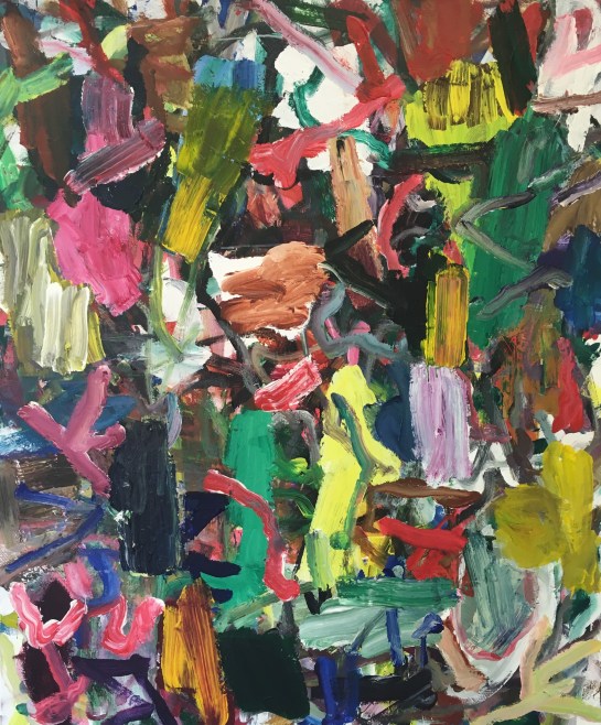
Funky Jam Fizz (acrylic on canvas, 100x120cm)
16th July 2018, near King’s Lynn.
Taking part: Steven Walker, Anne Smart, Anthony Smart, Hilde Skilton, Mark Skilton, Robin Greenwood, Sarah Greenwood, Alexandra Harley, Noela James Bewry, Edward Pile, Richard Ward, John Pollard.
Neptune’s Staircase (acrylic on canvas, 100x120cm)

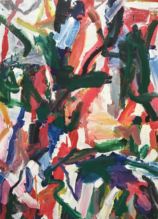
Centre Right Collapse (deflation) (acrylic on canvas, 124x140cm)

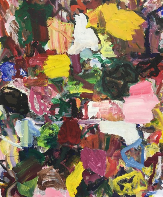
Au Contraire (acrylic on canvas, 100x120cm)
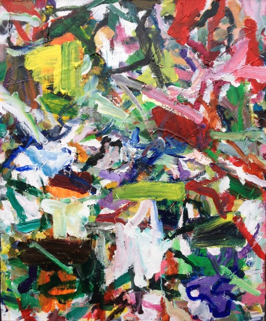
Untitled 1 (acrylic on canvas, 100x120cm)

Untitled 2 (acrylic on canvas, 108x144cm)
Untitled 3 (acrylic on canvas, 108x144cm)

I think it’s interesting to compare “Funky Jam Fizz” with Noela’s Nr. 1.
They both have a loosely cluttered, confetti-like space with most of the marks free to move against each other, and an intuited virtual background that you never actually reach.
Steven’s has more variety of colour, shape and facture, which invites a more interesting, speculative wandering around among the elements but tends towards the arbitrary and weakens the image when seen as a whole. I like them both.
“Neptune’s Staircase” and “Centre Right” don’t have this loose quality. Here the space tends towards landscape, with the coloured areas less independent and combining more effectively with one another.
“Centre Right” looks more successful on the jpegs, though I can’t remember it well from the day. I have a slight problem with the top left hand corner falling away, but apart from this I like it a lot.
I liked “Untitled 1” too on the day, but I can’t really see it on the photo now.
LikeLike
First and foremost, I’d like to say how welcome you all made me (and my family) feel over the (very hot) days of filming. Thank you everyone. I will admit I was very apprehensive before it, but your generosity and hospitality helped put me at ease.
As I said at the end of the Brancaster video, I learned a lot, and although I haven’t had much studio time since the summer I have been thinking about and digesting the ideas that came up during my Brancaster. Being able to see the discussion and not solely relying on what I remember what was said has been reinvigorating for my thoughts too. Hilde’s and Ed’s ideas have stuck with me; my intentionality in the detail and paradoxically the shifted grid.
I don’t consider the grid at all when painting and for it to be noticed was quite the revelation, even if it is a slipped or shifted grid. An unconscious, reductive, rigid element which contradicts what might be considered as more intuitive, spontaneous, “boof” moments. All very interesting. Perhaps also the shape of canvas is limiting me and hemming me in somehow.
Untitled 1 I can see as being different to and therefore more successful in ridding myself of the grid. It doesn’t echo the shape of the rectangle so much and I have gone more with the flow of the paint.
My understanding of the consensus and the views held by those present before the weekend of the filming was that the artists intention isn’t important, so I feel I underplayed my intentionality in the detail when speaking about it with Hilde. I am more conscious of what I am doing in those moments in terms of noticing what the canvas is telling me to do. Here it is not pre-planned and it’s not a preconception, but it does have intent. Intent in terms of choosing a colour from having a dialogue with the painting and intent about the application of it, but I never know what it will do when the brush touches the canvas.
I thought I was at my most intuitive and spontaneous in these moments (I was very certain about this) but there must be intent there, a preconception of sorts. I feel there is a micro-paradoxical event occurring in those moments, just as the whole painting could be considered paradoxical.
(Examples of this being Funky Jam Fizz, Neptune’s Staircase and Centre Right Collapse (deflation)).
LikeLike
is it that a “boof” moment is a spontaneous and intuitive action?
I would say we all feel at our most intuitive and spontaneous at such times.
Intent ,in my opinion, should be shaken not stirred,with attitude.
If you go to the Poussin Gallery web site and look up David Lendrum you will see on his first page a predominantly pale painting with fabulous red ,blue,orange,umber ,yellow and more marks over its surface. At first it looks free. It seems fluid,spatial and also whole. Is he painting here lots of “boof” moments? I think he is but I have also worked out, after looking long and hard,that his attitude towards the work is wrapped up inside his intent. All of the blue brush marks have a purposeful relationship with an orange mark. All of them different, whether they abut or cover a little or just run along side. This is specific. So for me the occurrences in the painting [ and there are many more such relationships in it] all look very “booffy” ,very immediate but ……….. well I don’t believe it was at all rushed.
I find your paintings awesome in their relentless enthusiasm ,painterliness and attack. I have really enjoyed a trawl through them on social media as well as here on Brancaster.
I liked all your paintings in this Brancaster chronicle and find it hard to express any preferences. Perhaps the first two are too unrestrained and have spatial background issues. ?
You asked me in my chronicle why I painted out the sides/edges of my paintings. You expressed a liking for getting into the history of a painting by tracking the remnants of marks there. I can’t remember which painting of yours it was but Hilde pointed out a small area that seemed strong and I agreed and thought it to have intent in relation to the marks/colours/areas etc around it.You said you had overpainted the area and changed the colour and direction of travel of the marks to make the whole painting ‘work’.We agreed it was a good move. So I wonder if the marks you painted out where done in one of the many “boof’ moments and by changing it and settling it down your attitude was more considered in relation to the whole painting and in fact was working with the intent to make the whole painting a “boof” painting not just a Lot of “boof” moments.
I remember Fred Pollock saying he was happy with over painting in certain areas on his canvasses ,they were part of the history of the painting.But if you look at a selection of Fred’s paintings here on this site I am pretty sure you will ,like myself, marvel at their complex colour and enjoy their immediacy which shows no history …In a roundabout way I am thinking they took more than 5 minutes!
Its just brilliant.
Its just great to have these magic moments,and try to grab them and make them part of Abstract art.
LikeLike
Hi Steven,
Thinking too much or thinking to little? Don’t know. Too much intent or too little? Don’t know. Something perhaps needs to break more, and more often, and get free. How does that happen? Feels a little like a struggle to make more of that, but that’s probably the only way – a sort of ‘try-it-out’ and then ‘destroy it’ thing?
When I first saw your work on Twitter (nine months ago?) you were doing some crazy spray-can all-over colour/non-colour, structure/non-structure linear/non-linear stuff, pulling everything around the whole canvas at once – and I got a real impressive buzz out of that. Can’t say if they were really good by judging on a tweet, but I confess to a slight disappointment when none of that arrived for Brancaster. I got over that straight away, but I do think there are for me the remains of some conventions that I’ve seen before by other painters. In fact you seem to have engaged with an extraordinary array of different ways of making painting over the past year. No problem with that either. We all do it/ have done it. But the ‘grid’ thing in some of these really bugs me, and most of all I question the layering of mark-making that is attached to the grid, one thing over another, in space, when the depth of the painting starts to establish a measure of figuration. I’m still questioning some of that in John and Noela’s work too. I don’t think they agree with me that it is to do with how acrylic paint gets on the surface, sticking on top of itself all the time, part over part. Layering like that seems sometimes quite difficult to find something whole.
I see on Twitter you have a few VERY new thinks that look similar but better (I guess) in how they are less obviously organised, compared to the best ones here (I don’t really want to sort them out). At the end of the day, maybe ‘organisation’ has to go?
LikeLike
I very much enjoyed seeing your paintings for real Steven, I seem to have a different memory of them compared to the photographs, but they still show the wonderful complexity of marks and colour, even if that colour doesn’t feel quite right in repro.
I feel the first three paintings work more completely than the last three, and ‘Au Contraire’ in the middle feels different because the blocks of colour and matted areas are larger within the picture frame, and give a solidity and slower pace.
I hear what you say Robin, regarding acrylic paint.
There is an endlessness to it’s use which can sometimes work against finding a coherent, integrated solution without getting complicated and confused.
I don’t think the look of a layered painting is necessarily a bad thing though. Seeing the history of a work and allowing layered passages to interact can be thrilling and does not always look figurative.
Oil paint can’t be used in the same way technically, without delamination problems, and so mixing and merging colour could have coherence because it would blend with itself, or shine through itself like in Hilde’s work.
I remember this cropping up last year after Richard’s comments about paint creating space and depth in one go, rather than by layering.
Both oil and acrylic have benefits, does it come down to taste and the preference for a certain look to the surface?
LikeLike
Not to taste, no; or a preference to look to the surface, though of course I may be subject to both those wrong ideas of my own. But I don’t agree yet about the “look” of a layered painting being able to move the matter along – the matter being wholeness in the “abstract”, a way out of superficial surface. John said recently “On acrylic paint the main issue is process” and I’m really uneasy about that, because ‘process’ must go. If you look at a close-up of “Shadowplay” (keep in mind I love that painting) you will see the on the bottom left hand side are disconcerting ‘laminations’ of paint, flaring in the light. Delamination might be a way out, if acrylic can be made to do that. Maybe I’m over-fussing.
LikeLike
‘Flaring in the light’ is about the time of the photo I think. I don’t think the laminations ‘flared’ in King’s Lynn. I do think oil has a more attractive ‘look’ when the layers of paint are thick.
‘Over-fussing?’ Maybe? Could be a ruse.
Try painting in acrylic Robin (if you haven’t already).
LikeLike
Could be your photography, but, no, I think it is about the surface.
I have already tried acrylic, of course. By seriously, why would I try it again? You must realise I don’t “like” oil paint either!
LikeLike
I should say I enjoyed the group of paintings Steven had at Brancaster. You have great strengths, both in your naturally energetic and physical process and your experimental nature. Like us all the most important question is in judgement. I too, liked a lot of your earlier work posted on twitter, and wondered where that may have gone.
The tension seems to be between a too loose, simple, open structure and one where the interruption of this looseness has resulted in a too severe halt to the painting’s movement and complexity. Perhaps the ideal lies somewhere inbetween but this is illusive and rare.
As I say I liked the work.
LikeLike